Apple’s AirTags have a hidden developer menu
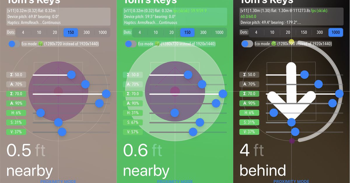
Source: The Verge added 06th May 2021Apple’s new item-tracking AirTags have arrived, and they come with a surprise addition: a hidden menu in the Find My app that reveals some of the back-end data used by the service.
To uncover this menu, open up Apple’s Find My app, select one of your AirTags, then tap your name in the top left corner five times. And just like Dorothy clicking her heels together, you’ll be whisked away to a comforting world of, well, sliders and data. It’s not clear what all the information means, though some of the labels (like “device pitch”) are obvious enough.
The menu seems to be an accidental remnant of Apple’s development process, with the information presumably left over from an early beta version of the Find My app. Think of it like builders leaving architectural plans under the floorboards of a house they’re constructing. This is normal stuff, you just don’t usually see it (especially from Apple).
The menu itself was discovered by a self-described “frustrated” AirTags user on Reddit, who was tapping around the app in annoyance when they uncovered the information. We were able to verify that the menu works with our own devices, as have plenty of people on Twitter, which is where we first saw this accidental Easter egg.
Over on Reddit, one user suggests that the bottom four sliders actually relate to the various colors your screen turns as you approach your AirTagged item. “A=% mixed with view; H=hue; S=saturation; V=value/brightness,” says Redditor pmarksen. “The top two sliders relate to camera blur, and brightness. Not sure what the middle ‘sum’ slider does yet.”
The “eco mode” label seems to refer to a battery-saving feature that deploys a smaller screen resolution (the Find My user interfaces includes an AR camera overlay that directs you to your item), while the “dots” options apparently refer to the number of dots that swarm on the screen as part of the animation that shows you approaching your target.
If anyone else has any more hints, clues, or wild speculation about what else the screen shows, please feel free to drop by the comments below. We’ve pinged Apple to ask about this menu and expect to hear only embarrassed silence.
brands: Apple Eco Especially First It New One Value WAS media: 'The Verge' keywords: App Apple
Related posts
Notice: Undefined variable: all_related in /var/www/vhosts/rondea.com/httpdocs/wp-content/themes/rondea-2-0/single-article.php on line 88
Notice: Undefined variable: all_related in /var/www/vhosts/rondea.com/httpdocs/wp-content/themes/rondea-2-0/single-article.php on line 88
Related Products
Notice: Undefined variable: all_related in /var/www/vhosts/rondea.com/httpdocs/wp-content/themes/rondea-2-0/single-article.php on line 91
Warning: Invalid argument supplied for foreach() in /var/www/vhosts/rondea.com/httpdocs/wp-content/themes/rondea-2-0/single-article.php on line 91
