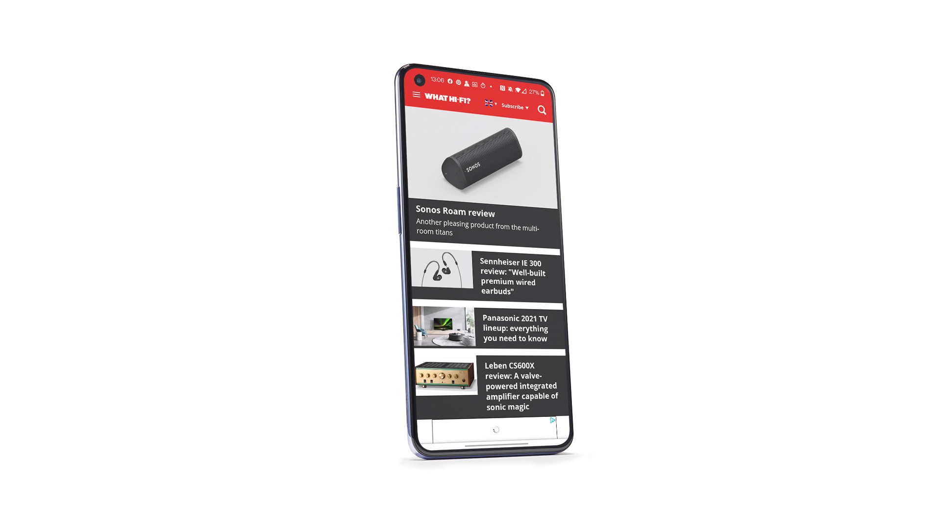
Pixel 5A camera sample leaks, hints at similar specs to the Pixel 5

Google seems to have accidentally shared a photo sample from its upcoming Pixel 5A, giving us some hints about what to expect from the barely announced device. The photo appeared in an album posted alongside a blog post about Google’s HDR+ Bracketing technology, which aims to reduce noise in HDR photos (via Android Police). The EXIF data for most of the photos said they were captured by existing Pixel phones including the Pixel 5, Pixel 4A 5G, Pixel 4, and Pixel 4 XL, but in among them was one image apparently taken with a Pixel 5A.

Google recently confirmed the existence of the Pixel 5A 5G in response to rumors that the device had been cancelled. However, beyond confirming that the device will be available later this year in the US and Japan, it didn’t offer any more details about the phone’s specs or cameras.

The image labeled as coming from a Pixel 5A has since been removed from the album, but offered several details about the camera performance of the upcoming device while it was up. First is that it appears to have been taken with an ultrawide camera, which corroborates previous reports that the 5A will have two rear cameras — a main camera and an ultrawide. That’s similar to the Pixel 4A 5G, while the Pixel 4A had just the one rear camera.

A screenshot of the photo’s EXIF data before it was removed.
Screenshot: Google Photos

Its resolution is also listed as 12.2 megapixels, which is similar to the photos we saw from the Pixel 5. Although the sensor in the Pixel 5’s ultrawide camera is technically 16 megapixels, it produces 12.2-megapixel shots by default. The 5A’s EXIF data also shows it has the same f/2.2 aperture as the 5. Given that the photo was attached to a blog post about HDR+ Bracketing, it seems likely that the 5A will also offer support for the technology.

Combined with previous rumors, it looks like the Pixel 5A could be a very similar device to last year’s Pixel 5. Reports suggest it’ll use the same Snapdragon 765G processor, and have a similar design with a 6.2-inch OLED display with a hole-punch selfie camera. Like Google’s previous A-series devices, however, the rear panel is expected to be made of plastic rather than glass, and the phone will also reportedly feature a 3.5mm headphone jack.

According to the leaked photo’s EXIF data, the photo itself was taken last October just before the Pixel 5 was released. Without official confirmation from Google there’s no guarantee it’s representative of the 5A’s final camera hardware, but the fact that the photo has now been removed suggests it wasn’t a simple labeling mistake.

clubhouse-is-partnering-with-the-nfl-for-draft-week-programming

Clubhouse is partnering with the NFL for draft week programming

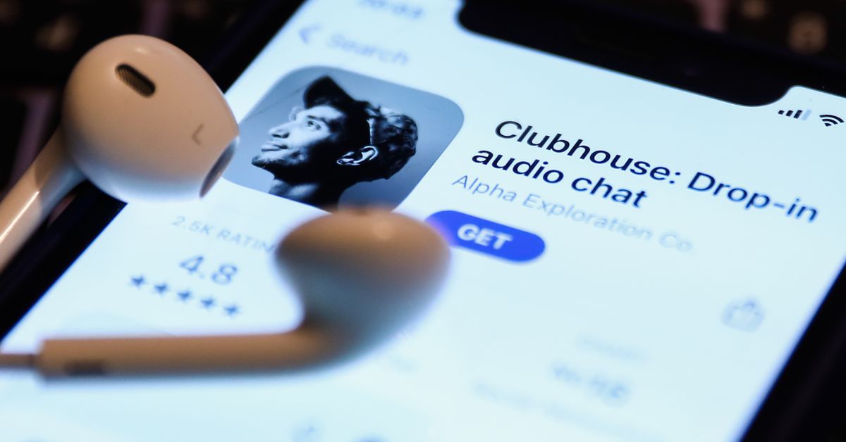
Audio social platform Clubhouse is partnering with the National Football League for some exclusive programming during the upcoming NFL draft, the company announced Sunday. This is the first sports partnership for Clubhouse.

The NFL will host a series of draft-themed rooms on Clubhouse beginning Monday and throughout the week, which will include player assessments, a mock draft for fans, and a conversation with football team alumni from the University of Alabama. Football fans can drop into the NFL rooms on Clubhouse to follow the picks as they’re announced and listen to “discussions featuring key NFL figures—from athletes and coaches to network personalities,” according to a release from Clubhouse, and fans could be invited on stage by moderators to ask draft questions or share reactions.

Clubhouse had a huge first year, with more than 10 million downloads, and sparked a raft of competing audio products from Twitter, LinkedIn, Discord, Spotify, Slack and Facebook. Its March 2020 debut came at the height of the coronavirus pandemic, when people were isolating and turning to online platforms to keep in touch with friends and family. Earlier this month, Bloomberg reported Clubhouse was valued at around $4 billion.

Clubhouse is still invitation-only, and is not yet available on Android devices.

samsung-galaxy-a52-5g-review:-a-midrange-phone-that-will-last

Samsung Galaxy A52 5G review: a midrange phone that will last

If you buy something from a Verge link, Vox Media may earn a commission. See our ethics statement.

If a $100 budget phone is the fast-food dollar menu and a $1,000 flagship is a steakhouse dinner, then the Samsung Galaxy A52 5G sits comfortably halfway between the two: the laid-back all-day cafe with surprisingly tasty food.

It’s good. More importantly, it’s good where it matters. Sure, you have to order your food at the counter and get your own water refills, but it’s worth it because brunch is fantastic and the prices are reasonable.

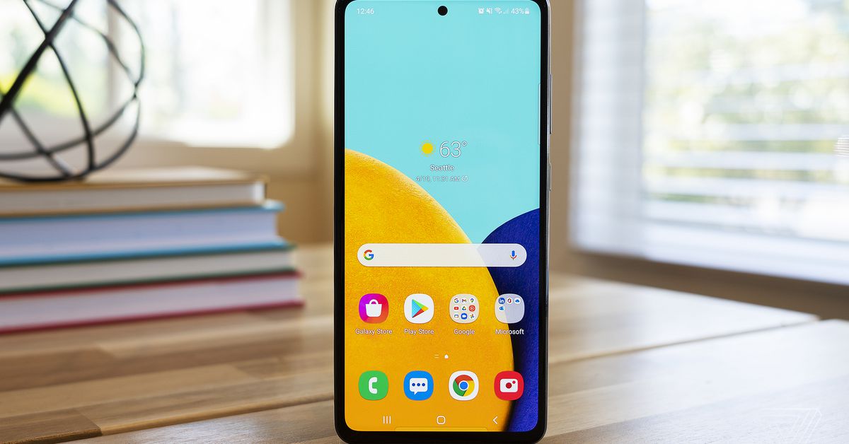
The A52 5G is the highest-specced of the budget A-series Galaxy phones we’ll see in the US this year, offering all of the basics for its $499 price tag along with a few good extras. Its 6.5-inch screen comes with a fast 120Hz refresh rate that’s scarce at this price point. Its main camera includes optical image stabilization, something I missed when I used the more expensive OnePlus 9. The A52 5G is rated IP67 waterproof for some extra peace of mind. And hey, there’s still a headphone jack! In this economy!

Still, this isn’t a flagship, and costs had to be cut somewhere. The device’s frame and back panel are plastic, and while I like the matte finish on the back, there’s a certain hollowness when you tap on it that’s not very reassuring. There’s also no telephoto to complement the wide and ultrawide cameras, just digital zoom plus a depth sensor and macro camera of dubious usefulness.

The important stuff is here, though. Samsung has the A52 5G on its list for monthly OS updates currently, and it says it will offer three years of major Android OS updates and at least some security support for four years. That will go a long way toward making the most out of your investment in this phone, and it will help you take advantage of its headline feature: 5G — Sub-6GHz, specifically, with hardware-level support for the C-band frequencies carriers will start using in 2022.

It’s getting more common to see 5G offered in midrange and budget phones, but in this country, it’ll be a couple more years before our 5G networks are truly good. Healthy device support for the next few years makes it more likely that the A52 5G will actually last long enough to make it to that 5G promised land.

The A52 5G offers solid everyday performance with a Snapdragon 750G chipset and 6GB of RAM.

Samsung Galaxy A52 5G performance and screen

The A52 5G uses a Snapdragon 750G processor with 6GB of RAM, and the combination feels like a good fit here. You can certainly push it out of its comfort zone with heavier tasks like webpages with JavaScript, and I noticed it hesitating a moment too long when opening the camera app from the lock screen. But for day-to-day tasks and social media scrolling, it keeps up well.

As in last year’s model, the screen is where the A52 5G (and Samsung generally) really stand out. This is a 6.5-inch 1080p OLED panel that’s rich, bright, and generally lovely to look at. Plus, it offers all of the velvety smoothness that comes with its 120Hz refresh rate. Swiping between home screens, opening apps, scrolling through Twitter — it all just feels nicer with a fast refresh rate.

Even considering the additional power needed for the 120Hz screen, the A52 5G’s 4,500mAh battery consistently lasted well into the next day in my use. I managed to get two full days out of it when I forgot to charge it overnight and decided to embrace chaos and just plow through on the remaining charge. This was with light to moderate use, and I was down to low double-digit battery percentage by the end of day two, but my gamble paid off.

One feature I continue to fight a losing battle with on the A52 5G is the in-display optical fingerprint sensor. I’ve been chastised by the phone many times for not leaving my finger on the sensor long enough, and I almost always need at least two tries to get it to register. That hit rate goes down significantly outside in bright light.

These problems aren’t unique to this device, and you can just opt to use (less secure) facial recognition or a plain old PIN to lock and unlock the phone. But there are nicer in-display fingerprint readers in pricier phones like the OnePlus 9 and Samsung’s own S21, so it’s a trade-off to be aware of.

The Galaxy A52 5G ships with Android 11, which is great. The less good news is, as we saw in the S21 devices earlier this year, Samsung’s latest take on the OS stuffs a lot of unwanted apps, ads, and general clutter into the UI. I see enough ads throughout my day as it is, and I do not appreciate seeing one more when I check the weather on my phone’s own weather app.

If there’s a positive way to look at this situation, it’s that it feels more forgivable on a budget phone than on a $1,000-plus flagship. But I’d rather not have the ads at all. If you buy the similarly priced Pixel 4A 5G, you give up a lot of other features from the A52 5G, but you get an ad-free experience.

Housed in the rear camera bump are a standard wide, ultrawide, macro, and depth sensor.

Samsung Galaxy A52 5G camera

The A52 5G includes three rear cameras, plus a 5-megapixel depth sensor. You get a 64-megapixel standard wide with OIS, 12-megapixel ultrawide, and the seemingly obligatory 5-megapixel macro camera. There’s also a front-facing 32-megapixel selfie camera.


  • Taken with 2x digital zoom


  • Taken with ultrawide


  • Taken with ultrawide


The 64-megapixel main camera produces 16-megapixel images in its standard photo mode that are bright with the very saturated colors you’d expect from a Samsung phone. Sometimes the look is pleasant, but more often than not, it’s a little much for my taste. The good news is that this sensor is capable of capturing lots of fine detail in good lighting, and it even does well in dim to very low-light conditions.

I put its night mode up against the Google Pixel 4A, which is still the low-light champ in the midrange class. There’s more noise visible in the A52 5G’s night mode shot, and details have a watercolory look, but while the 4A hangs on to its title, the A52 5G is quite close behind.

Left: Galaxy A52 night mode. Right: Pixel 4A night mode.“,”image_left”:{“ratio”:”*”,”original_url”:”https://cdn.vox-cdn.com/uploads/chorus_asset/file/22465175/samsung_night_crop.jpg”,”network”:”verge”,”bgcolor”:”white”,”pinterest_enabled”:false,”caption”:null,”credit”:null,”focal_area”:{“top_left_x”:0,”top_left_y”:0,”bottom_right_x”:2040,”bottom_right_y”:1580},”bounds”:[0,0,2040,1580],”uploaded_size”:{“width”:2040,”height”:1580},”focal_point”:null,”asset_id”:22465175,”asset_credit”:null,”alt_text”:””},”image_right”:{“ratio”:”*”,”original_url”:”https://cdn.vox-cdn.com/uploads/chorus_asset/file/22465178/pixel_night_crop.jpg”,”network”:”verge”,”bgcolor”:”white”,”pinterest_enabled”:false,”caption”:null,”credit”:null,”focal_area”:{“top_left_x”:0,”top_left_y”:0,”bottom_right_x”:2040,”bottom_right_y”:1580},”bounds”:[0,0,2040,1580],”uploaded_size”:{“width”:2040,”height”:1580},”focal_point”:null,”asset_id”:22465178,”asset_credit”:null,”alt_text”:””},”credit”:null}” data-cid=”apps/imageslider-1619271003_9454_116978″>

Left: Galaxy A52 night mode. Right: Pixel 4A night mode.

The Pixel 4A is still the better camera in good lighting, too, but the differences are more subjective here. The 4A goes for more subdued color rendering, and the A52 5G’s images lack a little contrast in comparison.

Left: Galaxy A52 5G. Right: Pixel 4A.“,”image_left”:{“ratio”:”*”,”original_url”:”https://cdn.vox-cdn.com/uploads/chorus_asset/file/22465190/samsung_goodlight.jpg”,”network”:”verge”,”bgcolor”:”white”,”pinterest_enabled”:false,”caption”:null,”credit”:null,”focal_area”:{“top_left_x”:0,”top_left_y”:0,”bottom_right_x”:2040,”bottom_right_y”:1530},”bounds”:[0,0,2040,1530],”uploaded_size”:{“width”:2040,”height”:1530},”focal_point”:null,”asset_id”:22465190,”asset_credit”:null,”alt_text”:””},”image_right”:{“ratio”:”*”,”original_url”:”https://cdn.vox-cdn.com/uploads/chorus_asset/file/22465193/pixel_goodlight.jpg”,”network”:”verge”,”bgcolor”:”white”,”pinterest_enabled”:false,”caption”:null,”credit”:null,”focal_area”:{“top_left_x”:0,”top_left_y”:0,”bottom_right_x”:2040,”bottom_right_y”:1530},”bounds”:[0,0,2040,1530],”uploaded_size”:{“width”:2040,”height”:1530},”focal_point”:null,”asset_id”:22465193,”asset_credit”:null,”alt_text”:””},”credit”:null}” data-cid=”apps/imageslider-1619271003_1919_116979″>

Left: Galaxy A52 5G. Right: Pixel 4A.

So the A52 5G can’t beat the generation-old imaging tech in the 4A, but that might say more about the Pixel than anything else. Aside from that, the A52 5G turns in good all-around camera performance. Images from the ultrawide sometimes have a little cooler color cast but are generally good. The selfie camera offers two zoom settings: a slightly cropped-in standard wide view and an ever-so-slightly wider angle. The “focal length” difference between the two is almost laughably small.

At its default settings, the selfie camera does a fair amount of face smoothing and brightening. I don’t think it quite crosses the line into hamcam territory, but it certainly has that telltale “maybe it’s AI, maybe it’s Maybelline” smoothed look to it.

If you want to go full hamcam, there’s a new mode just labeled “fun” in the camera app with AR face filters brought to you by Snapchat. There’s a different selection of them every day, and you don’t need a Snapchat account to use or share them.

I’m tempted to dismiss them as “for the youths,” but maybe this is really for the olds like me who would rather not join another social platform if I can possibly avoid it, thank you very much. At last, I can transform my face into a piece of broccoli and share it with the world without logging in to Snapchat — three years after the kids have all moved on to something else. Anyway, it’s there, it works, and you can indeed turn your face into broccoli.

Good hardware and healthy software support make the A52 5G worth spending a little more on.

There’s a lot that the Galaxy A52 5G gets right. Maybe the most important feature is one that sounds much less exciting than cool headline specs: security updates for at least the next few years. At $500, this is the higher end of the budget market, but a few extra hundred dollars is likely easier to swallow if you know you’ll get a couple more years out of your investment.

Samsung has invested in hardware in all the right places: the 120Hz screen makes for an elevated user experience, battery life is good, camera performance is strong, and a healthy processor / chipset combination handles daily tasks well.

What I didn’t love — the cluttered software, fussy fingerprint sensor, a tendency toward oversaturated color in photos — feels more forgivable when the phone gets the nonnegotiable stuff right. The Pixel 4A 5G is probably this device’s closest competition, and it beats the A52 5G on camera quality and a cleaner UI, but it’s a smaller device without a fancy fast refresh rate screen. Depending on how you feel about either of those things, the 4A 5G might be the better pick for you.

In any case, the A52 5G is a good midrange phone today. But just as importantly, it will be a good phone a few years from now. With solid hardware and a software support system to back it up, this is a pricier budget phone that’s worth budgeting a little extra for.

Photography by Allison Johnson / The Verge

lenovo-flex-3-chromebook-review:-good-price,-bad-screen

Lenovo Flex 3 Chromebook review: good price, bad screen

If you buy something from a Verge link, Vox Media may earn a commission. See our ethics statement.

Lenovo’s Ideapad Flex 3 Chromebook is one of the tiniest Chromebooks I’ve ever used. It’s also one of the cheapest, retailing for just $349.99.

Any laptop that costs that little is going to have some serious drawbacks — and the Flex 3 certainly does. On the other hand, if you’re the sort of shopper who’s willing to set those aside, this little IdeaPad also has a number of pleasant surprises up its sleeve. There are even a few areas (in particular, the battery life) where it gives significantly more expensive devices a run for their money.

I’ll start with the pleasant surprises. The Flex 3 offers a more modern port selection than I’d expect at its price point — there are two USB 3.1 Type-C Gen 1 ports and two USB 3.1 Type-A Gen 1 ports (one on each side, which is really handy for charging and connecting accessories), as well as a microSD reader, an audio combo jack, and a lock slot. There’s a 720p webcam that works decently well if you’re not in low light. And the touchpad is surprisingly sturdy — I often find that touchpads in this price range feel plasticky. The Flex even comes with a Google Security H1 chip, which encrypts sensitive on-device data.

There’s a power button on the side, as well as a volume rocker.

There are two features that really impressed me (in addition to the battery life, which I’ll discuss later on). First, I can’t stop talking about the keyboard. It’s great, with tons of travel and a satisfying click. The keys have a slightly rough texture that really grew on me. I got one of the highest scores I’ve ever gotten on my usual typing test, with almost no errors. The only note is that it lacks backlighting, a feature you’ll find on more expensive devices like Acer’s Chromebook Spin 713 (our current top Chromebook pick) and Lenovo’s Flex 5 Chromebook.

God, I love a good keyboard.

Second, audio. The balance and volume that these 2W stereo speakers deliver are on par with those of any number of more expensive Chromebooks. They easily beat the Spin 713, which sounds tinny and thin. There are caveats, of course: There’s very little bass, percussion is weak, I heard a bit of distortion at max volume, and you’ll want an external speaker for any crowded setting. But the Flex is great for video conferences and regular music-listening, and certainly beats what I’ve heard from all kinds of Windows laptops that are over $1,000.

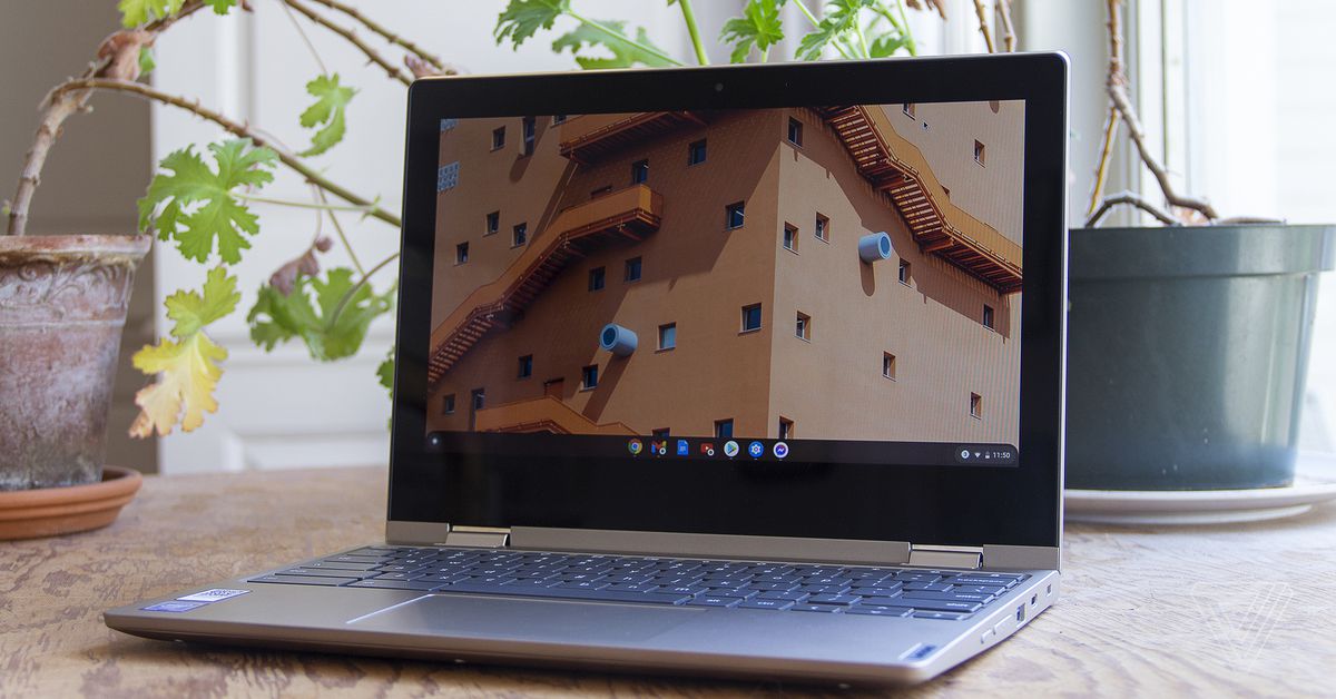
Now, for the major drawbacks. First, this thing is a clunker. It’s not too heavy, at 2.65 pounds, but it’s 0.7 inches thick, and it’s not too far from the size of many modern 13-inch laptops despite having just an 11-inch screen. My main turnoff, though, is the bezels. Good lord, the bezels are enormous. When I’m using the Flex 3, I feel like I’m looking at a small window of screen floating in an abyss of black. It looks like a device you’d have bought in 2014.

I wish Lenovo had sprung for a better screen.

I do like some things about the chassis, though. It doesn’t feel at all flimsy, with an aluminum cover and a non-plasticky finish. The display and keyboard are free of flex (despite the laptop’s name). And the 360 hinge is sturdy, with very little wobble.

Speaking of the display, though: That’s the second major drawback here. It’s cramped — I often use two windows side-by-side and I’ve been squinting at tiny text in order to make that work on the Flex 3. Moreover, it’s dim (maxing out at 250 nits), kicks back a ton of glare even indoors, and is quite low-resolution (1366 x 768). I’m gonna be real: It’s pixel-y to look at. I’ve been using the Flex 3 as my primary driver for a week, and while I will miss the keyboard and audio when I send it back, I can’t wait never to have to look at this terrible screen again.

That’s the lowdown on the chassis — let’s look inside. This Ideapad Flex 3 Chromebook configuration is powered by Intel’s dual-core Celeron N4020. That’s the bottom of the barrel as Intel processors go, and it comes with just 4GB of memory (LPDDR4-2400, soldered) and 64GB of eMMC 5.1 storage.

On a Windows machine, these specs would be a hard pass. But Chrome OS is a lighter load, and I can vouch that the Flex 3’s screen is a bigger limit on multitasking than its horsepower is. I was able to use the laptop for a substantial workload, jumping between dozens of Chrome tabs and some apps, but the experience was cramped enough that I wouldn’t recommend it.

The color is called “almond”.

Scrolling got a bit sluggish when I tried to work on top of a Spotify or YouTube stream, and the transitions between laptop and tablet mode were a bit slower than I would’ve liked. The only task where I ran into real trouble, though, was sorting through a batch of shots in Google Photos (with a couple other apps running on the side). The Flex 3 did get the job done, but it was quite slow. The one Zoom meeting I tried (on top of some other tabs I needed) was also a bad experience — audio randomly cut out a couple times, and video was stuttery throughout.

Overall, this device is best if you’re looking to do basic office or school tasks, and don’t think you’ll need to have more than a few things open at a time. (And in case this doesn’t go without saying, you’ll want to stay far away from this thing if you plan on doing anything fancy with Linux.)

The flipside of the weak processor is that the Flex 3 has excellent battery life. I averaged eight hours and 45 minutes to a charge with brightness at 50 percent — and I was pushing the thing harder than most people probably will be, as noted above. You can expect that this thing will last all day, and certainly longer than many more powerful Chromebooks. The 45W charger is acceptably quick, juicing the device up to 60 percent in 52 minutes.

Six rows of keys.

The Flex 3 runs Chrome OS, which means it can run Android apps natively. Some of these have improved since the last time I used this operating system — Messenger is now functional and no longer a complete disaster that bricks the machine, for example. But most of the services I use daily (Slack, Twitter, Gmail, Reddit, etc.) are just better experiences in a browser, so I didn’t use the dedicated app functionality all that often. There’s also still a double-notification problem — every time I got a Slack message, I got a notification both from the Slack Android app and my browser.

The Flex 3 also supports Chrome OS’s tablet mode, which has gotten quite good. It supports Android-esque gesture controls, which should help flatten the learning curve for new Chromebook users (though they were a bit sluggish on this device).

Deciding whether to buy a $350 Chromebook comes down to understanding what the big drawbacks are. In this case, there are two: The screen is cramped, and the processor is weak. So the question to ask is: Given those caveats, can you get your stuff done?

If you’re just using this device to pay bills, email people, and run some YouTube videos, I would say you can. It’ll be a little cramped, but you can. And if you can stomach that, the Flex 3 does deliver some great benefits in other areas, from the great keyboard and convenient ports to the outstanding battery life and respectable audio. In these categories, it rivals or surpasses our top Chromebook pick (the Spin 713). If you’re okay with its flaws, you’ll find that the Flex 3 offers quite a bit for its budget price.

Photography by Monica Chin / The Verge

google’s-guacamole-may-be-premature,-but-it-sounds-ripe-to-become-an-android-feature

Google’s Guacamole may be premature, but it sounds ripe to become an Android feature

Google probably wasn’t planning to reveal this until the company’s I/O developer conference on May 18th, but it looks like a cat may be out of the bag: the company’s testing a feature that should let you stop alarms and answer calls on your Android phone simply by saying “stop” — no need to pick up your phone or even say “Hey Google.”

We know this because a mysterious new setting called “Guacamole” has popped up in the Google app on Android 11 for some users — including me. (Android Police and 9to5Google tipped us off.) And while none of us journalists have been able to actually turn on the feature yet, it’s fairly easy to imagine what it does.

The menus where Guacamole can be found, for some users running Android 11 and Google app version 12.15.9.29.

If you’d rather not imagine, 9to5Google’s sources say it specifically will handle alarms, timers, and calls by saying “Stop”, “Snooze” and “Answer/decline the call” respectively. None of those worked for me after I flicked the switch, likely because I wasn’t able to access a Google internal website for dogfooding employees.

I even tried adding a period to make it g.co/assistant-guacamole, thinking the “go” might have been a typo for one of Google’s g.co shortlinks, but no dice.

If the feature sounds familiar, it’s probably because Google already shoved some guacamole into its Google Home / Nest Hub smart speakers and displays at Google I/O 2019. You’ve been able to simply say “stop” to stop their alarms ringing for nearly two years already.

“We’re constantly experimenting with new ways to improve the overall experience with Google Assistant. We have no additional details to share at this time,” Google tells The Verge.

bowers-&-wilkins-pi7-initial-review:-b&w-goes-true-wireless-at-last

Bowers & Wilkins PI7 initial review: B&W goes true wireless at last

(Pocket-lint) – Audiophile brand Bowers & Wilkins has always taken its sweet time in adopting new technologies. It told Pocket-lint in the past that this is intentional – it likes to wait until the market matures and its own high audio quality standards can be met.

It was relatively late to market with a Bluetooth speaker and wireless heaphones. And, it only adopted active or adaptive noise-cancellation when it was sure its tech wouldn’t hamper audio performance.

That’s why it is also late to the party with true wireles in-ears. And, do you know what, we don’t mind. The flagship Bowers & Wilkins PI7 in-ear true wireless headphones are proof positive that a softly softly approach can reap dividends.

In many ways, these ‘buds remind us of the excellent Sony WF-1000XM3 earphones. Except smaller, more confortable, and with even more musicality. That’s the benefit of hindsight in effect right there.


The best Lightning headphones 2021 for your iPhone or iPad


By Dan Grabham
·

Top headphones capable of handling lossless 48kHz digital audio from Apple devices.

What you get in the box

When you open the box, you see a tasty-looking, small-scale case. It’s a bit larger than an Apple AirPods equivalent but a lot smaller than many we’ve also had through the Pocket-lint testing bed.

Pocket-lint

The case comes with a USB-C port and a couple of buttons, including a Bluetooth pairing button that allows you to connect it to your device without needing to take out the ‘buds.

A USB-C to USB-C cable is included, but you’ll have to provide your own charging plug. That does mean it is capable of being fast charged, though. It can also be charged wirelessly, if you have a Qi mat handy.

The case has a further neat trick up its sleeve too: it can also act as a Bluetooth transmitter. Using an additional included USB-C to 3.5mm mini jack cable, you can plug the case into any source and transmit audio to your PI7s wirelessly.

This feature could be great for listening to in-flight entertainment – rather than buying something such as the RHA Wireless Flight Adapter – for example, or for using with a Nintendo Switch, which doesn’t currently support Bluetooth headphones. The case will also pair with other Bowers & Wilkins wireless headphones – such as the B&W PX7 released in 2020 – so can simultaneously transmit audio to those too.

Design and fit

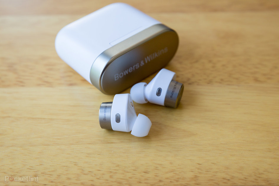
The Bowers & Wilkins PI7 in-ears are beautifully designed. We are testing the white version – they are also available in charcoal.

They are extremely comfortable and light, with a matte finish to the plastic and neat metallic element on the outer tips. It’s meant to be a gold finish but, depending on the light, can look gunmetal grey at times.

The eartips are silicone, with the medium sized tips on the earbuds as default. You get a couple of extra silicone tips in the box, in small and large.

Pocket-lint

In our ears, they fit very well indeed and are extremely comfortable. We wouldn’t imagine getting earache from these over long periods, unlike some competitors (although these first impressions are based on having the PI7s for a few days, so a full, in-depth test is yet to follow).

What we will say though, is that as the larger plastic section needs to fit inside the bowl of your ear, some with smaller ears may struggle to place it successfully.

The ‘buds are water- and dust-proof, which is great for indoor workouts. But, we’re not sure they’re secure enough for running outdoors. Very few non-sport TWS in-ears are, to be honest.

There are touch controls on each of the earphones. You can tap to take a call, pause, play and rewind music, and adjust noise-cancelling and activate your chosen voice assistant. There are also wear sensors on each, so when you remove either, the music stops. It plays automatically when you put them back in.

Set-up and battery life

Setting up the Bowers & Wilkins PI7 in-ears is a doddle. For iPhone users, you just need to head to your Bluetooth settings screen and press the button inside the case for a couple of seconds. The headphones should appear in your list for connection.

Pocket-lint

It’s even easier on Android devices with Google Fast Pair enabled. Just place the case nearby and open the case lid. Then follow the instructions on your phone.

You also need to download the Bowers & Wilkins Headphones app to control a couple of the features and/or update the PI7s or their case. Once paired via Bluetooth, you can search for your in-ears through the app – this will bring up a dedicated settings section.

The app will also show you the battery status of each earbud and the case. It gives you control over the adaptive noise-cancellation tech (switching it on or off, or choosing whether to have it automatically adjust depending on your surroundings). You can also change the strength of the noise-cancelling effect via a transparency slider.

Battery life is claimed to be up to 4 hours of playback for each ‘bud, with a further 16 hours from the case. We are yet to test that fully.

Audio performance

We’ve been hugely impressed by the audio performance and signature in our listening tests so far.

The B&W PI7 headphones support Qualcomm’s aptX Adaptive lossless wireless tech, although we’re yet to give that a thorough workout. We have, though, streamed plenty of Tidal Masters tracks via an iPhone 12 Pro Max.

Naturally, this isn’t the best we could get but it’s close to what we expect most users will acheive.

Pocket-lint

Led Zeppelin’s Bring it on Home (remastered) sounded deep, involving, and with excellent separation. As too did The Kink’s Shangri-La (the stereo mix). While it is weird writing about the imperfections in a recording, they are often what makes a certain version so good, and every squeaky guitar slide is picked out by these headphones.

Bass is impressive too. Each earbud has its own amplifier, supporting a custom 9.2mm drive unit. This works greatly across all fequencies, but bass certainly benefits.

Aside from obvious hip-hop examples, the opening bars of the 2019 remix of Come Together by The Beatles are throaty and tangible. All from tiny in-ears with no cable attached. Amazing.

First Impressions

We want to investigate further before we give our full opinion, but so far, it seems like Bowers & Wilkins is onto a winner with the PI7 wireless in-ears.

These earbuds are extremely high quality and look tasty to match. Their musicality is right up there, but then so is the price, so you would expect as much.

That’s probably our only quibble for now – the B&Ws are almost twice the price of Apple’s AirPods Pro equivalents. Indeed, there are few high-end alternatives priced quite so highly.

Bowers & Wilkins does counter that with the less expensive PI5 – released at the same time – but we haven’t heard those yet to give you a decent comparison, and they don’t come with the Hi-Res Audio specifications.

Still, we’d imagine there are plenty willing to pay a premium price for premium performance. We’ll soon follow up with a full review to let you know if it’s justified. So far, so good, however.

Writing by Rik Henderson. Editing by Mike Lowe.

citroen-e-c4-review:-crossover-coupe-that’s-comfortable-to-the-core

Citroën ë-C4 review: Crossover coupe that’s comfortable to the core

(Pocket-lint) – There’s a little thing in the car world called CMP – Common Modular Platform. While you won’t see it, it’s underpinning a number of cars coming from the PSA group – Citroën, Peugeot, Vauxhall, DS Automobiles, and for those in Europe, Opel.

That’s why you’ll find a number of cars with what look like similar specifications on the road, while the bodywork is all different. Basically, it’s different flavours of the same ice cream. The ë-C4 being Citroën’s flavour of this electric car. So just how tasty is it?

Design

Sitting in the crossover segment, the Citroën ë-C4 – and the combustion C4 versions – look to offer something a little different in terms of design. The C4 has always been slightly playful – we’ve seen the Picasso and the Cactus in previous years – and here we have coupe stylings, rather than just being another hatch.

We’ll come right forward and say that we like this design. It’s fresh and it’s different, the front half of the car swirling in some of the design elements we’ve seen from Citroën recently – with coloured trims and sculpting – while the rear drops off giving you a split rear window that’s reminiscent of the C4 Coupe of yesteryear.

Pocket-lint

This big coupe design has often been the preserve of German premium marques – Mercedes, BMW and Audi have all made SUVs with coupe styles in recent years. Adding Citroën to this list makes a lot of sense: this isn’t just another C segment hatchback and it’s all the better for it.

What’s missing is a full glass roof – there’s a sunroof on the options list (it’s £800 in the UK) – but we can’t help feeling that with a glass roof this car would be even nicer in the interior.

The move to that faster coupe style back brings with it a couple of points to note. The rear window has a horizonal split, with a trailing spoiler on the exterior and that does cut across your rearview vision slightly, although we think Citroën should have taken the glass higher up the back to give better rear vision.

That also means you don’t have the same standing height in the 380 litre boot that you might in a regular hatch design, but it’s slightly deeper – larger than the DS 3 Crossback E-Tense – and potentially more usable as a family car as a result.

Pocket-lint

At the same time, adding that split allows Citroën to keep the e-C4’s roofline slightly higher, meaning that interior space isn’t compromised and does give for an interesting design.

While it looks great, there are some minor quality concerns. The boot lid, for example, needs a really good slam and it just feels as though it’s not quite as substantial as you’ll find elsewhere.

A comfortable interior

Citroën puts a focus on comfort and the interior is a truly comforting space. There’s reasonable space in the front, while the interior gives respectable headroom for the rear passengers.

Comfortable seats get a cloth finish, leaving the leathers aside for the sake of affordability. There are touches of leather through the cabin, but the predominance is for hard- and soft-touch plastics. That lacks the premium feel that you’ll find in the DS 3, for example, but it doesn’t look cheap and has the attraction of being easy to clean.

There are colour details – with inserted blue stripes to remind you you’re in an electric car, while the only part we find that lets the side down is the glossy black plastics on the centre console. Gloss black leads to fingerprints and dust which always seems to be visible – you’ll be forever cleaning it.

The layout of the interior is similar to the DS Automobiles equivalent – you can see that these cars are related – although Citroën has minimised many of the controls. There’s a full spread of aircon dials and buttons, but other functions controlled though the display lack direct access buttons.

Pocket-lint

There’s a home button and a button by the electronic brake toggle for the electric stats screen – but radio, satnav and other functions all require you to punch the home button and then use the on-screen control. That means you’re often having to press a number of buttons to use these functions.

There’s also a mite more convenience than the DS layout which puts all the window controls in the centre of the car – the Citroën leaves them on the door, which we think is sensible.

The c-ë4’s interior display sits nice and high on the dash for easy visibility. And although the driver display is a little small, the head-up display (HUD) adds a touch of class.

What you really take away from it, however, is the comfort. There’s plenty of space in the front and you’ll fit adults in the rear too, with enough headroom for taller passengers.

Pocket-lint

There’s a false floor in the boot, but we like the fact that you can drop it to gain the maximum storage space – or keep it in place to keep your charging cables out of sight.

Talking about technology

The Citroën ë-C4 is reasonably well appointed with technology, but as we hinted at above, its biggest failure is in the lack of controls.

There’s a 10-inch display in the centre of the car, mounted on the top of the dash, so most of the interaction will be via touch. There’s a slight frame to it, like a shelf along the bottom edge, which gives you somewhere to rest your hand while tapping away – which makes it more usable.

The downside is that there are only a couple of physical buttons: the home button, which takes you home; a car button, which takes you the vehicle settings (which you’re unlikely to change once you’ve setup the car the first time you drive); and an electric button, which takes you through to see some of the electric stats, but little else.

Outside of this, you can scroll through pages, like the radio stations, using the steering wheel controls, but there’s no other direct controls via other buttons. Instead, you have to use touch – and often you’ll have to press the home button and then select what you want – navigation for example. There’s not even a home button on the display, so it’s a multitude of presses no matter what you want to get done.

That sours the experience slightly and really takes away from what is otherwise a decent offering. It’s in stark contrast to the DS 3 Crossback E-Tense which has massive buttons for every area. We can’t help feeling that somewhere between the two would be the more practical system.

Regardless, Citroën covers the basics pretty well, focusing on radio, navigation and calling. There’s support for Apple CarPlay and Android Auto via the USB connections, while the top trim will also give you a Qi wireless charger for compatible devices.

The navigation, visually, is ok, but the search isn’t very good. It’s just too hard to get to the essentials – like car charging stations. This should be front and centre on the satnav app, but buried in points of interest, somewhere after local helipads and other nonsense you’re never going to need to navigate to.

Pocket-lint

The Citroën ë-C4 offers essentially the same information as the DS 3 E-Tense under its electric button – that’s a flow diagram showing the battery power driving the wheels, or a bar chart showing average consumption across recent trips. At least Citroën is using a scale that works, so you can see if you’re driving more or less efficiently than previously – but still, compared to the data you’d get from the Kia e-Niro, it just feels like it should be trying harder.

The ë-C4’s driver display doesn’t offer customisation and is on the small side, but we’re not hugely worried about that – it does the job well enough in cahoots with the HUD.

While we’re also talking tech, there’s one downside to all that plastic in the door panels: it can’t really handle stronger bass from the standard speakers, so if your music gets a bit heavy, the performance isn’t that good and you’ll get some vibration back from it.

Citroën also offers a voice command system. This can get around some of the problems: you an just ask for the radio station by pushing the button on the steering wheel. However, once you’ve hooked up Android Auto and found that the same button will also support Google Assistant, you’ll likely never use the native system again.

The ë-C4 is also hiding a small surprise for tablet users, with a mount for tablets on the dashboard. Pop open the drawer and you’ll find a cover with a privacy screen in the front, which will accommodate a range of tablet sizes, but it’s mostly built around normal iPad sizes.

Once your tablet is on the cover, you’ll be able to attach it to the dash on a mount so the passenger can watch at leisure, the privacy screen ensuring that the driver isn’t distracted. It’s great because it all neatly hides away when not in use.

Overall, it feels like there are some easy improvements to be made here. The lack of direct controls and the lack of home button within the touch system just makes eveything more fiddly than it could be.

Drive, range and performance

The starting point for Citroën is comfort. The Citroën ë-C4 wafts over broken roads and speed bumps rather more majestically than many comparable models which are setup with suspension so firm it will knock your teeth out when you hit a pothole. Instead there’s a sense of tranquillity: it’s soft, quiet, comfortable – actually a nice place to be without the boneshaking adrenaline of pretending you’re a rally driver.

Pocket-lint

The important core specs of this car will sound familiar if you’re looking at cars in this segment. As we said in the opener, there are various flavours, so the 50kWh battery and 100Kw motor (136hp) will come as no surprise.

Yes, that’s not a huge battery and this is the thing that separates the Citroën ë-C4 from the likes of the Kia e-Niro (with its 64kWh battery) and longer range, or the likes of the cheaper Mini Electric (with its 32.6kWh battery) and shorter range.

Citroën says you’ll get 217 miles range from it (that’s the WLTP measure), but we found it easy enough to average 4.6-miles-per-kW, which comes in at 230 miles. More carefree driving might see that drop to around 170 miles from an average around 3.6 miles per kW, which is what we got in typical runs to the supermarket and other suburban chores – exactly what we expect this car to be doing.

Pocket-lint

The absolute range will of course vary based on all sorts of factors – how you drive, the conditions you’re driving in – but with support for 100kW charging, you’ll soon be back on the road.

There are three driving modes – eco, normal, sport – each changing the drive slightly as their names suggest. After playing with the faster sport mode, we settled into eco, which gives better lift-off regeneration than the normal mode so it’s closer to one-pedal driving – although you can’t bring it to a complete halt without using the brake.

In addition there’s the option of both D (drive) and B (battery) modes, the latter again making the car a little more economical. It’s slightly irksome that to engage B mode you have to press a button, but to select D you just move the drive selector. Again, it’s hard to fathom why that additional step was added.


Apple CarPlay explained: Taking iOS on the road


By Britta O’Boyle
·

Pocket-lint

The steering is light, with indicators for close front obstructions and a useful reversing camera to help you get into those tight charging spaces. It’s an easy car to manoeuvre and the visibility and road positioning is generally very good, even with that slight rear obstruction due to the split rear window. You can get a complete 360 vision system (£350 on the options list), though, which is a nice addition.

Verdict

The Citroën ë-C4 slots nicely alongside stablemates like the Peugeot e-2008, sitting around the same price and offering similar performance. Stepping up the range means moving to something like the Kia e-Niro, which will cost you more, so the Citroën feels like it’s about the right price for what you get – although it is about £10k pricier than the cheapest combusion version.

Overall, the Citroën ë-C4 is a great electric car. It sits somewhere in the middle of practical options available out there at the moment, offers a good balance of price to performance, all wrapped into a car that above all else is majestically comfortable for driver and passengers alike.

Alternatives to consider

Pocket-lint

Kia e-Niro

Those looking for more range will be attracted to the 64kWh e-Niro, one of the top EVs on the road, while the lower capacity e-Niro is around the same price as the Citroen, but with a smaller battery.

  • Read our review

Pocket-lint

Nissan Leaf

The Nissan Leaf is one of the best EVs on the road, and certainly one of the most popular. For just a little more you can get the 62kWh version which will give you more range, although it lacks the appeal of the ë-C4’s crossover stylings.

  • Read our review

Writing by Chris Hall. Editing by Mike Lowe.

apple-doubles-down-on-keeping-mac-and-ipad-separate,-despite-m1

Apple Doubles Down on Keeping Mac and iPad Separate, Despite M1

(Image credit: Apple)

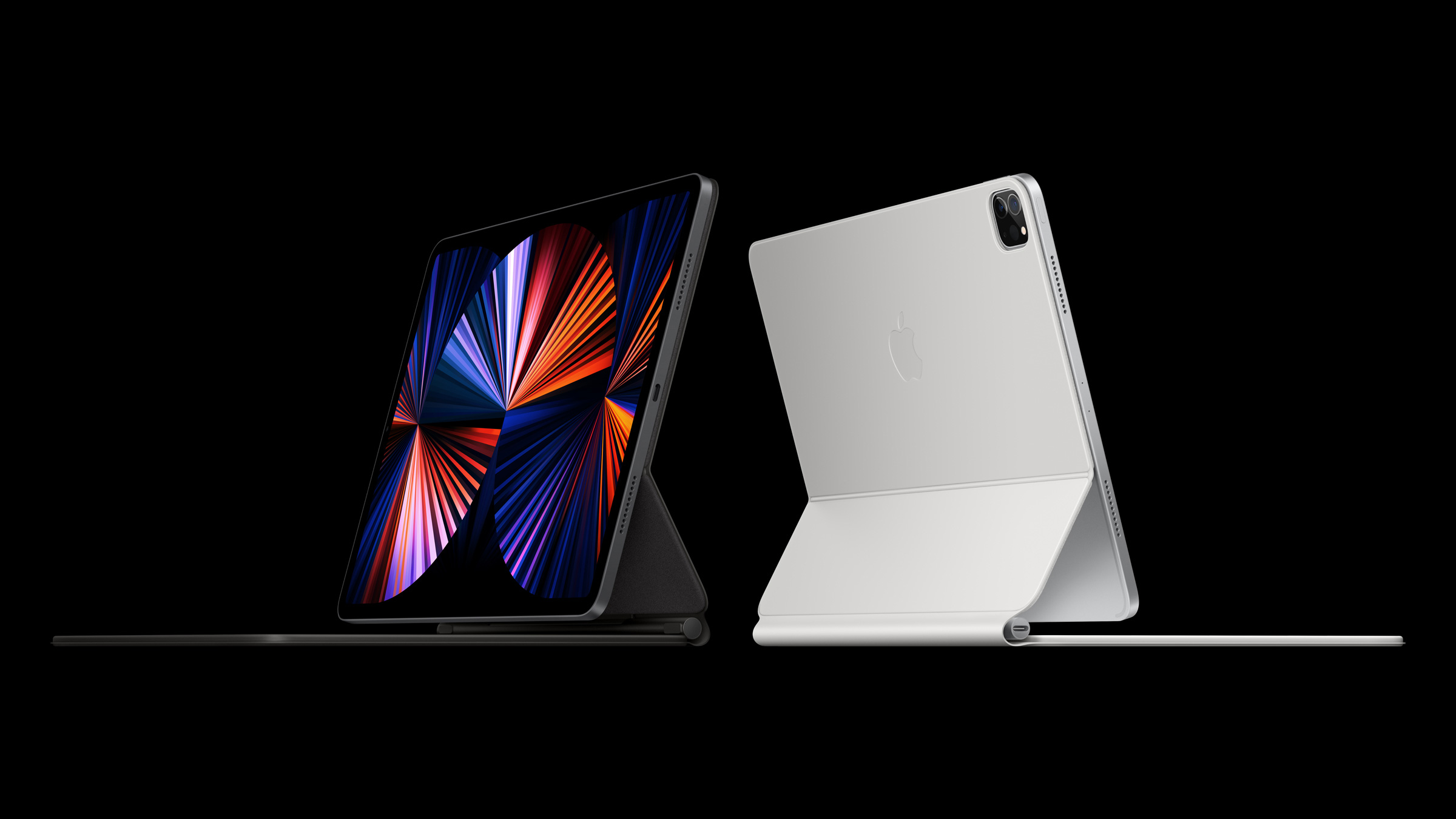
The iPad Pro now uses M1, Apple’s homegrown processor that is also in the 21-inch iMac, 13-inch MacBook Pro, MacBook Air and Mac Mini. That’s a lot of power, but don’t expect the iPad to merge with the Mac line anytime soon.

In an interview with The Independent, Apple hardware lead John Ternus and marketing chief Greg ‘Joz’ Joswiak were steadfast that the two platforms are separate.

“There’s two conflicting stories people like to tell about the iPad and Mac,” Joswiak told The Independent.  “On the one hand, people say that they are in conflict with each other. That somebody has to decide whether they want a Mac, or they want an iPad. Or people say that we’re merging them into one: that there’s really this grand conspiracy we have, to eliminate the two categories and make them one. And the reality is neither is true. We’re quite proud of the fact that we work really, really hard to create the best products in their respective category.”

Indeed, the iPad Pro is far and away better than any other Android tablet. Between the M1 and, if you splurge on a keyboard cover, the iPad Pro can easily handle many workflows with aplomb.

“We don’t think about well, we’re going to limit what this device can do because we don’t want to step on the toes of this [other] one or anything like that,” Ternus said. “We’re pushing to make the best Mac we can make; we’re pushing to make the best iPad we can make. And people choose.” He pointed out that some people have both, and that their workflow spans both devices.

But it also highlights what some consider the Mac’s biggest weakness: its lack of a touchscreen. Apple has long suggested that the Mac and macOS weren’t designed for touch, while critics have bragged about the flexibility some Windows PCs have gained from touch screen options. The iPad, however, is getting its most advanced touchscreen ever, with mini-LED technology with extreme dynamic range borrowed from the desktop Pro Display XDR.

The Mac, as of macOS Big Sur, can run some iOS and iPad OS apps. This doesn’t yet go the opposite way, and Apple can’t show the same pro apps running on both the iPad and the iMac in stage demos.

Yesterday, The Verge‘s Monica Chin wrote an op-ed entitled “Put macOS on the iPad, you cowards,” suggesting perhaps the ultimate convergence. If you’re not going to put touch on the Mac, let users run their Mac apps on the iPad. After all, they share the same processor.

But with rumors of iPadOS 15 getting a significant change, perhaps one differing it more from iOS on the iPhone, it doesn’t seem like the Mac and the iPad will become one anytime soon. Or perhaps ever.

“[W]e’re just going to keep making them [the iMac and iPad Pro] better. And we’re not going to get all caught up in, you know, theories around merging or anything like that,” Ternus said.