oppo-find-x3-pro-review:-standout-for-all-the-right-reasons

Oppo Find X3 Pro review: Standout for all the right reasons

(Pocket-lint) – Oppo is on the move, gaining popularity in its home market where it’s even overtaken Huawei. But it’s not just gaining at home: it’s now undoubtedly a top contender in the world of smartphones, make it the most likely challenger to Apple and Samsung’s dominance. 

Oppo’s latest effort, the Find X3 Pro, is seeking to go toe-to-toe with the likes of the Galaxy S21 Ultra and iPhone 12 Pro Max, offering a big and premium flagship experience that, as we’ve found, is stunning in almost every way.

Distinctive design

  • Glass and metal design; curved glass around rear camera enclosure
  • Dimensions: 163.6 x 74.0 x 8.26mm / Weight: 193g
  • IP68 water and dust resistance

For the past few years we’ve seen smartphone makers all use the same tired design and – for 2021 so far – thankfully we’re seeing some new takes. Samsung kicked things off with its odd, but purposeful, camera hump in the S21 series – the one that wrapped around the edge of the phone to form a more deliberate part of the design. 

Now the Find X3 Pro delivers what we think is an even more refined finish. Rather than have a separate unit for the camera, Oppo made the camera protrusion part of the same piece of glass as the rest of the phone’s back, forming this completely seamless curve. The company says it took 2000 attempts to get this right, and nearly gave up on the idea, but the effect is really unique.

The result is a lot more subtle and refined than just having a rectangle sticking out of the back fo the phone. It’s also unique, unlike anything else currently on the market. It’s really lovely to look at – and far better looking than the odd digital renders that leaked ahead of the phone’s launch – although the camera arrangement definitely has some iPhone-like vibes. 

The rest of the Find X3 Pro’s back is one smooth surface with gradual curves towards the edges, while this blue model features a lovely frosted soft glass finish that’s really nice to the touch. The branding is minimal too, giving this phone a look and feel that’s highly polished and befitting of its high price tag. 

It’s slimmer than its predecessor, the Oppo Find X2 Pro, too. In fact, it’s a more than a 1mm thinner than the vegan leather model of old and noticeably lighter too – although there’s no denying the Find X3 Pro is still quite a large phone. It doesn’t have the bulk or weight of the Samsung Galaxy S21 Ultra though. 

Pocket-lint

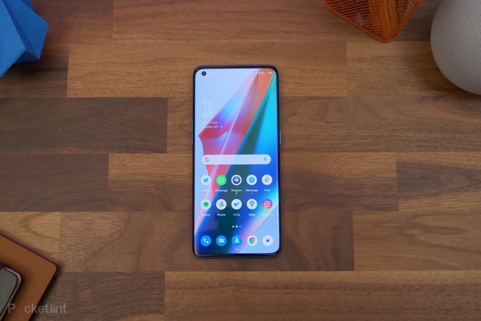
It’s skinny bezels all the way around on the front and nothing cuts into that display panel except for a small selfie camera punched into the top corner.

Aligning itself slightly with recent trends, the curves around the edges of the display are less extreme than we’ve seen in the past, but are very much still there. It seems the trend of ‘waterfall displays’ died before it began. Unsurprising, really, given how easy it is to perform accidental touches on those things. 

Another positive is that Oppo has built in some stereo speakers, so if the phone is close enough to your face, you get that left and right channel effect while watching movies and listening to music. The loudspeaker at the bottom is definitely the louder of the two, however, and can be quite easy to cover with a hand by accident – especially during landscape gaming – leaving you with quite a quiet left channel only. 

Brilliant display

  • 6.7-inch AMOLED panel, QHD+ resolution (3216 x 1440 pixels)
  • 120Hz refresh rate (with adaptive frame rate)
  • 1300 nits peak brightness
  • ColorOS 11 (based on Android 11)

Oppo has made something of a name for itself by putting fantastic screens on its phones this past couple of years. For 2021, that’s no different. With a high-resolution and fast refresh rate panel – with adaptive refresh up to 120Hz – the Find X3 Pro delivers on that sharp and smooth experience.

Pocket-lint

As if that wasn’t enough, it can display up to a billion colours, is HDR10+ compatible, and has a peak brightness of 1300 nits. The display spec sheet is enough to make any tech nerd’s mouth water.

But it’s not just read it and imagine stuff, it’s great in reality too. It’s bright, it’s sharp, it’s dynamic, and the colours are rich. It’s set to FHD+ resolution by default, but it’s easy enough to change to QHD within the settings and get the full effect of its sharpness (inevitably minus some battery life). 

We don’t find that it over-eggs the contrast too much either, so while blacks are really deep and dark, they don’t cause the screen to feature that overly contrasty or ‘black crush’ look we sometimes found with the Find X2 Pro or OnePlus 8. 

Pocket-lint

Oppo’s ColorOS software is great in a lot of ways too. As Android skins go, it’s worked itself into the position of being one of the cleanest, most fluid and attractive options out there. It doesn’t go crazy with colourful icons and trasitions like Samsung’s One UI, and has attractive rounded corners on the notification bubbles.

It’s come a very long way since it was effectively just a clone of Apple’s iOS back in the day – before Oppo’s launch in Europe (well, relaunch). There are some quirks though. Mainly around notifications. 

There doesn’t seem to be a lot of consistency in how notifications are handled. For instance, we could have a little icon showing we have a notification on the always-on display, but then there’s nothing displaying on the Lock Screen. Or there coule be a little red dot on the app icon, but nothing showing up in the status bar or notification shade when we dropped it down.

The lock screen’s inconsistency was particularly unusual. Even when we’d set notifications to wake up the phone we’d see the notification light up the lock screen, but upon picking up the phone to check again, the notification would vanish – despite being unread and still showing as an icon on the always-on display. 

Pocket-lint

All of these quirks were despite having set notifications to have the ability to show everywhere (status bar/app icon/lock screen), and despite setting our most-used apps to ignore any battery optimisations that might push them to background status or send them to sleep. 

Still, there’s some other fun and good points to ColorOS, such as the Relax app to help you get to sleep at night by playing some calming ambient noise. And we like the customisation options available for the interface and the always-on display.

Performance & battery life

  • Snapdragon 888 processor, 12GB RAM
  • 256GB storage, no microSD expansion
  • 4,500mAh battery capacity

    • 65W Super VOOC 2.0 flash charging
    • 30W Air VOOC wireless charging
  • 5G connectivity

As far as pure power goes, the Find X3 Pro is up there with the best of them, featuring the top-end for 2021 Qualcomm Snapdragon 800 series. Here that means the Snapdragon 888 with 12GB RAM and 256GB storage.

Load up your favourite games and the phone handles them without breaking a sweat, keeping up with fast animations and transitions. It doesn’t stutter or lag anywhere, so it really doesn’t matter what you try to do with it, it’ll handle it just fine. It didn’t even get particularly warm, even after a 30 minute gaming session. 

Pocket-lint

Battery management is similarly efficient. We struggled to drain the full battery in a single day, even at a weekend with three hours of gaming and then some camera testing we still finished the day with 30 per cent left over.

On quiter days with only a little dabbling with news sites, maybe an hour of gaming and some social media, we could easily finish the day with more than 50 per cent left at bed time. So we have no doubt this could easily be a two-day phone for light to moderate users.

Then when the battery does eventually empty, it has Oppo’s trademark flash charging technology in both wired and wireless forms. With the wired adapter, it can full refill in under 40 minutes. With the proprietary AirVOOC tech – which OnePlus also uses in its Wireless Warp Charge stand – you can fill it up pretty quickly with the wireless charger too. 

Under the microscope

  • 3-megapixel ‘Micro lens’

Where to start with the camera. Let’s go with the gimmick bit first. Because, actually, it’s rather fun. 

In its quad camera system, the Find X3 Pro has a so-called ‘Micro lens’. This gives you the effect of zooming in up to 60x and has its own little LED light ring around it. That’s an essential addition because it’s for shooting really, really close-up shots, allowing you to see detail you just can’t with the naked eye. 

Launch the microscope mode in the camera and a curtain goes from being just about able to see a weave pattern to being able to see the individual threads and weaves in the construction. It’s a similar effect with a weaved nylon watch strap or a clothbound book. Hold it to a screen and you’ll see the sub pixels in the panel. It’s pretty cool. 

Yes, it’s a gimmick – and with a low 3-megapixel resolution – so it’s not particularly sharp, but it is fun and definitely adds a different edge to your photography. 

It also takes some concentration and very steady hands. Holding the camera 1-3mm away from a subject is hard enough without the extreme magnification also making every tiny hand movement or shake exagerated. 

It has a macro mode too, which thankfully isn’t handled by this low-resolution sensor. It instead uses the same sensor as the ultra-wide camera – which we’ll come to later.

What that means for photos – examples of which you can see in the gallery above – is that your images retain colour, detail and a natural blur that you generally don’t get with a seperate, low-resolution macro camera. It can get you great results, although its automatic activation can take a little while to get used to. 

With the camera set to its default 1x mode it’ll automatically switch to macro mode as soon as you get close to a subject. Sounds great, except it switches to the ultra-wide lens – and because that’s in a physically different position you have to then adjust and re-frame.

Our only real criticism here is that sometimes with the macro mode the background blur causes edges to appear to have a outline glow, which is kind of odd. 

Flagship cameras

  • Main: 50-megapixel, f/1.7 aperture, phase detection autofocus (PDAF), optical image stabilisation (OIS)
  • Zoom (2x optical): 13MP, f/3.0, PDAF, OIS
  • Ultra-wide: 50MP, f/2.2, PDAF

As for the other cameras, it’s pretty much all good here. Pictures have detail and a lot of vibrancy and life, especially when shooting in daylight. One of the best things is that both the ultra-wide and primary camera use exactly the same 50-megapixel sensor. 

That means – since they make use of the same image processing tech too – that the balance of colour, dynamic range and detail between the two is pretty much identical. It helps photos taken from those two camera appear consistent, which isn’t the case on a lot of other phones. 

The phone cameras seem to handle harsh lighting conditions pretty well too, balancing out highlights and shadows nicely. It’s a really reliable system. 

One thing we did notice – in both daylight and night modes – is that the camera produces quite a warm colour balance. We like the look, but it isn’t necessarily the neutral and clean finish some will like. Saying that, there is a ‘Pro’ mode which will let you adjust all manner of settings, including the white balance. 

There’s also a telephoto zoom camera with 2x optical zoom, 5x hybrid zoom, and up to 20x digital zoom, giving you that extra range you might want to shoot subjects further away. 

Images from this camera don’t have that same quality look of the two primary cameras, but they hold up well – up to about 5x anyway. Zoom beyond that and the detail falls off quite rapidly. At 20x the picture looks quite ropey, with details somewhat jagged and blurry.

With night mode activated the phone performs well in low-light conditions too. To our surprise we found that both the primary and ultra-wide cameras perform well in night mode, drawing in a lot of light. Although, with its wider aperture, the primary is noticeably better.

We took the Find X3 Pro out to compare with the iPhone 12 and Google Pixel 5 at night and found that its images were warmer than the other two. It doesn’t seem as heavy-handed with contrast and highlights like the iPhone, but isn’t quite as realistic looking as the Pixel in our view.

Night mode doesn’t just apply to photos either. Tapping an AI enhancing button boosts the video performance at night too. This does effect the optical stabilisation a little negatively, but results in some pretty colour and hyper-realistic scenery, but it’s impressive to see the difference in really low-light situations. 


Best smartphones 2021 rated: The top mobile phones available to buy today


By Chris Hall
·

Verdict

When it comes to display, battery life and overall speed, the Oppo Find X3 Pro is undoubtedly one of the best flagships on the market right now – and will likely remain a strong choice throughout 2021. 

While the camera does have a habit of warming up pictures’ colour balance and sometimes making them a bit oversaturated, the whole system is immensely versatile and gets great results, regardless of lighting conditions. 

The only other negative relates to quirks with notifications from the ColorOS software. Otherwise it’s hard to find much fault with Oppo’s top-tier flagship.

While Oppo might not be a familiar name to everyone, the Find X3 Pro is so fantastic in nearly every way that it’ll put the brand name on the map. It simply stands out from the crowd for all the right reasons.

Also consider

Pocket-lint

Samsung Galaxy S21 Ultra 

squirrel_widget_3816752

Oppo is competiting with the big names, and Samsung’s latest ultra-premium device has a lot going for it. The screen is fab and it has a super camera system. Oh, and that Phantom Black colour is stunning too.

  • Read our review
Pocket-lint

iPhone 12 Pro Max 

squirrel_widget_3699102

It’s Apple’s latest all-singing all-dancing flagship and offers many of the same hardware features. It’s a very polished experience all-round if you’re not up for Google’s Android OS.

  • Read our review

Writing by Cam Bunton.
goldtouch-go!2-bluetooth-wireless-mobile-keyboard-review

Goldtouch Go!2 Bluetooth Wireless Mobile Keyboard Review

Introduction

You may not have heard of Goldtouch before, but you probably have used one of their products. The company makes ergonomic peripherals used by over 90% of the Fortune 1000 companies worldwide, including Dell, Apple, Intel, and Microsoft to name a few. Indeed, this is arguably the largest keyboard brand I have experienced to date, with a retail channel in over 180 countries, and the brand that is behind so many OEM HID solutions globally. Somewhat ironically, I was living a short drive away earlier (well, relative to the USA anyway), but Goldtouch now had to send the keyboard across an ocean. Thanks again to the company for sending a review sample to TechPowerUp!

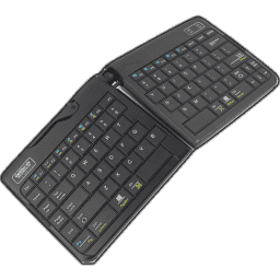
The company has a wide plethora of ergonomic products for work, but today, we are taking a look at one of their more interesting keyboards for mobile travel while retaining an ergonomic fit. The Go!2 Bluetooth Wireless Mobile keyboard name might be a handful and then some, which is why I will refer to it as the Goldtouch Go!2 in this review henceforth, though its full name explains the nature of the keyboard well. The image above does an even better job of showcasing how this is a split ergonomic keyboard, too. The low-profile, wireless nature combined with these features might be bringing up dollar signs in your minds, but there is a pleasant surprise at the end of the review which begins with a look at the specifications in the table below.

Specifications

Goldtouch Go!2 Bluetooth Wireless Keyboard
Layout: 75% form factor in a modified US ANSI layout, other languages supported dependent on your region
Material: ABS plastic case and keycaps
Macro Support: No
Weight: 0.5 kg/1.1 lbs.
Wrist Rest: No
Anti-ghosting: 6-Key rollover Bluetooth
Media Keys: Available as a layered function
Dimensions (when together): 152 (L) x 343 (W) x 23 (H) mm
Cable Length: 1 ft
Software: No
Switch Type: Scissor-style membrane switch
Backlighting: No
Interface: Bluetooth 3.0
Warranty: One year
go-listen-to-spotify’s-podcast-about-itself-that-ignores-the-existence-of-itunes

Go listen to Spotify’s podcast about itself that ignores the existence of iTunes

Spotify is making a podcast about its own history, and the first two episodes are well worth a listen for the details on the jump from piracy to streaming, how the company decided to build its business, and the technical details of how it did so. There are also some fun interviews included, with the podcast featuring stories from Sean Parker, inventor of Napster, and Lars Ulrich of Metallica.

In the podcast, the Spotify founders discuss the history of piracy in Spotify’s home country, Sweden, to give context about its development environment. It goes into the existence of Sweden’s Pirate Party, an actual political party that once held several seats in the country’s parliament. The founders also discuss how they wanted to take the ease of pirating music but make it legitimate.

If talk about being easier than piracy sounds familiar, it’s probably because that was part of the pitch for the iTunes Music Store, too. It seems, for the most part, that iTunes and the iPod are pretty much completely ignored. The podcast presents music distribution as going from CD stores to Napster to Spotify. Apple and Spotify aren’t the best of friends, but it’s honestly somewhat hilarious to hear how the story completely ignores the fact that people could, in fact, buy digital music (an option that was around even before Spotify launched).

Despite the lack of objectivity about the history of digital music, the technical depth alone makes it well worth a listen. The second episode (labeled 01) gets into how Spotify used the same peer-to-peer tech used by the pirates to build its legitimate music streaming service and how its approach blew people’s minds at the time. Even though the story leaves some pretty important parts out, it’s still worth a listen to hear the origins of the popular music (and, obviously, podcasting) service.

building-the-ultimate-retro-computer

Building the ultimate retro computer

Although I assembled it myself, and its software all comes from an open-source DIY project, in many ways my MiSTer is the most versatile computer I own. It’s a shapeshifting wonderbox that can change its own logic to make itself run like countless other machines as accurately as possible. From old arcade boards to early PCs to vintage consoles, MiSTer developers are devoted to helping it turn into an ever-expanding range of hardware.

If you’ve ever wanted to use computer software or hardware that is no longer available for sale, you’ve probably run into emulation before. It’s a huge field that often involves a ton of people working on a technically challenging feat: how to write software that lets one computer run code that was written for another. But there’s only so much traditional emulators can do. There are always inherent compromises and complexities involved in getting your current hardware to run software it was never designed to handle. Emulated operating systems or video games often encounter slowdown, latency, and bugs you’d never have encountered with the original devices. So what if there was a way to alter the hardware itself?

Well, that’s MiSTer. It’s an open-source project built upon field-programmable gate array (FPGA) technology, which means it makes use of hardware that can be reconfigured after the fact. While traditional CPUs are fixed from the point of manufacture, FPGAs can be reprogrammed to work as if they came right off the conveyor belt with the actual silicon you want to use.

What this means is, you’re not tricking a processor into believing it’s something else, you’re setting it up to run that way from the start. A MiSTer system can theoretically run software from the NES to the Neo Geo, to the Apple II or Acorn Archimedes, and deliver responsive, near-as-dammit accurate performance next to what you’d get from the actual devices.

Of course, it’s not as easy as that makes it sound. In order to program an FPGA to act like a computer from three decades ago, you have to intimately understand the original hardware. And that’s what makes MiSTer one of the technically coolest DIY projects going today, building on the knowledge of developers around the globe.

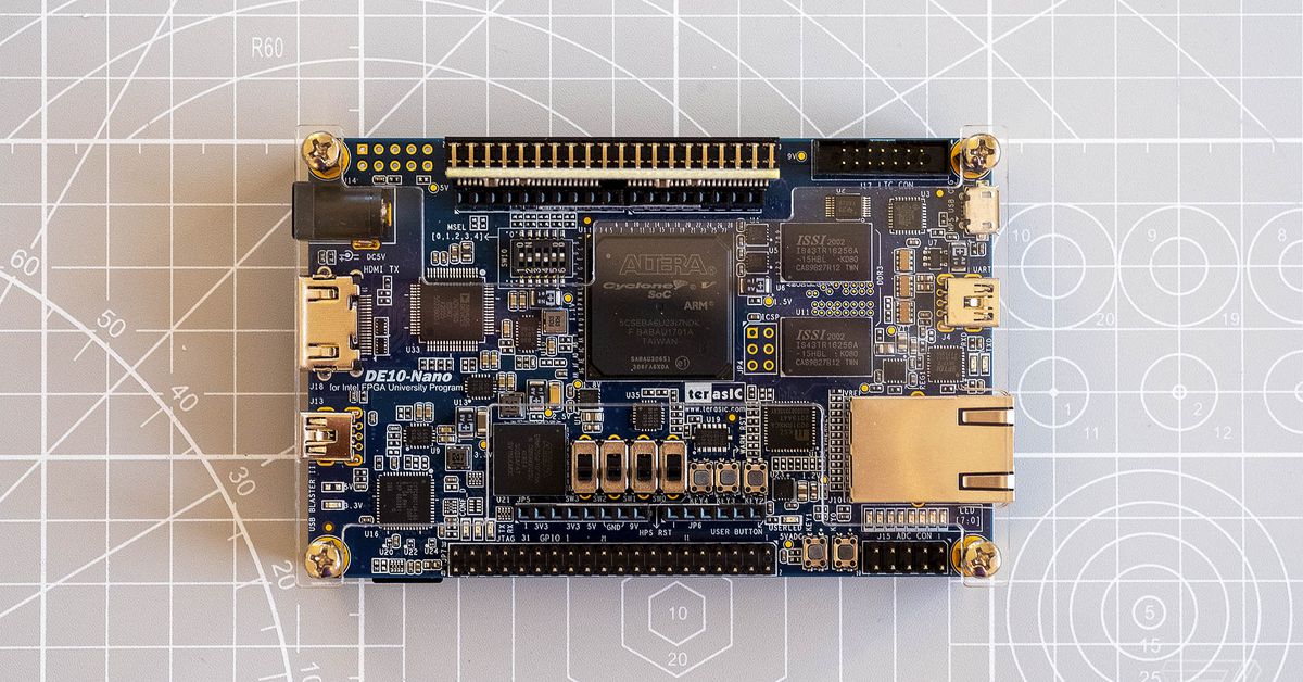
The DE10-Nano sandwiched between the I/O and USB hub boards.

FPGAs aren’t new technology. Two early companies in the field (sorry) were Altera, now owned by Intel, and Xilinx, now part of AMD. The two have competed since the 1980s for market share in programmable logic devices, largely serving enterprise customers. One of the biggest advantages of FPGAs on an industrial scale is that companies can iterate their software design on hardware before they need to manufacture the final silicon. FPGAs are widely used to develop embedded systems, for example, because the software and the hardware can be designed near-concurrently.

You might be familiar with FPGAs if you’ve come across Analogue’s boutique console clones, like the Mega Sg and the Super Nt. Those use FPGAs programmed in a certain way to replicate a single, specific piece of hardware, so you can use your original physical cartridges with them and get an experience that’s very close to the actual consoles.

The MiSTer project is built around more accessible FPGA hardware than you’d find in commercial or enterprise applications. The core of the system is an FPGA board called the DE10-Nano, produced by another Intel-owned company called Terasic that’s based out of Taiwan. It was originally intended for students as a way to teach themselves how to work with FPGAs.

The DE10-Nano looks somewhat similar to a Raspberry Pi — it’s a tiny motherboard that ships without a case and is designed to be expanded. The hardware includes an Altera Cyclone V with two ARM Cortex-A9 CPU cores, 1GB of DDR3 SDRAM, an HDMI out, a microSD card slot, a USB-A port, and Ethernet connectivity. It runs a Linux-based OS out of the box and sells for about $135, or $99 to students.

MiSTer is inspired by MiST, an earlier project that made use of an Altera FPGA board to recreate the Atari ST. But the DE10-Nano is cheaper, more powerful, and expandable, which is why project leader Alexey Melnikov used it as the basis for MiSTer when development started a few years back. Melnikov also designed MiSTer-specific daughterboards that enhance the DE10-Nano’s capability and make a finished machine a lot more versatile; the designs are open-source, so anyone is free to manufacture and sell them.

You can run MiSTer on a single DE10-Nano, but it’s not recommended, because the board alone will only support a few of the cores available. (A “core” is a re-creation of a specific console or computer designed to run on the MiSTer platform.) The one upgrade that should be considered essential is a 128MB stick of SDRAM, which gives MiSTer enough memory at the right speed to run anything released for the platform to date.

Beyond that, you’ll probably want a case, assuming you’d rather not run open circuitry exposed to the elements. There are various case designs available, many of which are intended for use with other MiSTer-specific add-ons that vertically attach to the DE10-Nano. An I/O board isn’t necessary for most cores, for example, but it adds a VGA port along with digital and analog audio out, which is useful for various setups. (A lot of MiSTer users prefer to hook up their systems to CRT TVs to make the most of the authentic output and low latency.) You can add a heatsink or a fan, which can be a good idea if you want to run the system for extended periods of time. And there’s a USB hub board that adds seven USB-A ports.

For my setup, I ordered the DE10-Nano, a 128MB SDRAM stick, a VGA I/O board with a fan, a USB hub board, and a case designed for that precise selection of hardware. These largely came from different sources and took varying amounts of time to show up; you can order the DE10-Nano from countless computer retailers, but other MiSTer accessories involve diving into a cottage industry of redesigns and resellers. Half of my parts arrived in a battered box from Portugal filled with shredded paper and loosely attached bubble wrap.

MiSTer accessories are based on Melnikov’s original designs, but since the project is open-source, many sellers customize their own versions. My case, for example, includes a patch cable that hooks directly into the IO board to control its lighting, while some others require you to route the LEDs yourself. The USB board, meanwhile, came with a bridge to the DE10-Nano that seemed to be a different height from most others, which meant I had to improvise a little with screw placements. Nothing I ordered came with instructions, so it did take some time to figure out what should go where, but everything worked fine in the end. The only other thing I had to do was go buy a small hex screwdriver for the final screws in the case.

That’s part of the fun with MiSTer. There’s a base specification that everything works around, but you’re still ultimately assembling your own FPGA computer, and you can adjust the build as much or as little as you want.

Once your hardware is set, you need to install the MiSTer software. There are a few ways to do this, and you’ll want to dig around forums and GitHub for a while so you know what you’re doing, but the method I went with was simple in the end — essentially, you format your microSD card with an installer package, put it into the DE10-Nano, plug in an Ethernet cable and a USB keyboard, power on the system, and it’ll download all of the available cores. Your SD card will then be set up to boot the MiSTer OS directly, and you can run another script to make sure everything’s updated with the most recent versions.

The MiSTer OS is very simple, with a default background that looks like pixelated TV static and a basic menu in a monospaced font that lets you select from lists of console and computer cores. The first thing I did was load some old Game Boy Advance ROMs I dumped well over a decade ago, because for some reason Nintendo doesn’t want to sell them for the Switch. (Please sell them for the Switch, Nintendo.) The performance felt about as authentic as I could’ve expected, except for the fact that I was looking at a 4K TV instead of a tiny screen.

My main reason for getting into MiSTer is to have a hardware-based way to access the parts of computer history that I missed, or to revisit forgotten platforms that I was around for. I knew that computer systems like the Apple II and the Amiga were big gaps in my knowledge, so it’s great to have a little box that can run like either of them on command. I’ve also been getting into the MSX platform, which was popular in Japan in the ’80s. My next rainy-day project is to work on an install of RISC OS, the Acorn operating system that was on the first computers I ever used at school in the UK. (You can actually still buy licensed ROM copies of various versions of the OS, which was a neat surprise.)

MiSTer development is a vibrant scene. Melnikov has a Patreon that’s updated several times a week with improvements he’s made to various cores, but there are lots of other people contributing to the project on a daily or weekly basis. A colleague introduced me to the work of Jose Tejada, for example, who’s based in Spain and has made a ton of progress on replicating old Capcom arcade machine boards. There’s another project aiming to get the original PlayStation running, marking the biggest step yet into 3D hardware on MiSTer.

FPGAs are often talked about as if they’re a silver bullet for perfect emulation, but that’s really not the case — at least, not without a lot of effort. Anything that runs perfectly on MiSTer, or as close to perfectly as is otherwise imperceptible, is the result of a ton of work by talented programmers who have spent time figuring out the original hardware and applying the knowledge to their cores. Just read this post from the FPGA PSX Project about what it took to get Ridge Racer running on MiSTer, as well as the assessment of how far they have to go. The cores can vary in quality, accuracy, and state of completion, but a lot of them are still under active development and huge strides have been made in the past couple of years.

Analogue lead hardware engineer Kevin Horton spoke to The Verge in 2019 about the work that went into re-creating the Sega Genesis for the Mega Sg console. The process took him nine months, including two-and-a-half months figuring out the CPU at the heart of the console. “I didn’t know Genesis very well, and knew literally nothing about the 68000 CPU at all!” he said. “This was my first foray into both things and probably slowed the process down since I had to learn it all as I went.”

Ultimately, Horton confirmed the accuracy of his work by directly connecting a 68000 to an FPGA and comparing their performance on a test that ran for a week straight. It demonstrates the lengths that FPGA enthusiasts go to in pursuit of the most accurate results possible, but what makes MiSTer special is that this is largely the work of hobbyists. No one’s paying anyone a salary to make incremental tweaks to the performance of the arcade version of Bionic Commando, but that’s where Tejada has directed his passion.

MiSTer is an important project because it speaks to the concept of preservation in a way that all too often goes underserved by the technology industry. The project makes the argument that the way we run software is as big a part of our experience as its content. Yes, you can port or emulate or re-release software to run on modern hardware, but there’s always going to be a compromise in the underlying code that moves the pixels in front of your eyes.

Of course, that might sound like a pretty niche concern for anyone who’s satisfied with, say, the emulated software you can run in a browser at Archive.org. I’m often one of those people myself — emulation can be great, and it’s hard to beat the convenience. But the MiSTer project is an incredible effort all the same. I’ll never have a shred of the technical knowledge possessed by MiSTer developers, but I’m grateful for their effort. Once you build your own system, it’s hard not to feel invested in the work that goes into it; MiSTer is a never-ending pursuit of perfection, and there’s something beautiful about that.

Photography by Sam Byford / The Verge

Technics Ottava F SC-C70 MK2

Our Verdict

It might work for those who need a CD player and streaming in one box, but there are far better alternatives if you can compromise on features

For

  • Plenty of weight to sound
  • Good timing
  • CD player can be useful

Against

  • Dynamically uninteresting
  • Bass detail is poor

With vinyl sales having overtaken those of the CD for the first time in 35 years, and cassette tapes enjoying a similar resurgence to the black disc, it is almost novel to be testing an all-in-one system such as the Technics Ottava F SC-C70 MK2 in 2021.

We’re very much in favour of any physical media inclusion in a sector that is increasingly geared towards streaming, of course; it’s just a pleasant surprise when there’s a wireless speaker asking us to dig into our racks of CDs.

This is actually the second generation of Technics’s most premium Ottava wireless speaker, adding features such as Auto Space Tune along with a complete retune for its new drivers. We didn’t get our hands on the first one, but did spend some time with the four-star Ottava S SC-C30 – the baby of the group – so feel justified in having some high expectations.

That said, you shouldn’t really need any prior knowledge of the range to expect something for the money you’ll have to pay. A price tag of £799 ($999, AU$1649) certainly isn’t the weightiest among the wireless speakers we’ve tested, but it does place the SC-C70 MK2 in a premium bracket.

We’ve heard plenty of speakers that can comfortably account for prices doubling that of this Technics, even without bonuses such as the CD player. But to get an idea of how stiff competition is here, we only dished out one 2020 What Hi-Fi? Award to a wireless speaker costing more than £500, and that one is £50 cheaper than the SC-C70 MK2. Essentially, this is a lot of money to spend, and you’re well within your rights to expect something special in return.

Build

(Image credit: Technics)

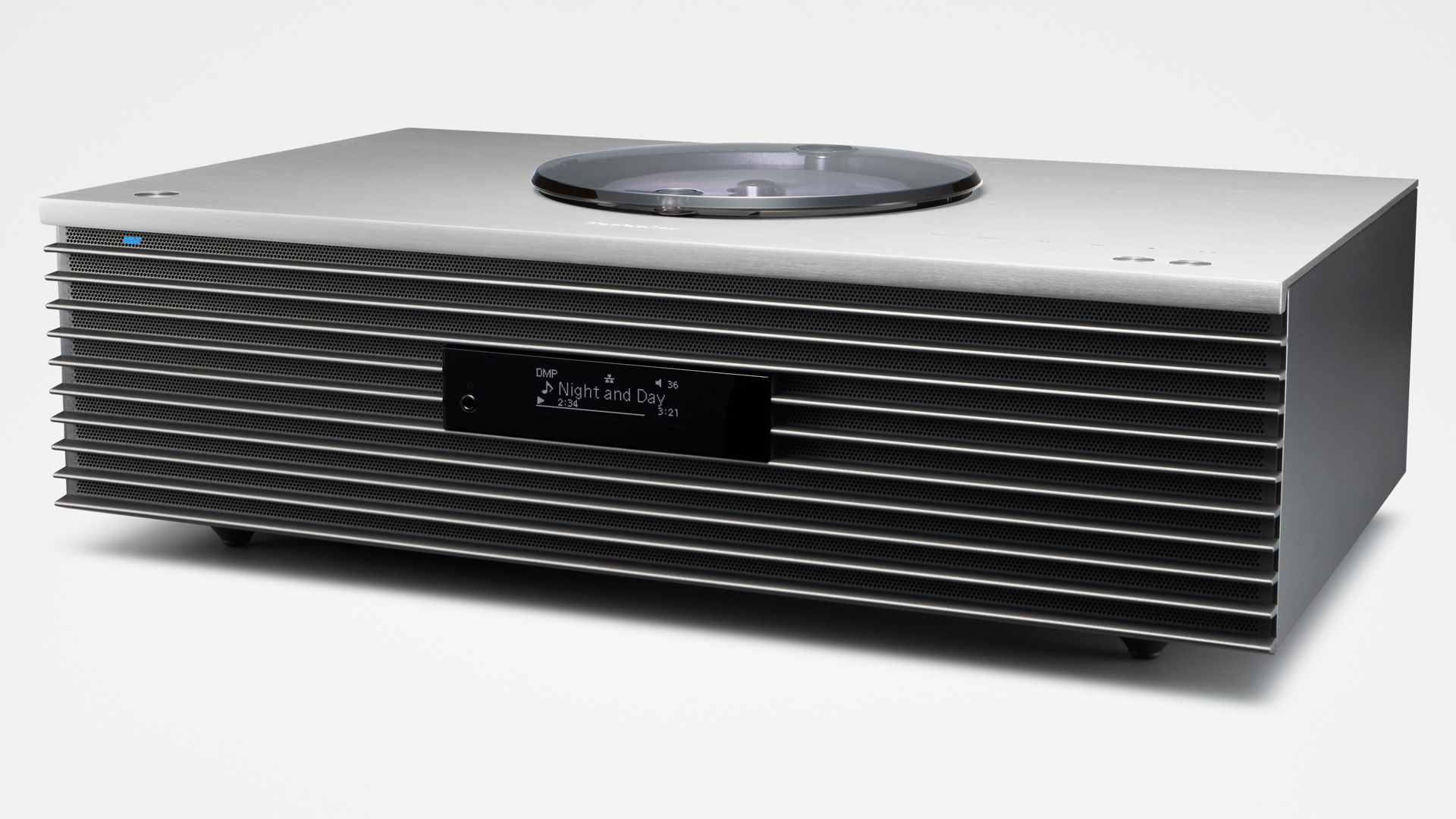
There are certainly some aspects of the SC-C70 MK2’s construction that resonate with its price. Opening the packaging reveals a thick aluminium top panel – either grey or black, depending on which of the two finishes you’ve chosen – and the speaker’s weight as you lift it from the box is equally reassuring.

It looks pretty good, too. There’s an industrial stylishness to its straight lines and vent-like grille, which stands out just enough while hopefully not dating it too much into the future; a speaker such as this should have some staying power.

The OLED display is small, but functional, while that top plate also houses a few well-engineered push buttons alongside a row of touch controls for playback. You probably won’t be up this close often, though, thanks to the included remote and ability to work the SC-C70 MK2 via its app.

Around the back, there are inputs for aux-in, optical and USB, alongside connections for the included radio antenna, power and wired internet. These are all sandwiched between a pair of reflex ports that complement a quintet of drivers inside.

Most notably, the SC-C70 MK2’s downward-firing subwoofer, which you’ll feel if you stroke the speaker’s undercarriage. It’s a 12cm driver aiming to add some serious depth to the pair of forward-firing 8cm drivers taking care of the speaker’s midrange.

Technics F Ottava SC-C70 MK2 tech specs

(Image credit: Technics)

Power 30W + 30W (40W sub)

Inputs Aux-in, optical digital, USB-A

Headphone out Yes

Finishes x2

Dimensions (hwd) 14.3 x 45 x 28cm

Weight 8kg

In this second-generation SC-C70, these woofers are said to benefit from the reduced weight of their voice coil, enhanced airflow and increased rigidity of their diaphragm, and aren’t the only component to have undergone a major revamp.

The pair of 2cm dome tweeters are much changed, too, with a lighter silk diaphragm and optimised acoustic lens for improved dispersion. And each section has its own JENO Engine full digital amp unit, delivering 30W to the tweeters and midrange drivers and 40W to the sub.

There’s a lot packed in, and it becomes evident that it’s the SC-C70 MK2’s interior, along with the top plate, providing most of the weight. Unfortunately, the rest of the outside is rather plasticky to the touch. That might not be of great importance, given you’ll rarely touch the speaker’s sides, but it’s a feature that extends to the swiveling CD lid. Our initial hope that this might be glass is soon quashed, and a less than smooth finish on the edge only compounds the disappointment.

Features

(Image credit: Technics)

At least we can’t fault the feature list. Built-in Google Chromecast means the SC-C70 MK2 is primed for multi-room use, while Apple AirPlay 2 and Bluetooth also offer wireless playback options. That is, of course, along with the CD drive, DAB+ and FM radio, and analogue and digital inputs.

Less ordinary, though, is Technics’s Space Tune technology, and more importantly this speaker’s new automatic function. The MK1 offered pre-sets of Free, Near the Wall, and Near the Corner; all of those are present again for quick EQing, depending on where your speaker is placed, but the new Auto function can do that more precisely by using test tones and on-board mics for optimal sound.

You can even go further, using the Technics Audio Center app to adjust settings depending on your listening position. iOS devices can also be used to measure room noise and acoustic conditions as well as further calibrating sound characteristics.

Sound

(Image credit: Technics)

Some tuning could be vital, depending on your room, as there’s a lot of power coming from the SC-C70 MK2 that needs to be kept tame. Most notably in the low end, where that subwoofer proves a sound investment early on for those who like a lot of bass.

The key, of course, is finding a good balance; the Auto Space Tune does a good job of that, and the ability to further tweak is welcome. But you won’t be criticising this Technics speaker for not having enough in the way of bass weight.

Detail levels are generally okay as well, giving enough information to keep that full-bodied presentation from becoming soft – in the upper registers at least. Unfortunately, though, the other side of all that bass is that the mix is a bit of a blunt object and rather bereft of detail.

Despite that slightly corpulent low end, timing is still surprisingly good. It is an aspect with which a lot of really bassy-sounding products often struggle, appearing slow or muddled, but the SC-C70 MK2 is actually rather good at keeping time.

However, because that accurate timing is betrayed by a real dearth of dynamic expression, it fails to deliver any great sense of rhythm. This is our main gripe: there is such a lack of expression it quickly becomes a wearing listen.

(Image credit: Technics)

We sit there willing the SC-C70 MK2 to appear a little more interested in the music we’re sharing with it, but it has made up its mind. It’s even more of a shame when you consider all the power it flaunts delivering those bass frequencies; even if just a little more of that was directed at giving some punch, this would be a more entertaining listen.

And as we noted earlier, the SC-C70 MK2 has entered the market among some seriously talented rivals. If we were underwhelmed with its performance at first, the Technics only loses more ground when we compare it with the Award-winning Naim Mu-so Qb 2nd Generation.

There’s no CD player here, of course, but you should ask yourself whether you really need one; the Naim is leagues ahead in terms of detail, rhythmic sense and excitement. And you can always put the money saved towards a CD transport later on if necessary.

You’d even get a better all-round performance by going for a micro system such as the Denon D-M41DAB. Again there are compromises – the stereo speakers are separate, so it isn’t a on-box solution, and your only wireless streaming is via Bluetooth – but if CD is your main concern, then it’s a no-brainer in terms of sonic performance and value.

For anyone considering buying the Technics SC-C70 MK2, our advice would be to go back to the drawing board and think about what you’re willing to compromise. Our choice would always be features or space, rather than compromising on sound.

Verdict

Regardless of whether or not there is a true like-for-like alternative, the Technics Ottava F SC-C70 MK2 is just too expensive to sound this lifeless. A re-tune may be able to solve its issues – the feature set and building blocks of a good performance are here, but at the moment you’d need some fairly specific requirements to consider this a worthy buy.

SCORES

  • Sound 3
  • Features 5
  • Build 4

MORE:

Read our guide to the best all-in-one systems

Read our Naim Mu-so Qb 2nd Generation review

Read our Denon D-M41DAB review