my-top-5-phones-of-2020-–-ro

My top 5 phones of 2020 – Ro

My outlook on this year’s smartphone market is in stark contrast to the year as a whole. I actually feel like 2020 was a better year for smartphones than 2019, seeing technologies introduced last year rapidly evolve and mature.

Just take a look at how fast we jumped from 90Hz displays to having 120Hz and even 144Hz bright, energy-efficient OLEDs. Even LCDs have been improved in this regard so now midrangers employ HRR panels.

Under-display fingerprint readers have taken a big step too. I’m still using my trusty OnePlus 7 Pro, which boasted probably the fastest UD fingerprint reader at the time and now it feels slow compared to most 2020 implementations.

Telephoto cameras are more common now, shoot better and we even get more than one of those on certain smartphones like the Mate 40 Pro+ (3x and 10x optical zoom) or the Xiaomi Mi 10 Ultra (2x and 5x optical zoom). Sadly, no significant improvement in the ultrawide department this year except that more manufacturers start to implement AF in those.

Lastly, in 2020 batteries got bigger and charge faster. Fast charging is a common thing even in the budget segment whereas in 2019 was still touted as a special feature. Also, a 4,000mAh battery was a standard, now most users frown upon anything below 4,500mAh or even 5,000 mAh.

Anyway, here’s my list of top 5 phones this year reflecting what I liked about tech in 2020.

Xiaomi Mi 10 Ultra

Let me start off with perhaps the best phone of 2020, in my opinion. There’s literally nothing about this phone that I dislike. Maybe punch-hole bothers me a little but the rest of the hardware covers 100% of my needs and expectations. And I’m pretty sure it does for a lot of people.

Superb screen, versatile and competent camera setup, mature and feature-rich software, stupid-fast 120W charging, dependable battery life, stereo speakers and one of the best features on the list – the Transparent Edition. The one we reviewed at the office is just stunning in person and gets in touch with my geeky side. It’s truly a shame it’s not available outside of China.

Samsung Galaxy S20 FE

To be honest, I somehow expected more from the Galaxy S20 lineup this year. I can’t really put my finger on it but something just doesn’t feel right about those phones and how Samsung used the Galaxy S20 Ultra’s price to justify the high launching price of the other two S20s.

Maybe that’s why I like the Galaxy S20 FE so much. It’s an excellent all-rounder with the right price – a true flagship killer in my book. It has the flagship SoC, it has a versatile camera setup with 3x zoom, extra-long battery life, fast charging, HRR OLED panel and a ton of other high-end features you wouldn’t normally find on a phone in this price bracket.

Sorry, guys, that’s my choice from Samsung this year in case you expected to see the Z Fold2. That one is also a great phone but a bit out of reach price-wise and I still don’t think foldables are anything more than a tech showcase. Samsung is definitely getting there, though.

iPhone 12 mini

Back in 2014 when I got the original Sony Xperia Z1 Compact for my girlfriend’s birthday, something stuck with me. And that’s the feeling of holding a small, yet powerful and capable smartphone. To be able to operate the phone with one hand with ease. That’s why I think the iPhone 12 mini is one of the best phones in 2020, even though I’m not a big Apple fan myself.

iPhone 12 Pro Max and iPhone 12 mini

It’s the epitome of compact flagships and I regret not suggesting to my father to wait for the mini instead of pulling the trigger with the iPhone SE (2020). For anyone sick of big-screen phones and familiar with iOS, the iPhone 12 mini makes all the sense in the world.

Asus ROG Phone 3

Despite not being able to fully understand mobile gaming at this point in its development I properly like the Asus ROG Phone 3. I’m an old-school PC gamer and everything from the aesthetics to the buttery-smooth 144Hz OLED and nifty pressure-sensitive shoulder triggers is free of compromises. And the best part is that the hefty 6,000 mAh battery is enough to keep the device going for days.

Not to mention the huge selection of accessories that take the gaming experience on a whole new level.

OnePlus 8 Pro

To be frank, I’m including the OnePlus 8 Pro just because it aligns so well with my own priorities. The OnePlus 8 Pro is surely an improvement over its predecessor (unlike the vanilla 8) in many aspects but I keep coming to OnePlus because of that notorious software. That’s what I love about the brand and what I got used to for the past couple of years. Even though it’s not the flagship killer anymore.

Objectively speaking, though, the OnePlus 8 Pro is well worth the price hike. OnePlus flagships have always been criticized for skipping on some essential features and the OnePlus 8 Pro is the first phone from the company to check all the boxes. Blazing-fast wireless charging and reverse wireless charging too, IP68 certification and a display that can easily go head to head with the ones on high-end Samsung phones. Lastly, OnePlus improved the camera experience quite a bit too.

flashback:-periscope-zoom-cams-with-smooth-zoom-are-the-future,-but-we-already-had-them

Flashback: periscope zoom cams with smooth zoom are the future, but we already had them

In 2019 the Huawei P30 Pro and Oppo Reno 10x zoom kicked off a zoom arms race with the introduction of the periscope telephoto lens – or should we say “re-introduction”. One phone had a periscope several years ago and with a design that was more advanced than modern phones.

Currently, you can get a periscope-equipped phones from Huawei, Oppo, Samsung, Xiaomi, vivo and Honor. But they have two major downsides. One, they have very long focal lengths (100+ mm). And two, they are locked at that focal length.

This means that mid-range zoom requires either digital zoom with the main camera (the most common approach right now) or a secondary telephoto module (an increasingly popular option). However, even with two tele lenses the gap between their focal lengths must be bridged by digital zoom. What if you wanted smooth zoom without digital processing?

The solution is to have a module with a variable focal length. Earlier this year O-Film announced such a periscope, which could go smoothly between 85 mm and 170 mm. A couple of months later Oppo unveiled its module that covered a more conservative range (85mm to 135mm). We’re excited to see these two (and others) in smartphones next year. But we have to take a minute to recognize the phone that did it right way back in 2015.

That was the Asus Zenfone Zoom (available as ZX551ML in Europe). It had just one camera module and yet its variable focal length periscope lens could take wide-angle shots at 28 mm, portrait shots at 50 mm and zoom in to 84 mm (that’s 3x optical magnification) and everything in between. All without a hint of digital zoom.

The phone used a module created by Japanese company HOYA and announced in 2013. Tentatively named the “Cube”, this was advertised as the thinnest periscope module to date, measuring only 6mm in depth. This meant it could be used in relatively thin smartphones – the Zenfone Zoom is 12mm thick, which sounds like a lot but is rather slim compared to the 15.4 mm of 2013’s Galaxy S4 zoom (later Galaxy camera modules were even thicker).

This module housed a 13.1MP sensor, 1/3” in size, which was fairly typical for the time. For comparison, the iPhone 6S Plus had a 12MP 1/3” sensor, the Galaxy S6 went bigger with a 16MP 1/2.6” imager.

The Cube module featured Laser AF for fast autofocus and optical image stabilization (OIS), which is essential for shooting at long focal lengths. As we mentioned already, the lens could stretch to 84 mm (in 35 mm equivalent) and open up to 28 mm on the wide end.

That’s not too bad, actually, the P30 Pro has a 27mm wide lens and the Reno 10x goes only slightly wider with a 26mm lens. But the keen-eyed among you would have spotted an issue with the Zenfone Zoom. In fact, it’s an issue shared by all telephoto lenses, periscope or otherwise.

The aperture is quite dim – only f/2.7 at the wide end. In 2015 the apertures of flagship phones were closer to f/2.0, which really helped with low-light performance. The Zoom’s sensor was comparable in size to that of the Galaxy and iPhone, but the lens held it back. Indeed, reviews at the time pointed out that the Zenfone produces less than stellar nighttime photos.

Using a larger senor in a periscope design is tricky as the thickness of the module is directly tied to sensor size. And the Zoom was already pushing the limits at 12mm. The camera bumps on some 2020 smartphones are ridiculous in size, but even that may not be enough.


Official Asus Zenfone Zoom photo samples: 1x zoom, f/2.7 • 3x zoom, f/4.8

Plus, there’s only so much a new lens design could do to widen the aperture, especially now that f/1.7 lenses are fairly common on the wideangle cameras. In other words, having a camera that handles both wide and tele focal lengths is not practical.

To be fair, a single camera was the norm in 2015, it wouldn’t be until the following year (2016) that LG would show off the LG G6 with a wide + ultrawide dual setup. These days mutli-camera setups are the norm as they deliver the best flexibility.

They really do. The wide cameras on modern smartphones are amazing and can beat most digital cameras in the hands of a casual user. A Zenfone Zoom style design unavoidably places restrictions on sensor size and aperture. The phone was ahead of its time, but its time has passed – it’s impossible to have a single do-it-all camera and compete in quality.

Still, when 2021 flagships are unveiled with wide angle cameras with huge sensors next to variable focal length periscopes, spare a moment to remember the innovative Zenfone Zoom.

By the way, this type of lens can be seen in some digital cameras. They have the advantage over traditional designs in that the periscope is safely housed inside the device’s body. This allows waterproofing and drop resistance to be added. In contrast, traditional designs have better optical qualities but are more fragile, which is why we have only seen them in a few oddball phones like the Galaxy S4 zoom and a few others. The Zoom wasn’t waterproof, but it could have been.

The Asus Zenfone Zoom itself is a curiosity from a past era and not just because of its camera. It ran Android on an Intel Atom x86 processor, which seems crazy now that Apple dropped x86 in favor of ARM for its Mac computers and Microsoft is enhancing x86-64 emulation for ARM-based Windows.

The writing was on the wall even in 2015, as the Intel Atom Z3590 was showing its age. Built on an old 22nm process, it housed four cores running at 2.33 GHz and an Intel GPU at 457MHz (533MHz boost). The European version of the Zoom got the Z3590 chip instead, which raised the CPU clock to 2.5GHz the GPU boost went up to 640MHz boost.

Earlier Atom-powered Zenfones were competitive in single-core performance – those CPU cores were intended for laptops and were larger than smartphone CPU cores, after all. However, ARM chipsets evolved quickly and left the x86 behind. In the smartphone form factor at first and now, perhaps, in laptops as well.

Since then Intel has abandoned its smartphone efforts, phone chipsets went first and more recently the modem division was sold to Apple. The company is now struggling in the laptop and desktop markets too, with AMD’s Ryzen showing impressive gains in performance. But we doubt AMD will re-enter the smartphone business (as some of you may know, Qualcomm bought the mobile Radeon division and scrambled its letters to come up with Adreno).

Another now-rare feature was the leather back. This was made from ox leather using traditional Italian tailoring methods to conform the leather to the milled aluminum frame. These days vegan leather is more likely to be used instead.

The SIM-free price of the Zoom was just $400, whereas Android or iOS flagships were in the $500-600 range. Excellent pricing considering the unique camera, but delays, limited availability and insignificant marketing spending made sure it never caught on with consumers and Asus never made a sequel. So, this unique phone now lies mostly forgotten.

review:-yamaha-rx-v4a-real-surround-for-next-to-nothing

Review: Yamaha RX V4A Real surround for next to nothing

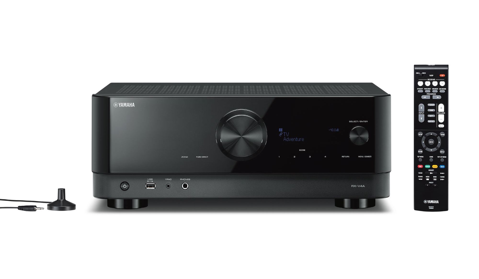
Not everyone can (or will) a surround installation with eleven speakers and a handful of subwoofers. Are you doomed to go for a soundbar? Not necessary. There are also receivers such as the new Yamaha RX-V4A that offer film lovers and gamers an interesting alternative: true multi-speaker surround, but at a modest 5.1 scale and without the complexity of Atmos setups.

In 2020, not many new AV receivers have appeared. This is partly due to the corona situation, partly because manufacturers were waiting for the availability of chips with the latest HDMI video standard. They are now already reaching the consumer – and indeed, the RX-V4A is one of the first surround devices with HDMI 2.1, making it 8K 60 – and 4K / 120 – can process signals. Is that so important? Unless you’ve completely jumped on the latest generation of consoles and bought a high-end TV, that HDMI 2.1 tech isn’t all that relevant yet. It’s different for gamers. They are without a doubt one of the main target groups of this receiver, as it also has a number of features to work better with game consoles. That is of course not surprising, because just like movies, games rely heavily on surround sound to create atmosphere. The film lover who likes to have his Netflix binge watching session served compellingly will of course also find what he likes in the Yamaha RX-V4A. Just like the music lover, who will find the necessary streaming and multi-room options in the MusicCast streaming platform and AirPlay 2. Unique to Yamaha is MusicCast Surround. This allows you to wirelessly connect the rear speakers and subwoofer if desired. This makes the RX-V4A hardly more difficult to connect than a soundbar.

Fresh design The RX-V4A is one of Yamaha’s first AV receivers with a totally new design. The button-rich front of yesteryear is exchanged for a sleeker, more modern front where all the attention goes to a large volume knob in the middle. There is a smaller rotary knob with which you select inputs and a modest display with white letters, for the rest the RX-V4A presents itself very sober. Although the rounded sides and the attractive ventilation holes at the top and two sides also provide a sophisticated touch. What is not striking is that the front panel contains more buttons than first appears. These buttons seem very visible on photos, when the receiver is on the rack in our test room and we look at it from a distance, they are hardly noticeable. You can select things such as presets via these touch buttons. Speaking of remotely: from afar that shiny front appears to be made of dark glass, but this is a plastic.

Ready for the future Because the RX-V4A is a 5.1 receiver, you don’t have a lot of options in terms of speaker setups. That is different with machines that 9, 11 or more channels and designed for Dolby Atmos home theaters. However, this Yamaha is aimed at someone who wants a better surround experience, but who is not looking for the extremes either. The 5.1 input of the RX-V4A is perfect if you like to watch films and TV series via streaming services such as Netflix and Amazon Video. These services do have content in Dolby Atmos (5.1.4, where that 4 stands for four extra height channels), but most videos come with a 5.1 surround track. Due to its focus on 5.1, connecting speakers to the RX-V4A is easy. There are few connections at the back and you can therefore do little wrong. At first sight, the speaker terminals only seem suitable for stripped wires, but if you remove the small caps, banana plugs will also fit.

To connect video sources, such as consoles and Blu-ray players, you have four HDMI inputs. There is exactly one HDMI output that you connect to your TV or projector. This is eARC compatible, which means that the sound from TV apps or a device directly connected to your television is delivered to the receiver in the highest quality. Do you have an older TV? Then the receiver will switch back to HDMI-ARC.

For connecting music sources there are three analog cinch pairs and two digital (1 x optical, 1 x coaxial). Yamaha keeps the back relatively sober, but for most this offer will suffice. The modest offer seems to us a strength in this case.

Surround without wires Yamaha offers an option on its newer receivers that makes it easier to install a real surround setup: MusicCast Surround. The wired rear speakers can be replaced with one or two MusicCast with this function 20 or 50 – speakers. If you wish, you can do the same with the subwoofer: instead of connecting a device with cable to the receiver, do the same with the MusicCast 100. Since it is best to place a subwoofer in the front of the room anyway, that wireless sub option may be less necessary. Cordless rear speakers are useful, because you can then replace the longest and usually difficult to hide speaker cables. We have not tested MusicCast Surround with this receiver, but we have tried it before with a previous generation Yamaha receiver. The function works well and delivers a decent result.

With a MusicCast Surround setup, there are two wireless speakers at the back of the room, while the three speakers at the screen (left-center-right) with the cable are connected. This is a reasonable compromise compared to a high-end soundbar with wireless rear speakers. By using three separate speakers at the front, the soundstage with the RX-V4A will usually be larger and more realistic; however, high-end soundbars (such as the Samsung HW-Q 950 will also are often Atmos-compatible and theoretically create a three-dimensional representation via additional overhead speakers. Although the performance of such speakers in sound bars is sometimes very disappointing, depending on the space in which they end up.

Ready for 8K Yamaha positions this receiver as the first of a new generation ready for the future. And indeed, eARC, among others, indicates that it is indeed a future-proof receiver. Thanks to eARC, you don’t have to panic if you have more video sources than the four you can hang on the receiver. You simply connect a fifth to the TV without compromising on audio quality.

In terms of functions, the look of the RX-V4A focused on the horizon. The HDMI 2.1 ports support many new features, for example, including HDR 11 + (a new Samsung HDR standard) and video signals at 4K / 120 and 8K / 60 (HDMI 2.0a is â ???? limitedâ ???? to 4K / 60 and 8K / 30). In addition, there is support for a range of video features intended for gamers, such as ALLM (which automatically switches the TV to the correct game mode) and VRR, QMS and QFT (all of which intervene on the refresh rate and frames to show smoother game images). Note that some of these functions will only come with a firmware update.

The Yamaha receiver also has the HDMI chipset, which seems to have problems with the combination Xbox Series X and a 4K / 120 – or 8K / 60 – video signal. The manufacturer says it will offer a solution for this. A temporary workaround is to connect the new Xbox console directly to your TV and send the sound to the receiver via eARC. With the new PlayStation 5 there is no problem with game forwarding in 4K / 120 or 8K / 60 . After all, Sony does not use the optional video compression that on the new Xbox causes outages.

Handy app to help you The RX-V4A’s TV interface remains quintessentially Yamaha: a bit more technical in appearance and bone-dry when on explanation arrives. Press the button â ???? Setupâ ???? and a menu slides over some of your screen content. This is sufficient on our large 65 inch TV , on a 40 – inch screen it will seem a bit small. You don’t have to descend the menus often to use this receiver, but whoever does it may need the manual initially. It is, in some ways, the flip side of the many options that Yamaha is happy to offer its customers. A plus is that Yamaha really gives you many options to personalize the device. Naming the HDMI inputs appropriately (such as â ???? Xboxâ ???? or â ???? Ziggoâ ????) for example, is very simple.

Positive is that the information-poor interface is supplemented by an app that helps you to set up and use the receiver. This AV Setup app is simple and straightforward, just what you need if you have little experience configuring an AV receiver â ???? perhaps the most complex audio device you can get at home. On the basis of questions you will be helped in very practical settings. You will see, among other things, how to connect the speakers and devices in your specific situation. There is even a checklist that tells you which cables you need. Good found.

Quick measurement  AV receivers can be very complex. If you get started with the many options that such a device offers, you can even quickly get lost at first. In particular the â ???? room correctionâ ???? can seem complicated on some devices, with measurements at various points in the room and target curves you can adjust. Some really like that and that tech path will take you to the very best surround experience too.

However, Yamaha is aiming with this receiver at film lovers who want the best possible result with minimal effort. To achieve this, the RX-V4A is equipped with YPAO, a system that very quickly identifies the acoustic problems in a room. And with â € œ fastâ € we mean exactly that: you take the hockey puck-shaped microphone out of the packaging, plug it in and confirm that you want to take the measurement. Just place the microphone on the back of the sofa … and then test tones sound for a minute to check that your speakers are correctly connected and what the room problems are. And then it is done. It is a big difference from the extensive measurements at Audyssey and Dirac. This is the simple form of YPAO, higher Yamaha receivers come with an advanced version where you can (optionally) measure several times and with extra functions, such as YPAO Volume (which flattens high and low peaks in a mix).

With this entry-level receiver, we really think it is an asset that setting the room correction is so effortless. YPAO does a lot to improve the surround sound (including by matching speakers to each other), which benefits the experience when watching movies and gaming.

Excellent for streaming Despite its relatively modest price tag, the RX-V4A has exactly the same streaming options as the more expensive Yamaha models. Thank you for not being punished for choosing to buy a cheaper model.

Almost all AV receivers from the Japanese brand are equipped with MusicCast, Yamaha’s proprietary streaming and multi-room platform. You control everything via the MusicCast app (iOS or Android), which is now completely on point and works very well. It is really a versatile app, in which you can also select the physical inputs in addition to streaming options elect and sound modes.

H and if you have other MusicCast devices in your home, you can control them all via this one app. This part of the app really looks good: each zone / room is represented by a large photo. You can use your own images here, which really gives the app a personal touch. Streaming audio from one MusicCast device to another is simple. For example, you can play the music you play on a MusicCast Vinyl 500 – turntable in the hobby room can also be heard via the RX-V4A receiver. There are dozens of MusicCast devices, ranging from Sonos-like wireless speakers to hi-fi devices (and even a piano). When building a multiroom system, you can choose from a lot of building blocks.

If you don’t feel like a new app, just use a other ways to stream. Spotify users have it easy: they just see the receiver pop up in the app of the music service. Tap and the music will play on the receiver. The RX-V4A does not have a Chromecast on board, but you can cast the audio from any app on an iPad or iPhone via Airplay 2. That works fine in our experience and is in lossless quality.

A final option is Bluetooth, with support for AAC. This is unusual with mainstream receivers, usually only the basic SBC codec is provided. We are also happy to see that the RX-V4A has a Bluetooth transmitter, not just a receiver. So you can connect wireless headphones when the rest of the family goes to sleep but still want to watch the movie.

Plenty of sound options Via the MusicCast app is the fastest way to discover the many DSP and sound options that are specific to Yamaha receivers. Most AV receivers are full of such options, but the Japanese company is still the main samurai in that area. In addition to typical sound modes such as “stereo”, “stereo over all channels” and â ???? surroundâ ???? (with various decoder and upmixing options) also quirky DSP choices like â ???? Dramaâ ????, â ???? Role-Playing Gameâ ???? and a number of simulations of well-known concert halls. To try to your own taste; we still tend to choose “Pure Direct” for films and TV series with a surround track. With musical content, the result is somewhat more changeable and depends on the content. Sometimes one of those DSP modes can really provide a more enjoyable listening experience. At other times it becomes very artificial. Whatever your preferences, the advantage with this device is that you can easily try out the different choices via the MusicCast app. And that’s the most important thing, we think.

As you dive into the sound settings, you discover even more options that you can use or not to adjust the sound. We find the Dialogue Level setting handy, with which you can bring dialogues more to the foreground in a film. You can also quickly turn the sub quieter or louder. That is handy if you decide to watch a Michael Bay movie and discover that the director has gone all out in the LFE channel again.

By the way, you can also do all of the above calls via the supplied remote. It’s not a super luxurious thing, but it is effective. There are quite a few buttons on it, but compared to the cabinets of some rivals â ???? Denon for example â ???? it’s not overwhelming. A number of settings are conveniently accessible immediately, such as that Pure Direct option. Also very practical: you can call up four scenes both via the app and via the remote. These are presets that you set and that, for example, take you immediately to the Blu-ray player and select the correct sound modes. It is worth setting the scenes, because after that it is very comfortable to work â ???? also for other family members who may not feel like a workshop â ???? how do I operate the AV receiver (and what is such a thing actually)? â ????.

Mando Approved The RX-V4X was set up just in time for the last two episodes of â ???? The Mandalorian S2â ???? (Disney +, Dolby Digital, via an Apple TV 4K). Especially in the exciting final to save baby Yoda from the clutches of the perfidious Moff Gideon, the Yamaha receiver got a chance to prove its worth. True to the Star Wars credo pioneered by Lucas and Williams, this series uses music by Ludwig Göransson almost continuously to get you in the right mood. The composer does work more subtly than with the big Star Wars films, for example by exchanging the large orchestral movements of Williams for soft pan flutes that are played playfully in the background by the Yamaha. The soundstage that the RX-V4A creates is spacious and well-defined, an important feature if you want to discover why surround is also worthwhile with subtle mixes. This is also the case with games. It’s not all about explosions and gunshots. With an accurate surround you can also access, say, â ???? CoD: Warzoneâ ???? pick up small audio cues that tell you something about the position and armament of your opponents.

Bombast can also handle the Yamaha. We remain in the Star Wars universe and switch to “Rise of Skywalker”, to the scene where the not-dead Emperor Kylo Ren seduces by him “everything” ??? ? to offer. In terms of adjustment, that single YPAO measurement has delivered an excellent result on our DALI Rubicon speakers. We are effectively in the middle of a sound bubble, and the emperor’s grave voice comes full and menacing from the center speaker. The Monitor Audio Silver W 11 – sub complements the rest of the speakers quite well, which is mainly a matter of good tuning by YPAO. (A sub is usually active and owns its own amplifier.) When the Emperor reveals that he has thousands of Star Destroyers in reserve and the many spacecraft come out of the ground, the spectacle enthusiast in us is spoiled with earth-shaking rumble and a menacing atmosphere. This is exactly what you are looking for if you go to the trouble of building a real surround setup.

Also later in the same movie, during the lightsaber fight between Kylo Ren and Rey, the Yamaha comes across as convincing. The pair fight on the debris of the Death Star, in the middle of a stormy sea, which creates a lot of sound effects that come at you from all sides. The Yamaha receiver manages that well. The main channels are well represented, so you get the screams and the swishing lightsaber sounds fine. The mood-building water sounds â ???? crashing waves, especially â ???? are transmitted sufficiently powerfully. A more expensive receiver may provide a bit more body and definition, but this is a good performance for this price segment.

In terms of power, the RX-V4A delivers enough to drive typical speakers at living room volumes. . It is of course a great contrast to the previous receiver, the Denon AVC-A 110 with 11 reinforced channels. But that device literally costs ten times more and is certainly intended for another target group.

Conclusion The reasonable price point of the Yamaha RX-V4A makes this receiver a real alternative to better sound bars. Sure, you still have to buy the necessary speakers, but if you choose well, you will end up with a price tag that is lower than a high-end soundbar, but you do enjoy a better surround experience with films, TV series and games. The option to work with wireless rears is particularly useful if you do not want to run cables through the living room.

The RX-V4A is a well-equipped machine that is very expensive for 500 euro (which is not much for a receiver) much offers. There are plenty of HDMI inputs, excellent streaming options and an easy-to-use room correction function that still works fine. For Dolby Atmos you have to go to a higher model, but those who are satisfied with a nice 5.1 setup to take their Netflix viewing experience to a higher level will be satisfied with this Yamaha.

Yamaha RX-V4A

â ?? ¬ 499 | yamaha.com

Rating 4.5 out of 5

amazfit-gtr-2:-beautiful-and-cheap-but-will-have-to-improve-on-some-things.-the-review

Amazfit GTR 2: beautiful and cheap but will have to improve on some things. The review

Amazfit GTR 2 has a nice appearance, it offers decent fitness tracking and has now strengthened some of its capabilities including sleep tracking and the introduction of a smart assistant like Alexa. It also allows you to have a good autonomy compared to its competitors in this price range. It’s certainly not perfect, and its sports tracking is only for occasional workouts. Here is the review.

by Bruno Mucciarelli published , at 00: 21 in the Wearables channel

Amazfit

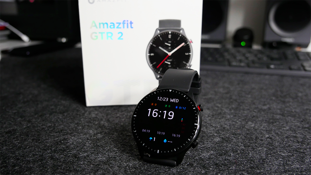
Amazfit GTR 2 is a smartwatch for Android but also iOS-friendly which certainly sees in its price one of the most important features. However, it also offers many other aspects that every user expects nowadays from such a device, but also pointing to other features that can become an important plus. And let’s talk about a design made with high quality materials, an AMOLED touchscreen display clearly visible and a strap that can be quickly removed for replacement with others.

IS available in two options as regards the color of the case and this is the only difference since both offer the same functionality both for it concerns fitness than for classic notifications. Clearly present an integrated GPS and a sensor that monitors the heart rate 24 hours on 24, 7 days a week and during exercise. It can also perform blood oxygen measurements , a feature sought after in this last period of COVID and that all smartwatch or smartband manufacturers are implementing in their products. It also works as a fitness tracker and ultimately this is perhaps where one of its greatest strengths lies. It is suitable for step tracking and sleep tracking rather than sports tracking a little bit more stringent.

And then there are others too smartwatch functionality: supports basic notifications and is optimized for the AMOLED display. Interesting news is being able to interact with the Amazon Alexa intelligent assistant in the future to get some information directly from the wrist. There is also an integrated music player with 3GB of storage space to transfer music directly to the smartwatch.

To power all these features, Amazfit GTR 2, has a battery that allows you to even reach the 14 days oi 38 days in easier use according to the company. Let’s say that in reality with a constant use of all its features we will get closer to 7 days than to 14 but in fact nothing prevents you from reloading it quickly and using it again. Clearly, we will see that by turning off the always-on display and heart rate monitoring, autonomy will make a big leap forward.

UNBOXING

The packaging of this Amazfit GTR 2 is very classic since it contains inside, in addition to the smartwatch itself, its magnetic power cable which allows you to recharge the battery in a simple way by combining it with any power supply. The end is magnetic and contains two pins that allow you to join the body on the back quickly and easily. Nothing else and therefore a classic and minimal box in its components.

DESIGN and DISPLAY

We assume that the new Amazfit GTR 2 costs in Italy 169 ?? and without a doubt this is the most interesting feature of this smartwatch. At this price, in fact, you get a smart digital watch that is certainly very attractive from an aesthetic point of view which in some ways can do better than other famous competitors even more expensive. Amazfit GTR 2 guarantees a much cleaner feel than the first GTR and fits much better on the wrist too.

It changes a lot compared to its predecessor especially in its being more beautiful to see and perhaps even less sporty. It has a metal body with a classic case of 46 mm and with two physical buttons on the side just as we used to have on the first version. The strap in this case is classic, i.e. in silicone. It is very light in thickness but we admit that after a first impression not too good because of its lightness, the strap has held up well even after extreme use and is not damaged or damaged by dirt or scratches. Moreover, it can be changed in an instant thanks to the system that Amazfit has decided to insert on the case and this makes it possible therefore to customize the smartwatch to the maximum with other straps to your liking.

It is clear that the true interest in the design, however, goes on the display since the quality of the circular panel placed on the smartwatch seems to be decidedly higher than expected in this price range. We are talking about a 1.3 inch AMOLED panel with resolution 454 x 454 pixel that affects immediately due to the absence of protruding frames or even important edges. Here the display is flush with the body, slightly rounded and above all with a visual quality that is certainly higher than expected. Nice to look at especially for the colors that are well outlined, very bright and also fun thanks to the use of them on some dials and widgets that Huami has created especially for this smartwatch. Its brightness is very high especially when you go outside with direct light. Excellent news especially because this does not impact the battery which is still good thanks to an AMOLED panel that with dark skins especially black tends to consume very little.

To the below the body we clearly find all the sensors that the Chinese company sets for tracking health conditions. The back in this case is made of plastic but very well done, not too annoying and above all not too thick, a symptom that the designers wanted to make the smartwatch as light and comfortable as possible from this point of view. To underline also the presence of a red frame on the upper button of the smartwatch: a peculiarity that does not change the functionality of the button compared to the lower one but in fact allows you to give that touch of beauty and originality to the smartwatch.

HARDWARE and OPERATING SYSTEM

Hidden beneath the sleek design are the sensors and features that make Amazfit GTR 2 a fitness tracker and a pretty competent sports watch for its price range. As a practice in a smartwatch of this type there are an accelerometer and gyroscopic sensors to track the movement . But there are also sensors to allow you to monitor the activity 24 hours on 20 , 7 days a week and not only during the day but also during the night with sleep. Add to this a 3-axis geomagnetic sensor and an air pressure sensor to provide additional data when you go out for some running or climbing.

There is Huami’s BioTracker PPG sensor , which offers continuous heart rate monitoring and the ability to better measure exertion levels during exercise. It is also used to generate blood oxygen measurements : a parameter that users with the arrival of the pandemic increasingly seek to understand if there is any respiratory problem. Given the price, they are all sensors that do not want to reach a professional level of measurement but still allow you to have a rough view of what is happening to the body during a non-professional physical activity or during a walk a little longer. fast. Too bad the lack of a Wi-Fi module or even the NFC but the price to pay for the cheapness of the smartwatch is this.

For sports tracking, there are then 10 modes available in total . The number is not surprising given that it is not a smartwatch for real sportsmen but in fact the inclusion of running, cycling and swimming guarantees to cover on the one hand the greater percentage of sports users and on the other hand to be able to use the smartwatch even in water. which is resistant up to 5ATM . Just about the swimming activity, it is somehow surprising to find it on a product of this price. Clearly present the integrated GPS to ensure more precise work mapping and monitoring those outdoor activities.

How fitness tracker does a good job on the accuracy front although maybe something will have to improve on the software and algorithm side. As regards the count of the daily steps that we have recorded, comparing them to those of a more sophisticated fitness tracker, we can say that we do not have a big difference since we are talking about only a few tens of steps of difference. This means that Amazfit GTR 2 does its monitoring job well and will allow you to actually understand how much you have moved during the hours of the day. The step count can be easily viewed as they are accumulated directly in the various interfaces of the chosen watchfaces or even in the appropriate screen which can be called up quickly.

Huami also includes the PAI Health scores, which take into account the heart rate and through algorithm try to make the user stay more active especially on of a longer time span. For sleep monitoring, it did a fairly well done job as the smartwatch actually recognized when we fell asleep, and then reported the various stages of sleep including REM sleep with some problem likely caused by heart rate detection. it didn’t work properly.

And this brings us to heart rate monitoring in general , which is more or less suitable for the price at which the smartwatch is sold too if the measurement is really very slow compared to the competition. It is the cons of this Amazfit GTR 2: the heartbeat is detected only after about ten seconds and sometimes even more. Moreover sometimes the values ​​do not really reflect reality exceeding by 10 / 15 beat the actual value. Also to be improved on the reception of the GPS signal which sometimes is not accurate on tracking the distance.

FUNCTIONALITY’

For the smartwatch features the new Amazfit GTR 2 basically does nothing but bring what was already seen with the first GTR version. In this case the smartwatch works well on the connectivity side both on Android and iOS devices, managing notifications well. There are music controls, the ability to answer calls via Bluetooth, check the weather forecast and set reminders for events.

There are also a nice range of watch faces , or watchfaces if you prefer, to choose from to show your fitness, sleep or also to display only the time in a more or less scenic way. There are several and we admit that we liked them for completeness and also for the possibility of customization. Moreover, through the application it is also possible to download others directly from the store.

Scrolling down with a swipe it will be possible to enter a series of quick commands where we also find the one for the do not disturb mode: here is the smart function that is activated automatically when it recognizes the user has fallen asleep. By swiping upwards, always with a swipe, you can then access the notifications. They are reported promptly and the icon for some apps is also shown. You can read the title and in various cases the content of the message, but unfortunately it is not possible to respond to the notification in any way. This is a flaw that makes it more of a visualizer than a real smartwatch.

Interesting presence on the offline voice assistant clock which allows you to perform some operations on the smartwatch but which only works if you set English as the language system. However, Alexa will also arrive via an update within the year and this perhaps will allow us to make more sense to a voice assistant on a smartwatch given the potential of Alexa. In this case we could not evaluate this aspect.

The other big news is the presence of a integrated music player with 3GB of sufficient space to be able to insert a good amount of music: from 300 to 600 songs in MP3 format. To load music on the watch you will simply need the Zepp app which will allow you to synchronize them. Once the music is loaded, just pair some Bluetooth headphones and listen to it. It is certainly not the most complete experience we can find on a smartwatch but it does the basic things quite well and this may be enough for many. Hopefully future improvements to music features and the arrival of Alexa to make it even better.

AUTONOMY

One of the most interesting aspects of the new Amazfit GTR 2 is undoubtedly the autonomy that since it will not be necessary to recharge the smartwatch every night before going to sleep. It was possible before with the GTR and is still possible with the new GTR 2. There is a battery with a capacity of 471 mAh that according to the company it should provide 14 days of typical use and 38 days of basic use. The first is based on the use of features such as listening to music, using GPS, the display in always-on mode and continuous heart rate monitoring. The second ” basic ” instead involves the abandonment of the Bluetooth connection used to pair it with the phone, as well as heart rate monitoring and the use of other features such as GPS in a more economical way.

With the typical scenario, we found that the smartwatch can easily make it through seven days and has the potential to go further. Features such as heart rate monitoring, music streaming, sleep assistant activation and always-on display will have a major impact on battery performance.

We also spent a few days in that more basic mode and is a smartwatch that keeps its promises with an autonomy that it can even go up to several weeks with much lighter use. If you are willing to juggle less intensive uses and you don’t have the real interest in keeping everything under control, even the 18 days on a single refill. And especially when it runs out it will take 2.5 hours to go from 0 to 100%. There is no fast charging support but still it doesn’t seem to be such an important shortcoming.

CONCLUSIONS

As said the new Amazfit GTR 2 costs 100 ?? . A decidedly affordable price for a smartwatch that on its side sees the presence of a good level AMOLED circular panel capable of making it readable in any situation and above all very scenic thanks to the 3D finish. The materials are aluminum and polycarbonate and make the smartwatch solid even if very light on the wrist. A considerable advantage for users who can always put it on their side, even and especially during a workout or even a swim or an elegant evening.

There are some things to update. And in this case we are talking about the software. Well done the application that allows to have a vision of any type of information that is the classic one on the activities that regarding the customization of the dials or other. In fact it is slow recording of the heart rate and sometimes it is not even too precise. Ok the price range is not high but in fact a heart rate sensor even inexpensive can quickly evaluate the pulse on the wrist. Hopefully it’s a software issue because it would be a shame not to fully recommend this new Amazfit GTR 2 which from its side really possesses many peculiarities between autonomy, design, lightness and its will to be youthful, elegant but also suitable for every day.