polk-react-soundbar-+-react-sub-review:-an-injection-of-bass

Polk React soundbar + React Sub review: An injection of bass

(Pocket-lint) – If your TV audio isn’t up to snuff then there are a bevy of options on the market to help step things up a notch. Among these is Polk Audio’s React soundbar, which is available for less cash than many a rival.

But just because you’re paying less doesn’t mean you’ll get less in terms of raw sound capability. Especially if, as we have for this review, you opt for the bundled React soundbar and React Sub package.

That said, the Polk React doesn’t offer any fancy object-based sound decoding, it doesn’t even play pretend – as there’s no Dolby Atmos surround output here from the bar itself – instead sticking to Dolby Digital and DTS surround formats.

You can later invest in Polk’s RS2 surround speakers, which are simply paired at the touch of a button, to create a fully fledged 5.1 system (if you have the Sub) in smaller steps rather than forking our a massive chunk of change up front. That, we think, is a big part of this soundbar’s wider appeal.

Design & Setup

  • Ports: 1x HDMI (ARC) output; 1x optical input
  • Controls: Included remote / four-button top-of-‘bar panel
  • Connectivity: Wi-Fi, Bluetooth, Alexa voice control integrated
  • Dimensions (soundbar): 56mm (H) x 864mm (W) x 121mm (D)
  • Dimensions (sub): 348mm (H) x 218mm (W) x 419mm (D); 7.5kg

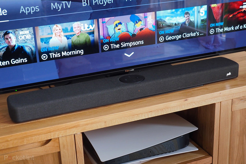
Having recently reviewed the JBL Bar 5.0 MultiBeam – which is an all-in-one box solution that can’t ever be connected to separates – it was interesting to dig into the Polk React for its points of difference. The Polk is a longer soundbar – at 864mm it’s 160mm longer by comparison – so even sat against a 55-inch telly, as pictured, it’s fairly good at covering the majority of the screen width, which is handy for a wide soundscape to help match the action on screen.

The Polk is simpler than the JBL in terms of core specification, though, as there’s no HDMI input, just the one HDMI input – the latter of which is ARC (audio return channel) capable. For us this meant a slight rejig of our TV’s four HDMI ports, as we couldn’t passthrough using the soundbar itself, ensuring the HDMI ARC cable provided was running from TV to React ‘bar.

Thing is, our ARC port is one of the two 4K resolution capable HDMI ports on the TV (every maker does this at present), so our BT TV box for telly had to be relegated to HDMI 4 (running Full HD maximum – which, in fairness, is how majority content from there is streamed) to save HDMI 1 for our PlayStation 5 (our source of Blu-ray and 4K streaming apps such as Netflix). ARC does its job though: once the TV is switched on the audio handshakes between device and soundbar.


Best Bluetooth speakers 2021: Top portable speakers to buy today


By Dan Grabham
·

Our guide to the best Bluetooth wireless speakers available to buy today, including B&O, Denon, JBL, Marshall, Sonos and Ultimate Ears

Well, it didn’t at very first. For a brief period of time we were in a no man’s land of having both TV audio and soundbar audio outputting simultaneously. That’s because the setup is, to our mind, a little finicky. The soundbar needed an update out of the box, that much it told us (by voice alert), but having advised us to install the Polk Connect app – which we did on our Google Android phone – it then didn’t like it, forcing a handover to Amazon Alexa instead. But the Alexa app initially failed to get things talking successfully.

Pocket-lint

Success did come after a few attempts, after which there’s been no issues, but it very much points to this Polk’s intentions: it’s an Alexa voice control soundbar through and through. There’s even an Alexa button pride of place on the included remote control. There’s not even a proper off button – as your main TV remote will take over for that duty anyway – and there’s always a glowing light of some colour to the front of the ‘bar, which we think is a design downside when watching movies in darkened rooms.

Oh, and Alexa shouts crazily loud for some reason too – almost to the point of distorting – and there’s no simple way that we can find to turn this down, which is irksome.

The included remote isn’t the prettiest, but it’s well appointed, able to switch between TV and Bluetooth audio sources. There are adjustments for bass up/down on the left, volume up/down in the middle, voice up/down on the right, four quick-select movie presets below this, and surround sound volume/balance adjustment to the bottom of the controller.

That surround sound adjustment won’t do anything unless you’ve bought into the Polk’s expandable options though. As the React soundbar itself is a straight forward left, centre, right speaker arrangement. But if you buy the RS2 surround speakers – not on test here – then you can easily sync them at the touch of a button on the back of the soundbar and boost things to a 5-channel system.

Go with the subwoofer – paired in the same way, using the same button to quickly sync without extra wires – and that brings 5.1 channel potential into your living room. The sub is pretty beefy in terms of scale – and deeper than it is either wide or tall – but the addition of true bass at the lower end of the spectrum is transformative to the sound profile. We think it’s an essential addition to make the React ‘bar deliver its potential.

Sound Quality

  • Soundbar: 2x 96x69mm mid-range drivers; 2x 25mm tweeters; 2x passive radiators
  • Adjustment: Bass +/-, Voice +/-, Volume +/-, Surround balance & volume
  • Mode presets: Movie, Music, Sport, Night
  • Sub: 1x 7-inch woofer

Which brings us to the whole reason to buy a soundbar: to enhance audio quality, notching up TV audio to new heights. And the Polk React does a generally decent job, although given its positioning to the base of a screen (inevitable, of course) and lack of object-based sound control it lacks any distinct verticality – so on larger screens voice parts might not give the impression they’re coming from the person speaking with the greatest of precision.

Pocket-lint

Otherwise there’s a lot of tweaking that can be done with ease, so it’s great to have all that control directly to hand. The presets are particularly useful, selecting Movie to enhance that extra bass – there’s always a good down-pitched “wommm” in an action flick – or Night to quieten such frequencies and allow your family/neighbours/whoever to get some shut-eye when you’re having a late night session.

The independent controls for bass and voice are handy too, the latter really adjusting the mid-to-high-end of the frequency range to give more curvature to vocal output. So if you’re finding the bass balance is a bit too high, then this can help voices to cut through the mix with greater clarity. We like that it’s a simple system, too, not over-complex in how many ways it can all be adjusted.

Pocket-lint

However, bass-wise we’ve heard soundbars with chunkier capability. Which is why, once paired with the React Sub, you’ll really hear and feel the difference. With the React subwoofer linked up the sound has a much more rooted appeal, delivered with gusto. It’s got great musicality too, to the point we’ve ceased using our Marshall standalone speaker in the living room and instead just tuck into the Polk React and Sub on Music mode for the best possible listen.

Through the Alexa app it’s simple enough to get the soundbar to register as part of your home network. With Google Home open it’s easily identified (although not directly controllable here, as Alexa rules the way), so Spotify plays nice – and you can ask Alexa by voice to load your favourites.

We suspect that adding a pair of RS2 speakers would add to the expanse of the overall sound as, like we said up top, the Polk React doesn’t support object-based audio, so you’re not going to get any Dolby Atmos pseudo height and all-around sense from this soundbar. But, really, given how such systems can sometimes fly off the handle in weird (and not always wonderful) ways, we think Polk delivers here exactly what people will want – enhanced sound on a smaller budget.

Pocket-lint

That will raise the question, however, as to whether you want something smaller and more technologically complete, such as the JBL Bar 5 MultiBeam that we mentioned at the beginning of this review. It can’t match the smacking bass of the subwoofer by any means, but if you don’t have the space then it might be a better fit to your needs – and the Atmos found there is impressive given the right source material.

Verdict

While the Polk React doesn’t have object-based sound decoding bells and whistles – that’s to say there’s no vertical channels for pseudo surround – as a standalone large ‘bar with decent output and control, for a very fair price, it’s got a lot going for it. Especially if you’re keen on Alexa integration for voice control.

But things really step up a notch when you add a React Sub as part of the package. That’s when the sound becomes extra full, deep and rich – to the point that it’s taken preference as our living room music speaker when the telly is out of use. Now if that’s not high praise, then what is? Keep your expectations in check in terms of technological prowess and Polk delivers strong at this end of the market.

Also consider

Pocket-lint

JBL Bar 5.0 MultiBeam

squirrel_widget_4229578

It’s a different prospect, as it’s a single box solution – so you’ll never be able to add extras or a sub – but that might better suit your space restrictions. However, it permits passthrough (thanks to HDMI in and out ports with eARC) and offers Dolby Atmos decoding, which with the right source delivers a more complete sound. That said, the Polk’s React Sub, if you want to fork out the extra cash, takes impactful sound to the next step where the JBL simply cannot reach.

  • Read our review
Pocket-lint

Yamaha SR-C20A

squirrel_widget_4026933

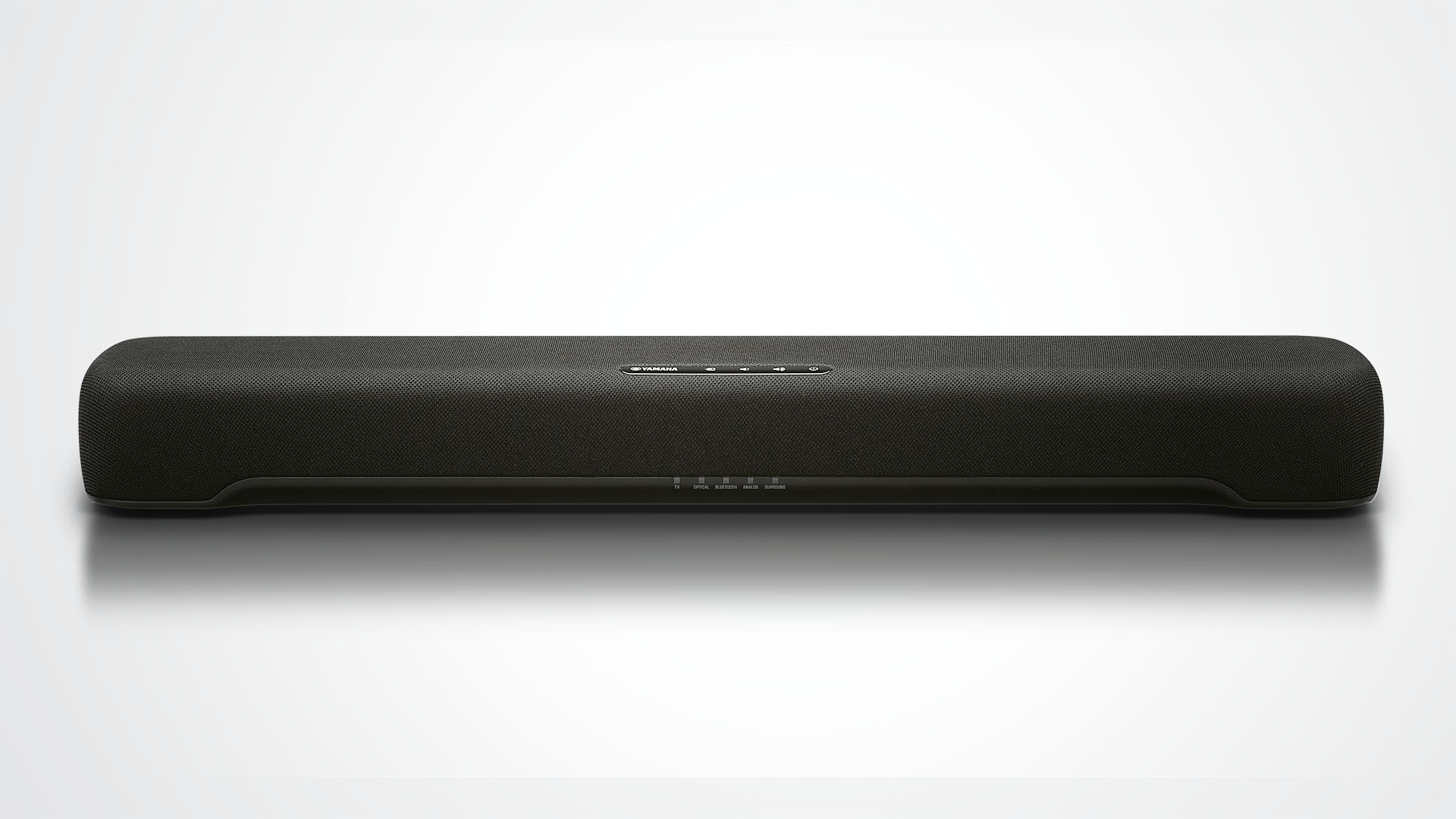
Looking for something smaller? If what you need is a bit of everything from your soundbar – ignoring that, at this price point, you can’t expect surround sound – you can’t go far wrong with this little Yamaha. It’s a one-box solution (so, like the JBL above, there there’s no subwoofer here) and can turn its hand to pretty much anything, without ever making itself the centre of attention. A different prospect, but a nice neat little package.

  • Read our review

Writing by Mike Lowe.

oppo-find-x3-pro-review:-standout-for-all-the-right-reasons

Oppo Find X3 Pro review: Standout for all the right reasons

(Pocket-lint) – Oppo is on the move, gaining popularity in its home market where it’s even overtaken Huawei. But it’s not just gaining at home: it’s now undoubtedly a top contender in the world of smartphones, make it the most likely challenger to Apple and Samsung’s dominance. 

Oppo’s latest effort, the Find X3 Pro, is seeking to go toe-to-toe with the likes of the Galaxy S21 Ultra and iPhone 12 Pro Max, offering a big and premium flagship experience that, as we’ve found, is stunning in almost every way.

Distinctive design

  • Glass and metal design; curved glass around rear camera enclosure
  • Dimensions: 163.6 x 74.0 x 8.26mm / Weight: 193g
  • IP68 water and dust resistance

For the past few years we’ve seen smartphone makers all use the same tired design and – for 2021 so far – thankfully we’re seeing some new takes. Samsung kicked things off with its odd, but purposeful, camera hump in the S21 series – the one that wrapped around the edge of the phone to form a more deliberate part of the design. 

Now the Find X3 Pro delivers what we think is an even more refined finish. Rather than have a separate unit for the camera, Oppo made the camera protrusion part of the same piece of glass as the rest of the phone’s back, forming this completely seamless curve. The company says it took 2000 attempts to get this right, and nearly gave up on the idea, but the effect is really unique.

The result is a lot more subtle and refined than just having a rectangle sticking out of the back fo the phone. It’s also unique, unlike anything else currently on the market. It’s really lovely to look at – and far better looking than the odd digital renders that leaked ahead of the phone’s launch – although the camera arrangement definitely has some iPhone-like vibes. 

The rest of the Find X3 Pro’s back is one smooth surface with gradual curves towards the edges, while this blue model features a lovely frosted soft glass finish that’s really nice to the touch. The branding is minimal too, giving this phone a look and feel that’s highly polished and befitting of its high price tag. 

It’s slimmer than its predecessor, the Oppo Find X2 Pro, too. In fact, it’s a more than a 1mm thinner than the vegan leather model of old and noticeably lighter too – although there’s no denying the Find X3 Pro is still quite a large phone. It doesn’t have the bulk or weight of the Samsung Galaxy S21 Ultra though. 

Pocket-lint

It’s skinny bezels all the way around on the front and nothing cuts into that display panel except for a small selfie camera punched into the top corner.

Aligning itself slightly with recent trends, the curves around the edges of the display are less extreme than we’ve seen in the past, but are very much still there. It seems the trend of ‘waterfall displays’ died before it began. Unsurprising, really, given how easy it is to perform accidental touches on those things. 

Another positive is that Oppo has built in some stereo speakers, so if the phone is close enough to your face, you get that left and right channel effect while watching movies and listening to music. The loudspeaker at the bottom is definitely the louder of the two, however, and can be quite easy to cover with a hand by accident – especially during landscape gaming – leaving you with quite a quiet left channel only. 

Brilliant display

  • 6.7-inch AMOLED panel, QHD+ resolution (3216 x 1440 pixels)
  • 120Hz refresh rate (with adaptive frame rate)
  • 1300 nits peak brightness
  • ColorOS 11 (based on Android 11)

Oppo has made something of a name for itself by putting fantastic screens on its phones this past couple of years. For 2021, that’s no different. With a high-resolution and fast refresh rate panel – with adaptive refresh up to 120Hz – the Find X3 Pro delivers on that sharp and smooth experience.

Pocket-lint

As if that wasn’t enough, it can display up to a billion colours, is HDR10+ compatible, and has a peak brightness of 1300 nits. The display spec sheet is enough to make any tech nerd’s mouth water.

But it’s not just read it and imagine stuff, it’s great in reality too. It’s bright, it’s sharp, it’s dynamic, and the colours are rich. It’s set to FHD+ resolution by default, but it’s easy enough to change to QHD within the settings and get the full effect of its sharpness (inevitably minus some battery life). 

We don’t find that it over-eggs the contrast too much either, so while blacks are really deep and dark, they don’t cause the screen to feature that overly contrasty or ‘black crush’ look we sometimes found with the Find X2 Pro or OnePlus 8. 

Pocket-lint

Oppo’s ColorOS software is great in a lot of ways too. As Android skins go, it’s worked itself into the position of being one of the cleanest, most fluid and attractive options out there. It doesn’t go crazy with colourful icons and trasitions like Samsung’s One UI, and has attractive rounded corners on the notification bubbles.

It’s come a very long way since it was effectively just a clone of Apple’s iOS back in the day – before Oppo’s launch in Europe (well, relaunch). There are some quirks though. Mainly around notifications. 

There doesn’t seem to be a lot of consistency in how notifications are handled. For instance, we could have a little icon showing we have a notification on the always-on display, but then there’s nothing displaying on the Lock Screen. Or there coule be a little red dot on the app icon, but nothing showing up in the status bar or notification shade when we dropped it down.

The lock screen’s inconsistency was particularly unusual. Even when we’d set notifications to wake up the phone we’d see the notification light up the lock screen, but upon picking up the phone to check again, the notification would vanish – despite being unread and still showing as an icon on the always-on display. 

Pocket-lint

All of these quirks were despite having set notifications to have the ability to show everywhere (status bar/app icon/lock screen), and despite setting our most-used apps to ignore any battery optimisations that might push them to background status or send them to sleep. 

Still, there’s some other fun and good points to ColorOS, such as the Relax app to help you get to sleep at night by playing some calming ambient noise. And we like the customisation options available for the interface and the always-on display.

Performance & battery life

  • Snapdragon 888 processor, 12GB RAM
  • 256GB storage, no microSD expansion
  • 4,500mAh battery capacity

    • 65W Super VOOC 2.0 flash charging
    • 30W Air VOOC wireless charging
  • 5G connectivity

As far as pure power goes, the Find X3 Pro is up there with the best of them, featuring the top-end for 2021 Qualcomm Snapdragon 800 series. Here that means the Snapdragon 888 with 12GB RAM and 256GB storage.

Load up your favourite games and the phone handles them without breaking a sweat, keeping up with fast animations and transitions. It doesn’t stutter or lag anywhere, so it really doesn’t matter what you try to do with it, it’ll handle it just fine. It didn’t even get particularly warm, even after a 30 minute gaming session. 

Pocket-lint

Battery management is similarly efficient. We struggled to drain the full battery in a single day, even at a weekend with three hours of gaming and then some camera testing we still finished the day with 30 per cent left over.

On quiter days with only a little dabbling with news sites, maybe an hour of gaming and some social media, we could easily finish the day with more than 50 per cent left at bed time. So we have no doubt this could easily be a two-day phone for light to moderate users.

Then when the battery does eventually empty, it has Oppo’s trademark flash charging technology in both wired and wireless forms. With the wired adapter, it can full refill in under 40 minutes. With the proprietary AirVOOC tech – which OnePlus also uses in its Wireless Warp Charge stand – you can fill it up pretty quickly with the wireless charger too. 

Under the microscope

  • 3-megapixel ‘Micro lens’

Where to start with the camera. Let’s go with the gimmick bit first. Because, actually, it’s rather fun. 

In its quad camera system, the Find X3 Pro has a so-called ‘Micro lens’. This gives you the effect of zooming in up to 60x and has its own little LED light ring around it. That’s an essential addition because it’s for shooting really, really close-up shots, allowing you to see detail you just can’t with the naked eye. 

Launch the microscope mode in the camera and a curtain goes from being just about able to see a weave pattern to being able to see the individual threads and weaves in the construction. It’s a similar effect with a weaved nylon watch strap or a clothbound book. Hold it to a screen and you’ll see the sub pixels in the panel. It’s pretty cool. 

Yes, it’s a gimmick – and with a low 3-megapixel resolution – so it’s not particularly sharp, but it is fun and definitely adds a different edge to your photography. 

It also takes some concentration and very steady hands. Holding the camera 1-3mm away from a subject is hard enough without the extreme magnification also making every tiny hand movement or shake exagerated. 

It has a macro mode too, which thankfully isn’t handled by this low-resolution sensor. It instead uses the same sensor as the ultra-wide camera – which we’ll come to later.

What that means for photos – examples of which you can see in the gallery above – is that your images retain colour, detail and a natural blur that you generally don’t get with a seperate, low-resolution macro camera. It can get you great results, although its automatic activation can take a little while to get used to. 

With the camera set to its default 1x mode it’ll automatically switch to macro mode as soon as you get close to a subject. Sounds great, except it switches to the ultra-wide lens – and because that’s in a physically different position you have to then adjust and re-frame.

Our only real criticism here is that sometimes with the macro mode the background blur causes edges to appear to have a outline glow, which is kind of odd. 

Flagship cameras

  • Main: 50-megapixel, f/1.7 aperture, phase detection autofocus (PDAF), optical image stabilisation (OIS)
  • Zoom (2x optical): 13MP, f/3.0, PDAF, OIS
  • Ultra-wide: 50MP, f/2.2, PDAF

As for the other cameras, it’s pretty much all good here. Pictures have detail and a lot of vibrancy and life, especially when shooting in daylight. One of the best things is that both the ultra-wide and primary camera use exactly the same 50-megapixel sensor. 

That means – since they make use of the same image processing tech too – that the balance of colour, dynamic range and detail between the two is pretty much identical. It helps photos taken from those two camera appear consistent, which isn’t the case on a lot of other phones. 

The phone cameras seem to handle harsh lighting conditions pretty well too, balancing out highlights and shadows nicely. It’s a really reliable system. 

One thing we did notice – in both daylight and night modes – is that the camera produces quite a warm colour balance. We like the look, but it isn’t necessarily the neutral and clean finish some will like. Saying that, there is a ‘Pro’ mode which will let you adjust all manner of settings, including the white balance. 

There’s also a telephoto zoom camera with 2x optical zoom, 5x hybrid zoom, and up to 20x digital zoom, giving you that extra range you might want to shoot subjects further away. 

Images from this camera don’t have that same quality look of the two primary cameras, but they hold up well – up to about 5x anyway. Zoom beyond that and the detail falls off quite rapidly. At 20x the picture looks quite ropey, with details somewhat jagged and blurry.

With night mode activated the phone performs well in low-light conditions too. To our surprise we found that both the primary and ultra-wide cameras perform well in night mode, drawing in a lot of light. Although, with its wider aperture, the primary is noticeably better.

We took the Find X3 Pro out to compare with the iPhone 12 and Google Pixel 5 at night and found that its images were warmer than the other two. It doesn’t seem as heavy-handed with contrast and highlights like the iPhone, but isn’t quite as realistic looking as the Pixel in our view.

Night mode doesn’t just apply to photos either. Tapping an AI enhancing button boosts the video performance at night too. This does effect the optical stabilisation a little negatively, but results in some pretty colour and hyper-realistic scenery, but it’s impressive to see the difference in really low-light situations. 


Best smartphones 2021 rated: The top mobile phones available to buy today


By Chris Hall
·

Verdict

When it comes to display, battery life and overall speed, the Oppo Find X3 Pro is undoubtedly one of the best flagships on the market right now – and will likely remain a strong choice throughout 2021. 

While the camera does have a habit of warming up pictures’ colour balance and sometimes making them a bit oversaturated, the whole system is immensely versatile and gets great results, regardless of lighting conditions. 

The only other negative relates to quirks with notifications from the ColorOS software. Otherwise it’s hard to find much fault with Oppo’s top-tier flagship.

While Oppo might not be a familiar name to everyone, the Find X3 Pro is so fantastic in nearly every way that it’ll put the brand name on the map. It simply stands out from the crowd for all the right reasons.

Also consider

Pocket-lint

Samsung Galaxy S21 Ultra 

squirrel_widget_3816752

Oppo is competiting with the big names, and Samsung’s latest ultra-premium device has a lot going for it. The screen is fab and it has a super camera system. Oh, and that Phantom Black colour is stunning too.

  • Read our review
Pocket-lint

iPhone 12 Pro Max 

squirrel_widget_3699102

It’s Apple’s latest all-singing all-dancing flagship and offers many of the same hardware features. It’s a very polished experience all-round if you’re not up for Google’s Android OS.

  • Read our review

Writing by Cam Bunton.

yamaha-sr-c20a

Yamaha SR-C20A

Our Verdict

For those simply looking to improve on the sound of their TV for just a couple of hundred pounds, the Yamaha SR-C20A is a great option

For

  • Focused, clear presentation
  • Rich tone
  • Great size

Against

  • Could be more expressive

As with any market that becomes congested, manufacturers are trying every trick in the book to make their soundbar stand out. For only a few hundred pounds these days you can have it all: mile-long bar, massive sub and every 3D sound technology so far invented.

Sound quality, however, is often secondary. After all, if you can sell a cheap soundbar before anybody’s heard it then you’re unlikely to get many returns – unless it sounds absolutely atrocious.

Build

(Image credit: Yamaha)

It’s almost a relief, then, when we receive an affordable product such as the SR-C20A and find it to be free of frills, almost basic. It suggests Yamaha has focused on designing a great-sounding compact soundbar that will improve your TV’s sound with little fuss. And if you take a look at our 2020 Award winners, you’ll see that is an approach we like a lot.

At only 60cm wide and 6.4cm tall, the SR-C20A will have little trouble sitting beneath any TV (a 32-inch set is about 70cm in width) or, as Yamaha suggests, a computer monitor for more immersive gaming. Not that it is content sounding that small.

Features

(Image credit: Yamaha)

The SR-C20A promises volumes and depth belying its stature thanks to its pair of 46mm full-range drivers and integrated 75mm subwoofer with dual passive radiators. Though there is no attempt made here to deliver counterfeit height channels, it does use Yamaha’s Virtual Surround Technology to help create room-filling sound you might not readily associate with a soundbar of its size.

Yamaha SR-C20A tech specs

(Image credit: Yamaha)

Bluetooth version 5.0

Output power 100W

AirPlay No

Dolby Audio Yes

Inputs/outputs HDMI, optical x2, analogue audio

Dimensions (hwd) 6.4 x 60 x 9.4cm 

Weight 1.8kg

Things are kept simple at the back of the unit, too. Between the keyholes for wall mounting are two optical inputs, one 3.5mm analogue in and an HDMI ARC out – there is also a USB socket, for updates only. And if you don’t want to connect your new soundbar to anything but the power, Bluetooth 5.0 is on board for wireless streaming.

You’ll also find a few touch controls on top of the SR-C20A for source selection, power and volume, and LEDs at the front signifying the source in use, but otherwise, this is a pleasingly clean soundbar. In fact, you’ll find much more going on with the remote than the unit itself.

Yamaha has its own Sound Bar Remote App from which you can control all aspects of the SR-C20A, but we’re pleased to have a physical controller in the box as well. As well as the basics, you can use this remote to tweak subwoofer levels and select from four sound modes: Stereo, Standard, Movie and Game.

There are also buttons for Bass Extension, should you want to give more emphasis to the lower frequencies, and Clear Voice, which picks out dialogue and allows it to be more audible when otherwise it may get lost in a busy scene.

All potentially useful, though inevitably the SR-C20A sounds its best in its standard settings, with the bass dialled back depending on the surface the unit is placed on. Leave it to do its work in its most basic mode, and this is a cost-effective soundbar well worth your attention.

Sound

(Image credit: Yamaha)

The SR-C20A delivers that rich Yamaha tone, immediately promising a performance it’d be difficult to dislike. The midrange in particular is full-bodied and clear, the SR-C20A’s woofer making itself known by providing solid foundations, if not exactly rumbling the walls of the room.

There is a commendable level of detail on offer for a soundbar at this price, too, and overall clarity is good. Yamaha is clever enough to know why people buy products such as these, and has succeeded in delivering a clear and focused presentation that will improve on that of any regular flat-screen TV. The SR-C20A’s dimensions mean the sound is a little closed in at times – when scenes become particularly busy and at higher volumes – but never to the extent it becomes messy or unintelligible.

The main area in which it lacks a little something is in terms of dynamic expression. This Yamaha is indeed quite interesting – you couldn’t go as far as to accuse it of being flat – but it doesn’t quite convey the lilts and emphases of dialogue in a way we’d want in order to give it a full five stars.

That affects its use as a wireless speaker for music too, or for watching music shows on TV, as does a slightly pedestrian sense of timing. It’d be harsh to compare the SR-C20A directly with a sole-purpose speaker at the same price, but rhythmically we’d still like a little more energy and impetus. It’s why the Sonos Beam is well worth the extra outlay if you can afford it.

Verdict

But that doesn’t mean this soundbar is unworthy of our recommendation. It is still a clear step up from the sound of most TVs, while its price and dimensions make it easy to accommodate in just about every way.

Of course, there are better soundbars out there, but you’d have to be willing to spend a chunk more. At this price, the Yamaha SR-C20A is a worthy contender for a spot in your living room.

SCORES

  • Sound 4
  • Features 5
  • Build 5

MORE:

Read our guide to the best soundbars

Read our Sonos Beam review

Read our Yamaha SR-B20A review

Read our JBL Bar 5.0 MultiBeam review