moto-g100-review:-a-new-dawn-for-the-g-series

Moto G100 review: A new dawn for the G series

(Pocket-lint) – Motorola’s Moto G100 marks a big occasion for the brand. Why? Because it’s a G series phone with a Qualcomm Snapdragon 870 processor inside. That, on the face of it, contradicts what a G series is supposed to be all about: affordability. Which, in turn, would typically mean entry-level specification – not a high-end processor such as this.

But, no, the G100 is all about change. It’s the phone to say, “hey, you don’t need that big, expensive flagship when you can have this for half the price”. Which might sound like an echo of, say, what OnePlus has been shouting from the rooftops with its Nord model, as one example.

Yet the Moto G100 feels genuinely different. Having recently reviewed a glut of Chinese-borne phones – such as the Poco X3 Pro, the Redmi Note 10 Pro – where sub-flagship affordability is the key selling point, the lighter touch of the Motorola software feels simply refreshing.

So what gives? Well, the G100 can’t pretend to have the biggest, fanciest cameras. Because it doesn’t. It’s not got a Hasselblad partnership like OnePlus. It’s not got a Zeiss partnership like Vivo. But, you know what, we don’t care – because the Moto G100 is a half-price flagship that adds up to oh so much more.

Design & Display

  • 6.7-inch, 21:9 aspect ‘Cinema Vision’ IPS LCD screen
    • Full HD resolution (2520 x 1080 pixels)
    • 90Hz refresh rate
    • HDR10
  • Dimensions: 168.4 x 74 x 9.7mm / Weight: 207g
  • Finishes: ‘Iridescent Sky’, ‘Iridescent Ocean’
  • Side-mounted fingerprint scanner
  • Water repellent (no IP rating)
  • 3.5mm headphone port

Curiously the G100 has already been released elsewhere in the world: it’s called the Edge S in China. Which, um, makes absolutely no sense to us – as we thought the ‘Edge’ series was all about having a curved screen edge.

Pocket-lint

The G100 does not have a curved screen, it’s flat, so there’s nothing ‘edge’ about it. It’s also an IPS LCD panel, not an AMOLED one, so you might not call it ‘cutting edge’ either.

That said, it sits perfectly well in a device like this a you don’t really lose out on brightness or resolution at this level. Plus the IPS part of the tech means viewing angles are good without causing colours to skew. Speaking of which: the colours – available in natural, boosted and saturated configurations within the settings – hold up really well, delivering realistic rather than ridiculous hues.


Best smartphones 2021 rated: The top mobile phones available to buy today


By Chris Hall
·

The best smartphones you can currently buy, covering the best of iPhone and Samsung, and everything Android has to offer

The only thing that we’re a little less keen about with this panel is the surface’s coating, which is a little more reflective than some. Oh, and the double punch-hole camera is, well, exactly that: two holes burning into the corner of the screen that are more distracting than just the one (but at least it’s not a giant pill-shaped hole).

Pocket-lint

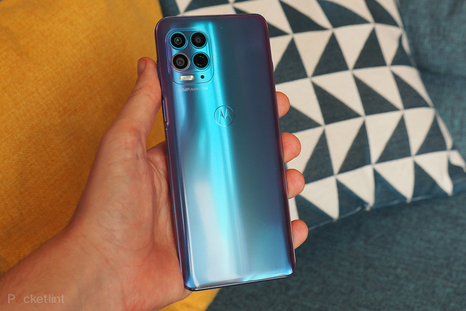
Flip the G100 over and, what’s this, a finish that’s actually fun? Hurrah. After the dodgy palette of the Moto G30, it’s good to see that the colour palette people at Motorola have got their mojo back. This model pictured is called ‘Iridescent Sky’, because it looks like one of those pink/blue spring-time sunsets we suppose.

That finish is good at hiding how fingerprints catch on the surface, too, because they are there aplenty – we’ve just been cautious when photographing the handset. It’s easy to wipe clean, though, as the surface is nice and smooth – even the ‘batwing’ Motorola symbol on the rear is holographic-like in appearance, not debossed or textured onto the surface.

That the Moto logo lives on the rear and doesn’t serve a function hints at the fingerprint scanner’s location too: it’s found within the power button on the side of the phone, foregoing the in-display option. Much as we like the display-based sign-in, this fingerprint scanner is a decent operator. And there’s face unlock available too.

Pocket-lint

Keeping with being a G series handset, the G100 also features a 3.5mm headphone jack and microSD card expansion slot. Good to see it’s not forgotten its roots.

Performance & Battery

  • Qualcomm Snapdragon 870 platform, 8GB RAM (LPDDR5)
  • 128GB storage, microSD card expansion slot
  • 5G connectivity (Sub-6GHz), Wi-Fi 6 (ax)
  • 5,000mAh battery, 20W charging
  • ‘Ready For’ dock compatible

While the G100 supports such legacy features as card expansion and wired headphones, in other departments it’s very much all about embracing the future. There’s no sloppy Wi-Fi connection, as you’ll suffer in the lower-down-the-ranks G10. The 128GB storage is reasonably generous, but it’s UFS 3.1 to ensure fast read/write access for best performance.

Pocket-lint

But above all else, the big sell of this phone is the Qualcomm platform at its heart. Here it’s the Snapdragon 870 – which, while part of the 800 series, isn’t the very, very top-end processor, it’s only a whisker away. Which is to say: it’s mighty fast, a step up from many of those using 700 series processors, and if you want to dabble in a bit (or a lot) of gaming then it’s a really good choice.

That’s one of the things about the Moto G100: it’s kind-of like a budget gaming phone. Things will run super smooth thanks to the processor, the fast RAM, but also the smooth 90Hz refresh rate of the display. No, you won’t see that bump in refresh affecting everything all of the time – plus you’ll need to activate it within the settings, as it’s off by default – but it’s a good place for a phone such as this to exist.

Even plugging away at games for hours at a time doesn’t cause too much trouble where battery is concerned. The 5,000mAh cell is a big part of the reason for the G100’s above average weight, but it’s a great capacity to have at your fingertips. We’ve seen its drain be very linear – around 30 per cent every 8 hours – even with an hour of gaming thrown in during such a time-frame.

Given the capability of the processor, the screen refresh rate, and the presence of 5G (we’ve been outside of such networks for this review though), that’s really solid performance.

As we’d alluded to before, the software in the Moto G100 is lovely to use. It’s close to stock Google Android, with a single Moto app to control gestures, themes/styles, display notifications, and gaming controls (such as do not disturb). You don’t have to dabble in the Moto app, indeed you could entirely ignore it. But what’s particularly great about the software is that it doesn’t need lots of tinkering, it just works – and without glitches, such as the notification delays issue with our Xiaomi Mi 11.

Pocket-lint

There’s another sideline part of the G100 puzzle too: it’s the first Motorola phone to be compatible with the company’s Ready For system. Which is a bit like ‘Moto DeX’ if you’re familiar with Samsung’s desktop-based DeX system. We’re not going to dig deep into the system for this review as, frankly, we don’t think it’s the core appeal of why people will buy a G100. It’s a niche extension option, complete with a camera dock that may have its uses instead of a Facebook Portal, but that’s as much as we can say right now. 

Cameras

  • Quad rear cameras:
    • Main: 64-megapixel, f/1.7 aperture, 0.7μm pixel size
    • Wide (117-degrees): 16MP, f/2.2, 1μm pixel size
    • Depth sensor: 2MP, f/2.4
    • Time-of-Flight sensor
  • Dual punch-hole front selfie cameras:
    • 16MP main, 8MP ultra-wide

Whereas many flagships make a big song and dance about their camera arrangements, the G100 doesn’t really earn the right to do so. That’s the thing about top-end devices these days – so much of the cost comes from additional lenses, co-engineering partnerships, and so forth. The G100, on the other hand, keeps things fairly simple.

Pocket-lint

: Main cameraMain camera

Well, kind-of simple. The claim of “quad camera” on the rear is nonsense as that apparently includes both a depth sensor and time-of-flight sensor, which would more or less do the same thing – both are there to ultimately make up the numbers as if “quad” is better than “triple”, even if it isn’t due to lack of core, usable lenses.

Anyway, let’s focus on what is here: a usable main camera and less commendable wide-angle one. There’s a gallery above showing how the two compare, and the quality drop-off from the wide-angle option is quite significant.

The main lens is 64-megapixels, using a four-in-one processing method to output at 16-megapixels total – although the processing is often heavy handed, oversharpens and can’t discern detail in all situations (the daylight country scene below being one such example – the trees are all blocky and indistinguishable, if you look at the 100 per cent crop).

Pocket-lint

: Main cameraMain camera

Where subjects are a little closer to camera – but not too close as it struggles to focus and the macro mode is poor (avoid this when prompted) – there’s more ability to resolve detail from a scene. Whether a dim-lit puzzle board or the fur of a toy bear, there’s enough detail to tick the main camera’s “usable” box.

But we touched upon this at the very beginning: if you don’t want the biggest and fanciest of cameras then the G100 does the job. Not the best job, but it gets by. And with features such as HDR (high dynamic range) to balance out shadows and highlights, various shooting modes, and the hardware to capture without delay, there’s enough to keep this camera setup from being the very baseline of entry-level kit for 2021. 

Verdict

The Moto G100 is a shake-up for the G series, bringing performance levels not before seen in this line-up. While that might be a little perplexing on the face of it – especially as it’s not a G series device in China, it’s the Edge S, muddying the naming convention further – it’s a rather refreshing take in a section of the market where there’s not a tonne of great options.

If you’re willing to forego the usual camera hype and pizzazz that top-end flagships tend to promise – as there’s really very little of that here – and having a high-end processor and performance potential is high up your roster, then the Moto G100 is a strong sell. It’s got the software right – which, in our opinion, can’t be said of the Xiaomi MIUI and Oppo ColorOS competition – the visuals tight, and performance is at peak height.

That’s the Moto G100 in a nutshell: a budget gaming-capable phone that foregoes the AMOLED screen hype and camera cost implications to deliver a half-price near-flagship that, in use, adds up to oh so much more.

Also consider

Pocket-lint

OnePlus Nord

squirrel_widget_305633

Also 5G capable, with a 90Hz refresh screen, but a little less power and, therefore, a little lower asking price. If every penny counts then it’s a savvy alternative.

  • Read our review

Writing by Mike Lowe.
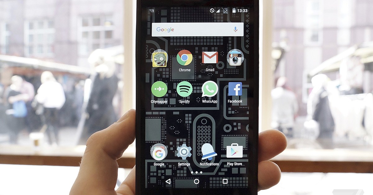
five-year-old-fairphone-2-getting-updated-to-almost-three-year-old-android-9

Five-year-old Fairphone 2 getting updated to almost three-year-old Android 9

Sustainable smartphone manufacturer Fairphone has gotten Google’s certification for its Android 9 update for the Fairphone 2. Getting certification for a nearly three-year-old version of Android doesn’t sound that impressive until you realize that it’s running on a phone originally released five years ago when it ran Android 5. The roll-out of the software starts today, and will continue until April 18th, Fairphone says.

It’s a length of support that’s basically unheard of among Android phone manufacturers. Although Fairphone 2 owners aren’t going to be able to enjoy the latest Android 11 features, the more important thing is that they’re running a version of Android that’s still officially supported. Google’s latest Android security bulletin from this month includes multiple fixes for security issues in Android 9.

The Fairphone 2’s Android 9 update has been in the works for a while and was released in beta way back in June 2020. At the time, Fairphone outlined the challenges it had in trying to support such an old phone, including the fact that Qualcomm no longer provides support for the processor inside the device, a Snapdragon 801, which originally announced back in 2014.

“To get Google certification for Android 9 for Fairphone 2 just as we hit five years of support for the smartphone is a huge achievement for Fairphone,” says CEO of Fairphone Eva Gouwens. “In order to get certification, we had to pass approximately 477,000 Google tests.”

“We want to show the industry that this kind of thing is possible, that a smartphone doesn’t have to be discarded after 2-3 years, we can prolong it’s lifespan,” the CEO added.

The only other smartphone manufacturer that offers a similar length of support for its devices is Apple, which last year released iOS 14, its latest phone OS, for its 2015 iPhone 6S. Android manufacturers, while behind Apple, are improving. Samsung now offers four years of security updates for its recent Galaxy devices, while Google offers three years of updates for its Pixel phones, and OnePlus says it plans to release Android 11 for its 2018 OnePlus 6 and 6T.

The Fairphone 2’s update to Android 9 this long after release bodes well for the company’s long-term support of its more recent Fairphone 3 and 3 Plus phones. The company says the phones should be updated to Android 11 in the second half of this year, with “one more major Android upgrade” coming thereafter. Software support and spare parts availability is set to continue until 2024.

it’s-not-your-imagination-—-that-vaccination-site-really-is-crawling-along

It’s not your imagination — that vaccination site really is crawling along

On paper, using a website to schedule your vaccine appointment seems like an easy way to gain access to much needed COVID-19 immunizations. But a new investigation from The Markup shows that state-run vaccine websites are slow to load on mobile devices, compounding what can be an already intimidating sign-up experience for people who are less comfortable online.

The Markup conducted its performance tests using Google’s open-source Lighthouse tool, in this case relying on the tool’s ability to measure the time it takes for a site to load and be functional. For this test, The Markup focused on the performance of the mobile version of sites on the Chrome browser and conducted the tests from three separate locations (New York, Texas, and California). Nevada’s state vaccine site was the slowest to load, taking 15.7 seconds to fully load in comparison to the fastest (Puerto Rico) at 1.4 seconds, and the average (Colorado) at 5.9 seconds.

The spread of state vaccine site loading times.
Image: The Markup

The causes for these slowdowns vary, but in the case of the Nevada site, The Markup suggests that an abundance of interactive, embedded content could be contributing to the slowness:

Nevada’s vaccination page features several embedded YouTube videos and Facebook, Twitter, and Instagram posts that offer public health information, featuring health professionals answering common questions in both English and Spanish. Our tests show that Nevada’s page has the lowest average performance score of all the sites we examined.

All of that extra information is great, but I think the confusion also arises for less web-literate people because these sites don’t work like scheduling a traditional doctor’s appointment over the phone. Being presented with a bunch of links from the original site out to other vaccine provider’s websites was intimidating for my grandparents — who often worry about getting “lost” online — and I imagine it would be for many others.

The situation is reminiscent of other times government organizations have been tasked with building out essential online infrastructure, like the rollout of healthcare.gov. The federal site’s issues have since been resolved, and state health departments are working at a much smaller scale, but some of the problems are similar. It’s not that these departments are incapable of making a website, it’s that time and resources are stretched thin, and many of them have never really been tasked with a project so huge. “They’ve never required the infrastructure that they do now,” Ohio State University health services professor Tory Hogan tells The Markup.

Third-party solutions have sprung up in response to these inadequacies, from startups focused on connecting people with leftover vaccine doses like Dr. B, to independent vaccine hunters booking appointments for strangers. But there’s no one solution, at least not until President Biden’s promised vaccine finding website launches on May 1st. Here’s hoping that website works better.

the-lower-cost-oneplus-9r-is-official,-and-it-sounds-surprisingly-strong

The lower-cost OnePlus 9R is official, and it sounds surprisingly strong

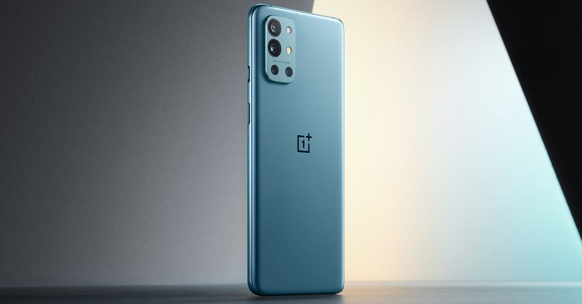
Yesterday’s OnePlus event covered the high-end 9 and 9 Pro, but outside of that spotlight, the company has quietly revealed a smartly specced, less-expensive model: the OnePlus 9R. CEO Pete Lau confirmed last week that the 9R was on the way and would launch in India. It’s now listed on the company’s Indian website starting at ₹39,999, which is about $550. That’s an attractive price indeed, especially considering you’ll get one useful camera feature here that the $729 OnePlus 9 doesn’t have: optical image stabilization.

The 9R doesn’t include the Hasselblad-branded cameras on the 9 and 9 Pro, which isn’t actually a big loss. The 9 and 9 Pro offer newer hardware with features like bigger pixels and a higher-res ultrawide, so you do miss out on some nice upgrades, but the Hasselblad-developed color tuning is nothing special. You do, however, get a stabilized 48-megapixel main camera, which helps reduce blur from camera shake in lower lighting conditions. It’s unfortunately missing from the 9, though it is included on the $969 OnePlus 9 Pro.

Other cameras on the 9R include a 16-megapixel ultrawide, a 5-megapixel macro, and a 2-megapixel monochrome sensor. This system is borrowed from the OnePlus 8T, which is wholly capable of good image quality, even though its macro and monochrome cameras aren’t very useful.

There’s a 6.55-inch 1080p OLED with fast 120Hz refresh rate — same as the OnePlus 9 — and a Snapdragon 870 processor with either 8GB or 12GB of RAM. It’s not quite as powerful as the top-notch 888 processor on the 9 and 9 Pro, but it should be more than adequate to keep day-to-day tasks running quickly and smoothly. The 9R is equipped with a 4,500mAh battery with 65W fast wired charging, a handy OnePlus signature feature that delivers a full charge in just under 40 minutes. Wireless charging, however, isn’t offered. Oh, and there’s 5G support, of course.

All told, it looks like a series of smart trade-offs for almost $200 less than the flagship model. Right now, the phone is only confirmed to launch in India, but we’re hopeful that it will make its way to European and North American markets. While OnePlus brought its good $300 Nord N10 5G to the US earlier this year, the midrange Nord never made it stateside. The 9R looks like an excellent candidate to fill in a wide gap between the budget N10 and the basic flagship model.

In the meantime, customers in India can preorder the 8GB RAM / 128GB version for ₹39,999 (~$550) or the 12GB RAM / 256GB model for ₹43,999 (~$600).

nintendo-made-a-tool-to-help-you-show-off-your-animal-crossing-island

Nintendo made a tool to help you show off your Animal Crossing island

Nintendo has a new tool that lets show off your Animal Crossing: New Horizons island with a poster or even a trailer. While you’ve always been able to take screenshots and video clips from the game using the Switch’s built-in tools and share those with your friends and on social media, the new Island Tour Creator lets you add some Animal Crossing-themed flair to what you’ve captured.

Nintendo made an example island tour video in this tweet. It includes a voiceover and even New Horizons’ iconic theme song, and the trailers you make will have them, too, which I thought was a nice touch.

And here’s a poster I made for my island, Hoopla:

To use the Island Tour Creator, which only works on mobile, visit this link on your smartphone. From there, you’ll be asked to log in to your Nintendo account, and after a brief chat with Tom Nook, you’ll be able to pick between making a poster or a trailer.

You can use media taken from the game that you’ve saved to your phone or posted to Twitter, and both the poster- and trailer-making tools have lots of customization options. I really wish you could use the Island Tour Creator in-game in some way, though, since getting screenshots and video from my Switch to my iPhone is a bit of a hassle. But once I had everything I wanted saved on my phone, using the tool was straightforward.

The Island Tour Creator interface.

Now that people have had their hands on New Horizons for more than a year, I’m looking forward to seeing the virtual tours and posters people create to show off their islands.

The Realme 8 Pro is a £279 phone with a 108-megapixel camera

Officially launching in the UK today, the Realme 8 Pro is a budget device that’s one of the first to use the new Samsung ISOCELL HM2 108-megapixel sensor in its main camera. While similar high-res sensors have been more common in pricier phones like the Samsung Galaxy S21 Ultra, this chip is designed for lower-cost devices like the 8 Pro.

This 108-megapixel chip isn’t the same one used in the S21 Ultra or even last year’s S20 Ultra. It’s a smaller sensor — 1/1.52-inch versus 1/1.33-inch — with slightly smaller 0.7μm pixels. However, it uses the same binning approach to improve light-gathering abilities by combining neighboring pixels into a less noisy 12-megapixel image.

The Realme 8 Pro offers a 6.4-inch OLED screen, a Snapdragon 720G processor with 8GB of RAM, 128GB of storage, and a 4,500mAh battery that supports 50W fast charging. The back of the device, which comes in blue and black variants, features some intense Realme branding with the company’s “Dare to Leap” slogan in large fluorescent lettering that — the company claims — glows in the dark. Realme also says the design will appeal to “a new generation of younger users,” which we’ll have to take its word for.

The 8 Pro will go on sale on March 31st in the UK for £279 (about $380).

huawei-p40-pro+-vs.-samsung-galaxy-s20-ultra:-battle-of-the-super-phones

Huawei P40 Pro+ vs. Samsung Galaxy S20 Ultra: Battle of the super phones

(Pocket-lint) – 2020 was the year of the ultra-premium super phones – among other things – with more than one manufacturer now offering a big, spec monsters. They also started becoming far more expensive than previous generations of flagship.

For Samsung, that beast was the S20 Ultra. For Huawei, the P40 Pro+ led the lineup. Unfortunate naming perhaps, but one that makes sure we know it’s not just Pro, it’s extra Pro. 

With a spec sheet that reads like a tech nerds wish list, does Huawei’s all-singing all-dancing smartphone compete with the best? 

squirrel_widget_184581

Design

  • S20 Ultra: 166.9 x 76 x 8.8 mm
  • P40 Pro+: 158.2 x 72.6 x 9 mm
  • Both IP68 dust/water resistant
  • S20 Ultra comes in grey and black glass finishes
  • P40 Pro+ available with white/black ceramic options

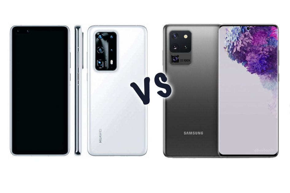
The design of a smartphone can often make or break an experience using it, and when building big, spec-heavy behemoths it’s important to make ergonomics a focus. Both Huawei and Samsung take similar approaches in this regard, with both featuring slim metal edges, and glass that curves around the sides. Styling is a little different, but the ethos is the same. 

Interestingly, Samsung opted to only release two colours (or non colours) of Ultra edition: black and grey. Huawei has a few different coloured glass finishes, including white, black blue, ‘blush gold’ and ‘silver frost’ as well as ceramic options. This last finish is designed to be shiny but ultra durable. The other glass finishes are either glossy glass or matte/frosty glass. So there’s no shortage of colours or textures. 

Both have quite large rectangular protrusions on the back where the camera systems are housed, both are also water and dust resistant up to IP68 certification. 

With Samsung having the larger display, the phone is noticeably larger than Huawei’s.

Display

  • S20 Ultra: 6.9-inch AMOLED, QHD+ 
  • P40 Pro+: 6.58-inch, QHD+
  • S20 Ultra: 120Hz refresh
  • P30 Pro_: 90Hz refresh

If what you want is the biggest display possible, the Samsung is going to be the best option here. The S20 Ultra features a 6.9-inch QuadHD+ resolution panel built using one of the company’s own Dynamic AMOLED panels. 

Similarly, Huawei’s phone also has a QuadHD+ resolution screen, but measuring 6.58-inches diagonally, which means technically it will appear slightly sharper because it has a similar number of pixels in a smaller space. 

Both have quite high refresh rates too, with Samsung offering up to 120Hz (as long as you use it in a lower resolution mode) and Huawei offering 90Hz. It should mean they both feel fluid and fast, with no lag in the interface or gaming animations. 

Both feature hole-punch cutouts in the display to make space for the front facing camera, but Samsung’s a really small singular cutout in the centre. Huawei’s has a dual-coutout placed in the left corner. 

Both of the phones also have invisible in-display fingerprint sensors, but using different technologies. Huawei uses an optical scanner, which means it uses a camera to take a picture of your fingerprint, while Samsung uses ultrasonic technology which doesn’t need a light to flash, and is technically more accurate since it measures depth. 

Cameras

  • P40 Pro+ has five cameras
  • S20 Ultra has four
  • P40 Pro+ offers 10x optical zoom
  • S20 Ultra has 10x hybrid optical zoom
  • P40 Pro+ primary sensor is 50MP
  • Samsung primary is 108MP

Huawei has gone all in on the cameras for the P40 Pro+. The primary camera is 50MP built on a 1/1.28-inch sensor, making it one of the largest smartphone camera sensors around for better detail, light capture and dynamic range. Samsung’s primary camera 108MP on slightly smaller 1/1.33-inch sensor. 

Curiously, Huawei has gone with two optical zoom cameras for the P40 Pro. One’s a traditional 8-megapixel 3x optical zoom, the other is an 8-megapixel 10x periscope camera. Samsung has a 48-megapixel periscope zoom too, offering 10x hybrid zoom. 

Of course, the both have ultra-wide cameras as well, with Huawei opting for a 40-megapixel sensor in that one, and Samsung going with 12-megapixels. 

The additional sensor on both phones is a depth sensing background camera. You can’t take pictures with it, but it helps the cameras get a better understanding of depth and distances to help produce those portrait shots with blur. 

Both manufacturers also have their own versions of post processing and analysing to decide which effects to apply to a particular shot. Whether that’s making skies more blue, or plants more green and so on. 

Hardware and performance

  • Both 5G
  • Huawei: Kirin 990 processor
  • Samsung: Exynos 990 or Snapdragon 865
  • Huawei: 4,200mAh battery w/40W wired or wireless charging
  • Samsung: 5,000mAh battery w/45W wired and 15W wireless

Both these phones are about as powerful as you can get right now. Huawei uses its own custom processor called the Kirin 990 with built-in 5G capabilities. Similarly, Samsung has either the Exynos 990 or Snapdragon 865. They’re all octa-core processors built on 7nm processes. 

What that means for the every day user is that the phones both feel fast and fluid and won’t struggle to launch even the most demanding games and apps. 

As for battery size, Samsung clearly has the advantage here with 5,000mAh capacity compared to Huawei’s 4,200mAh. Huawei is known for its efficient battery optimisations in its software, so actually battery life will still be very good. 

Charging speed is similar when you use a cabled connection. Samsung can accept 45W power to charge up quickly, although it only ships with a 25W adapter. Huawei ships with 45W, and is also able to charge wirelessly at a similar speed. Samsung’s wireless charging is much slower. 

Conclusion

A big reason to choose one of these phones over the other may end up just being software. Huawei has been forced to try its own route, using the open source version of Android that doesn’t come with Play Store or Google Play Services. That means hoping your most-used apps are on the Huawei AppGallery. While it’s improving every week, not all the most popular apps are on there yet. 

From a hardware perspective, Huawei’s cameras seem to offer more, especially with the extra zoom capabilities, but Samsung’s display being noticeably bigger and having a much smaller punch-hole camera means there’s less intrusion. 

In the end – although the situation is improving all the time – it’s still difficult to recommend any Huawei phone without Google Play Services, and so Samsung will still give you the most complete experience, even if Huawei’s hardware is fantastic. 

Writing by Cam Bunton.

ds-3-crossback-e-tense-review:-electric-with-a-touch-of-flair

DS 3 Crossback E-Tense review: Electric with a touch of flair

(Pocket-lint) – The DS 3 Crossback E-Tense name might be something of a mouthful, but hidden behind the nomenclature is a nice compact hatchback, boosted to give it crossover appeal, while retaining the charms of the regular DS 3.

The E-Tense is the first fully electric car from DS Automobiles, arriving in full DS style, with options for lavish design and something that’s just a bit different to everything else on the road. But it’s a bit expensive considering, so does it offer true appeal?

A unique design

Being different is often enough to make you stand out when you’re a car. If it wasn’t for the super Honda e – which is even more different – the DS 3 Crossback E-Tense might be the most distinctive EV on the road, from the interior at least.

From the outside there are some quirks – such as that shark fin behind the B pillar – but you can feel the DS 3 heritage getting inflated, riding a little higher, slightly more accentuated. Otherwise the general positioning of the car as a practical hatchback remains the same.

Pocket-lint

But this is a unique DS model. While it sits on the same platform as some rivals – the Peugeot e-2008, Vauxhall Corsa e, Citroën eC4 – nothing carries these looks. There’s no old Citroën model that looks the same, and no petrol version that’s just been converted – so there is something special about this model.

There’s a huge grille on the front, while areas that look like they might have been somewhere to put other vents on a combustion car sport the same look, resulting in a car that isn’t a hugely electric-looking EV.

But that does lend some sporty charm to things, while the recessed doorhandles – which pop out as you approach the car – bring a premium sense of occasion.

Pocket-lint

The stance on the road is pretty good, but some of those styling points do start to get in the way. The fins on the side reduce the window space for the rear passengers, while the rear window looks smaller from the inside than it needs to be – a chunk of the rearview is eaten up by plastic bodywork across the bottom of the window, which we don’t really think needs to be there.

A distinctively designed interior

Since the separation of DS Automobiles from Citroën, DS has pursued a design line based around offering something inspired by French fashion. It wants to be unique and it wants to give you a higher quality experience. That’s seen heavily in the interior design, with the use of textures you might associate more with prestige watchmaking than in a car.

Up at the top level, on the Prestige Ultra model (as reviewed), that results in a sumptuous finish. It’s not just leather, it’s hand stitched in places, using special pearl stitching and – importantly – uniquely different to the premium German marques that DS Automobiles wants to compete with.

At the same time, that commitment to design can see impracticalities. We know why DS chose to put the dash buttons into diamond shapes, but they are larger than they need to be – and the couple of blank spaces are what you notice the most.

But there are choices to be made, with the DS 3 Crossback E-Tense available in five different trims, affecting the wheel size, paint colours and interior options.

To give the E-Tense its due, though, it is comfortable. We like the finish on the seats and it’s nice to be in a cabin that isn’t just the same as a whole family of cars elsewhere. Front passenger and driver get plenty of room, but the rear is a little short on knee space, just like many other hatchbacks.

Pocket-lint

The boot offers 350 litres of space, which is typical for this size of car, meaning you can stuff in a large family shop or enough baggage for a weekend away.

Interior tech

When it comes to the interior tech offering, the DS 3 Crossback E-Tense again suffers from that heavy design ethic. We’ve commented on this before – especially on the DS 7 Crossback – that some of that styling in the graphical interface isn’t especially helpful.

The DS 3 is clearer, however, with a smaller digital driver display having the benefit of not giving the software designers too much space to fiddle around. There are several views you can scroll through to customise the information – and on our review model, a heads-up display (HUD) to provide pertinent information while on the road.

In the centre of the car is a larger display, 7-inches on lower trims and a 10.3-inch on higher trims. The expansion to the larger models seems to result in empty space at the edges, or once you’ve made your selection, permanently visible cabin temperature, so it’s not a huge gain.

The infotainment system is easy enough to use, offering touchscreen interaction, working with those big buttons on the dash to work through the mainstays of music, climate control, navigation, car settings, and phone.

We found the navigation and mapping to be pretty good, although you can’t zoom and manipulate the maps to the same sort of extent that you can a smartphone, so it does have some limitations – likely to be addressed in the new system being introduced in the DS 4.

Pocket-lint

Perhaps the thing that’s the most irksome is having to dig to find charging stations through the points of interest options. Again, as this is an EV, that sort of option should be front and centre.

Where things get a bit questionable are diving into the details of power consumption. As this is an electric car, efficiency and performance is ever more important, and getting access to that information is useful for a driver. There’s a dedicated button which is good, but the information you get could be better.

The E-Tense will present stats for your journey, giving you a sensible miles per kWh which is useful, but it also presents a graph. The Y axis on this graph has a scale that runs up to 120miles per kWh, which is utterly useless, seeing as the average is going to be around 4 – so it’s literally wasted space, unless you’re just rolling down hills.

Pocket-lint

On the Prestige Ultra there’s a Qi charging pad for your phone, but it also supports Android Auto and Apple CarPlay, so you can use a phone-based system if you want.

We found the sound quality to be good from the speakers within the car, although it’s always a pleasure listening to music in an electric car when you’re not fighting with any engine noise.

Equipped with cameras, there’s fancy parking assistance, able to view the car’s surroundings on the screen, making it really easy to put yourself into a tight parking space – especially useful for reversing into awkward EV charging locations.

Driving, battery size and range

The DS 3 Crossback E-Tense is a nice car to drive. It rides pretty high, so there’s a sense of road domination which is great from a smaller car. The ride is pretty quiet, too, so you don’t hear too much noise coming into the cabin – extending the feeling that this is just a little better than average.

The suspension is perhaps a little on the hard side – while we didn’t have a problem with it on broken suburban roads, it could just be a little softer. The steering is a little light, probably designed to suit the urban driver that’s likely to buy this car, rather than the B-road racer who might want something a little heavier.

Pocket-lint

One of the advantages of electric cars is that they offer instant torque for a spritely drive and the E-Tense is no different in that regard. There’s a D and B position on the gear selector, with the B (battery) option giving you a stronger regeneration when lifting off the pedal. This goes some way to offering one-pedal driving, although the car won’t come to a complete standstill in this mode, it will just slow down and then creep along the road.


The best electric cars 2021: Top battery-powered vehicles available on UK roads


By Chris Hall
·

There are also driving modes which have a bigger impact on the setup of the car – eco, normal, sport – with the names very much revealing what they do. Eco cuts the throttle response so you don’t expend so much energy in acceleration. It works well, we just wish you could have the car startup in these modes, rather than having to select it every time.

Turning to the important range, and the DS 3 Crossback E-Tense is equipped with a 50kWh battery and a 100kW motor. That gives you a larger battery than the Mini Electric, a smaller battery than the Kia e-Niro – and that’s generally reflected in the resulting range.

Pocket-lint

The range, on paper, is 191-206 miles. In our driving we found we could, with a little effort (aircon off, eco mode, infotainment off), get averages of around 4.7 miles per kWh around town, which would bring it in at 235 miles. Casually nipping to the supermarket sat closer to 3.2 m/kWh, which would give you 160 miles. We couldn’t find long-term averages for the car during our review.

It also supports up to 100kW charging, which will take it to 80 per cent in 30 minutes. Home charging on a 7.2kW will take about seven-and-a-half hours to completely charge it.

That sits the E-Tense in a reasonable position, although the Kia e-Niro gives you more range for your money in a similar size car, while the Peugeot e-2008 is a healthy chunk cheaper for much the same setup. There is a premium to pay for all that prestige, it seems.

Verdict

There are some elements of the DS 3 Crossback E-Tense that we really like. It’s a nice car to drive and the performance is pretty good, making it a practical electric car, sizeable enough to seat a small family, so great for everyday use.

The range sits in the middle of the pack and you can get a little more range for around the same price elsewhere – it’s hard to ignore the offerings from Peugeot which are also more affordable.

Ultimately, the DS 3 Crossback E-Tense again delivers something a little different. Stylistically that interior is like nothing else on the road. That could make the E-Tense stand apart – but at the same time, there are things that could be done to make it a more attractive buy too.

Also consider

Pocket-lint

Kia e-Niro

It’s one of the top rated electric cars and that comes down to value for money, efficiency of the drive, and the option for a pretty big battery.

  • Read our review
Pocket-lint

Nissan Leaf

Nissan has been in this game a long time and that shows in the Leaf. There’s efficiency and the option for bigger batteries to provide a useful range. 

  • Read our review

Writing by Chris Hall. Editing by Mike Lowe.

amazon-delivery-drivers-have-to-consent-to-ai-surveillance-in-their-vans-or-lose-their-jobs

Amazon delivery drivers have to consent to AI surveillance in their vans or lose their jobs

Amazon is well-known for its technological Taylorism: using digital sensors to monitor and control the activity of its workers in the name of efficiency. But after installing machine learning-powered surveillance cameras in its delivery vans earlier this year, the company is now telling employees: agree to be surveilled by AI or lose your job.

As first reported by Vice, Amazon delivery drivers in the US now have to sign “biometric consent” forms to continue working for the retailing giant. Exactly what information is being collected seems to vary based on what surveillance equipment has been installed in any given van, but Amazon’s privacy policy (embedded below) covers a wide range of data.

The data that drivers must consent to be collected includes photographs used to verify their identity; vehicle location and movements (including “miles driven, speed, acceleration, braking, turns, following distance”); “potential traffic violations” (like speeding, failure to stop at stop signs, and undone seatbelts); and “potentially risky driver behavior, such as distracted driving or drowsy driving.”


It’s this last point that seems to be the most contentious. In February, Amazon announced it would start installing AI-powered cameras built by tech firm Netradyne in its delivery vans. These cameras record “100% of the time” and are supposed to identify dangerous behavior, like if a driver is yawning or checking their phone. The systems can then provide real-time feedback, telling a driver to take a break or keep their eyes on the road.

This level of micro-management — and the potential for the AI systems to get it wrong — seems to have angered some drivers. One driver speaking to the Thomson Reuters Foundation earlier this month said the cameras were an “invasion of privacy.” “We are out here working all day, trying our best already,” the driver, 22-year-old Henry Search, told the publication. “The cameras are just another way to control us.”

Other drivers have simply refused to sign, reports Vice. “It’s a heart-breaking conversation when someone tells you that you’re their favorite person they have ever worked for, but Amazon just micromanages them too much,” the owner of one Amazon delivery company told the publication.

When news of the cameras’ installation was announced earlier this year, Amazon defended the technology as a boon for safety. “We are investing in safety across our operations and recently started rolling out industry leading camera-based safety technology across our delivery fleet,” an Amazon spokesperson told The Verge. “This technology will provide drivers real-time alerts to help them stay safe when they are on the road.”

Previously, Amazon’s deployment of this sort of technology has mostly focused on its warehouse workers, where “pickers” have to fulfill orders while being timed by handheld scanners. The company has patented wristbands that even track workers’ hands in real-time, using haptic feedback to nudge them when they reach for an incorrect item. And it recently expanded its use of opt-in “gamification” techniques that hustle workers into ever greater efforts in exchange for digital rewards.

lime-adds-features-to-make-scooter-sharing-less-stressful

Lime adds features to make scooter-sharing less stressful

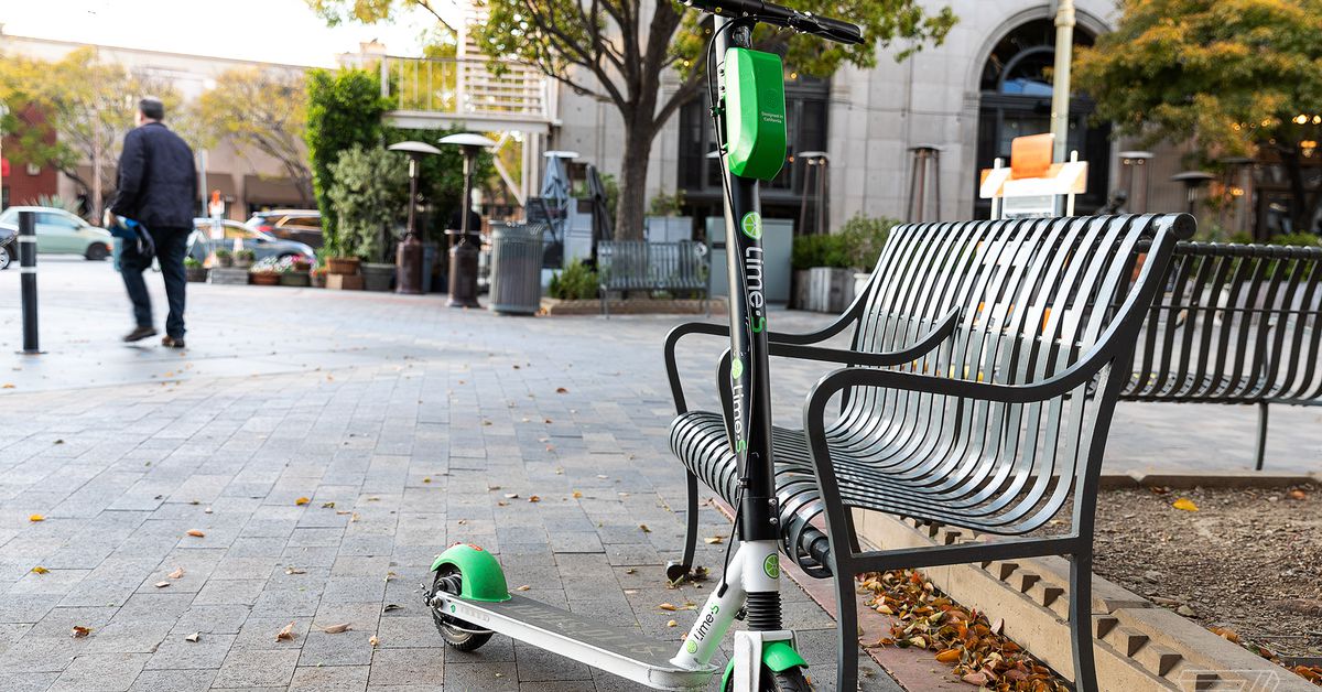
Scooter-sharing giant Lime is updating its app to make renting one of the company’s battery-powered two-wheelers a little easier. Customers can now take advantage of new features like app-less riding, 10-minute reservations, and vehicle configurations to take some of the bite out of scooter-sharing.

Customers who don’t have the Lime app on their phone can still ride by taking a photo of the scooter’s QR code and paying through Apple Pay or Google Pay. Lime says it will be a useful tool for first-time riders who don’t want to commit or don’t have space on their phones.

Reservations could be a potential boon to anyone who has thought to rent a nearby scooter, only to find it gone by the time they arrive at its purported location. After testing out the feature in a couple of key markets, Lime will now allow customers to reserve a scooter for 10 minutes in an effort to take some of the stress out of scooter riding.

Lime will also start recommending certain vehicles to its customers. So when you open the app, the company will refer you to the nearest vehicle with the best battery range. Combined with the reservation feature, Lime thinks this will help customers secure their vehicle faster, estimating it will take “less than 5 seconds” to reserve a scooter after opening the app.

And finally, Lime’s app is getting a dark mode to help customers see their options better while riding at night.

Lime, which operates in 120 cities across five continents, is in growth mode as the weather warms up in certain key markets. In addition to adding new products like electric mopeds and pouring money into a huge e-bike expansion, the company is said to be in talks to go public via a reverse merger. Lime says its customers took more than 200 million rides on its e-scooters and e-bikes last year, with the company expecting that number to grow significantly in 2021.

oneplus-9-pro-review:-more-hassle-than-hasselblad?

OnePlus 9 Pro review: More hassle than Hasselblad?

(Pocket-lint) – OnePlus started off as that limited, small batch phone-maker that only insiders knew about, before growing into a proper big-time brand. And yet, despite being available through proper partner carriers and in real stores, it’s still not a company you’d consider hugely mainstream. It certainly doesn’t have that mindshare that Apple and Samsung have enjoyed for years. 

Counting all the ‘T’ versions, however, we’re now into the 13th generation OnePlus flagship. And in all of those generations it’s always nailed the speed, performance and fluidity. The cameras, however, have always raised questions, never quite delivering to the same degree as the competition. To try and conquer this final frontier OnePlus has brought in some outside help from a partnership with Hasselblad.

So does the OnePlus 9 Pro, Hasselblad riposte at the ready, succeed in flying us to the moon and back?

So shiny 

  • Finishes: Morning Mist, Forest Green, Stellar Black
  • Dimensions: 163.2 x 73.6 x 8.7mm / Weight: 197g
  • IP68 water- and dust-resistant rating
  • Stereo speakers

OnePlus has three different finishes for the OnePlus 9 Pro. We’ve been using the silver coloured Morning Mist version, which is oh so shiny. At least, the bottom third of the back is. It’s reflective enough that you can see your face in it (which also makes photographing it a real pain – not that this would be a concern to 99 per cent of the people who buy one). 

This reflective surface subtly gradients into a more misty, foggy look at the top. The surface of the glass on the outside is glossy and slippery, so attracts fingerprints like nobody’s business. All in all meaning you may just want to use the case, or pick up the frosted glass Forest Green variant instead. 

Still, there’s plenty to like about the 9 Pro’s design. For one, the camera housing has a look about it that says the designers really cared about how it turned out. It’s not just a characterless rectangle stuck onto the back. It’s colour-matched to the back and each of the two main cameras has a metallic ring around the lens, making it stand out against the background. It’ll certainly make it stand out from the crowd. 

The rest of the design is very familiar for anyone who’s used a OnePlus phone over the past year. The glass curves on the back towards the edges, making an otherwise quite large phone feel a bit more comfortable than it would if it were completely flat and square. 

It’s not the lightest phone around, but in its size category, squeezing in below 200 grams is a good thing. It makes it perfectly bearable to use day in day out. Plus, all the buttons being within easy thumb reach means there’s not too much over-stretching going on to locate the alert slider or the volume rocker. 

Pocket-lint

While we’re on the subject of practicality, the Pro has IP68 rating against water and dust ingress. So when this slippery fish does inevitably slip out of your hand into a sink full of water, it won’t get damaged (well, not from the water anyway!).

Unlike the standard ‘non-Pro’ version, the OnePlus 9 Pro doesn’t have a completely flat panel, but the curves on the screen are definitely smaller than in previous iterations. That does mean the phone feels a bit chunkier than 7 Pro from two years ago, but it means it’s less prone to accidental touches. Plus, the bezels are really skinny, giving an almost edge-to-edge screen with only a neat little selfie camera punching its way through the top corner. 

Display and software 

  • 6.7-inch AMOLED display
    • QHD+ resolution (1440 x 3216 pixels; 525ppi)
    • Adaptive frame rate up to 120Hz
  • Oxygen OS 11 (over Android 11)

It’s not just in physical button placement where OnePlus has attempted to make its large phone comfortable to use. The software, Oxygen OS, went through a massive refresh for its Android 11-based version – which first launched on the OnePlus 8T. This update didn’t just radically change the entire look and feel of the previously Google stock-like experience, it was designed so that the bits you need to reach with your thumb are easy to get to. Buttons and controls are shifted down, so you don’t have to awkwardly stretch across to the top corner. 

The thing that works against this somewhat is that OnePlus has fewer of its own apps than it used to. It’s gone all-in with Google, so apps like Messages and the Phone app are Google; similarly, as we saw with the 8T in 2020, the Shelf that used to live on the left of the Home Screen has been replaced by Google’s Discover feed. 

None of these moves are bad, as Google’s Discover is far more useful and more relevant than Shelf. That in itself hasn’t disappeared completely, though, as you can get to it by swiping down on the Home Screen. It could be useful for things like getting quick access to favourite contacts, or remembering where you parked the car. We didn’t find it all that useful, so we just changed the setting so that a swipe on the Home Screen dropped down notifications instead.

As for the screen, it’s one of the best available on the market. It’s a 6.7-inch AMOLED panel that has a top refresh rate of 120Hz, meaning it cycles through 120 refreshes per second to give the sense of smoothness.

Like Samsung’s latest flagships – the Galaxy S21 Ultra at the top of the stack – the OnePlus also has adaptive refresh rate capabilities. Here, however it can go all the way down to just 1Hz when it detects a static page, which will help save battery life. It also means it’s pretty much identical to the screen on the Oppo Find X3 Pro.

It’s really bright and vivid, and – once you’ve enabled its maximum sharpness within the settings – it’s crisp to the eyes too. One clever little feature actually enables you to toggle on a battery saver mode when you choose the QHD+ resolution, which means the screen can switch to a lower resolution if it’s appropriate to do so. 

As usual, there are plenty of additional features, such as the ability to tune the appearance to your preferences: be that dark mode for night time, comfort tone for automatically adjusting the white balance based on the ambient light, or reading mode for, um, you guessed it, reading. 

On the whole, it’s a mighty fine display. Colours pop, bright areas are almost searing, and animations are smooth. There’s perhaps a bit too much contrast, while auto-brightness dims the output a bit much – as to not retain balance of highlights, shadows and colours – but most of the time we were impressed by it.

For those who want it there’s plenty of customisability too. The display settings menu lets you adjust the overall look of the screen, making it more or less vibrant and adjusting colours and white balance. 


Best smartphones 2021 rated: The top mobile phones available to buy today


By Chris Hall
·

The best smartphones you can currently buy, covering the best of iPhone and Samsung, and everything Android has to offer

More hassle than Hasselblad? 

  • Quad camera system:
    • Main: 48-megapixel, f/1.8 aperture, 1/1.43in sensor (Sony IMX789), optical stabilisation (OIS)
    • Ultra-wide: 50MP, f2.2, 1/1.56″ (Sony IMX766)
    • Tele (3.3x): 8MP f/2.4
    • Mono: 2MP
  • Front-facing camera: 16-megapixel
  • Video: 8K30p / 4K120p

So to the all-important cameras. Both the primary and ultra-wide cameras use high-end Sony sensors – which is OnePlus showing off that it’s sourcing the best core kit for the job. For the most part, these sensors deliver good pictures.

The primary sensor looks like it’s had the most love from Hasselblad’s partnership, delivering natural-looking colours with good detail. Likewise, the ultra-wide sensor can take great pictures – and that’s no surprise given it’s the same sensor used by the Oppo Find X3 Pro in both of its two main cameras. 

In good light you’ll get sharp mostly noise-free pictures, while the freeform ultra-wide lens will ensure you don’t get lots of curving and distortion at the edges. In fact, it’s very level and doesn’t suffer from that fish-eye effect you sometimes see from such lenses. It’s not as good in low-light situations as the primary sensor, neither is perfect once light levels drop. You’ll start to see image noise introduced when it gets a bit darker, particularly in greys and blues in any shadows. 

The only inescapable problem isn’t with either camera individually. It’s when you compare them to each other. At some points it looks like results are from two different phones. Not in terms of angle of view, as that’s inevitable, but with the final aesthetic. The ultra-wide often boosts warmth and saturation to give a really vivid (almost more orange feel), while the primary lens delivers a more neutral, cooler image where blues are more standout. 

You can see this difference when switching to Macro mode – which automatically switches to the ultra-wide sensor to perform the close-up shot – as well as when you shoot at night time using the Nightscape mode. 

Nighstscape mode seems to have improved from previous generations of OnePlus phones, though, with the 9 Pro able to draw in decent light. We did sometimes struggle to get results looking sharp though, with finer details and edges blurring – not an out-of-focus blur, more like a motion blur as if the camera’s optical stabilisation can’t quite compensate for hand-shake enough. 

It wasn’t the only time the phone’s camera struggled with detail either. Using the telephoto zoom lens – which is 3.3x that of the main camera, and can reach up to 30x digitally – we found that detail simply lacked. It’s not a great optical zoom.

Pocket-lint

: Ultra-wideUltra-wide

If you scroll through the gallery above – which cycles through the cameras at ultra-wide, 1x, 3.3x, 5x, 10x and 30x – you’ll see how the tree branches in the 3.3x shot turn into a weird-looking mush. And once you zoom past 3.3x the detail becomes increasingly ropey with the images at the top end looking more like an oil painting than a photograph. 

As for macro mode, that’s pretty strong in good light. Details are sharp and in-focus, while the background blur adds depth and doesn’t suffer from unnatural and nauseating bokeh like some dedicated macro lenses do. That’s likely down to the fact the OnePlus 9 Pro is using the ultra-wide sensor, rather than have a poor low-resolution macro camera. 

On the whole, then, the 9 Pro’s cameras are a bit of a mixed bag. It performs well, but the difference in colour balance between the primary and ultra-wide is confusing, especially given OnePlus’ insistence on using Hasselblad’s ‘strict’ tuning standards. The optical zoom lens is quite poor when it comes to detail, and night mode suffers a little with motion blur. 

The primary lens is great for the most part, but we’d just love to see that consistency between the different lenses. It’d turn this system into one that truly competes with the market leaders. The hardware is obviously there, we just need to see attention to detail on balance still.

Speed, I am speed

  • Qualcomm Snapdragon 888 platform, 5G connectivity
  • RAM: 8GB/12GB LPDDR5
  • Storage: 128GB/256GB (UFS3.1)
  • 4,500mAh battery (2x 2250mAh cells)
  • Warp Charge 65T flash charging (1-100% in 28 minutes)
  • Warp Charge 50 wireless charging (1-100% in 43 minutes)

If there’s one thing you can virtually guarantee from OnePlus when it comes to its flagship phones: they’re all fast and fluid. For years the company has used whichever is Qualcomm’s latest top-tier processor. For 2021 that’s the Snapdragon 888. 

In all areas, the OnePlus 9 Pro performs like a proper flagship should. It’s fast and smooth, loading any games and apps without stopping to think about it. We had no instances of stutter or delay. Part of that is also down to the screen’s refresh rate, but also its touch sampling rate – which can read your fingers taps and swipes at a rate of 240 times per second. The animation on screen responds virtually immediately, making it feel nimble and instant. 

Even simple and mundane tasks like refreshing a Twitter feed or loading a web page is hassle-free. Plus, if you live in an area with 5G signal, you get that goodness too, for speedy cellular downloads. 

During our testing there were moments where – after an hour or so of gaming – the phone became a little warm, but it didn’t feel uncomfortable. That’s likely down to having an efficient vapour chamber and graphite-based cooling system inside, making this the most non-gamer gamer phone on the market. 

As for battery life, with the screen cranked up to its highest resolution and frame rate settings, the 4500mAh capacity is more than capable of pushing through a full day. Even on quieter ones, however, we never quite got the sense it’d make it through two full days.

On our heavier days with a three or more hours of screen time, we got to bed with somewhere around the 30 per cent mark left over. Here’s the thing though: battery anxiety is never an issue because when it comes to charging few phones compare to the OnePlus 9 Pro. 

If you use the included 65W wired charger, you can get the battery from dead to 100 per cent in just 28 minutes. That’s a full charge in less than half an hour, which is mind-boggling. Plug the phone in for 10 minutes and that’ll provide  enough to get you through a good few hours.

But there’s more: it charges fast wirelessly too. Using OnePlus’ latest Warp Charge Wireless stand (an optional extra, at your expense), you can get a full charge in 43 minutes. Of course, if it’s by your bed and you charge overnight you don’t need those speeds, but it can be programmed to go into bedtime mode which charges slower and, crucially, quieter. The fan it uses to keep itself cool during the faster charging speeds is shut off to allow you to get to sleep. 

The Warp Charge Wireless is so quick that we’d often just leave the 9 Pro off charge at night, then put it on the stand while getting ready in the morning. It’s a bit of a game-changer.

It’s worth noting that – even though it charges quickly – OnePlus has kept its battery optimisation features in play, which ensure the device’s battery isn’t harmed by such speedy refills. It learns your charging routine and does the first chunk of charging quickly, before leaving it and then finishing the charge right before you wake up in the morning – which is good for battery health and longevity over an extended period of time. 

Verdict

The OnePlus 9 Pro attemps to address the series’ historically biggest issue: the cameras. However, even with support from Hasselblad, it still doesn’t quite hit the mark in that regard. But the core of the phone impresses, with fast wireless charging a truly brilliant feature, and the display being top notch too.

While it’s possible to get great photos from the 9 Pro’s cameras, the imbalance of colour between the two main sensors – with photos often looking like they’ve come from two different phones – and the poor results from the telephoto zoom just don’t quite add up to what we’d expect. More hassle than Hasselblad, eh?

It’s also worth pointing out that the 9 Pro’s price has crept higher still, edging ever closer to the four-figure mark and, in so doing, sitting closer to other premium flagship competitors. That does mean it’s still more affordable than some of the other top tier phones out there, but it’s no longer the instant buy the series once was.

Overall, the OnePlus 9 Pro continues to deliver on the series’ well-established strengths. Its fast and fluid, has a cracking screen, mind-boggling impressive fast-charging, and all for a price that undercuts the established elite. But it continues the series’ ongoing weaknesses too, as those cameras still just aren’t class-leading.

Also consider

Oppo Find X3 Pro

squirrel_widget_4300049

In a lot of ways, the Oppo is very similar to the 9 Pro, offering similar hardware in terms of screen, battery size, charging and processing power. Where it differs is with a more consistent camera experience and a more refined designed. 

  • Read our review

Samsung Galaxy S21+

squirrel_widget_3816733

Pricing isn’t all that much between Samsung’s S21+ and OnePlus’ latest top tier phone. It may have a plastic back, but its performance is strong in all the important ways. The cameras are a tad disappointing however. 

  • Read our review

Writing by Cam Bunton.

qualcomm-is-reportedly-developing-a-switch-like-android-gaming-device

Qualcomm is reportedly developing a Switch-like Android gaming device

Qualcomm is reportedly working on an Android-powered, handheld gaming console that’s similar to a Nintendo Switch, according to Android Police and XDA’s editor-in-chief Mishaal Rahman. The device would be powered by Qualcomm’s silicon, and could hit store shelves by next year — if it ends up being a real product at all.

According to the article, which cites images seen by Android Police, the device would feature detachable, Joy-Con-like controllers, an SD card slot, Android 12, and (of course) 5G. Also noted, and corroborated by Rahman, is a huge 6,000mAh battery. While the physical dimensions aren’t clear, Rahman tweeted that the screen could be 6.65-inches, with a resolution of at least 1080p (the Switch’s screen is 6.2-inches and runs at 720p). He also indicated that it could have a fan.

In other words, the device sounds like a big smartphone with attached controllers and active cooling, though that may not be a bad thing — the Switch kind of looks like a giant phone too. But it also has a library of great games that only it can play, which is its biggest draw. While there are plenty of good gaming experiences to be had on Android, from retro emulators to games like Fortnite and Genshin Impact, Qualcomm would have to give customers a reason why they should play those games on a separate device, rather than on their Qualcomm Snapdragon-powered gaming phones with built-in buttons or controller accessories (or on their regular phones).

The ROG Phone 5 Ultimate with a controller accessory.
Photo by Cameron Faulkner / The Verge

Or at least, it will if it’s trying to sell the device to people — the Android Police article indicates that Qualcomm does want it to be commercially available, potentially at carrier retail stores. It also says that the price target for the device is $300, the same as a full-sized Switch. Currently, the cheapest phone I found with Qualcomm’s flagship 888 processor, the Realme GT 5G, costs roughly $430 (and is only sold in China).

However, Rahman notes that his source believed the product was closer to a reference design than something that would ever see store shelves. Chipmakers, including Qualcomm, often build sample devices to help other manufacturers design around their SOCs or radios. Sometimes, these reference products even end up being sold by other companies under different brands, known as whitelabeling.

It is worth noting that the disagreement between the sources could be due to uncertainty from Qualcomm itself — AP believes this project is almost a year from being finished, so the company may not yet know for sure what it wants this to become.

Whether the device ends up as a product or not (it could easily get canceled before it makes a public appearance), it seems like Qualcomm is actually designing and building a dedicated Android gaming device. It’s understandable why the company would be eying the handheld gaming market: it’s been heating up since Nvidia’s handheld Shield idea turned into the Nintendo Switch, with high-powered gaming phones, Windows PCs with Switch-like form factors, and a variety of mods, classic handheld redesigns, and novelty pocket gaming systems.

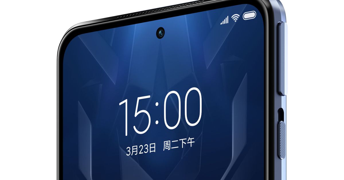
the-black-shark-4-is-a-high-end-gaming-phone-that-doesn’t-look-like-one

The Black Shark 4 is a high-end gaming phone that doesn’t look like one

Xiaomi’s Black Shark brand has announced its fourth series of gaming phones, the Black Shark 4 and 4 Pro. They improve on the previous series in most of the ways you’d expect them to. There’s a faster processor, moving up to the Snapdragon 870 in the standard Black Shark 4 and the Snapdragon 888 in the 4 Pro. Both phones also come with fast LPDDR5 RAM and UFS 3.1 storage, though each will come in different configurations.

The Black Shark 4 starts with 6GB of RAM and 128GB of storage for 2,499 Chinese yuan (roughly $383), while the 4 Pro starts at 3,999 yuan (about $613) and has 8GB of RAM with 256GB of storage. These will debut in China on Friday, March 26th, while the company says an overseas launch will happen “in the near future.”

Image: Xiaomi

As is almost a given in the realm of gaming phones, Black Shark has leap-frogged Asus and RedMagic — some of its biggest competition in the niche gaming phone space — when it comes to touch sampling rate or how many times the display can register a touch. Both the Black Shark 4 and 4 Pro have a 720Hz touch sampling rate with a 8.3ms touch delay, which it claims to be an industry best. This spec likely won’t make a difference in most people’s day-to-day usage of these phones, but some hardcore gamers might care.

Both phones have the mechanical shoulder buttons introduced in the previous Black Shark phones, though the company claims it has improved their look and feel with “magnetic power lift” tech, making them feel more tactile to click, as well as fitting more seamlessly into the phone’s design. Speaking on the look of these new phones, they’re decidedly more attractive than the previous models.

Here’s the Black Shark 2, which introduced the pressure-sensitive display that lets you map two functions to one spot on the screen.
Photo by James Bareham / The Verge

In addition to the shoulder buttons, these phones still have a pressure-sensitive display that I really liked in the Black Shark 2. With the shoulder buttons and a screen like this, you can re-map the controls of a mobile game to be a little more comfortable.

Unlike last year’s model, the Black Shark 4 and 4 Pro have displays that are the same size. They both have 6.67-inch OLED screens with a 144Hz refresh rate. Like the Asus ROG Phone 5 Ultimate that I recently reviewed, these phones have dual front-facing speakers with claims that they have good spatial audio separation. Also like that Asus phone, Black Shark announced that a fan accessory called the FunCooler 2 Pro can be attached to keep it cooler. The price for that is 199 yuan (about $30).

apple’s-upcoming-mixed-reality-headset-will-reportedly-weigh-less-than-an-iphone

Apple’s upcoming mixed reality headset will reportedly weigh less than an iPhone

Apple’s long-rumored mixed reality headset could weigh less than 150 grams, which would make it much lighter than many other headsets on the market, according to a new research note from Apple analyst Ming-Chi Kuo seen by 9to5Mac. That lighter weight might mean Apple’s headset could be easier to wear for long periods of time.

A weight of 150 grams would make Apple’s headset lighter than the Oculus Quest 2 (503 grams), Microsoft’s HoloLens 2 (645 grams), and the Valve Index (809 grams). It would be lighter than Google’s Daydream View, a fabric VR headset designed to hold your phone, which weighed 220 grams. The headset could even be lighter than your iPhone, given that the standard iPhone 12 weighs 164 grams.

As attractively light as this headset sounds, though, it might be a while until we get to try it out for ourselves. Bloomberg reported in January that the device, which may have both virtual reality and augmented reality features, won’t launch until at least 2022. The Information backed that up in February by reporting that the device could ship “as early as next year.” The Information also had a drawing of what the headset could look like, including mesh fabric in the front and Apple Watch-style bands in the back, and I could see how the device could be very light if made with those materials.

Image: The Information

The headset, codenamed “N301,” may also have 8K displays, eye-tracking technology, and more than a dozen cameras to both track your hand movements and capture footage that can be displayed inside the headset, according to The Information. And in his new research note, Kuo reported that the device will have plastic lenses, an ultra-short focal length, and Micro-OLED displays.

But the headset may not be cheap: Apple has apparently discussed pricing the headset at around $3,000, The Information reported. That would make it much more expensive than the $299 Oculus Quest 2 but more affordable than the $3,500 HoloLens 2.

Apple’s device has already hit several development challenges, Bloomberg reported, and given how far out the rumored headset is, there’s always a possibility that details about the device could change. However, Apple recently moved Dan Riccio, its former hardware chief, into a role reportedly overseeing Apple’s AR and VR devices, which could signal the company’s commitment to launching a device sooner rather than later.

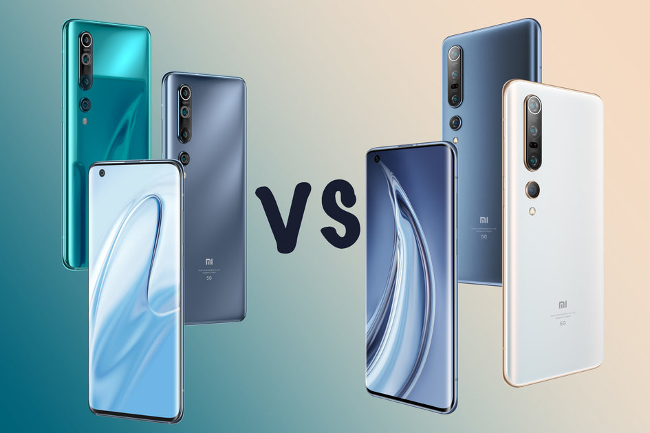
xiaomi-mi-10-vs-mi-10-pro:-what’s-the-difference?

Xiaomi Mi 10 vs Mi 10 Pro: What’s the difference?

(Pocket-lint) – The Xiaomi Mi 10 was the flagship phone series from Xiaomi.

Launching in early 2020, it was then updated with the Mi 10T versions, which you can find a comparison of right here. But if you’re looking at the Mi 10 or the Mi 10 Pro, there’s still plenty to consider.

So which is the phone for you?

squirrel_widget_265372

What’s the same?

Sticking the to the Mi 10 models, we’re going to start by telling you what’s not different – i.e., those parts that are the same on both these devices.

  • Same size and weight
  • Same design, build
  • Qualcomm Snapdragon 865, 8GB RAM
  • 6.67-inch AMOLED display, 90Hz
  • Both 5G
  • Both have in-display fingerprint scanner
  • Both support 30W wireless charging, and reverse wireless charging
  • Both have a 108MP main camera and 20MP selfie camera

There’s a lot that the Mi 10 and Mi 10 Pro have in common. The overall design and finish of the phones is the same, both with the same dimensions and weights (according to the spec sheets), as well as having the same size, resolution and refresh rate on the display. 

Both phones also have the same core hardware with Snapdragon 865, supporting 5G, with 8GB RAM. Both will come with 256GB storage, although there’s also a 128GB version of the Mi 10 (there may be some regional differences here). 

Both also support 30W wireless charging and that’s reversible too, so can charge other devices.

Both have a headline-grabbing 108-megapixel main camera and both have a 20-megapixel front camera in a punch hole. 

So what’s actually different? 

These devices are a lot closer related than some other “pro” versions, but there are a few remaining areas that are very different. Here’s how the Mi 10 and Mi 10 Pro differ.

Cameras

  • Xiaomi Mi 10:

    • 108MP main with 7P lens
    • 13MP ultra-wide camera
    • 2MP macro camera
    • 2MP depth sensor
  • Xiaomi Mi 10 Pro:

    • 108MP main with 8P lens
    • 20MP ultra-wide camera
    • 12MP telephoto camera
    • 8MP telephoto camera
    • 960fps slow-mo

There’s a huge difference in the cameras on the Mi 10 models. While both have the same 108-megapixel sensor – with exactly the same specs – the lens is different, with the Pro getting an eight element lens. This could improve the quality.

There’s then a complete departure in camera specs. Both have an ultra-wide camera, but it’s a different sensor. The regular Mi 10 has a lower resolution sensor, but a wider field of view and larger pixels. Exactly how different the quality will be is hard to tell – we suspect on wide-angle photos it won’t make much difference.

The Mi 10 then offers a dedicated macro lens – something the Mi 10 Pro doesn’t have – and a depth sensor – which is generally nothing to be excited about.

The Mi 10 Pro by comparison gets two telephoto lenses, one claiming 2x optical zoom, which is more like a portrait lens and a second offering 10x hybrid zoom to be used for the long range stuff – it also offers 50x digital zoom.

That means that the Mi 10 Pro is offering telephoto options that the Mi 10 simply doesn’t have.

Battery and charging

  • Mi 10: 4780mAh, 30W charging
  • Mi 10 Pro: 4500mAh, 50W charging

While both offer the same wireless charging, the Mi 10 Pro gets faster 50W wired charging – but it also has a slightly smaller battery. That’s because Xiaomi needed to reduce the battery size in the Mi 10 Pro to support the faster charging rate.

The Mi 10 on the other hand gets a 4780mAh battery, so might last you a little longer. It’s not as fast to charge, but the difference probably won’t be huge. There’s one other difference here too: the Mi 10 Pro comes with a 65W charger in the box, compared to the 30W charger in the Mi 10’s box – although this might differ depending on where you buy the phone.

squirrel_widget_204249

The price

  • Mi 10: €799 (at launch)
  • Mi 10 Pro: €999 (at launch)

There’s a pretty big difference in price between these two models, with the Mi 10 coming in at €799 and the Mi 10 Pro at €999. While both offer great value for money, you’re getting a lot in the Mi 10 with that display and main camera – while the Mi 10 Pro will obviously offer more across the entire camera experience.

Summary 

The differences between the two phones are minor, falling into the camera, and battery and charging areas only. What difference will that really make? The Mi 10 Pro is the more exciting camera offering with those telephoto options. The lens on the main camera and the change to the ultra-wide don’t actually make a huge difference, apart from putting bigger numbers on the specs sheet. 

The battery is different too, but not hugely so and in the long run doesn’t make much of a difference. With the same display, the same power and the same overall design and build, if you choose the cheaper Mi 10 then you’re not missing out on a huge amount.

The real question will be how much you want those telephoto cameras.

Writing by Chris Hall.