There are new features, but it’s the biggest design update in years
Google is announcing the latest beta for Android 12 today at Google I/O. It has an entirely new design based on a system called “Material You,” featuring big, bubbly buttons, shifting colors, and smoother animations. It is “the biggest design change in Android’s history,” according to Sameer Samat, VP of product management, Android and Google Play.
That might be a bit of hyperbole, especially considering how many design iterations Android has seen over the past decade, but it’s justified. Android 12 exudes confidence in its design, unafraid to make everything much larger and a little more playful. Every big design change can be polarizing, and I expect Android users who prefer information density in their UI may find it a little off-putting. But in just a few days, it has already grown on me.
There are a few other functional features being tossed in beyond what’s already been announced for the developer betas, but they’re fairly minor. The new design is what matters. It looks new, but Android by and large works the same — though, of course, Google can’t help itself and again shuffled around a few system-level features.
I’ve spent a couple of hours demoing all of the new features and the subsequent few days previewing some of the new designs in the beta that’s being released today. Here’s what to expect in Android 12 when it is officially released later this year.
Material You design and better widgets
Android 12 is one implementation of a new design system Google is debuting called Material You. Cue the jokes about UX versus UI versus… You, I suppose. Unlike the first version of Material Design, this new system is meant to mainly be a set of principles for creating interfaces — one that goes well beyond the original paper metaphor. Google says it will be applied across all of its products, from the web to apps to hardware to Android. Though as before, it’s likely going to take a long time for that to happen.
In any case, the point is that the new elements in Android 12 are Google’s specific implementations of those principles on Pixel phones. Which is to say: other phones might implement those principles differently or maybe even not at all. I can tell you what Google’s version of Android 12 is going to look and act like, but only Samsung can tell you what Samsung’s version will do (and, of course, when it will arrive).
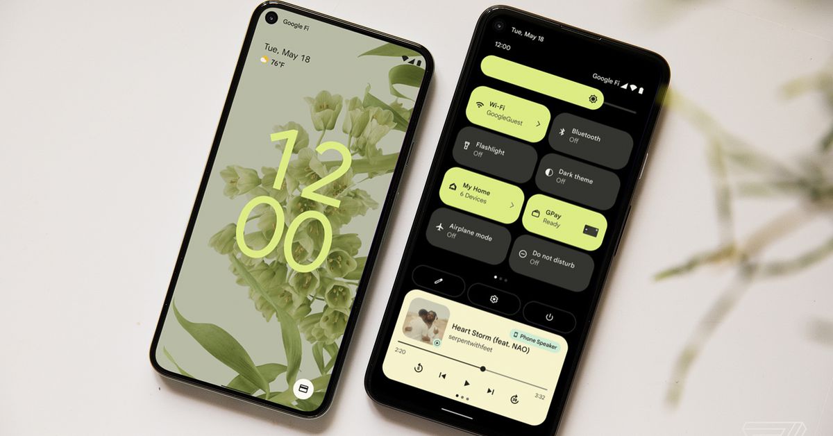
The feature Google will be crowing the most about is that when you change your wallpaper, you’ll have the option to automatically change your system colors as well. Android 12 will pull out both dominant and complementary colors from your wallpaper automatically and apply those colors to buttons and sliders and the like. It’s neat, but I’m not personally a fan of changing button colors that much.
The lock screen is also set for some changes: the clock is huge and centered if you have no notifications and slightly smaller but still more prominent if you do. It also picks up an accent color based on the theming system. I especially love the giant clock on the always-on display.
Android’s widget system has developed a well-deserved bad reputation. Many apps don’t bother with them, and many more haven’t updated their widget’s look since they first made one in days of yore. The result is a huge swath of ugly, broken, and inconsistent widgets for the home screen.
Google is hoping to fix all of that with its new widget system. As with everything else in Android 12, the widgets Google has designed for its own apps are big and bubbly, with a playful design that’s not in keeping with how most people might think of Android. One clever feature is that when you move a widget around on your wallpaper, it subtly changes its background color to be closer to the part of the image it’s set upon.
I don’t have especially high hopes that Android developers will rush to adopt this new widget system, so I hope Google has a plan to encourage the most-used apps to get on it. Apple came very late to the home screen widget game on the iPhone, but it’s already surpassed most of the crufty widget abandonware you’ll find from most Android apps.
Bigger buttons and more animation
As you’ve no doubt gathered already from the photos, the most noticeable change in Android 12 is that all of the design elements are big, bubbly, and much more liberal in their use of animation. It certainly makes the entire system more legible and perhaps more accessible, but it also means you’re just going to get fewer buttons and menu items visible on a single screen.
That tradeoff is worth it, I think. Simple things like brightness and volume sliders are just easier to adjust now, for example. As for the animations, so far, I like them. But they definitely involve more visual flourish than before. When you unlock or plug in your phone, waves of shadow and light play across the screen. Apps expand out clearly from their icon’s position, and drawers and other elements slide in and out with fade effects.
More animations mean more resources and potentially more jitter, but Samat says the Android team has optimized how Android displays core elements. The windows and package manager use 22 percent less CPU time, the system server uses 15 percent less of the big (read: more powerful and battery-intensive) core on the processor, and interrupts have been reduced, too.
Android has another reputation: solving for jitter and jank by just throwing ever-more-powerful hardware at the problem: faster chips, higher refresh rate screens, and the like. Hopefully none of that will be necessary to keep these animations smooth on lower-end devices. On my Pixel 5, they’ve been quite good.
One last bit: there’s a new “overscroll” animation — the thing the screen does when you scroll to the end of a page. Now, everything on the screen will sort of stretch a bit when you can’t scroll any further. Maybe an Apple patent expired.
Shuffling system spaces around
It wouldn’t be a new version of Android without Google mucking about with notifications, Google Assistant, or what happens when you press the power button. With Android 12, we’ve hit the trifecta. Luckily, the changes Google has made mostly represent walking back some of the changes it made in Android 11.
The combined Quick Settings / notifications shade remains mostly the same — though the huge buttons mean you’re going to see fewer of them in either collapsed or expanded views. The main difference in notifications is mostly aesthetic. Like everything else, they’re big and bubbly. There’s a big, easy-to-hit down arrow for expanding them, and groups of notifications are put together into one bigger bubble. There’s even a nice little visual flourish when you begin to swipe a notification away: it forms its own roundrect, indicating that it has become a discrete object.
The thing that will please a lot of Android users is that after just a year, Google has bailed on its idea of creating a whole new power button menu with Google Wallet and smart home controls. Instead, both of those things are just buttons inside the quick settings shade, similar to Samsung’s solution.
Holding down the power button now just brings up Google Assistant. Samat says it was a necessary change because Google Assistant is going to begin to offer more contextually aware features based on whatever screen you’re looking at. I say the diagonal swipe-in from the corner to launch Assistant was terrible, and I wouldn’t be surprised if it seriously reduced how much people used it.
I also have to point out that it’s a case of Google adopting gestures already popular on other phones: the iPhone’s button power brings up Siri, and a Galaxy’s button brings up Bixby.
New privacy features for camera, mic, and location
Google is doing a few things with privacy in Android 12, mostly focused on three key sensors it sees as trigger points for people: location, camera, and microphone.
The camera and mic will now flip on a little green dot in the upper-right of the screen, indicating that they’re on. There are also now two optional toggles in Quick Settings for turning them off entirely at a system level.
When an app tries to use one of them, Android will pop up a box asking if you want to turn it back on. If you choose not to, the app thinks it has access to the camera or mic, but all Android gives it is a black nothingness and silence. It’s a mood.
For location, Google is adding another option for what kind of access you can grant an app. Alongside the options to limit access to one time or just when the app is open, there are settings for granting either “approximate” or “precise” locations. Approximate will let the app know your location with less precision, so it theoretically can’t guess your exact address. Google suggests it could be useful for things like weather apps. (Note that any permissions you’ve already granted will be grandfathered in, so you’ll need to dig into settings to switch them to approximate.)
Google is also creating a new “Privacy Dashboard” specifically focused on location, mic, and camera. It presents a pie chart of how many times each has been accessed in the last 24 hours along with a timeline of each time it was used. You can tap in and get to the settings for any app from there.
The Android Private Compute Core
Another new privacy feature is the unfortunately named “Android Private Compute Core.” Unfortunately, because when most people think of a “core,” they assume there’s an actual physical chip involved. Instead, think of the APCC as a sandboxed part of Android 12 for doing AI stuff.
Essentially, a bunch of Android machine learning functions are going to be run inside the APCC. It is walled-off from the rest of the OS, and the functions inside it are specifically not allowed any kind of network access. It literally cannot send or receive data from the cloud, Google says. The only way to communicate with the functions inside it is via specific APIs, which Google emphasizes are “open source” as some kind of talisman of security.
Talisman or no, it’s a good idea. The operations that run inside the APCC include Android’s feature for ambiently identifying playing music. That needs to have the microphone listening on a very regular basis, so it’s the sort of thing you’d want to keep local. The APCC also hands the “smart chips” for auto-reply buttons based on your own language usage.
An easier way to think of it is if there’s an AI function you might think is creepy, Google is running it inside the APCC so its powers are limited. And it’s also a sure sign that Google intends to introduce more AI features into Android in the future.
No news on app tracking — yet
Location, camera, mic, and machine learning are all privacy vectors to lock down, but they’re not the kind of privacy that’s on everybody’s mind right now. The more urgent concern in the last few months is app tracking for ad purposes. Apple has just locked all of that down with its App Tracking Transparency feature. Google itself is still planning on blocking third-party cookies in Chrome and replacing them with anonymizing technology.
What about Android? There have been rumors that Google is considering some kind of system similar to Apple’s, but there won’t be any announcements about it at Google I/O. However, Samat confirmed to me that his team is working on something:
There’s obviously a lot changing in the ecosystem. One thing about Google is it is a platform company. It’s also a company that is deep in the advertising space. So we’re thinking very deeply about how we should evolve the advertising system. You see what we’re doing on Chrome.
From our standpoint on Android, we don’t have anything to announce at the moment, but we are taking a position that privacy and advertising don’t need to be directly opposed to each other. That, we don’t believe, is healthy for the overall ecosystem as a company. So we’re thinking about that working with our developer partners and we’ll be sharing more later this year.
A few other features
Google has already announced a bunch of features in earlier developer betas, most of which are under-the-hood kind of features. There are “improved accessibility features for people with impaired vision, scrolling screenshots, conversation widgets that bring your favorite people to the home screen” and the already-announced improved support for third-party app stores. On top of those, there are a few neat little additions to mention today.
First, Android 12 will (finally) have a built-in remote that will work with Android TV systems like the Chromecast with Google TV or Sony TVs. Google is also promising to work with partners to get car unlocking working via NFC and (if a phone supports it) UWB. It will be available on “select Pixel and Samsung Galaxy phones” later this year, and BMW is on board to support it in future vehicles.
For people with Chromebooks, Google is continuing the trend of making them work better with Android phones. Later this year, Chrome OS devices will be able to immediately access new photos in an Android phone’s photo library over Wi-Fi Direct instead of waiting for them to sync up to the Google Photos cloud. Google still doesn’t have anything as good as AirDrop for quickly sending files across multiple kinds of devices, but it’s a good step.
Android already has fast pairing for quickly setting up Bluetooth devices, but it’s not built into the Bluetooth spec. Instead, Google has to work with individual manufacturers to enable it. A new one is coming on board today: Beats, which is owned by Apple. (Huh!) Ford and BMW cars will also support one-tap pairing.
Android Updates
As always, no story about a new version of Android would be complete without pointing out that the only phones guaranteed to get it in a timely manner are Google’s own Pixel phones. However, Google has made some strides in the past few years. Samat says that there has been a year-over-year improvement in the “speed of updates” to the tune of 30 percent.
A few years ago, Google changed the architecture of Android with something called Project Treble. It made the system a little more modular, which, in turn, made it easier for Android manufacturers to apply their custom versions of Android without mucking about in the core of it. That should mean faster updates.
Some companies have improved slightly, including the most important one, Samsung. However, it’s still slow going, especially for older devices. As JR Raphael has pointed out, most companies are not getting updates out in what should be a perfectly reasonable timeframe.
Beyond Treble, there may be some behind-the-scenes pressure happening. More and more companies are committing to providing updates for longer. Google also is working directly with Qualcomm to speed up updates. Since Qualcomm is, for all intents and purposes, the monopoly chip provider for Android phones in the US, that should make a big difference, too.
That’s all heartening, but it’s important to set expectations appropriately. Android will never match iOS in terms of providing timely near-universal updates as soon as a new version of the OS is available. There will always be a gap between the Android release and its availability for non-Pixel phones. That’s just the way the Android ecosystem works.
That’s Android 12. It may not be the biggest feature drop in years, but it is easily the biggest visual overhaul in some time. And Android needed it. Over time and over multiple iterations, lots of corners of the OS were getting a little crufty as new ideas piled on top of each other. Android 12 doesn’t completely wipe the slate clean and start over, but it’s a significant and ambitious attempt to make the whole system feel more coherent and consistent.
The beta that’s available this week won’t get there — the version I’m using lacks the theming features, widgets, and plenty more. Those features should get layered in as we approach the official release later this year. Assuming that Google can get this fresh paint into all of the corners, it will make Google’s version of Android a much more enjoyable thing to use.
