samsung-galaxy-book-pro-360-(15-inch)-review:-a-big-screen-entertainment-machine

Samsung Galaxy Book Pro 360 (15-inch) review: a big-screen entertainment machine

Samsung has released a number of Galaxy Books in the last few years. Despite generally being good devices with a recognizable brand name, most of them have remained Samsung-enthusiast purchases; none have truly entered the mainstream conversation.

So it seems fitting that the Galaxy Book Pro 360 isn’t a direct sequel to any preexisting Galaxy Books. Instead, it’s an attempt to combine the best features of Samsung’s previous PCs and create a device that Samsung knows it can do really well.

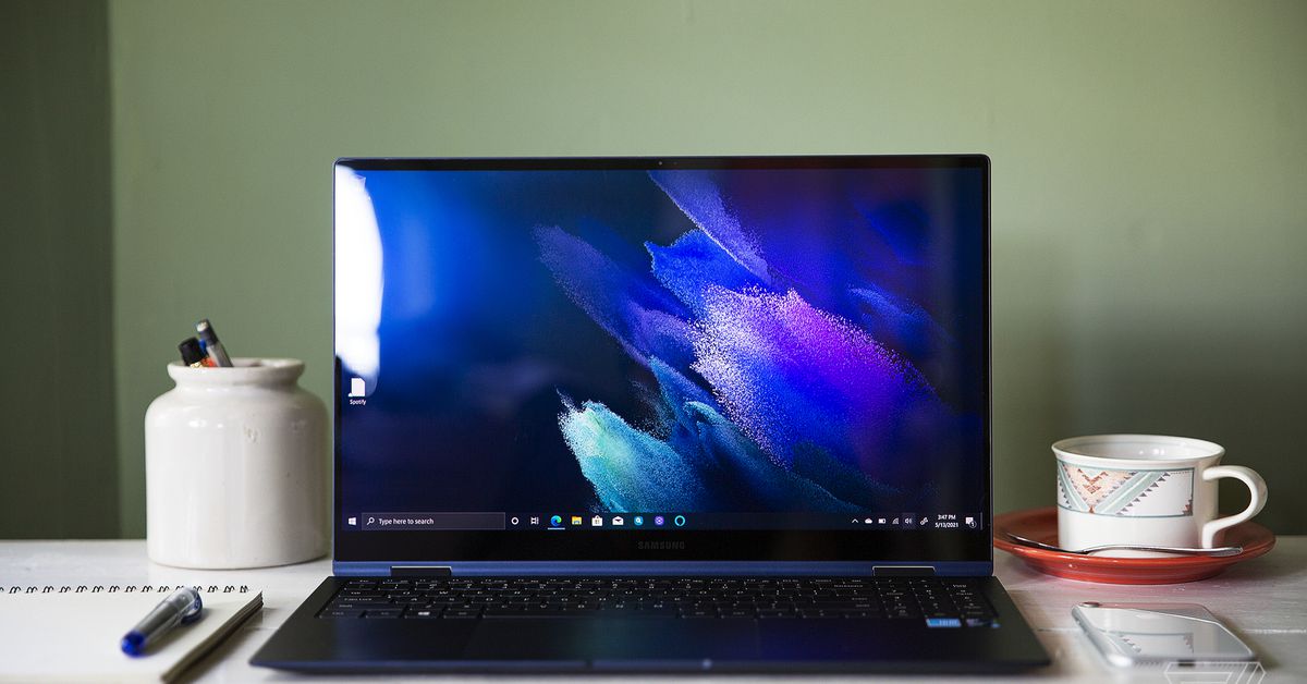
It worked. The Galaxy Book Pro 360 is targeting a fairly specific audience, but in two areas — its OLED screen and its three-pound weight — it’s a groundbreaking device that has little significant competition across the market. But what’s really exceptional is that you don’t have to sacrifice much to get those standout features. It’s solid in the other areas that matter, it comes with some neat software and has few significant problems. If there’s a device that could bring the Galaxy Book out of the territory of Samsung super-fans and into the mainstream market, this is it.

The 15-inch Galaxy Book Pro 360 starts at $1,299. For the base price, you get a Core i7-1165G7, 8GB of RAM, and 512GB of storage. For $200 you can upgrade to the model I’m reviewing, which has 16GB of RAM and 1TB of storage. The only other difference between these configurations is that the base only comes in “mystic navy” (the color of the unit I have), while the pricier one also comes in “mystic bronze.” There’s also a 13-inch model, starting at $1,399.99, that will support 5G at some point (though it doesn’t yet).

That’s competitive pricing. The Galaxy Book Flex, Samsung’s most recent ultraportable touchscreen convertible, has an MSRP of $1,399 for an 8GB / 512GB model (though it’s often on sale now). Comparable Surface Laptop 4 and Surface Pro 7 Plus models start at $1,499 at the lowest. All Galaxy Book Pro 360 models also ship with an S Pen, which is just like the S Pen on the Galaxy Book Flex except that it’s 2.5 times thicker. As I noted in my initial look at the Book 360, it really does feel like a real pen (especially compared to the S Pens that you get with Galaxy Note phones, which feel like toys in comparison), though I wish there were somewhere in the chassis to store it.

The quad-core Core i7-1165G7 is the same processor that powers a number of the best consumer laptops on the market. The Pro 360 was just fine for the large load of Chrome tabs and apps that I pushed it through during each day of testing. Performance was snappy, and I rarely heard the fans spin up (though I occasionally heard coil whine from the processor). Note that there’s no discrete GPU option, but Iris Xe graphics can lend a hand in some lightweight gaming and graphic work.

Then, there are a number of customization features that you can tweak in the Samsung Settings app. You can swap between cooling profiles, including a “no fan” mode if you want total silence. You can toggle “Studio Mode,” which is supposed to enhance your video quality on calls — while it wasn’t night and day, I did find that this made me look a bit better in low-light settings. One feature I didn’t love was Secret Screen, which purports to be a privacy screen but really just makes the app you’re using either translucent or darker (and it doesn’t work with every app). Maybe this makes it slightly harder to snoop, but it also makes work an odd experience, and you could achieve a similar effect by just dimming your screen. I’d invest in a laptop with a real privacy shield (such as HP’s Elite Dragonfly) if you’ll be viewing highly sensitive material.

And then there are some bonuses for folks who are already Samsung devotees: you can expand your display onto a Galaxy Tab S7 or S7 Plus and quickly move files between Galaxy devices with Samsung’s Quick Share function. And the Pro 360 comes preloaded with some Samsung software, including Samsung Notes (which can sync between devices) and SmartThings.

Most of my (very few) quibbles with the device come from the outside. For one, the blue chassis is a fingerprint magnet (the lid was all smudged up after half a day of use). I also experienced some occasional palm-rejection issues with the touchpad, which improved but didn’t disappear when I bumped it down to the lowest sensitivity. And I know some people like flat keyboards, but this one is too flat for my taste, with just 1mm of travel.

But there are a couple reasons why the Galaxy Book Pro 360 really stands out, and they easily make up for those quibbles. The first is the screen. The 13-inch Galaxy Book Pro 360 will be one of very few 13-inch OLED laptops on the market. OLED is more common in the 15-inch tier, but it’s unusual to see outside of creator-focused workstations with discrete GPUs. The most obvious use for this 15.6-inch OLED panel is likely entertainment, rather than on-the-go creative work. (That’s especially true because it’s just 1920 x 1080 resolution, not 4K.)

The screen is quite sharp, with vibrant colors. (It maxed out our colorimeter, covering 100 percent of the DCI-P3 color gamut and 100 percent of the sRGB color gamut). As we’d expect from an OLED panel, it delivers bright whites and unparalleled blacks. If you’re looking for a 15.6-inch laptop with an OLED display, you’re unlikely to find one at a lower price.

That said, there are a few things to note. First, it doesn’t get super bright, maxing out at just 276 nits in my testing. It kicked back some glare outdoors, though I was still able to use it. Second, it’s 16:9, which is an aspect ratio I’ve sworn off forever because it’s cramped for multitasking. And third, there’s some wobble when you type or use the touchscreen. It’s not the worst wobble I’ve ever seen, but it’s there.


  • Tent mode.


  • Pretty darn thin.


  • The touchscreen is glossy, but bright enough.


  • It’s responsive and generally smooth.

Another standout feature: the Galaxy Book Pro 360 is really darn portable. It’s just a few millimeters thicker than the Galaxy Note 20 Ultra (0.46 inches). And at three pounds, it’s easily one of the lightest 15-inch laptops you can buy. The 15-inch Surface Laptop 4 and Galaxy Book Flex, both of which are also known for their lightweight builds, are almost half a pound heavier. I’ve never considered buying a 15-inch laptop myself, due to how much they tend to weigh; this is the first 15-incher I’ve reviewed that I can actually see myself carrying around all day.

The third benefit is one I wasn’t expecting: battery life. This laptop has a 68Wh battery, which isn’t huge for 15-inchers (though it’s bigger than you often see for a 15W processor with integrated graphics). It also has a display that could be a battery suck. Samsung’s last attempt at an OLED laptop had disappointing battery results. So I was pleasantly surprised by how long the Galaxy Book Pro 360 lasted. I averaged 10 hours and 23 minutes to a charge during my testing, which included using around a dozen Chrome tabs and some apps on the side with the screen around 200 nits of brightness. If you’re just using this for entertainment, and not as a primary work driver, you’ll likely get even more.

I’m a fan of the 15-inch Galaxy Book Pro 360, though I do think its audience is fairly specific. This is a laptop worth considering if you’re looking for an excellent big-screen entertainment experience while you’re out and about, and maybe also need to take notes for class or make artwork in your spare time. Bonus points if you’re already plugged into the Samsung ecosystem. Not everyone needs that kind of laptop — but if you do, this is a good one to look at.

The device’s weight is a huge benefit, but what’s even more impressive is that you’re not sacrificing a lot to achieve that weight. You also get a premium build, a capable processor with plenty of RAM and storage, a decent port selection, a nice screen with stylus support, and all-day battery life, all for a competitive price. What ultimately makes this laptop worth its price is that the lightweight chassis is icing on the cake — it’s not a feature you have to compromise on a ton of other things to get.

If you’re a Samsung fan who hasn’t been sold on the Galaxy Book lineup so far, I’d say this is the one to get. I wish the hinge were sturdier, I wish the keyboard wasn’t quite so flat, and I wish the screen got a tad bit brighter. But I don’t see any of those things significantly hindering the overall experience. For once, Samsung has made a tough 2-in-1 to beat.
volvo-xc40-recharge-review:-electrified-elegance

Volvo XC40 Recharge review: Electrified elegance

(Pocket-lint) – One of our very favourite electric cars ever is the Polestar 2. You might be wondering why on earth we’re mentioning that as a prelude to this Volvo XC40 Recharge review. Well, it’s simple really: they’re like long lost cousins (Polestar was once an arm of Volvo, which separated back in 2017).

Anyway, long story short, you can see the similarities. The XC40 Recharge echoes stacks of our favourite features from the Polestar – easy one-pedal driving, an integrated Google infotainment system (that will only further improve over time), and decent real-world range per charge – albeit in a more capacious, higher-up, SUV format.

Which sets the XC40 Recharge in very good stead – especially as this is Volvo’s very first all-electric vehicle (well, ignoring the dedicated C40, the first solely EV car from the company). And having lived with the car for a week that sentiment hasn’t changed; if anything we’ve only grown to adore this slice of electrified elegance all the more.

Design

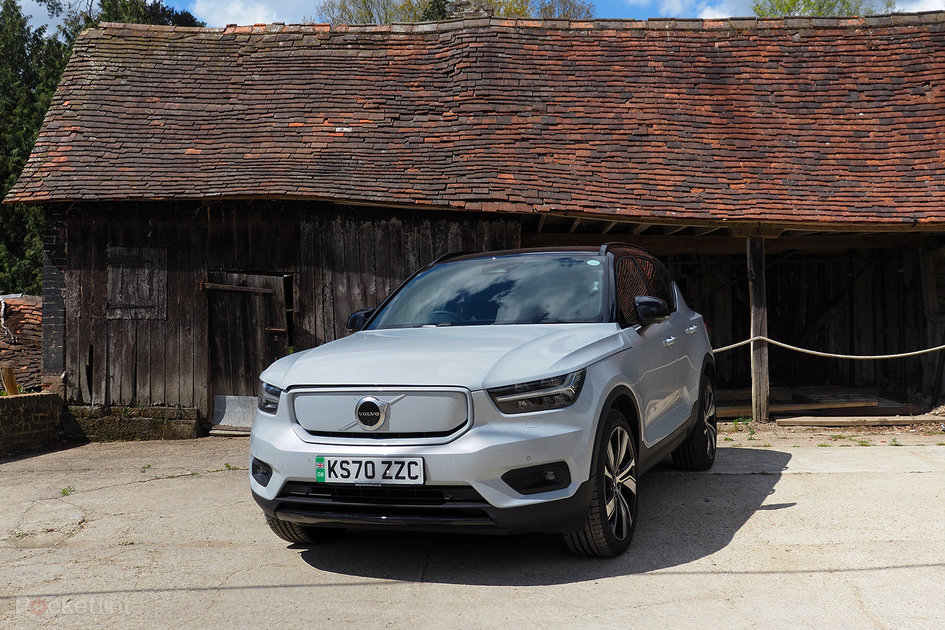
First up, it’s all about aesthetics. Dressed here in a premium metallic ‘Crystal White’ paint, the XC40 Recharge has an elegant face, set off by those dynamic LED headlights, cutting an overall sleek finesse. It’s not the boxy Volvo style of old, this is far more contemporary.

Pocket-lint

If you’re wondering why our XC40 Recharge has something of a raised eyebrow, it’s because we charged the car – the cables are in the front under the bonnet – and seemingly didn’t close the lid quite properly on the right side. That’s the peril of having the cables housed in an area where they’re fussy to remove – we would much prefer them to be in a carry case in the boot, for easier access.

Still, no raised eyebrows from us about the way the XC40 Recharge looks from the front and sides. The rear, however, has a much greater sense of verticality about it, due to those extended rear light pillars. It’s not our favourite quarters of the car, yet still forms a complete picture and doesn’t have any of that “miserable face” look you’ll find on the Land Rover Discovery.

Not that the XC40 Recharge is as physically massive as a Land Rover. It’s a smaller-scale SUV by comparison, with plenty enough room for a family of four plus the shopping/dog/bikes/whatever in the back – the car’s battery doesn’t actually utilise additional space in the boot compared to the standard fuel variants, you see, which is good news indeed (maintaining its 452 litre space).

Interior

Step inside and this is where the XC40 Recharge delivers a strong cabin space. The seats, typical Volvo design, have a slightly protruding front for the legs – not as pronounced as the sometimes uncomfortable Polestar 2, thankfully – and a host of electric adjustment controls to get you seated just perfectly. There’s front heated seats and even a heated steering wheel – both of which have proven much needed during testing at the tail-end of the UK’s coldest ever spring season.

Unusually for any car, the XC40 Recharge is refreshingly hands-off in its approach. The key has proximity entry, meaning a tug on the door handle will open the car even if they key’s in your pocket. You don’t even then need to press a start button (or, heaven forbid, turn a key) for the car to fire up; it’s just there, ready and waiting, for you to pop it into drive/reverse with the flick of the control stick and off you go on your merry way. There’s something rather futuristic about this endeavour which we enjoy. You won’t forget to turn the car off either – as when you lock it that does the job. 

Unlike some earlier electric vehicles there’s no giant central column that buffets against your legs, so the cabin feels open and airy. The optional panoramic sunroof makes everything feel all the more expansive when the sun’s out too. There’s good legroom for rear passengers too, although being this is the XC40 – there’s also XC60 and XC90 going bigger, the latter with seven seats as standard – it’s not a gigantic SUV compared to some.

In terms of storage there’s a couple of well positioned cup holders to the central column, the usual door bins to the side, and a removable little bucket beneath the driver’s armrest, which is nestled in a larger open space – handy for popping various kit into (we had a DSLR, sunglasses and a phone, so it’s not short on capacity).

Pocket-lint

It’s a largely practical interior, then, without too much fuss. There are some slightly glinty sections to the doors which catch subtle lighting when the sun’s gone down, a tasteful approach that’s easy on the eye – not distracting like, say, an Audi e-tron’s coloured lighting options – and we find the overall padding and finish to be of consistent quality.

Tech

In the tech department, also like Polestar, Volvo has gone fully Google in its approach. Its one of a handful of cars with an integrated Google infotainment system aboard. By which we mean it’s built in proper, there’s no Android Auto to plug your phone in to take over. Which, given how fussy that connection can sometimes be, we find really refreshing.

Principal to the system is the fact that Google Maps is on hand. No sub-par navigation system to depend on here, just what you’re (probably) already familiar with. Easy search of places and specifics – not backwards postcode only, as you’ll find from some brands – ensures you’ll be going where you want to get to in double-quick time. With on-board mobile connectivity there’s real-time traffic and diversion too.

The Google system also allows you to sign in using your personal account – although, from our perspective, this still isn’t fully realised. For starters it has to be an ‘at Gmail’ account, not a masked version (like an ‘at pocket-lint’ one), and once signed in there’s a handful of easy-to-reach extras – the Play Store for various apps being the prime example – but things like Gmail email don’t sync. We’re not saying you’ll want to always read your emails in the car, but having the option could be handy in the future (even if just for VIP contacts list).

Google being Google, though, we suspect this in-car system has a lot of capacity to grow and develop. Not only in terms of features, but layout too – at present it’s a little finicky to have to reach to the far side of the screen, so it could be made more driver friendly.

Pocket-lint

It’s a largely touch-based experience, too, as is the current norm for many in-car systems. That’s generally fine here, but we think that Volvo should have implemented physical climate controls – below the screen there’s only physical buttons for demist (avoiding the conundrum that Volkswagen’s ID3 suffers), play/pause and skip track forward/back – because the carmaker’s overlay in this touchscreen environment takes a little more tapping to adjust than it should. The aircon ‘blowers’ are also a little whistly when sealed and air is trying to rush out.

There’s also some apparent fisticuffs between Google and Volvo systems at times, such as the rear reversing camera system crashing out and failing to present any imagery. Which is a shame, as this 360-degree view around the car makes parking a breeze – less so when it’s totally blacked out. But it’ll always come back to good once the system has reset.

Other physical controls are present on the steering wheel and surrounding columns, which makes for handy control of the adaptive cruise control and Volvo’s Pilot Assist driver assist (with this activated it basically drives for you, keeping lane by turning the wheel as needed, and watching out for any surrounding vehicles and maintaining distance). As rules change and these systems advance this is the stepping stone to fully autonomous motorway driving.

Pocket-lint

Overall the XC40 Recharge has a refreshingly compelling tech setup. From safety to entertainment (the Harman Kardon sound system is bristling with brilliance too), to Google integration and apps (built-in Spotify, data included, is a dream), it’s got the room to grow. It just needs a little more stability in some areas, and some more physical buttons for one or two key controls would be good too.

Drive & Range

Which brings us to what the XC40 Recharge is like to drive. We’ve had the ‘standard’ XC40 before now and, well, found its plasticky interior clicked more and the overall drive left more to be desired. The Recharge, being an all-electric vehicle, totally flips this on its head: it’s super smooth, super fast, and for an SUV that’s packing a chunk of weight beneath its shell, performs fantastically.

Pocket-lint

That’ll be down to the all-wheel drive (AWD) system and high-torque motors – able to propel this SUV from a stationary start to 62mph in 4.7 seconds. It might not be ‘Tesla fast’, but it’s genuinely fast enough to get your passengers’ stomachs tingling with this kind of acceleration. That it’s so smooth with it, too, is extra impressive. 

If you’ve never driven an electric car before then the XC40 Recharge is a masterclass in how we think it should be done. Again, just like Polestar, there’s a one-pedal driving system by default. This effectively means the car is always looking to brake – applying recuperation and therefore energy back into the battery at every available opportunity. Sure, other EVs do this to some degree too, but not to this kind of extreme – the XC40 Recharge will come to a full stop, meaning you’ll rarely need to use the brake pedal at all. 

That kind of aggressive recuperation might sound almost threatening, but the big pedal is a breeze to use deftly, ensuring the right amount of auto-braking depending on your situation. Plus, it helps to assure a decent range per charge.

Pocket-lint

Volvo’s figures say the XC40 Recharge – which has a 78kWh battery – will deliver 257 miles (415km) per charge. As ever, that’s a little beyond real-world potential – but not by much. We were managing mixed condition driving – back-roads, B-roads, A-roads, all the kinds of roads – delivering around 13 per cent depletion per 30 miles (48km). Tot that up and you’ll genuinely get over 225 miles (338km) of range per charge.

Note that it’s not been warm in the UK of late, so that figure could even increase in the summer months. It’ll likely only decrease on faster predominantly motorway stints, but nonetheless it’s a good figure. Not quite Polestar 2 levels, but then the Volvo has more weight to carry. We do think there’s an opportunity to squeeze a higher battery capacity on board, but the additional weight and cost may not balance out quite right – both physically and financially speaking.

Verdict

The Volvo XC40 Recharge is a sumptuous slice of SUV electrified elegance. It’s undoubtedly up there among the best all-electric SUVs available on the road, easily giving the likes of the Jaguar i-Pace a run for its money.

content c

Especially given the allure of so many aspects of the XC40 Recharge. Sure, it’s not especially affordable in this small-scale SUV space. But what you get makes it worth the extra. It’s spacious. It’s comfortable. It’s fast. Its range is commendable. It’s got one foot in the future with its Google infotainment system.

The XC40 Recharge is, by any measure, one highly accomplished electric vehicle and a very real reason to forget about a petrol or hybrid as your next car contender.

Writing by Mike Lowe.

corsair-virtuoso-rgb-wireless-xt-review:-expensive-excellence

Corsair Virtuoso RGB Wireless XT Review: Expensive Excellence

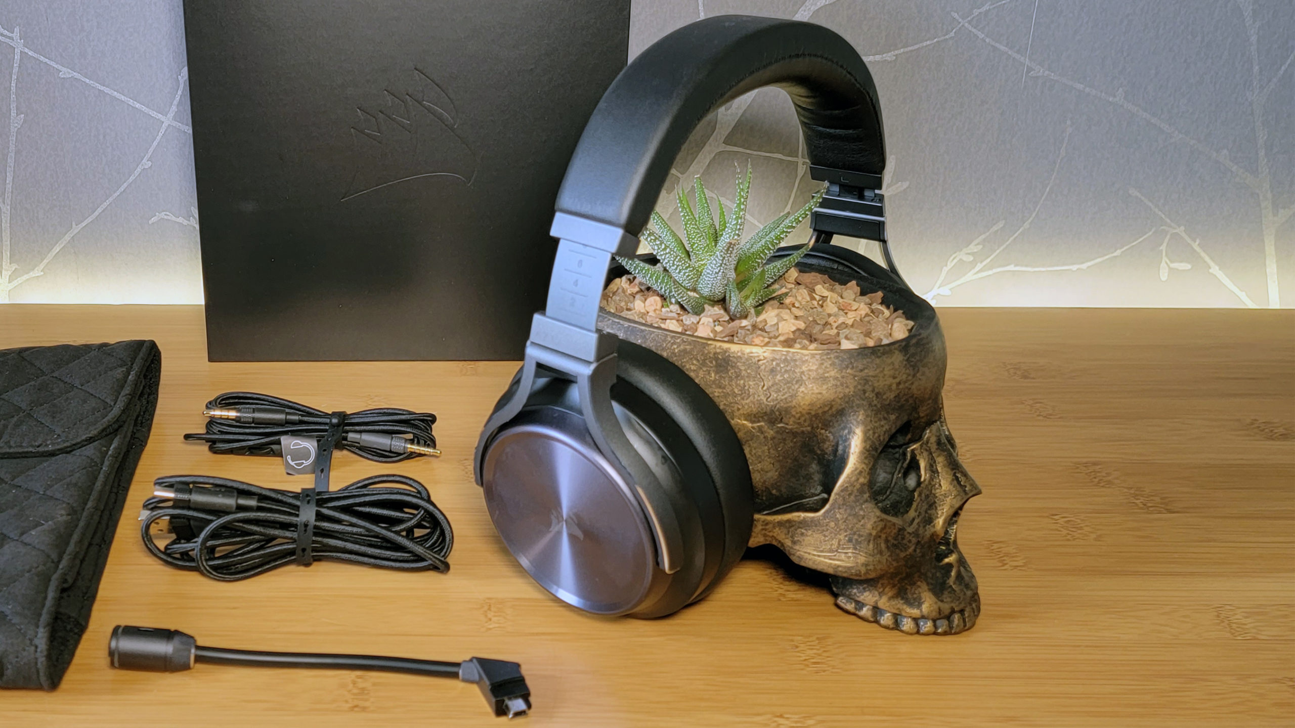
Corsair’s Virtuoso RGB Wireless XT headset is extremely comfortable, versatile and delivers great sound. It can also play audio from both a PC and Bluetooth device at the same time. But you’ll have to seriously need those abilities to shell out the $269 asking price.

silicon-power-xd80-2-tb-review

Silicon Power XD80 2 TB Review

Introduction

Silicon Power is a Taiwanese hardware manufacturer founded in 2003. In enthusiast circles, they are well known for providing high-quality flash storage products at reasonable pricing. Silicon Power’s various product lines include DRAM modules, SSDs, flash drives, and portable storage.

Today, we are taking a look at the Silicon Power XD80, which is the company’s new high-performance PCIe Gen 3 TLC-based SSD that was announced last month. The XD70 is based on a combination of a Phison E12 controller paired with TLC flash from Toshiba. A UnilC DRAM chip provides 512 MB of storage for the mapping tables of the SSD.

The Silicon Power UD70 comes in capacities of 256 GB ($48), 512 GB ($78), 1 TB ($126), and 2 TB ($243). Endurance for these models is set to 380 TBW, 800 TBW, 1665 TBW and 3115 TBW respectively. Silicon Power includes a five-year warranty with the XD80.

Specifications: Silicon Power XD80 2 TB
Brand: Silicon Power
Model: SP002TBP34XD8005
Capacity: 2048 GB (1907 GB usable)

No additional overprovisioning
Controller: Phison PS5012-E12S-32
Flash: Toshiba 96-layer BiCS4 TLC
DRAM: 1x 512 MB Xi’an UnilC Semi DDR3-1866L

SCB13H4G160AF-11M
Endurance: 3115 TBW
Form Factor: M.2 2280
Interface: PCIe Gen 3 x4, NVMe 1.3
Device ID: SPCC M.2 PCIe SSD
Firmware: ECFM13.3
Warranty: 5 years
Price at Time

of Review:
$243 / 12 cents per GB
amazon-echo-buds-review:-very-hard-to-beat-for-the-price

Amazon Echo Buds review: very hard to beat for the price

If you buy something from a Verge link, Vox Media may earn a commission. See our ethics statement.

Amazon’s new second-generation Echo Buds are the company’s second crack at true wireless earbuds. They’re smaller, lighter, and more comfortable than before, and now have more effective noise cancellation. The first time around, Amazon borrowed some of Bose’s tech to help the original Echo Buds block outside noise, but version two was built completely in-house. Hands-free Alexa voice commands still get top billing, but the most compelling thing about the Echo Buds is still their aggressive price — and the solid mix of features you get in exchange.

The Echo Buds cost $99.99 or $119.99 (with wireless charging case) for a limited time, after which the prices will rise to $119 and $139.99, respectively. Not only is Amazon undercutting premium noise-canceling buds from Apple, Bose, Sony, and others, but it’s also seemingly trying to obliterate mid-range options like the Anker Liberty Air 2 Pros.

The revamped Echo Buds are 20 percent smaller in footprint and have a shortened nozzle, so they protrude from the ears a bit less. They ditch the glossy outer touchpad for a matte design (though the side facing your ear is glossy) The Amazon “smile” logo is present on both earbuds, but it’s not as obnoxious as I assumed it’d be. It’s matte and printed onto the buds instead of being embossed or given a different texture to stand out, so the logo doesn’t really call attention. Still, I’d have preferred it not to be there at all. The charging case is far more understated; there, the smile logo is on the underside — where most people are never even going to see it.

Amazon’s blatant logo is unfortunate, but doesn’t call much attention.

That case has also been downsized and is roughly 40 percent smaller than the last gen, but still carries enough juice to provide the earbuds with two full recharges. The Echo Buds last for five hours with ANC enabled, which is extremely par for the course in 2021. This stretches to 6.5 hours if you disable noise canceling and hands-free Alexa. Oh, and the case does charging LEDs right: you get separate indicators for the case’s charge and both earbuds also have their own.

Amazon includes a plethora of ear tips and wing tips to help you get a perfect fit.

Amazon has included everything but the kitchen sink to help guarantee a good seal and snug fit. There are four sizes of silicone tips in the box — S, M, L, XL — and three different pairs of optional wing tips. The ear tips are color coded, which makes it much easier to tell the different sizes apart without having to squint at them. The wing tips might prove useful if you’re going to use the Echo Buds for intense workouts, but they weren’t necessary for everyday use or outdoor runs in my ears; the reduced size of the earbuds was enough to keep them locked in place for me.

The new Echo Buds now feature a vented design to cut down on ear pressure, similar to Apple’s AirPods Pro and recent Samsung Galaxy Buds models. But the flipside of this change means if you turn off ANC in the Alexa app (or with a voice command), you’re going to hear a fair mix of ambient noise. If you want to hear more, Amazon gets credit for its passthrough mode, which nearly matches the AirPods Pro and Bose in how natural sound it sounds. If you crank it up all the way, it almost feels like superpower hearing — but there’s a very noticeable hiss at max passthrough.

Amazon claims that the second-gen Echo Buds cancel out “twice as much noise” as the original pair, and the improvements are most concentrated in lower sound frequencies — exactly what you’d want for flights or bothersome hums around the house or office. But remember that the original Echo Buds utilized Bose’s noise reduction technology, which isn’t the same as full-blown active noise cancellation. (Even at the time, Bose said it could do better.) So while Amazon is advertising significant gains over the prior model, you won’t hear any claims that it’s outperforming earbuds from Apple, Bose, Jabra, or other companies. Those are different goalposts.

And the Echo Buds objectively aren’t as effective as the AirPods Pro or Bose QuietComfort Earbuds at turning down the volume knob on the outside world. You might assume that it’s because of the vented design — but the AirPods Pro have that design trait too — so it’s really just that Amazon’s proprietary noise cancellation tech doesn’t yet measure up to the best out there. Occasionally when holding the Echo Buds in my hands, I’d hear a high-pitched whine or squeal coming out of them. This has happened with other earbuds, and Amazon tells me it’s due to an ANC-related feedback loop. Amusingly, I’m also told there’s a “squeal detection algorithm” that’s meant to suppress this. The noise is never really a bother when they’re in your ears, thankfully, but it does pop up from time to time.

The new Echo Buds are 20 percent smaller than Amazon’s first-gen earbuds.
Photo by Chris Welch / The Verge

Passable ANC aside, the Echo Buds do sound good. They handily beat out the AirPods Pro at bass, which is becoming a regular occurrence at this point. Amazon says the 5.7mm drivers are “optimized for increased fidelity in bass and treble,” and they make for easy listening when you’re playing spoken word content like podcasts, audiobooks, or watching videos. All of this proves out as true when using them. The bass has ample kick and the treble is well contained and never gets earsplitting. Tracks like Lil Nas X’s “Montero (Call Me By Your Name)” or Dua Lipa’s “Don’t Start Now” are perfect demonstration of what the Echo Buds are good at. I get the impression that Amazon has tuned these with modern hits in mind.

But they do lack a layer of depth and texture that you’ll find in the higher price tiers of true wireless earbuds. Acoustic-heavy tunes aren’t as warm as they could be, and tracks like Phoebe Bridgers’ “Graceland Too” don’t have as wide of a soundstage. The powerful bottom end can make up for that somewhat on songs like “Chinatown” by Bleachers, where the bassline never gets lost to the synths, vocals, and guitars.

The earbuds have a vented design to reduce ear pressure.

So even before you get to the Alexa part of the equation, the Echo Buds establish themselves as worthy contenders at a hard-to-resist price. They also offer IPX4 water and sweat resistance, and voice call quality has improved some over the first-gen buds. Audio automatically pauses when either bud is removed, and each side can be used independently. Like most earbuds (save for those from Jabra), the Echo Buds lack multipoint Bluetooth pairing. Both AAC and SBC codecs are supported. Connection stability has been rock solid in my review period so far with only the rarest blip or dropout.

But how does Amazon’s voice assistant fare? Alexa can aptly handle music requests (“play my Release Radar on Spotify”), weather checks, smart home commands, and other activities that are normally smooth sailing on Echo speakers. Amazon says “later this year” the Echo Buds will get the same VIP Filter as its Echo Frames, which lets you pick which notifications you want to hear.

But on the whole, Alexa noticeably lags behind Siri and Google Assistant at more on-the-go requests. If you ask for directions, Alexa responds that you must tap a notification on your iPhone for those directions to actually open up in Apple Maps. It’s not a huge inconvenience, and some of this — like SMS messaging being limited to Android — boils down to platform restrictions, but there are often middle steps that don’t exist if you’re making the same ask of Siri or Google Assistant. (You also must grant the Alexa app full-time location access for directions to work.) It’s nice that I can ask these earbuds where the nearest COVID-19 vaccine site is or inquire about the status of a given subway line, but these are the kind of things that I’m always going to use my phone for. Getting people to change that default behavior is no small hurdle.

There were also bugs where I didn’t expect them. When I would say, “Alexa, turn on noise canceling,” it would often respond “sorry, what device?” Apparently “noise cancellation” is the term you’ve got to use, but it seems obvious that both should get you there. This was never an issue with voice commands asking to enable or switch off passthrough mode, which worked every time.

Amazon says it has built in a number of privacy-minded features to limit how often the microphones are listening for the “Alexa” wake word. At least one of the earbuds needs to actually be in your ear for the mics to function — they’re automatically muted when both are removed — and there must be an active Bluetooth connection to your phone. You can also manually mute the mics with the Alexa app or by customizing a long-press to do that.

The Echo Buds package together a lot of good for less.

Though Amazon promotes hands-free Alexa as a flagship feature of the Echo Buds, I think it’ll be a negligible value add for some buyers: the price, comfort, and sound are still enough to make these earbuds quite enticing. You’ve also got the choice of using your phone’s native assistant instead of Alexa, which is another option for the long-press command on the outside of a bud. So at least Amazon isn’t forcing anything on you.

If you don’t have an inherent resistance towards Amazon products (and some people certainly do), the 2021 Echo Buds strike a balance of features that’s downright impressive at their selling price. They’re a considerable upgrade from the first-gen earbuds in comfort with improved noise cancellation to boot — even if it’s not close to best in class. You can do better if you’re willing to spend upwards of $50 to $70 more. If you don’t want to go that high, the Echo Buds won’t disappoint.

Photography by Chris Welch / The Verge

biden-signs-executive-order-aiming-to-prevent-future-cybersecurity-disasters

Biden signs executive order aiming to prevent future cybersecurity disasters

President Joe Biden signed an executive order on Wednesday implementing new policies aimed to improve national cybersecurity. The executive order comes in the wake of a number of recent cybersecurity catastrophes, such as last week’s ransomware attack that took down the Colonial Pipeline, the Microsoft Exchange server vulnerabilities that may have affected north of 60,000 organizations, and the SolarWinds hack that compromised nine federal agencies late last year — each of which were specifically namedropped by the White House in a fact sheet accompanying the order.

The executive order outlines a number of initiatives, including reducing barriers to information sharing between the government and the private sector, mandating the deployment of multi-factor authentication in the federal government, establishing a Cybersecurity Safety Review Board modeled after the National Transportation Safety Board, and creating a standardized playbook for responding to “cyber incidents.” You can read more about all of the initiatives in the White House’s fact sheet here.

In the past few months, we’ve seen example after example of major IT systems breaking down, whether they allowed for a huge effort like the email server hack from the state-sponsored Chinese hacking group Hafnium (the White House promised a “whole of government response” to that one), a ransomware attack that forced public schools to cancel classes, or even a pair of breakdowns that appear to have allowed workers to remote into their local water supply and mess things up. The policies outlined in Wednesday’s executive order could create critical infrastructure to help prevent future cybersecurity disasters — or, at the very least, better limit any potential fallout.

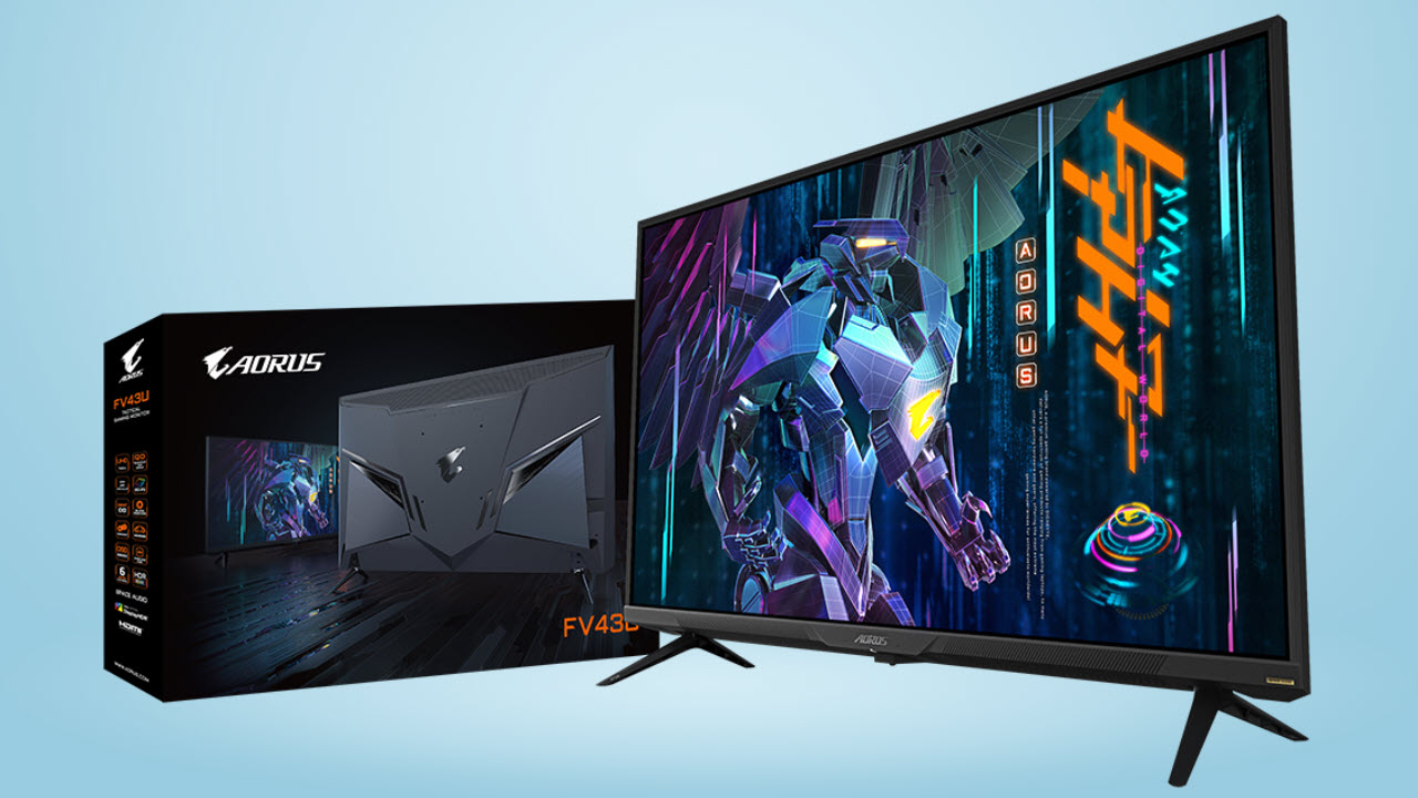
gigabyte-aorus-fv43u-usb-c-gaming-monitor-review:-king-of-the-43-inch-class

Gigabyte Aorus FV43U USB-C Gaming Monitor Review: King of the 43-Inch Class

Our Verdict

The Aorus FV43U misses a couple of things as a TV replacement, but for gaming, it has few equals. A huge and accurate color gamut coupled with high contrast, 4K resolution and 144 Hz makes it a great choice for both PC and console gamers.

For

  • + Class-leading contrast
  • + Huge color gamut
  • + Accurate out of the box
  • + Excellent HDR
  • + Solid gaming performance

Against

  • – No 24p support
  • – No Dolby Vision

Features and Specifications

If you’re looking for a jumbo-sized gaming monitor, there are plenty of routes you can take. There are multiple sizes of ultrawide 21:9 screens ranging from 34 to 38 inches diagonal. Then there’s the mega-wide 32:9, 49-inch genre. Or you can stick with flat panels in the 16:9 aspect ratio and go 32 inches or larger. Many simply opt for a TV, opening up the field to extra large displays that can top 80 inches.

If you want to stick with a desktop configuration though, the 43-inch category is a good choice. It’s large but not so big that you can’t sit close. It’s possible to play from 3 or 4 feet away, see the entire screen, and fill your peripheral vision with the image. And the 16:9 aspect ratio that 43-inch monitors come in means plenty of height, something that ultrawide and mega-wide monitors don’t have.

You can typically put a 43-inch gaming monitor on your desktop for around $1,500. That’s more than many 55-inch TVs but a computer monitor delivers a few things, like DisplayPort and high refresh rates, that consumer TVs do not. The Gigabyte Aorus FV43U makes the comparison a little easier, however, as it’s going for $1,000 as of writing. 

The FV43U is a 16:9 VA panel competing with the best 4K gaming monitors with a 144 Hz refresh rate, AMD FreeSync, HDR and a quantum dot backlight that’s specced to reach 1,000 nits brightness. It also delivers decent sound from its built-in speakers, thanks to multiple sound modes. Let’s take a look. 

Gigabyte Aorus FV43U Specs 

Panel Type / Backlight VA / W-LED, edge array
Screen Size & Aspect Ratio 43 inches / 16:9
Max Resolution & Refresh Rate 3840×2160 @ 144 Hz
  FreeSync: 48-144 Hz
Native Color Depth & Gamut 10-bit (8-bits+FRC) / DCI-P3
  DisplayHDR 1000, HDR10
Response Time (GTG) 1ms
Brightness 1,000 nits
Contrast 4,000:1
Speakers 2x 12w
Video Inputs 1x DisplayPort 1.4 w/DSC
  2x HDMI 2.1, 1x USB-C
Audio 2x 3.5mm headphone output
USB 3.0 1x up, 2x down
Power Consumption 54.3w, brightness @ 200 nits
Panel Dimensions 38.1 x 25.1 x 9.9 inches
WxHxD w/base (967 x 638 x 251mm)
Panel Thickness 3.5 inches (88mm)
Bezel Width Top/sides: 0.4 inch (10mm)
  Bottom: 1 inch (25mm)
Weight 33.8 pounds (15.4kg)
Warranty 3 years

By starting with a VA panel, the FV43U is already ahead of many premium gaming monitors that rely on lower contrast IPS technology. Most IPS monitors are specced for around 1,000:1 contrast, while the FV43U boasts 4,000:1 on its sheet and topped that dramatically in our testing with SDR and extremely when it came to HDR. HDR is aided by the monitor’s 1,000-nit backlight enhanced by a quantum dot filter for greater color volume, which our testing will also confirm.

Video processing leaves nothing under the table. The FV43U is one of the few 4K displays that can run at 144 Hz. It manages this over a single DisplayPort cable using Display Stream Compression (DSC). That means it can process 10-bit color, though it uses Frame Rate Control (FRC) to achieve this. FreeSync operates from 48-144 Hz in SDR and HDR modes. G-Sync also works with the same signals as verified by our tests, even though it’s not Nvidia-certified. (You can see how by checking out our How to Run G-Sync on a FreeSync Monitor tutorial). 

Peripheral features include two HDMI 2.1 ports, which support console operation, namely the PS5 and Xbox Series X, with variable refresh rates up to 120 Hz. The monitor’s USB-C port accepts Ultra HD signals up to 144 Hz. This is common among USB-C monitors as USB-C can replicate DisplayPort functions, but you’ll need a graphics card with USB-C, of course. The monitor’s USB-C port also allows for KVM switching (allowing you to control multiple PCs with a single keyboard, monitor and mouse) through additional USB 3.0 ports.  

Assembly and Accessories 

Two solid metal stand pieces bolt in place on the bottom if you set up on a desktop or entertainment center. Wall mounting is supported by a 200mm lug pattern in back. You’ll have to source your own bolts which should be part of any bracket kit. 

Product 360

Image 1 of 5

Gigabyte Aorus FV43U Remote (Image credit: Gigabyte)

Image 2 of 5

Gigabyte Aorus FV43U Side (Image credit: Gigabyte)

Image 3 of 5

Gigabyte Aorus FV43U Back (Image credit: Gigabyte)

Image 4 of 5

Gigabyte Aorus FV43U Top (Image credit: Gigabyte)

Image 5 of 5

(Image credit: Gigabyte)

From the front, the FV43U looks like any modern television with a narrow bezel around the top and sides and larger bit of molded trim across the bottom. The Aorus logo and a power LED are visible in the center. The stand puts the panel a bit less than 3 inches from the table, so it’s a good height for a desktop if you plan to sit around 4 feet back. The anti-glare layer is more reflective than most smaller screens, so plan placement accordingly if you have windows in your room.

A joystick for controlling the on-screen display (OSD) menu joystick is prominently situated on the panel’s bottom center but the easiest way to control the FV43U is with its tiny remote. It only has a few keys but they’re enough to zip through the OSD, change inputs and control the gaming features.

The back is where you’ll find most of the styling elements. Two slanted shapes are rendered in shiny plastic, along with an Aorus logo in the center. The rest of the finish is matte and features some brushed textures. Angles and straight lines are the order of the day with a generous grill at the top for heat dissipation. Speakers fire from the bottom vents and deliver 12W apiece (more on that in the Hands-on section). 

The input panel is on the right side which makes it easily accessible. You get two HDMI 2.1, one DisplayPort 1.4 and a USB-C, which also supports 144 Hz and Adaptive-Sync. The HDMIs are limited to 120 Hz but support Adaptive-Sync and 4K resolution, making it fit for console gaming.

OSD Features

The OSD looks just like the menu found in all Aorus monitors but you can make it larger so it can be more legible from across the room.

(Image credit: Tom’s Hardware)

The Gaming sub-menu has everything needed for competitive gameplay. At the top is Aim Stabilizer Sync, which is a backlight strobe for blur reduction. It’s one of the rare implementations that can work in concert with Adaptive-Sync, and it manages to do this without reducing brightness too much out of the box (of course, you can always turn the brightness up).

Black Equalizer makes shadow detail more visible; Super Resolution adds edge enhancement (not in a good way), Display Mode changes the aspect ratio and Overdrive offers four options. Balance is the best one, as it has good blur reduction, no visible ghosting and allows you to toggle Adaptive-Sync on or off.

(Image credit: Tom’s Hardware)

The Picture menu offers an extensive array of image modes (eight, plus three custom memories), along with color temp and gamma presets and something we normally see only on professional screens: selectable color gamuts. You can choose between Adobe RGB, DCI-P3, sRGB or Auto, but in our tests, Auto did not automatically switch the color gamut for different signal types. That means that if we wanted to watch SDR content in the sRGB it’s made in, we had to select the gamut manually. 

You also get Local Dimming, which increases contrast significantly. It makes the picture very bright as well, but highlight and shadow detail remain solid, so it is perfectly usable. However, we recommend leaving it off unless your room has a lot of ambient light because you can’t reduce brightness when it’s on. If you prefer a Low Blue Light mode for reading, that feature is in the OSD too.

(Image credit: Tom’s Hardware)

A single press of the large button in the center of the remote’s nav pad brings up a quick menu. Pressing left opens the Aorus dashboard, which can display your PC component’s internal temperatures and fan speeds. You’ll need a USB connection for this, but most motherboards will transmit the information to the FV43U.

A right press brings up Game Assist, which offers timers, counters, refresh rate info and aiming points. You also get a single cross in the OSD and can create additional reticles if you download the Aorus desktop app. Additionally, the OSD offers alignment marks in case you plan to set up additional FV43Us in a multi-screen configuration. Now that would be super cool! We’re thinking ultimate desktop flight simulator.

Gigabyte Aorus FV43U Calibration Settings 

The FV43U comes set to its Green (yes, that’s the term used in the OSD) picture mode. It has nothing to do with the color green but is fairly accurate out of the box – enough to make our Calibration Not Required list. But if you’re a perfectionist and want to tweak the image, choose the User Define color temp and adjust the RGB sliders. Gamma presets and color gamut options are also available. For the full native gamut, choose Auto or Adobe RGB. Either will deliver just over 100% of DCI-P3 coverage. sRGB is also very accurate, but we found it better to choose the sRGB picture mode rather than the sRGB gamut mode. Below are our recommended calibration settings for SDR on the Gigabyte Aorus FV43U.

Picture Mode Green
Brightness 200 nits 13
Brightness 120 nits 4
Brightness 100 nits 2 (min. 89 nits)
Contrast 50
Gamma 2.2
Color Space Auto or Adobe
Color Temp User Red 100, Green 97, Blue 99

When HDR content is present, there are four additional picture modes available: HDR1000, HLG, Game and Movie. HDR1000 is the most accurate, but locks out all image controls. Game and Movie allow for brightness and contrast adjustments and toggling and local dimming. We’ll explain that in more detail in the HDR tests. 

Gaming and Hands-on 

A question that should be answered when one considers buying a 43-inch gaming monitor is, will it function as a TV? Since some FV43Us will wind up in living rooms or entertainment centers, it’s important to know whether it can play well with things like disc players or streaming boxes.

There is no internal tuner so technically, the FV43U is not a TV. But its HDMI 2.1 inputs can accept input from any cable or satellite receiver, as well as a 4K disc player or streaming box like Apple TV. We tried a Philips BDP-7501 player and an Apple TV source. SDR and HDR10 signals were supported fine with one omission, 24p. Film cadences are present on any Blu-ray and in many streamed shows and movies from streaming services like Netflix and Amazon Prime (in addition to 50 and 60 Hz). The FV43U converted these streams to 60 Hz, which caused a bit of stuttering here and there. It wasn’t pervasive, but we occasionally saw artifacts. Note that the FV43U, like most computer monitors, doesn’t support Dolby Vision. We’ve only seen a few pro screens that includeDolby Vision. 

As a monitor for controlling Windows, the FV43U was a joy to use. With its vast area, we could clearly view four or five documents simultaneously. Sitting about 4 feet back, the pixel structure was invisible, but if we sat closer we were just able to see the dots. Color, meanwhile, was beautifully saturated, great for watching YouTube and browsing the web. If you want perfect accuracy for web browsing, the sRGB mode is available with a few clicks of the remote.

Gaming is also a blast with a screen this big. SDR games like Tomb Raider rendered in vivid hues with deep blacks, bright whites and superb contrast. The large dynamic range and accurate gamma mean that you’ll see all the detail present in the original content. That lends a realism seen on only the very best computer monitors.

HDR games, like Call of Duty: WWII, also showed tremendous depth on the FV43U. We played exclusively in the HDR1000 picture mode because of its very accurate luminance and grayscale tracking. The FV43Us large color gamut was put to good use here. It was readily apparent in skin tones and natural earth shades, like brown and green. That, coupled with nearly 39,000:1 contrast, made surfaces and textures pop with a tactility that we’ve only seen from premium screens like the Acer Predator CG437K or the Asus ROG Swift PG43UQ (both go for $1,500 as of writing). Without a full-array local dimming (FALD) backlight like that Acer Predator X27 and Asus ROG Swift PG27UQ have, the FV43U doesn’t quite make the very top tier of the best HDR monitors. But it comes awfully close to their image quality while delivering a lot more screen area.

The monitor’s two 12W speakers deliver sound that’s better than what you’ll hear from smaller monitors with much more bass and overall presence. Five audio modes help you tailor sound to your preference. If you’d rather use your best gaming headset, there’s a 3.5mm jack and an additional analog output for external systems.

Current page:

Features and Specifications

Next Page Brightness and Contrast