I would like to thank Lamptron for supplying the review sample.
Lamptron has been around since the early 2000s and is well known for its slew of fan controllers. In recent years, with the disappearance of external 5.25″ slots, Lamptron has expanded the line-up to internal components for both fan and RGB control, as well as several LCD monitors and RGB accessories. In this article, we will take a quick look at the Lamptron HX070, which is a 7″ display that may be used internally or externally.
Packaging and Contents
The Lamptron HX070 display comes in a brown cardboard box with a sticker on top to let you know what is inside. While the HC070 variant ships with AIDA64, this HX070 includes Lamptron’s own Hardware Monitor Software.
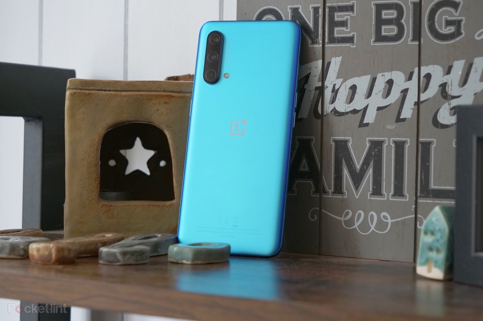
Taking a look at the display out of the box, it feels really sturdy with its metal housing. On the back, you can see that the controller board for the HX070 is also encased in the same material. In comparison, the Lamptron also offers an HC070 that comes with an exposed board. There are three connectors in the top. The Micro-USB and HDMI ones are for power and video, but what the third one is for is not clear.
You will receive an HDMI cable and a Micro-USB to USB-A cable to plug everything in properly. On top of that, Lamptron ships the HX070 with a desktop stand as well as a bracket for internal mounting within your chassis. The software comes stored on a Kingston USB drive with Lamptron branding.
Software
There are two parts to the Lamptron software kit. On one hand, it gives you direct access to your system’s sensor data. Out of the box, this comes as a 30-day trial with a user code. You have to email Lamptron the code to receive a unique registration code for the software. I am assuming this is due to the fact that this hardware monitor utilizes a 3rd-party code base with a per-user cost to Lamptron, so this is their way of ensuring the software is not freely passed around.
The second element of the software focuses on the screen and utilizes a total of ten templates, eight for landscape use and two for portrait mode. Below are the landscape ones, which were easy to screenshot, while you are able to take a peek at portrait mode in action further down. While some of these are made by Lamptron, several templates came from fans of Lamptron products. One even has an anime character dancing away for you on screen. I am sure there are fairly easy ways to edit the template, as many visual elements are just part of a static background image, so you should be able to replace outdated product or brand icons with little effort.
Display in Use
The coolest way to use the screen is certainly inside your system. While it is not nearly as bright as your desktop or notebook screen, it should do just fine without nearly 1000 W of studio lights fighting it. The sturdy bracket holds the unit in place nicely, and there is still ample room for bulky GPUs behind it. The HDMI and USB cables need to be routed outward, so an expansion slot bracket with holes in it would have been nice. Once booted, you actually see a Windows screen, as the Lamptron HX070 is a traditional IPS display at its core.
Cycling through the above-mentioned templates can easily be done by clicking the left or right edges of the screen with your mouse. That said, I like the default screen seen in this picture the most.
You may also use the screen outside the case by employing the included stand. Unfortunately, it is not specifically made for the screen and pretty clunky. A small monitor foot instead would have been better, as it could have been screwed to the housing, for example. You may also utilize the screen in portrait mode, as Windows allows you to rotate your desktop accordingly as well.
Once it is set as such, the two remaining templates may be used properly as well. You may even conduct traditional tasks, like “surf” to TechPowerUp on the HX070. While its native resolution is 1024×600 pixels, scaling to 1080P works really well by the way.
Conclusion
The Lamptron HX070 is at its core a 7″ IPS panel with 1024×600 resolution running at 60 Hz. Lamptron has gone as far as figuring out an interface for it to utilize USB as power and HDMI for your video signal. Furthermore, Lamptron has built a steel enclosure for the screen and, in the case of the HX and HM series, the controller board as well.
To round out the total package and present a unique use case, Lamptron includes an internal mounting bracket, which is where the screen really seems to fit best. In terms of the software front, while simple, it is nice to have the templates which can be edited fairly easily by the user, and Lamptron’s simple yet functional Hardware Monitor Software.
Priced at $150, the HX070 is certainly not cheap for a screen, but could still be an interesting purchase for those looking to add something really unique and special to their build.
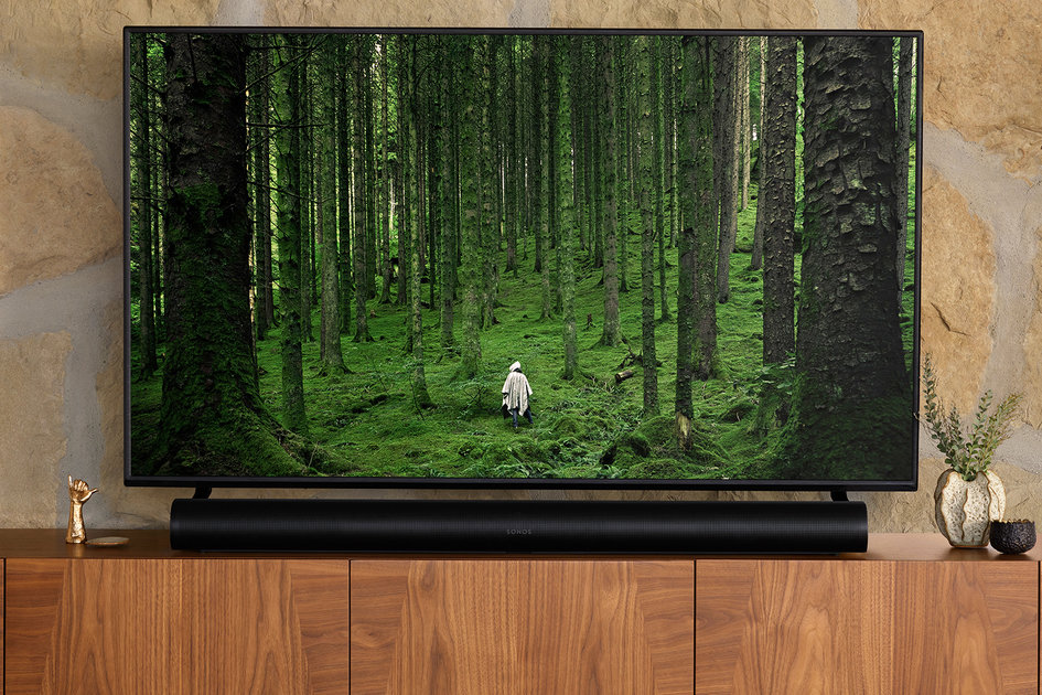
(Pocket-lint) – Sonos is not one for racing new products out for the sake of it. Its Playbar, for example, ruled the roost for seven years, being its only full-fledged soundbar in that time.
The Sonos Beam arrived in the meantime, but was more meant for smaller TVs and rooms, giving you a better alternative than the speakers on your flatscreen rather than cinematic experience. So, a replacement to the Playbar was long overdue.
That’s where the Sonos Arc came in. But it didn’t just replace the Playbar, it brought so many new bells and whistles to the party that it is an altogether different beast. One with Dolby Atmos – a first for the company – to deliver a virtual surround-sound experience from the single ‘bar.
Design
Dimensions: 87 x 1141.7 x 115.7mm / Weight: 6.25kg
Can be wall-mounted or laid on a TV cabinet
Black and white options available
Adjustable status LED
Putting its tech and audio prowess to one side for a minute, the Sonos Arc is a sleek looking soundbar that matches the aesthetic of the company’s One and Move standalones.
Best soundbar: Options to boost your TV audio
It is long – almost the length of a modern 55-inch flatscreen TV – but more subtle than its predecessor, with a plastic alloy build and grille to front and sides. Even the logo fades away when you’re not staring directly at it, whichever finish you choose (there’s black or white, nothing more outlandish than that).
Pocket-lint
We particularly like that there are no contrasting flourishes in the design, as there’s nothing worse than catching a soundbar out of the corner of your eye while watching an intense moment in a film. Unlike children, speaker systems – and especially soundbars – should be heard and not seen. The subtlety of Sonos’ bar ensures that is the case, whether it’s wall-mounted or laid flat on a TV stand.
There are a few touch buttons on the top for play/pause and volume adjustment, but the Sonos app is so simple to use we couldn’t see ourselves bothering with them. Plus, as it is HDMI eARC-enabled, you can mainly control the soundbar through your TV remote for general use.
What is HDMI eARC? Why is it different to HDMI ARC?
The only other distinguishable icon on the bar itself is a microphone symbol, indicating that it is voice-enabled, with support for both Amazon Alexa and Google Assistant. You can tap it to turn on/off the listening mode – signified by a small LED light.
Connections
Ethernet (10/100 Mbps) and Wi-Fi (802.11b/g, 2.4GHz)
HDMI eARC (with optical digital audio adapter)
IR sensor on the front
Around the rear, hidden in an alcove, there are connections for power, HDMI and Ethernet. That’s it.
Pocket-lint
Those not wanting to connect the Arc through HDMI will be pleased to know that a digital optical audio adapter is included in the box, but that will effectively disable any Dolby Atmos support, as that requires hooking it up to an HDMI eARC/ARC port on a compatible TV. You’ll still get very effective multichannel surround sound, just not Atmos.
Also missing (if setup using the optical connection) will be the ability for full automation through your TV’s remote control. There is an infrared (IR) sensor, so you can set your remote to also adjust volume, but that’s a less elegant solution than using HDMI CEC (standing for Consumer Electronics Control) between TV and Arc. It also emits automated audio sync between them.
Still, if it’s all you’ve got then that’s fine – you’re still getting a superb sound system and are future-proofed to boot.
Plus, while there are plenty of TVs with at least one ARC-enabled HDMI port, only more recent models support Dolby Atmos decoding or passthrough. Even fewer support the full HDMI eARC standard, so it’s possible you might consider the soundbar with an eye on upgrading your TV somewhere down the line.
Pocket-lint
As well as 10/100 Mbps Ethernet for wired network connection, single-band (2.4GHz) Wi-Fi is available too.
Features
Dolby Atmos support (through HDMI eARC/ARC)
Built-in Google Assistant and Amazon Alexa voice assistants
Runs on new Sonos S2 software
Apple AirPlay 2 support
Sonos multiroom compatible
As well as Dolby Atmos – which we’ll come to in a bit – the Sonos Arc is quite a step up over the Playbar when it comes to features.
Support for Amazon’s Alexa and Google Assistant is wholly welcome, for starters, implementing in similar fashion to Sonos One and Move.
The Arc has a four far-field microphone array built in that detects voice from a fair distance. We walked around a decent sized living room, even stepped outside for a moment, and it could still hear and recognise our voice.
Pocket-lint
FEATURE UPGRADE
Both services are setup through the Sonos app and, subsequently, their own individual applications on iOS and Android, so once complete act almost exactly as they would on any other supported device.
You can only use one assistant, having to disable the other if you swap, but it’s great to be given the choice. And, depending on Amazon and Google’s compatibility, it means you can play and control music by vocal command, across streaming services, and your own digital library.
You can also technically use your Arc to control your TV, if it too is Alexa and/or Google Assistant-enabled.
Apple AirPlay 2 is also supported by the soundbar, to present the cleanest possible audio sent wirelessly from an iPhone, iPad or Mac. And, Sonos’ Trueplay audio tuning during setup ensures that the output matches your surroundings through very simple instructions.
What is Sonos Trueplay and how does it work?
Of course, the Arc’s biggest, most attractive feature is that it is a Sonos speaker.
Sonos has provided an integrated, connected multiroom solution for many years, and has refined the experience over time. Today it is compatible with all the big music streaming services, including Spotify, Apple Music, Amazon Music, Deezer, Tidal, and more. There is also Sonos Radio, the brand’s own free service with ad-supported stations and curated playlists, so even if you aren’t a member of a third-party platform, you will still have plenty to listen to.
Pocket-lint
As Sonos products also connect wirelessly to each other, through your home network, you can sync the same songs playing on your Arc to, say, a Sonos Five speaker in another room, for example. You can group multiple speakers together and have them all play the same music. It’s great for house parties, that’s for sure.
Alternatively, you can use the interoperability to hook up a couple of Sonos One speakers to work as rear speakers, using your Arc as the front, centre and height channels. And adding a Sub for extra bass is made as simple as possible.
A decent feature set is all well and good, but the most important aspect of a soundbar is the sound itself. And the Arc does not disappoint when it comes to spatial performance.
Sonos
It effectively presents a virtual 5.0.2 soundfield with Atmos engaged, 5.0 when not. Dedicated centre, left and right channels provide the front-facing effects. Two other channels angled at either end of the bar provide virtual surround, while a pair of additional drivers point upwards to reflect Dolby Atmos height channels off the ceiling and back to the listening position.
There are eight woofers and three tweeters in all, each with its own Class-D digital amplifier, and when all are working in unison it presents a wall of sound that belies the simple, thin form factor.
We advise pairing the Arc with the Sonos Sub, as that will put extra growl into the bass, but we’re already impressed with the overall effect when it’s playing solo, including low frequencies.
As we’ve mentioned above, you can also add a pair of additional Sonos speakers for true rears/surrounds, but the reason why many invest in a soundbar is for its simplicity. Unless you are a true home cinema buff, you’ll already be impressed with the Arc’s out-of-the-box experience.
We tested the Arc using the latest Sonos software (Sonos S2) and several sources. We also used a Philips OLED754 TV, which has Dolby Atmos processing on board and passthrough – which we activated.
This allowed us to play a few Netflix shows that come with Atmos sound, plus several 4K Blu-rays: The Rise of Skywalker, John Wick 3 and Ready Player One. The second John Wick sequel is an especially good check disk for Dolby Atmos, with rain effects utilising the height channels throughout the first few scenes.
Pocket-lint
Perhaps the best test came via our Xbox One X. The Dolby Access app for the console (plus the One S) comes with a great collection of game and movie trailers featuring Atmos mixes, plus a few of Dolby’s own demo clips. They each gave the Sonos Arc a great workout, which it passed with flying colours. It provides a wall of sound, with clear precise spacing, even at extreme volumes.
When listening to the Arc you get an impression of audio above the seating position, plus a widening of the soundscape. But you also get a bold, cinematic presentation that seemingly comes straight from the TV screen. Having a dedicated centre also allows for clean vocal tracks.
In music terms, listening to high-res mixes of Price’s Purple Rain and The Rolling Stones’ You Can’t Always Get What You Want streamed over Tidal perfectly illustrated the bar’s ability with mid and high frequencies. Even bass response is more than acceptable for music playback.
You are still likely to want a separate Sub to get the most from genres utilising sub-bass – d&b and dubset heads, that’s you – but even without that additional cost the Arc’s neutral tones are a great starting point for all genres.
Verdict
The Sonos Arc is a highly-accomplished bit of kit. There are caveats: it only works with the Sonos S2 software, so cannot be part of the same multi-room setup as older legacy kit; and, without a separate source input on the bar, your TV needs to have Dolby Atmos and HDMI ARC/eARC support to use it at its fullest.
However, those are minor points really as, like the Playbar before it, this is a speaker with the potential to be relevant for the next seven years or more. Your surrounding kit will inevitably catch-up.
In the meantime, the Arc presents an exemplary sound experience even without Dolby Atmos – which accounts for 90 per cent or so of the audio you’ll pump through it anyway. And, with Alexa and Google Assistant built-in, plus AirPlay 2 and Sonos’ own feature-filled music platform, you have yourself a very compelling speaker system to elevate your entertainment no end.
It’s pricey, granted, but you’re getting a tough-to-rival feature set and a very classy act all told.
Also consider
Samsung
Samsung HW-Q90R
squirrel_widget_189189
If you’re not bound to Sonos’ multi-room system idea, yet want a true surround sound system in the one box, Samsung delivers a 7.1.4 with ‘bar, sub, rear speakers and Dolby Atmos support out of the box. All for a very reasonable price considering.
Read our review
Writing by Rik Henderson. Editing by Britta O’Boyle.
(Pocket-lint) – Google is expected to announce the Pixel 6 and Pixel 6 Pro smartphones towards the end of the year, succeeding the Pixel 5 that arrived in October 2020.
We’ve compared how the Pixel 6 and Pixel 6 Pro could compare based on the speculation in a separate feature, but here we are focussing on how the Pixel 6 might stack up against the Pixel 5.
Design
Pixel 5: 144.7 x 70.4 x 8mm
Pixel 6: 158.6 x 74.8 x 8.9mm, 11.8mm with bump
Pixel 6 Pro: 163.9 x 75.8 x 8.9mm, 11.5mm with bump
Based on the rumours, the Pixel 6 and 6 Pro will offer a complete redesign compared to the Pixel 5. Renders suggest a rectangular camera housing will stretch across the entire width of the devices on the Pixel 6 and 6 Pro compared to the square housing positioned in the top left corner on the Pixel 5.
It also looks like the punch hole camera at the top of the display will move to the centre in the Pixel 6 and 6 Pro, repositioning from the top left corner on the Pixel 5.
The other big change in design appears to be the introduction of an under-display fingerprint sensor on the Pixel 6, rather than the physical sensor on the rear of the Pixel 5. The Pixel 6 and 6 Pro also both appear to be a little more exciting in terms of colours, with blocks of colours on the rear based on the leaked images.
In terms of physical measurements, it looks like the Pixel 6 and Pixel 6 Pro will both be larger than the Pixel 5, as well as thicker. The Pixel 5 has an IP68 water and dust resistance, and we’d expect the same from the Pixel 6 and 6 Pro.
Display
Pixel 5: 6-inch, Full HD+, 90Hz
Pixel 6: 6.4-inch, Full HD+, 120Hz
Pixel 6 Pro: 6.67-inch, Quad HD+, 120Hz
Rumours suggest the Google Pixel 6 will come with a 6.4-inch display and the Pixel 6 Pro with a 6.67-inch display. If true, both devices would be bigger than the Pixel 5’s 6-inch display.
It’s thought the Pixel 6 will likely come with a Full HD+ resolution, a flat screen and a 120Hz refresh rate. The Pixel 6 Pro meanwhile, is thought to be coming with a slightly curved display, a Quad HD+ resolution and a 120Hz refresh rate.
The Pixel 5 has a 6-inch display that has a Full HD+ resolution at 2340 x 1080 for a pixel density of 432ppi. It offers a 90Hz refresh rate and it has HDR support, which the Pixel 6 and 6 Pro are both likely to offer too.
It’s thought the Pixel 6 and 6 Pro will run on an in-house chip Google is said to be working on codenamed Whitechapel. The chip is claimed to have a raw performance somewhere between the Qualcomm Snapdragon 888 and the Snapdragon 865. It’s expected to offer 5G capabilities.
RAM and storage options haven’t been detailed as yet in leaks, though it’s said the Pixel 6 will have a 5000mAh battery capacity, so we’d expect the same or higher from the Pixel 6 Pro.
The Pixel 5 runs on the Qualcomm Snapdragon 765G processor, with 8GB of RAM and 128GB storage. There’s no microSD support. The battery capacity is 4000mAh and the Pixel 5 supports fast charging and wireless charging, both of which we would expect on the Pixel 6 and Pixel 6 Pro.
Camera
Pixel 6: Dual camera
PIxel 6 Pro: Triple camera
Pixel 5: Dual camera
It’s claimed the Pixel 6 will have a dual rear camera with talk of a 50-megapixel main camera coupled with an ultra wide-angle lens.
The Pixel 6 Pro meanwhile, is said to have a triple rear camera with the same 50-megapixel main sensor and same ultra wide angle lens as the Pixel 6, but with the addition of an 8-megapixel telephoto sensor too.
The Pixel 5 has a dual rear camera comprised of a 12.2-megapixel dual-pixel main camera with 1.4µm pixels and a f/1.7 aperture, along with a 16-megapixel ultra wide-angle lens with 1.0µm pixels and an f/2.2 aperture.
The front camera on the Pixel 5 is an 8-megapixel sensor with 1.12µm pixels and an f/2.0 aperture.
Conclusion
Based on the speculation, the Pixel 6 and Pixel 6 Pro will offer a big redesign compared to the Pixel 5, along with larger displays, faster refresh rates and upgrades in hardware.
It also looks like the camera offering will be more advanced on the Pixel 6 and certainly the 6 Pro with the possible addition of a telephoto lens, but nothing is confirmed as yet and we’re still waiting for more rumours on the RAM and storage options.
You can follow all the rumours for both the Pixel 6 and Pixel 6 Pro in our separate round up features.
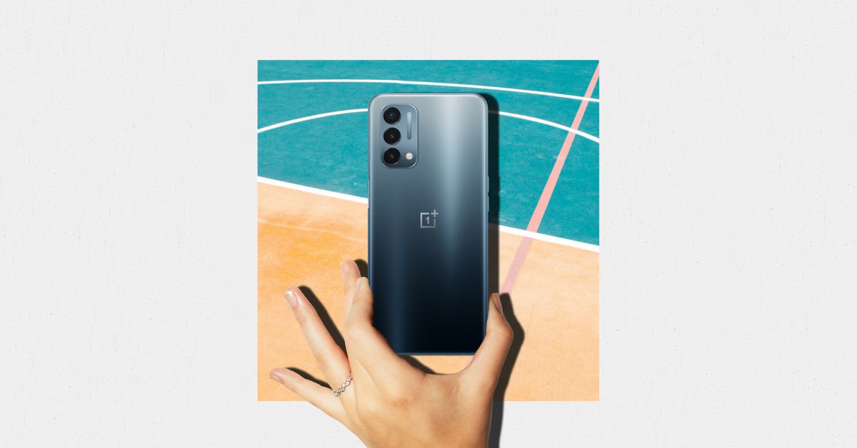
(Pocket-lint) – The mid-range market is heating up. And in this instance, when we say mid-range, we mean the less expensive phones, not necessarily the low powered devices. That’s because in this comparison we’re looking at two fast, smooth phones that won’t leave you wanting.
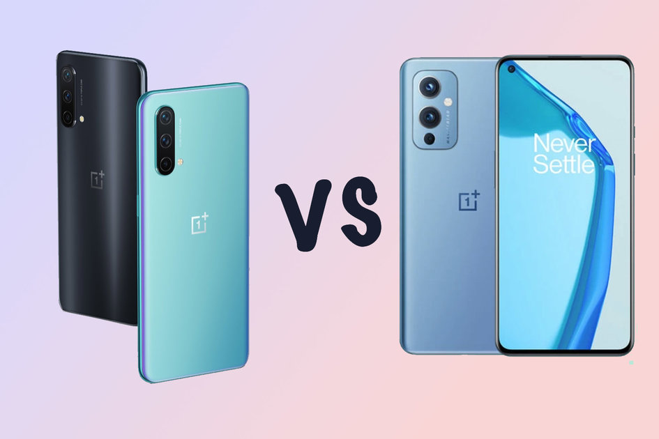
Those two phones are the excellently priced Poco F3 and the OnePlus Nord CE. Both offer great features and capabilities for what you pay, but each takes a slightly different approach.
squirrel_widget_4947367
Design
Nord CE: 159.2 x 73.5 x 7.99mm – 170g
Poco F3: 163.7 x 76.4 x 7.8mm – 196g
Nord CE: Plastic back and frame – no official water resistance
Poco F3: Glass back, plastic frame – IP53 splash resistance
Design could actually be one area that decides it for you, if only because of the difference in size. The Nord CE is noticeably more compact. At least, when it comes to width and height. There’s not much difference when it comes to thickness, there’s only a tenth of a millimetre between them, and both are generally quite slim.
The two phones each have their own practical benefits too. For instance, the Nord CE has a 3.5mm port for wired headphones and headsets, where the F3 doesn’t. Poco F3 has IP53 rating against water and dust, which means it’s basically splash proof. OnePlus doesn’t have that, but the company has told us it should survive splashes okay.
One thing we like, surprisingly perhaps, is the fingerprint sensor in the Poco. It has a physical reader in the button on the side that’s not just thin, but quick and reliable too. OnePlus’ we found was decent enough. It was reliable, just not as quick.
Then there’s the hole-punch cutout in each screen. Poco’s is much smaller, and so doesn’t interrupt as much of the available surface area. It’s also placed nicely in the centre, out of the way.
W love the feel of the Poco in two hands, typing away. It’s a great two-handed device, but the frosted plastic finish on the back of the Nord CE is really nice, and looks fantastic in the Blue Void colour.
What’s more, it’s nearly 30 grams lighter, and that’s something you can definitely feel when it’s in your hand. And the size makes a difference too. If you want something that’s easy to hold and carry around with you in your pocket, the Nord is the one.
One minor thing we noticed when typing – the Poco has a much more subtle haptic feedback than the Nord CE, which gives a nasty buzz when you’re typing.
Displays + Media
Nord CE: 6.43-inch – AMOLED – 90Hz – fullHD+ (1080 x 2400)
Poco F3: 6.67-inch – AMOLED – 120Hz – fullHD+ (1080 x 2400)
Nord CE: Single loudspeaker + 3.5mm port
Poco F3: Stereo speakers
Despite spec lists that look a different, there’s not a huge amount in this as long as you’re happy to go into the settings menu and adjust things. That’s because that while both have AMOLED fullHD+ displays at 1080×2400 resolution, their default settings are quite different.
OnePlus default vivid mode seems to boost reds, so white skin tones looks a lot pinker than they are, while the automatic mode on the Poco seems to over-saturate blues and make them unnatural. Thankfully, both have display settings that allow you to calibrate it to the way you’d like to have it.
Poco’s reaches refresh rates of 120Hz, which is higher than the 90Hz on the OnePlus. But to our eye, it’s really hard to tell the difference in daily use. Poco’s does feel fluid in the general interface, but so does the Nord. We wouldn’t suggest basing your purchase decision on this.
Instead, there are other factors, like the fact Poco’s screen is larger, making it a great immersive canvas, joined by stereo speakers to enhance that. Nord CE only has the single loudspeaker. The screen is also brighter. In that way, it’s a much better device for media consumption.
Performance
Nord CE: Snapdragon 750G – 5G
Poco F3: Snapdragon 870 – 5G
Nord CE: 6GB/128GB – 8GB/128GB – 12GB/256GB
Poco F3: 6GB/128GB – 8GB/256GB
Nord CE: 4500mAh battery – 30W fast charge
Poco F3: 4520mAh battery – 33W fast charge
As with any point of comparison on this list, you could easily make a judgement on performance and battery from just looking at the spec sheet and assume the Snapdragon 870 will give you much better performance then the Snapdragon 750 in the Nord CE, but that will depend on exactly what you use it for.
In truth, when it just comes to general day-to-day phone usage and casual gaming, both will run even the most demanding games pretty easily.
Where we did notice a difference was in load times for the bigger games like CoD Mobile where it took a second or two longer on the Nord CE. The Poco seems to render sharper images in those games with more demanding graphics, without stuttering and lag too. The Nord by comparison – while smooth and responsive – had more jagged edges and slightly less detail.
Technically speaking, the 870 is the more powerful chip and will benchmark way higher, offering better high refresh rate performance and you will see it in the more graphically demanding titles if you put them side-by-side.
As for battery life, both have very similar capacities. It’s 4500mAh on the Nord and 4520mAh on the Poco, both with their own fast-charging. 30W vs 33W.
That means each will get you a full battery in just under an hour, roughly. They’ll both even get you similar battery life. We lasted about a day and a half with both phones, using them for casual gaming, social media and such throughout the day.
Cameras
Nord CE primary: 64MP – f/1.8 – PDAF
Poco F3 primary: 48MP – f/1.8 – PDAF
Nord CE: 8MP ultrawide – 2MP monochrome
Poco F3: 8MP ultrawide – 5MP macro
So Poco has it when it comes to performance and media, where we think Nord is a better phone is in the camera. Speaking about the primary lens here, it seems to take shots which have much more natural colours and depth.
The processing on the Poco phone is quite aggressive sometimes depending on what you’re shooting, making colours seem too saturated and contrast a bit dark at times. Often it didn’t produce great HDR effect either, completely bleaching out the sky on some shots, while just about getting it right on others. It was just a bit inconsistent in that regard.
Neither is particularly good at focussing on objects that are close to the camera, and both have ultra wide lenses with similar performance. But for the most natural processing of colours, detail and depth, we’d say the OnePlus is the one to go for here.
squirrel_widget_4530346
Price
Nord CE: From £299
Poco F3: From £329
There’s little difference in price between these two phones. In fact, in the UK, the Poco F3 starting price is only £30 more than the Nord CE’s. It’s worth nothing that’s just the recommended retail price, and you could find it cheaper now that it’s a little older.
For those looking for more storage, the 256GB model Poco F3 is actually cheaper than the OnePlus Nord CE model with 256GB storage. So that’s also worth considering. In that instance it’s £349 for the F3 and £369 for the Nord CE in the UK.
Verdict
So in the end there are a couple of things to consider. The OnePlus is more compact, lightweight and – we think – has a better primary camera. The Poco has a bigger display, faster performance and the stereo speakers for better media and gaming consumption. There’s a little difference in price, with the Poco being slightly more expensive.
So what matters most to you: multimedia and speed or practicality and cameras? If you can answer that, you know which is the right phone for you.
OnePlus has confirmed that the inexpensive Nord N200 5G will be available in the US and Canada starting on Friday, June 25th, for $239, making it one of the most affordable 5G phones in the US. With US wireless carriers demanding more 5G devices, the N200 will likely get a lot more company soon.
OnePlus had previously dropped a few other details about the upcoming device, like its 6.49-inch 1080p display with 90Hz refresh rate and big 5,000mAh battery. Other newly confirmed specs include a Snapdragon 480 5G chipset (also used by the freshly announced Motorola Moto G Stylus 5G), 4GB of RAM, 64GB of expandable built-in storage, and a rear triple camera with a 13-megapixel main camera. OnePlus doesn’t specify details for the other two rear-facing cameras, but the N100’s 2-megapixel macro and 2-megapixel depth sensor are likely candidates. There’s a 16-megapixel selfie camera around front, and the N200 offers 18W charging.
The N200 5G features three rear-facing camera sensors, including a 13-megapixel main camera.Image: OnePlus
The N200 5G becomes one of the least expensive 5G phones to go on sale in the US, coming in $40 cheaper than the similarly specced Samsung Galaxy A32 5G and $60 less than OnePlus’ own Nord N10 5G. It’s likely to gain more competition in the near future, too, as other manufacturers adopt low-cost 5G chipsets like the 480 5G and wireless carriers aim to put more 5G phones on their shelves (and more customers on premium unlimited 5G plans).
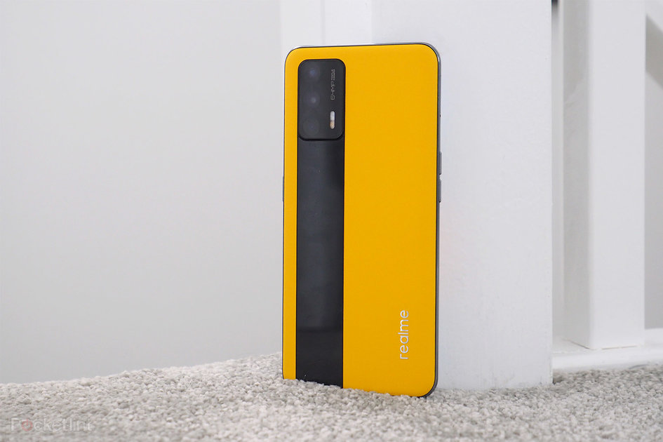
(Pocket-lint) – It’s probably no surprise that the Realme GT’s international reveal happened just one day after the OnePlus Nord CE hit the headlines. Because, while the GT isn’t a direct competitor – it’s actually more powerful than OnePlus’ more budget offering – it’s certainly a handset that wants to lead the young brand’s charge on OnePlus’ ongoing dominance in the alt-flagship space.
It’s even pulled the same old-hat promotional tagline – “flagship killer” – which is rather cheeky. But that gives Realme a platform upon which to stand. It is a bit cheeky. It has previously released phones with eye-slapping phrases plastered on them – we lambasted the Realme 8 Pro for its ‘Dare To Leap’ slogan. It’s that bit different, that bit of fun.
With the Realme GT the company is looking to enter the fast lane – the ‘Grand Tourer’ name reference name says it all really – for this alt-flagship has top-tier Qualcomm processing power, a more grown-up looking vegan leather finish than earlier Realme devices, and arrives at a price point that could make you pay attention to this brand over better-established products such as, say, a Moto G100 or Xiaomi Mi 11 Lite.
Design & Display
6.43-inch AMOLED panel, 1080 x 2400 resolution, 120Hz refresh rate
Colours: Racing Yellow, Dashing Silver, Dashing Blue
Dimensions: 156 x 73 x 9.1mm / Weight: 186g
Finishes: Vegan leather or glass back
In-display fingerprint scanner
With phones often gigantic slabs these days, it’s rather refreshing to hold onto the Realme GT – because it’s sensibly proportioned, not too thick even in its vegan leather finish, and is on the right side the 200g weight barrier (a limit that we’ve pretty much decided to impose having handled the all too heavy Xiaomi Mi 11 Ultra).
Motorola’s new Moto G9 Plus is a stunner of a phone – find out why, right here
By Pocket-lint Promotion
·
Pocket-lint
That the volume control buttons are on the opposite side to the Realme GT’s power button – a rarity in most Android phones – is something you might not immediately love, but we stuck with it and it’s actually a sensible layout. Taking one-handed screengrabs is easier, as one beneficial example.
But it’s not the layout that’ll first catch your attention. It is, but of course, that bright yellow rear – which Realme calls ‘Racing Yellow’, keeping in theme with that GT name. It’s a bold, bright finish, almost like an exemplary Pantone shade card for what a true yellow should represent.
That it’s vegan leather is another standout point, but less for its apparent environmental kudos – although there’s an argument that processes for this material aren’t actually Thunberg pleasing – and more for its tactile quality. It’s nice and grippy. It doesn’t become smeared in heaps of fingerprints. It looks consistent – and the black stripe down from the integrated cameras panel helps to soften the look.
Pocket-lint
Why, then, Realme has decided to (literally) stick its logo onto the rear is a big question. This silvered stick-on will inevitably fall off over time – not that we’ve actively been picking at it. Maybe that’d be for the better though – we’re not fans of any brand sticking big logos onto its phones. Motorola used to, before realising it looks much better to be subtle. Still, Realme ought to deboss or emboss for added chic.
Flip the phone over to its front and the Realme GT houses a 6.43-inch AMOLED panel, delivering a screen that’s capable of deep blacks and strong colours. Sadly, however, its auto-brightness adjustment is so shy that you’ll often end up squinting at the dulled screen trying to find the manual brightness slider. At maximum brightness it can remain visible in outdoor sunlight though. At lowest brightness there’s some ‘black crush’ to visuals, which is fairly common – an issue other Oppo phones present (Realme is effectively under the same umbrella as that brand).
Pocket-lint
Interestingly this panel has some top-end features, such as a 120Hz refresh rate, to keep visuals extra smooth and easy on the eyes. You needn’t have the 120 refreshes per second active for the sake of battery life, though, as a 60Hz option is found within the menus – which is on by default anyway. In terms of resolution the Full HD+ span of pixels over the 20:9 aspect ratio panel delivers ample detail – these days you don’t really want or need much more, as it rarely enhances apps and mostly just squeezes the battery life.
Performance & Battery
Qualcomm Snapdragon 888 platform, 8GB/12GB RAM
Realme UI (v2.0) software over Google Android 11 OS
4,500mAh battery capacity, 65W fast-charging
Stainless steel cooling system
5G connectivity
That the Realme GT can cope with a 120Hz refresh rate is no surprise given its top-end hardware under the hood. There’s a Qualcomm Snapdragon 888 processor, paired with 8GB or 12GB RAM (there are two variants, we have the lower spec 8GB model in for review).
Pocket-lint
It’s this “my processing power’s bigger than yours” angle that will garner the GT a lot of attention – especially for its asking price. And so it should, for this Realme performs really well whether you’re casually navigating between pages and apps, or digging deep into a gaming session.
Other than when recharging it doesn’t overheat either, which is impressive in the context of a faux leather-backed device with such a strong performance engine running things. The stainless steel cooling system designed within must be part of the reason for the apparent well-managed heat dissipation.
With mixed use we’ve found the GT’s battery life to be perfectly acceptable. Long days will see you finish close to the 20 per cent mark, after around 18 hours, but that includes some gaming so we think that’s pretty good innings. Besides, with a 65W fast-charging capability – no wireless to be found here – topping it up is speedy. It can even learn your typical charging pattern as to not refill the battery too quickly, which will help with long-term battery health.
We suspect the GT could last longer if various settings were activated to throttle the experience. But we’re glad that’s not the case. So often we hit a wall with, say, a Xiaomi phone because its software default controls the way in which apps respond – often causing notification issues or delays. Realme doesn’t have that issue; its Realme UI (version 2.0 here) is effectively a rework of Oppo’s ColorOS, which we’ve found in recent iterations to be generally pleasing.
Cameras
Triple rear camera system:
Main (26mm): 64-megapixel, f/1.8 aperture, Sony IMX682 sensor, 0.8µm pixel size
Given the phone’s price point its camera setup is the one area to expect some compromise. Realme has gone down the “triple camera” route – but, really, it’s a main camera paired with ultra-wide that show their worth, while the low-resolution close-up macro camera isn’t even worth including in our view. It’s a trap so many makers have fallen into – to oversell their cameras.
Anyway, that’s not to say expect bad things all across the board. As a straightforward point-and-shoot camera the main 64-megapixel sensor – which uses six-in-one processing to deliver 12-megapixel results by default – is capable enough. For sharing snaps on socials and so forth it’ll deliver the goods.
That said, however, it’s not the most refined in terms of processing. Where detail lacks – subject edges such as buildings, or busier areas such as trees and shrubs – there’s oversharpening, often to the detriment of realism. Colour also can look as though it’s been washed over with a blue filter, while contrast is a bit punchier than needed.
Pocket-lint
: Main cameraMain camera
Then there’s the wide-angle camera. Results from this aren’t consistent with the main lens – the colour looks different, for example – while detail lacks, and optically speaking it’s not particularly great. The benefit of having the wide camera is, of course, that it’s wide; that you can fit more into a shot, even if the edges are blurred and the contrast pushes image noise into greater visibility. You can compare the main camera and the wide camera – including 100 per cent zoom-in for each shot – in the gallery above.
The Realme GT might have wide-angle covered, but it doesn’t really cater for zoom. Well, it depends how you look at it. The camera app does offer 2x and 5x as part of the controls, but we’d strongly suggest avoiding using these as it’s nothing more than digital zoom. Given that the main sensor is 64-megapixels, however, the 2x ought to be better than it is. The 5x really pushes beyond what’s acceptable, with soft and unimpressive results. You can see the zoom stages from wide to main to 2x to 5x in the gallery below:
Pocket-lint
: Ultra-wide (16mm)Ultra-wide (16mm)
So while the zoom is one to avoid and the wide-angle isn’t great, the GT’s main camera is passable. It recognises backlighting to boost high dynamic range (HDR). It’s managed pretty well in low-light conditions, too, so if you’re shooting indoors at night then it can still focus and present enough detail – as we found out in a basement distillery at Edinburgh Gin.
That’s the long and the short of it: there’s not really much that’s “GT” about this Realme’s cameras. A “Pro” version might be able to rectify that – but it’d also come at cost, given the list price of camera components. And, really, that’s not the point of this phone. The GT is all about flagship performance for the day to day, not top-tier cameras – if you want that then you’ll have to pay out a lot more cash elsewhere.
Verdict
From its striking yellow-colour vegan leather finish, to its impressive performance thanks to Qualcomm’s Snapdragon 888 platform, the Realme GT is an impressive alt-flagship – but one that will depend on its eye-catching asking price to lure in a fan base.
As we said up top, this Realme has arrived at a time when OnePlus is no longer, well, “being OnePlus” – i.e. delivering flagship devices for considerably less cash. In that sense, then, the GT slots into the space that OnePlus once occupied in its earlier days, a tactic that’s as measured as it is a bit cheeky.
No, the GT doesn’t offer the greatest of cameras, its auto-brightness is shy to activate, and as a brand name it might not yet resonate with the masses.
But it’s hard to not see the GT’s specification for what it is: more powerful than a Motorola equivalent, such as the G100; and more software consistent than a Xiaomi device, such as the Mi 11 Lite.
In that sense, then, the Realme GT sure does enter the alt-flagship fast lane, overtaking some of the big competition that are also jostling for pole position.
Also consider
Pocket-lint
Xiaomi Mi 11 Lite 5G
We love the Xiaomi’s colour finish and slender build – it’s a great alternative to the current glut of massive flagship phones. That said, it’s less powerful and the software brings its share of irks.
Read our review
squirrel_widget_4576490
Pocket-lint
Moto G100
It’s about the same price, but with a slightly lower-spec processor, equally so-so cameras, but a more established brand name and near flawless software.
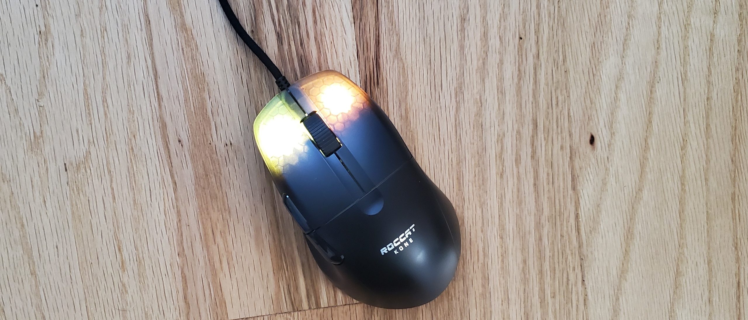
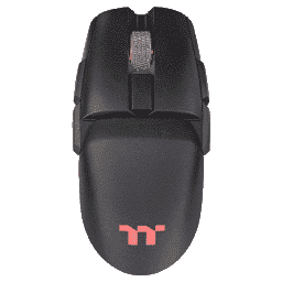
The Roccat Kone Pro is a very comfortable ergonomic mouse with a unique look and shape that’s more considerate of the ring and pinky fingers than most rivals. Its mundane plastic can easily attract moisture, dust and fingerprints. But once you download the mouse’s software, there’s a lot of programmability.
When it comes to the shape of your best gaming mouse, you may prefer an ambidextrous design that’s symmetrical in shape or opt for an ergonomic mouse, which typically curves in a way that caters to the right-handed gamer’s thumb. The Roccat Kone Pro (and wireless Kone Pro Air) are a more unique approach to ergonomic gaming mice with bolder curves that also provide support to the ring and even pinky finger.
For $80, the Kone Pro can keep up with the competition when it comes to specs, software and functionality. But an unimpressive plastic chassis with some questionable gapping in places like under the primary click buttons stop it from being flawless.
Roccat Kone Pro Specs
Sensor Model
Roccat Owl-Eye
Sensitivity
19,000
Polling Rates
125, 250, 500 or 1,000 Hz
Programmable Buttons
8, (including 3 scroll wheel functions)
LED Zones and Colors
2x RGB
Cable
5.9 foot (1.8m) USB Type-A, braided
Connectivity
USB Type-A
Measurements (LxWxH)
4.94 x 2.83 x 1.57 inches (125.6 x 72 x 40mm)
Weight
2.34 ounces (66g)
Extra
1x extra set PTFE feet
Design and Comfort of Roccat Kone Pro
Image 1 of 5
(Image credit: Tom’s Hardware)
Image 2 of 5
(Image credit: Tom’s Hardware)
Image 3 of 5
(Image credit: Tom’s Hardware)
Image 4 of 5
(Image credit: Tom’s Hardware)
Image 5 of 5
(Image credit: Tom’s Hardware)
The Kone Pro’s best asset is, perhaps, its shape. It caters to parts of the hand that many gaming mice today neglect: the ring and pinky fingers. Ergonomic mice often focus on curving in for a righty’s thumb, and the Kone Pro does too. But it also provides a subtler, longer curve in its right side, where the ring finger can easily rest and the pinky may find respite too. I have longer hands for a woman, and sometimes I noticed my pinky dragging on my mouse pad in my typical claw and palm grips still, but this happened less often than with most gaming mice I’ve tested.
The mouse’s shape makes palm gripping very comfortable. My palm’s outer edge makes comfortable contact with the Kone Pro’s hump, while the deepest part of my palm hovers above. In both palm and claw grips, my ring finger often grazes the gap underneath the right click button. This is a small annoyance but one worth noting for perfectionists. This wouldn’t be an issue if I used a fingertip grip, but I find the mouse a bit bulky for that, and a more symmetrical shape would be helpful too.
Roccat’s Kone Pro measures 4.94 x 2.83 x 1.57 inches and weighs 2.34 ounces. For comparison to other ergonomically shaped wire mice for righties, the Razer DeathAdder V2 is longer, less wide, taller and heavier (5 x 2.43 x 1.68 inches / 2.89 ounces), and the honeycomb-filled Glorious Model D is about the same length and weight but less wide, taller and lighter (5.04 x 2.4 x 1.65 inches / 2.4 ounces). Especially with its lightweight plastic, the Kone Pro does a good job of feeling light for its size, but I wouldn’t call it lightweight, especially with the likes of honeycomb mice like the 2.08-ounce Glorious Model O- around.
Roccat Kone Pro and wireless Roccat Kone Pro Air (Image credit: Tom’s Hardware)
Available in black or white (the above picture shows both color schemes available for the wired and wireless versions of the mouse, and the white version is wireless), the Kone Pro’s plastic shell is nothing remarkable. It’s carved with a gathering of parallel lines on the sides where it curves in, and it’s easy for fingerprints together there and elsewhere, making the mouse look extra unremarkable, especially with the black unit we’re reviewing. The chassis lacks gripping and is a little slick without being gross or too slippery, but some more grip would be appreciated.
A Roccat Kone logo stamped on the plastic chassis is inoffensive, yet snooze-worthy. The chunky, plastic side buttons don’t look the most premium to me; although I like the contrast they create on the white version of the mouse. Of greater concern is the amount of spacing under the primary click buttons, between them and throughout the scroll wheel, where dust accumulated during my weeks of testing. The gaps under the primary click buttons allow RGB to shine through in a unique, appealing way. But if you look through the spacing at the right angle, you’ll be alarmed to see some of the mouse’s internal components. (Note that the mouse has a 2-year warranty.)
Although the scroll wheel can get dusty and some might think it looks flimsy, it adds a special touch to the Kone Pro. Instead of opting for some pattern-textured rubber, the Kone Pro’s scroll wheel is a thin, but hard, piece of aluminum. It makes for a cool side profile, as I can see through the wheel into some RGB lighting. Tactile scrolls are subtly reassuring, and it’s a little heavier to press in than other wheels. It’s also not as grippy as some rubber wheels, but slippage shouldn’t be a problem unless you’re literally sweating. And if you are (no judgement here), this wheel may be a bother.
Gaming Experience on Roccat Kone Pro
The Kone Pro starts off with the right tech to compete with other gaming mice in its price range. Its Roccat Owl-Eye sensor is based off PixArt’s PAW3370 and can reach 50g max acceleration and a sensitivity of up to 19,000 CPI. But while many mice offer a way to change CPI settings without ever opening an app, the only way to change the Kone Pro’s CPI out of the box is by downloading software. There’s even a profile switch button on the mouse’s underside, but this doesn’t change CPI by default. Even worse, CPI was set uncomfortably low. Swarm eventually confirmed it was set to 800 CPI, when I’d prefer around 2,500-3,000.
I used the Kone Pro across CPI settings, from a comfortable 2,500, to the lowest (50) and highest (19,000). Regardless, tracking seemed as smooth and accurate as expected of a premium gaming mouse. I had no trouble with large sweeping swipes or careful, small movements, meaning the mouse was part of the action rather than a hindrance.
The primary click buttons use what Roccat calls Titan Switch Optical mechanical switches. If you haven’t heard the hype around optical mechanical switches, (which are finding homes in some of the best gaming keyboards too), yet, basically they actuate when their stem goes through a light beam, rather than via metallic contact. This should prevent them from suffering from accidental double-clicking, which has been reported among some premium gaming mice after a years of extended use. Roccat claims these Titan switches are particularly “great for FPS and action games.”
I tried the Kone Pro across some shooters and found it easy to press the primarily click buttons with my fingers at various positions. It didn’t take much force or effort to press those buttons or the cheaper feeling plastic side buttons.
Compared to left-click, right-click felt clunkier though. In a side-by-side comparison with mice using standard mechanical switches I had on hand, including the Logitech G203 Lightsync, Cooler Master MM711 and Razer Orochi V2, the Kone Pro’s clicks sounded noticeably softer and seemed easier and lighter to actuate, but the other mice’s clicks felt sharper.
In the Human Benchmark reaction time test, where you must click when the screen turns from red to green, I averaged 178.6ms with a low of 168ms with the Kone Pro, compared to 205ms and 163ms, respectively, with the Orochi V2.
Meanwhile, the side buttons are large and high enough to be easily accessible without repositioning. Both myself and a man with larger hands had no issue accessing both buttons that way with palm and claw grips and without accidentally pressing another button on the mouse.
The Kone Pro keeps up with the design trends of other gaming mice in its price range, with its 5.9-feet-long braided cable and “heat-treated pure PTFE glides.” The PTFE feet are spread across the top of the mouse’s underside, plus around the sensor and on the bottom. Roccat also includes an extra set of feet in the box. The mouse moves slightly easier and more lightly than I expected from looking at the chunkier rat, but it’s not as slippery a glide as I’ve experienced on other mice, such as the small Razer DeathAdder V2 Mini.
Roccat’s Kone Pro proved comfortable enough for hours of gaming but after a few minutes of heavy gaming it felt a little clammy and moist. There’s not much in the way of grip here either. There are slimier mice out there, but after a bit you may want to take a moisture break from the Kone Pro.
Features and Software of Roccat Kone Pro
Image 1 of 5
(Image credit: Tom’s Hardware)
Image 2 of 5
(Image credit: Tom’s Hardware)
Image 3 of 5
(Image credit: Tom’s Hardware)
Image 4 of 5
(Image credit: Tom’s Hardware)
Image 5 of 5
(Image credit: Tom’s Hardware)
The Kone Pro uses Roccat’s Swarm software, which is a required download if you want to change the mouse’s default CPI setting. There’s no button that’ll change CPI out of the box unless you program it to in Swarm. Swarm’s UI is pretty extensive but harmless to use; however, every saved change in Swarm results in a 1-2 second delay, making detailed changes to the mouse a little tedious.
The Settings page has tweaks that many gaming peripheral makers don’t include in their software, including vertical scroll speed and double-click speed. Here’s also where you can change the DPI settings from 50-19,000 in 100-unit increments. There’s a CPI calibration tool too, but I’ve found it ineffective here and with other Roccat mice because it always suggests I go just a little higher or lower than what I’ve already set it to.
Swarm’s Button Assignment section lets you assign functions for the programmable buttons: left and right click, scroll up, down or in, the two side buttons and the profile cycle button on the underside. Swarm even includes 3 extra presets to give you some ideas for using all that functionality. Additionally, if you program one button as the Easy-Shift[+] button, all aforementioned inputs can have a secondary function when pressing the Easy-Shift[+] simultaneously. The mouse’s RGB will automatically switch to blue to inform you that Easy-Shift[+] has been activated.
That ultimately means you can program 16 different inputs with the Kone Pro, from launching programs, to keyboard functions and macros and opening a new browser window. A macro manager also lets you set up macros that’ll automatically launch with games and other apps.
Illumination controls the Kone Pro’s 2 RGB zones, including a brightness slider. You get 5 RGB presets, (plus off), with most offering a slider for speed too. You can pick a solid color for each individual zone if you want via a color selector or by entering red, green and blue values.
I used the Kone Pro as my primary mouse for about a month on and off using its Aimo reactive RGB setting. According to Roccat, Aimo RGB is meant for “adapting to your play the more you use them, and becoming more dynamic and nuanced as AIMO products combine.” Swarm adds that “Roccat is continually developing exciting new features and effects for Aimo, which will see your level increase.” But I’ve never been able to get my AIMO level past 15% when reviewing Roccat’s Kone Pro, Burst Pro or Kain 200 Aimo; however, I haven’t combined Aimo peripherals. I did hit 35% with the Vulcan 122 Aimo keyboard but didn’t feel like RGB was reacting to what I was doing on the PC. The case was the same with the Kone Pro.
In Swarm’s Advanced Settings tab you can choose among a 125, 250, 500 or 1,000 Hz polling rate (sorry, extremists, no 8,000 Hz here yet). There are also tools for playing with things like distance control and angle snapping.
Swarm lets you program a generous 5 onboard memory profiles. If you have Swarm open, you can also have the profiles launch automatically with specific programs.
Bottom Line
(Image credit: Tom’s Hardware)
The Roccat Kone Pro is a solid gaming mouse, especially where ergonomic shapes are concerned. A well-endowed hump, accessible buttons and space for the ring and smaller pinky fingers make it a win for palm and claw grips especially. And while it’s not the most exciting look in all black (the white version does pop more), an aluminum scroll wheel and RGB-lit left and right-click buttons help differentiate the mouse.
The Kone Pro’s plastic shell is not a standout though. There’s nothing to help boost your grip, and it easily starts feeling moist when gaming. Plus, there are gaps throughout the design where dust easily builds up. For a better grip in an ergonomic design, consider the Razer DeathAdder V2 Pro, which is going for $30 less ($50) than the Kone Pro as of writing. And if you hate cables, note that there’s a wireless version of the Kone Pro.
But if your fingers have earned some extra attention, the Kone Pro knows what to do.
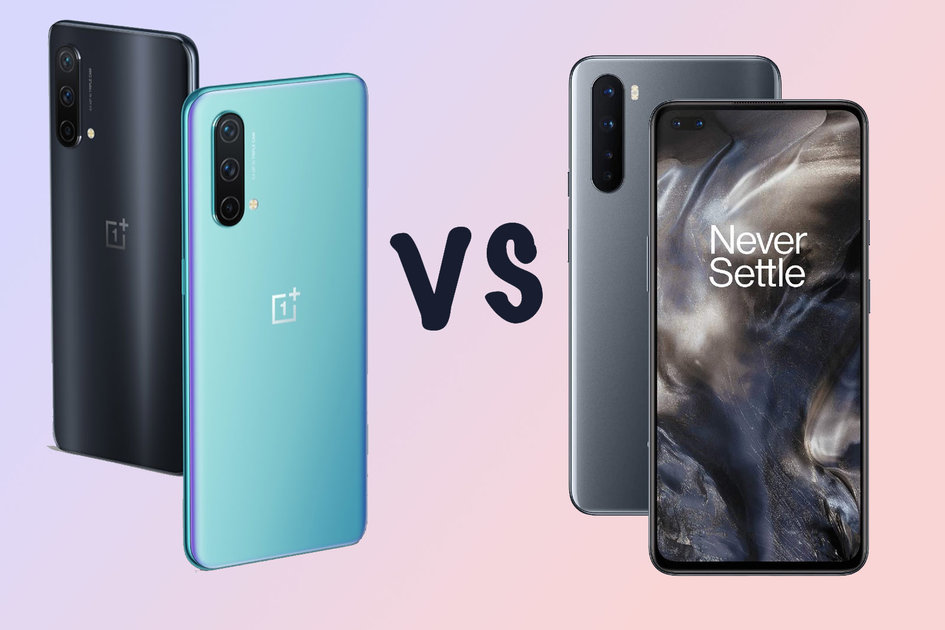
(Pocket-lint) – OnePlus has be on something of an exploratory journey over the past 12 months or so. Rather than delivering one or two phones at a time and launching them both globally, it took a more regional approach.
That meant while some markets got the original Nord, others – like the US – didn’t, then OnePlus followed up with various models to suit different territories. It even continued this approach with the OnePlus 9 series, offering a 9R in India, but nowhere else.
This is pretty standard practice for most manufacturers, but wasn’t for OnePlus. At least, not until now. But obviously this transition to being a ‘proper’ smartphone manufacturer is working, because it’s back again with another Nord: the Nord CE 5G.
Plastic fantastic
Dimensions: 159.2 x 73.5 x 7.9mm / Weight: 170g
No official waterproofing
3.5mm headphone port
Blue Void, Charcoal Ink and Silver Ray colours
For a while there’s been this sense that when building a good smartphone, you have to start with the right materials. It had to be aluminium or steel and glass. Using plastic was as good as writing ‘cheap trash’ over the back of the phone in capital letters. But things have changed, thanks in part to the efforts of Samsung.
Pocket-lint
With its Galaxy Note 20, S20 FE and this years S21, it showed you can use plastic materials in a way that doesn’t detract from the look and feel of the phone. OnePlus has taken the same approach with the Nord CE. Our unit in Blue Void has a lovely frosted/matte finish to it that’s very reminiscent of the Samsung approach, and we like it a lot.
It has an eye-catching blue finish with just the slightest splash of purple up the edges. There are two other safer colours in Charcoal Ink (Black-ish grey) and Silver Ray.
Being a frosted/matte finished plastic does have its advantages too. Firstly, it’s not at all slippery. So it’s not hard to keep a hold of one-handed, and it’s not likely to just randomly slide off the arm of your sofa. Secondly, it not as likely to crack or turn into tiny shards when it’s dropped or banged against something. It’s a very practical choice.
Also, it just feels, well, nice.
Pocket-lint
That’s not the only practical choice made by OnePlus with the Nord CE. It’s both slimmer and lighter than the first Nord, so it doesn’t feel like a huge phone in your hand. It’s not exactly compact, but it’s easy to hold and comfortable enough to use. And it has a 3.5mm socket for wired headphones and headsets.
One choice that might not go down so well with long-time OnePlus fans is the removal of the alert switch. For years this simple slider button on the side has set the company’s phones apart from rivals, offering an easy tactile way to switch your phone to silent or vibrate. Apparently, that’s not considered ‘Core’ enough to make it on to a ‘Core Edition’ OnePlus phone.
In case you were wondering: yes, that’s what CE stands for.
Other core design choices include: not having a physical fingerprint sensor. Instead, there’s an in-display one so there’s nothing on the back, breaking up that glorious matte blue surface. The camera housing is a pretty basic pull-shaped protrusion and the display has just the one hole punched through it for a single camera.
Pocket-lint
Sadly, one last feature not deemed essential to a Core Edition phone is a subtle haptic motor for feedback. That means, with it enabled, keyboard taps are accompanied by a nasty feeling buzz, rather than a subtle tap. We quickly switched it off.
Display and software
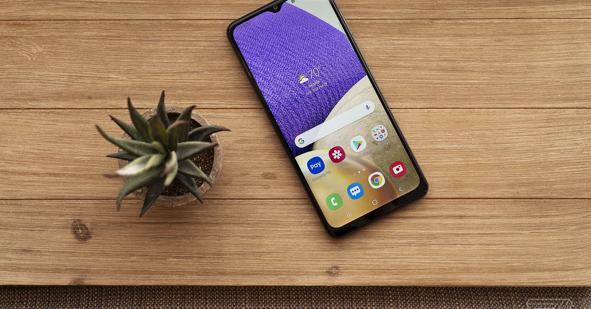
6.43-inch AMOLED 90Hz display
1080 x 2400 resolution
OxygenOS 11
Screen resolutions haven’t changed much in recent years with most smartphones opting for some version of full HD. This particular flavour is 1080 x 2400, which is the same as on most other OnePlus phones. That means it’s plenty sharp enough for day-to-day tasks with individual pixels imperceptible.
It’s AMOLED too, which means it’s a pretty punchy panel with vibrant colours and deep blacks. In its default ‘vivid’ mode the screen often over eggs the colours a bit, but with this being a OnePlus phone running OxygenOS, you get to customise its balance quite lot. Switching to ‘sRGB’ mode balances things out a lot more, but does make it a bit less exciting.
Pocket-lint
The 90Hz refresh rate ensure that when you touch the screen, or swipe at something in the interface, the response is immediate and smooth. It doesn’t reach the heights of the OnePlus 9 Pro’s 120Hz, and doesn’t feature the advanced adaptive refresh rate tech that adapts it to the content, but it’s impressively fluid and smooth for a mid-ranger.
That’s not the only element where you just about get the hint this isn’t a top tier panel.
For instance, despite being AMOLED, when the screen’s off (or black) it’s not quite as dark as the black frame around the panel, so you don’t get that blending effect, you can see where the bezel stops and the screen starts. There’s also a slight colour shift when you look at a white screen from different angles.
Just for a little perspective though, the fact we’re picking up on such non-issues as a slight negative shows two things: how competitive the mid-range market has become recently and how good this phone is for the money OnePlus is asking for it.
Part of the joy of OnePlus phones over the years is the customisation on offer from the OxygenOS software. We’ve already mentioned the ability to calibrate the screen to your exact liking, but there are also modes like Reading Mode which turns the screen monochrome for when you load up your favourite e-book app.
There’s not much new to report from a software side with the Nord CE. It’s the same as the software found in the OnePlus 9 series and OnePlus 8T that came before it. It’s OxygenOS 11 based on Android 11, which represented a major redesign when it first launched.
While OnePlus was often seen as a manufacturer offering a stock-like Android experience with lots of customisation choices, it no longer feels that way. Oppo’s ColourOS offers far more customisation of elements like the fingerprint scanner animation, always-on display, icon styles and shapes. OxygenOS by comparison feels quite stripped back and bare.
This does help it retain that feeling of ‘essentialism’ though. It has everything you need, presented in a clean and clutter free way. There aren’t any unecessary apps pre-loaded, and even core parts of the experience like phone, messages and software updates are now powered by Google’s own apps, rather than OnePlus’ own design.
Power and performance
Qualcomm Snapdragon 750G processor (8nm)
6GB, 8GB or 12GB RAM – 128GB or 256GB storage
4500mAh battery
30W fast charging
Where the Core Edition OnePlus Nord gets it right is the feeling of speed and fluidity under your fingertips. A big part of that, as mentioned, is down to the high refresh rate of the screen and the software. OnePlus has always done a great job of optimising its software animations to feel speedy.
That performance transitions well into games and apps too. Using it daily as a main phone, it never left us in any real need of more, despite ‘only’ having Snapdragon 750G. It’s not a top-tier platform, but just like the Snapdragon 765G that appeared in the first Nord, this one gets the job done without any trouble.
Playing Mario Kart Tour was a hassle-free and smooth experience, as was browsing the web, scrolling through Twitter and any other app we came across in our day-to-day phone usage.
Pocket-lint
Similarly, the 4500mAh battery inside is more than strong enough to cope with the most demanding of days. For the most part, with light usage, we’d finish the day with something like 40 per cent of the battery left over. That’s with the usual hour or so of web browsing and social media, plus a chunk of gaming.
Once empty it fills up quickly, as is typical OnePlus style. It uses a 30W wired charger, which OnePlus has clunkily named ‘Warp Charge 30T Plus’. In actual fact, it’s almost the same as Warp Charge 30T, in that it can fill 70 per cent of the battery in abut half an hour. It’s been a mainstay feature for OnePlus phones for many years and something of a lifesaver when you’ve forgotten to charge your phone or when it drains unexpectedly.
Cameras
Triple rear camera system:
64MP primary camera
8MP ultra-wide (119-degree)
2MP monochrome sensor
4K recording at 30fps
16MP selfie
Ah, OnePlus and cameras. It seems to be an age-old complaint of OnePlus phones having a not-quite-good-enough camera system. They’ve definitely improved the quality over the past couple of years, there’s no denying that, and for the most part the primary snapper on the Nord CE is decent.
Pocket-lint
You’ll get sharp photos with good colours and depth of field from the 64-megapixel sensor. It pixel bins down to 16-megapixel images automatically, so isn’t using all 64 million of those pixels individually. Not unless you enable it.
It has all the camera features you’d expect too. It’ll take portrait shots with excessive background blur, night mode shots, panoramas, timelapses, slow motion video and even has a ‘pro’ mode for adjusting ISO, white balance and shutter speed manually yourself.
There is one major weakness we’ve encoutered on the Nord CE’s primary lens however, and that’s focus distance. It really, really doesn’t like focusing on anything closer than about 13 or 14cm, which means close up shots of flowers, bugs, berries and the like are near-on impossible. You can see examples that would normally be simple shots, impossible because it refused to focus.
The only solution is either taking the photo from further away and cropping the photo in edit, or using the 2x zoom function to zoom in digitally when taking the photo.
We don’t expect super macro skills from an affordable mid-range necessarily, but we do expect it to at least handle close up focusing a bit better than this.
Without being too cricital though, having the 2x zoom and the seperate ultra-wide lens means you get enough versatility in shooting to make it useful in most situations. There’s a variety in focal lengths, but we do question the decision to put such a visually distinct different between them.
What we mean by that is there’s a noticeable drop in quality when switching from the main to the ultra-wide. Images lose some crispness, and appear visually more contrast heavy and darker, losing a lot of vibrancy in the colours while adding more noise, even in daylight. At times it also adds a hyper-real element to the colours where they just seem unnaturally saturated. It’s not the most consistent of cameras.
As for the third camera, that’s just a low resolution black and white sensor to act as a backup to the other two, bringing in some more light data.
Motorola’s new Moto G9 Plus is a stunner of a phone – find out why, right here
By Pocket-lint Promotion
·
On the front, the selfie camera is decent enough with OnePlus’ HDR capability shining when it comes to balancing out heavy backlighting behind you when snapping pictures of yourself. So even if the sky and clouds look too bright to get a decent shot of your face, the system does well to make sure that it’s not over-exposed and washed out.
Verdict
OnePlus Nord ‘Core Edition’ is something of an unusual phone in its position. The first OnePlus Nord in itself was supposed to represent the core essentials of OnePlus phones. Stripped down, but without real compromise. So in essence, the OnePlus Nord CE is a Core Edition of a Core Edition phone. But that’s perhaps overthinking it a bit.
What really matters is that for the money you’re getting a phone without any significant flaws. It’s fast and responsive, is well-designed, has a good camera and a good screen. It’s comfortably one of the best phones in its price bracket.
We question the removal of the alert slider though. It was one of the few remaining fixtures that helped OnePlus phones stand out from its competition. Without it, it feels like OnePlus is doing more blending in with the environment. It’s transitioned away from standout phone maker, to just another phone maker and the CE is the culmination of that effort.
Alternatives to consider
Pocket-lint
OnePlus Nord
squirrel_widget_305633
The original Nord is still here, and still packs a punch. It’s fast, fluid, smooth and has a more premium glass back, slightly more powerful processor and is now discounted because it’s a bit older.
Read the review
Pocket-lint
Redmi Note 10 Pro
squirrel_widget_4261498
The Redmi Note 10 Pro is one of 2021’s best value smartphones. It boasts similar specs and capabilities to the Nord CE, but is cheaper. Crucially, it has a bigger battery, bigger display and is water resistant.
This year’s Apple Watch could feature an improved screen and updated ultra-wideband support, Bloomberg reports, but more substantial improvements like temperature and blood glucose monitoring will not appear until later models. The company is also reportedly planning a successor to last year’s more affordable Apple Watch SE, as well as a new extreme sports-focused model, due for release in 2022.
The improvements coming to this year’s model, which will almost certainly be called the Series 7, appear to be small. Its display bezels are said to be thinner, and a new lamination technique could reduce the distance between the display and the front cover. The watch’s ultra-wideband support could also be improved after getting its Apple wearable debut in last year’s Series 6.
But the years ahead could bring more substantial improvements for Apple’s wearable. Top of the list is a new blood glucose monitoring feature, which could automatically log blood-sugar levels for diabetics without them needing to prick a finger to draw blood. There’s also reportedly a new body temperature monitoring feature on the way, which has reportedly seen a surge in interest due to the pandemic. The temperature sensor could appear in the watch’s 2022 refresh, while blood glucose monitoring is several years away, according to Bloomberg.
Bloomberg previously reported that Apple was internally discussing releasing a rugged smartwatch aimed at extreme sports users. It now reports this model, internally referred to as an “explorer” or “adventure” edition, is unlikely to release this year, and could arrive in 2022. However Bloomberg cautions that this, like all of Apple’s unannounced plans, are subject to change.
If you buy something from a Verge link, Vox Media may earn a commission. See our ethics statement.
If you’re looking for a 5G Android phone and want to spend as little as possible, you can stop right here. At $279, the Samsung Galaxy A32 5G is your best bet right now, especially if you’re in the US where such options are scarce. It offers good 5G support (including the all-important C-band!), a huge battery, and four years of security updates. That’s a compelling package for under $300.
That’s not to say it’s perfect. The A32 5G’s screen isn’t great, performance is a little laggy, and though capable, its camera is limited. If you can spend just a bit more, you can get a phone that does better in at least one of these areas. And if you can hold off on your phone purchase for even a few more months, we should see many more very affordable 5G phones on the market to choose from, like the OnePlus N200. But if you don’t have time to wait and can’t spare the extra cash, I can’t find a good reason to talk you out of the A32 5G.
The A32 5G is a big device, housing a 6.5-inch screen and a large 5,000mAh battery.
Samsung Galaxy A32 5G screen, performance, and design
The A32 5G features a big 6.5-inch 720p LCD panel that’s best described as nothing special. Colors look a little flat and washed out, and though it gets bright enough to see in direct sunlight, the screen’s reflective plastic protective panel makes it challenging. It’s also a low resolution to be stretched across such a large screen, so you’ll see a little pixelization if you look close.
The phone uses a MediaTek Dimensity 720 5G processor that compares well with Qualcomm’s Snapdragon 690 5G chipset for budget 5G phones, used by OnePlus Nord N10 5G. The Galaxy A32 5G combines the MediaTek processor with 4GB of RAM (decent) and 64GB of storage (skimpy but just enough to get by, and you can throw in a microSD card to expand it), and it performs well enough for its class.
There’s noticeable hiccuping with media-dense pages, brief pauses when diving into a demanding task like starting Google Maps navigation, and noticeable camera shutter lag. For the most part, though, I just didn’t notice slowdowns as I jumped between apps, scrolled through Instagram, and just generally went about using the phone normally. That’s about all I’d ask for from a sub-$300 phone.
The phone’s headline feature, 5G, still isn’t something we’d recommend you run out and buy a new phone to get. But the A32 5G has a couple of features that make it worth your time, even considering that good 5G is still a year or two away in the US. Crucially, the A32 5G has been cleared by the Federal Communications Commission to use C-band frequencies that Verizon and AT&T, in particular, will be utilizing for 5G in the coming years. Not all 5G phones can use C-band, so that’s a big ol’ checkmark in the A32 5G’s favor. There’s no mmWave support here, which is the fastest and scarcest flavor of 5G, but that’s no great loss.
The second factor here is that you can reasonably expect to keep using this phone for enough years to actually see 5G that’s meaningfully better than LTE because Samsung will keep offering security updates for four years. Many budget devices only get about two years of security update support, but the A32 5G’s lengthy lifespan should see it through to the actual 5G age in a few years.
Battery life is one of the A32 5G’s strengths. Its 5,000mAh capacity battery is big indeed, and I had no trouble getting two full days of moderate use out of it. My usage was more battery-friendly than someone else’s might be, with battery optimization on and the bulk of my time spent on Wi-Fi, but even the most power-hungry user would be able to get a full day — if not more — out of the A32 5G.
With a 6.5-inch screen, the A32 5G is a big phone for sure. It’s a little too bulky and awkward-feeling in my hand. What I dislike even more is that it feels slippery to me — the back panel plastic feels hard to get a decent grip on. On one occasion, I set the phone down on a softcover book, and it somehow shimmied itself across the cover and off of a side table when I wasn’t looking. (There’s a happy ending, though: it only fell about a foot into a box filled with hand-me-down baby clothes waiting to be put away, so there’s a good argument for keeping clutter around your house.) Anyway, get a case for it if you buy this phone, and know that if your hands are small, it won’t be very comfortable to use.
There’s a decent-quality 48-megapixel main camera on the A32 5G’s rear panel.
Samsung Galaxy A32 5G camera
There are two cameras of consequence on the A32 5G’s rear panel: a 48-megapixel standard wide and an 8-megapixel ultrawide. There’s a 5-megapixel macro camera that’s not very good and a 2-megapixel depth sensor that may or may not help with portrait mode photos. There’s also a 13-megapixel selfie camera around front.
Taken with ultrawide
Taken with ultrawide
Considering the phone’s price, the A32 5G’s main camera performs well enough. Like most any other phone, it takes very nice pictures in good lighting. That’s no surprise, even for a budget phone. But it reaches its limits quickly in less-good lighting, like interiors. That’s where optical stabilization or more sophisticated image processing would come in handy, neither of which the A32 5G offers. Instead, you may find some of your photos indoors are a little blurry, and you’ll be very challenged to get a sharp photo of a moving subject in anything less than bright daylight.
The ultrawide camera shows its shortcomings if you look close — there’s some distracting flare in direct sunlight, and some noise visible in shadows of high-contrast scenes. There’s no telephoto lens here, with shortcuts in the camera app to jump to 2x (acceptable), 4x (eh), and 10x (don’t use it) digital zoom.
The Galaxy A32 5G’s generous security support timeline means it’s a phone you can plan to use for the next few years.
It’s tough to say how the Galaxy A32 5G compares to the competition because it doesn’t have much yet. It’s among the least expensive 5G phones you’ll find anywhere. Its closest competition at the moment is the OnePlus Nord N10 5G, which is a little more expensive at $299 but offers some worthwhile hardware upgrades, like a nicer screen, a bit better camera performance, and faster charging. It’s a nicer phone in a lot of ways, but it’s only slated for two years of security updates.
Of course, if you only plan to hold on to your phone for a couple of years, then the N10 5G is worth strongly considering. If that’s the case, then 5G becomes a less important feature, too. If there’s room in your budget, consider the $349 Google Pixel 4A, which will get you a much better camera, cleaner software, and timely updates over the next couple of years, albeit without support for 5G at all. It’s a much smaller device, though. So if a big screen is part of the A32 5G’s appeal, you might want to look at something like the $279 Motorola Moto G Stylus.
If you’d like to avoid the hassle of phone shopping again in two years and you want a future-proof choice that’s easy on the budget, then the Samsung A32 5G will do the trick.
(Pocket-lint) – Arlo has a wide range of cameras, but is mostly known for its battery-powered outdoor cameras.
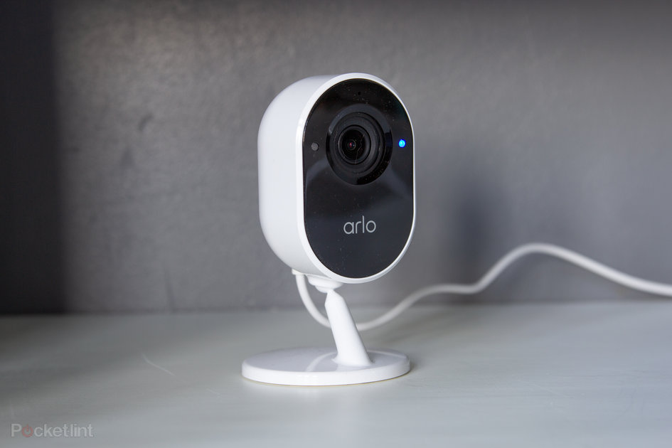
The Arlo Essential Indoor Camera, however, is a wired camera designed to sit indoors, sitting in the same sort of position as the ageing Arlo Q.
Design
Dimensions: 52 x 49 x 113.19mm
Privacy Shield shutter
Wired design
With no battery, the design of the Arlo Essential Indoor Camera is different to most of the rest of the Arlo range, because it’s not as deep, although the “face” of the camera is very much the same size as the rest of the family.
Rather than having a magnetic mount like other Arlo models, it sits on a stand with a ball mount, so you just have to take it out of the box, connect it to the power – and that’s just about it. If you want to wall-mount it, there’s a plate you can attach to the wall that the stand will clip into.
Pocket-lint
As a wired unit, there’s a power supply in the box with 2m cable, although this is a USB cable so you could potentially power this device without that plug if you have built-in USB ports in your sockets or elsewhere.
One criticism is that the cable is rather stiff, so once you’ve placed your camera, you’ll need to make sure the cable doesn’t then move the camera out of position. It could so with a softer cable cover that’s more malleable.
The big thing that stands the Arlo Essential Indoor Camera aside from some other cameras is the Privacy Shield. This is a physical plate that covers the lens, so when the camera is off, there’s a 100 per cent guarantee that it’s not watching you.
Just glancing at the front of the camera will show whether the white Privacy Shield is open or closed, adding extra peace of mind for those who feel uncomfortable having a lens pointing at them.
Pocket-lint
If you’re one of those people who will connect the camera to Alexa or Google Assistant, you’ll know as soon as someone asks to view the camera, because the Privacy Shield will have to open, which you can see and hear.
There’s also an LED on the front, with the colour showing the status of the camera: blue means everything is fine, amber shows that there’s a connection problem. You can turn the LED off in the app if you want.
Supercharge your home security with Swann’s high-performance Enforcer
By Pocket-lint Promotion
·
Connectivity and setup
Wi-Fi (2.4GHz only) or SmartHub connection
Needs the Arlo app
The Essential name in this device lets you know that it will connect directly to your Wi-Fi. As per the Arlo Q previously, this is a device that works perfectly well as a standalone camera, so if you’ve never used an Arlo device before that doesn’t matter. You can also add this camera to an existing Arlo system, of course, and if you have an Arlo hub then you can connect directly to the hub too. The choice is yours, providing some flexibility.
Pocket-lint
You will need the Arlo app on your phone, however, but once you start the setup process you’ll be guided through everything to get it working. The app controls the whole experience: you’ll be able to control what the Indoor Camera captures and when, giving you a full range of controls.
Unlike other cameras this Arlo’s Privacy Shield will be closed when it’s not in use and for added protection, you’ll only be prompted to unlock with biometrics when you want to make the camera live from the app to provide a live view.
Outside of this, the Arlo Essential Indoor Camera can be added to existing Arlo modes. If you have an existing system, you can have the Indoor Camera go live when you turn the other cameras on – and that can be manually, on a schedule, based on geolocation from your phone, or from any other condition, with a wide range of options in the app.
Pocket-lint
The important thing to note about Arlo’s cameras is that they don’t capture all the time. They need to be “turned on” via a capture mode, after which they will then start recording once triggered either by motion or sound.
Video and audio capture and performance
2MP sensor, 1080p (Full HD) video
Motion and audio detection
Infrared (IR) night vision
Two-way audio
The Arlo Essential Indoor Camera has a Full HD camera on the front with a 130 degree field of view from the lens. It offers digital zoom up to 12x and had infrared illumination to provide night vision. Unlike some of Arlo’s other models, there’s no LED illuminator on this model.
There’s two-way audio, meaning you can capture audio or hear live audio, while also being able to reply via a small speaker on the rear of the camera. There’s no siren on this model either.
Detection can be triggered by motion or sound depending on the placement of the camera. In some conditions, sound might cause too many false alerts, but you can change the sensitivity or remove sound if you feel it’s not helpful.
Captured video is of good quality, with accurate colours during daylight and enough detail in low-light conditions from the IR illuminator to see what’s going on. The lack of resolution shouldn’t be a concern: typically indoor cameras only need a shorter range, while higher resolution on outdoor cameras is mostly about providing great detail when zooming.
The wide-angle lens also captures plenty in its field of view, so you can place it in the corner of the room and know that you’ll get good full coverage. You can crop the capture area to exclude the edges of the frame, for example, so you’re not just recording areas of wall that are irrelevant.
Arlo Smart and additional options
AI detection
Rich notifications
Alexa, Google Assistant integration
Arlo has started pushing its Arlo Smart subscription plan, providing additional features via that route. That means you buy the camera and then potentially face additional costs for additional features in the future.
Pocket-lint
Arlo Smart unlocks 30 days of cloud storage. That will mean that everything is in the cloud and accessible for a month, so you can look through video and download whatever you need. This has the advantage over local storage in that you can access it from anywhere – although if you connect it to an Arlo SmartHub during setup, you’ll also have the option of storing video to a local microSD card in that Hub.
Without an Arlo Smart plan you’ll get notifications of anything that’s detected and you’ll be able to live stream, but you won’t get any cloud storage, so that’s a good argument for Arlo Smart. There is a three month trial included with the camera, so you can test out the features before deciding if it’s for you.
Beyond that, there are some clever artificial intelligence (AI) features that Arlo Smart unlocks. You can get alerts for specific things, such as vehicle detection, animal detection, package detection, people detection. While most of these don’t apply to an indoor camera, it means you can turn off animal detection, for example, if you don’t want a notification every time your dog walks past the camera.
Perhaps more useful is rich notifications. This doesn’t just send you an image of what triggered the camera, but you’ll get a little motion image, so you can see the movement. This can make it much easier to see exactly what’s happening and decide whether you need to take action or not.
Pocket-lint
For example, we’ve had our indoor camera triggered by a spider spinning a web across the front of the lens. That’s not something we need to take action about and the rich notification shows exactly what’s happening, so there’s no need to open and unlock the app for a better look.
Arlo can be connected to Alexa or Google Assistant and that will mean you can talk to your device, for example an Echo Show, and view your camera via that device. Interestingly, this bypasses any of the security of the app, so in theory anyone in your house can ask to view your camera at any time.
As we said above, having the Privacy Shield is again a benefit here: if someone else in your house views the camera, you’ll see the Privacy Shield open, so you’ll know straight away.
Verdict
There’s plenty of appeal in the Arlo Essential Indoor Camera. It works as a standalone device for those who just want some degree of indoor coverage, although it costs quite a bit more than something like the Ring Indoor Cam – which might do much the same basic job.
But there are additional features that add appeal to the Arlo camera. The Privacy Shield is a great option for those who don’t like staring down the barrel of the lens all the time, or worry that they might be being watched.
Arlo Smart adds a range of advanced features, which while not as useful indoors as they are outdoors, does boost the experience for those who subscribe – and adding this camera into an existing Arlo system is likely to be a popular option.
Also consider
Ring Indoor Cam
Ring’s Indoor Cam offers similar specs and will do much the same job, but you’ll need a Ring Protect subscription to get the most out of this camera.
squirrel_widget_169050
Nest Cam IQ Indoor
This camera has comparable intelligence to the Arlo camera, but offers a 4K sensor so will capture high quality video.
Microsoft develops under-screen camera with 4 color filters for Surface devices. When the camera is turned off, an adjustable logo or avatar will be displayed.
Many technology companies are currently working on under-display camera technology for smartphones and other portable electronic devices, including Microsoft. However, the US software manufacturer seems to take a slightly different approach. The company filed a patent application for an under-display camera with 4 colors filters and 4 image sensors. The technology is meant for smartphones and Microsoft Surface devices.
The Surface line-up offers different types of laptops, mainly 2-in-1 tablet PCs with touchscreen functionality. Like, for example, the Surface Go and the Surface Pro. One of the newest additions is the Surface Duo, a dual-screen Android tablet smartphone. A new patent that was discovered by LetsGoDigital suggests Microsoft could integrate a ‘logo camera’ in one of its future Microsoft Surface devices.
Microsoft under-screen logo camera
In October 2020, Microsoft Technology Licensing LLC filed a patent with the World Intellectual Property Office (WIPO) for a ‘Logo camera’. The 40-page documentation was published on May 14, 2021.
It is a unique invention, which we have not encountered before. The documentation mentions four under-display cameras, each with their own color filter. The 4 cameras together are called a ‘logo camera’ by Microsoft. Thanks to the use of color filters, which can display a color icon, a true-to-color logo can be displayed when the camera is turned off.
By default, the Microsoft logo will be displayed. As soon as the camera is activated, the logo will disappear and the shutter will be activated. In addition, an icon menu will be available, enabling users to set a logo or avatar as desired. Like a company logo or a club logo.
In order to visualize the patented technology, in-house designer Giuseppe Spinelli has made a number of product renders of this unique camera system. These images are for illustrative purposes only and based on the patent of Microsoft Technology.
The quad front-camera is placed in a 2×2 array. By choosing multiple camera sensors, thinner camera modules can be used, allowing the device to retain its slim form factor. To achieve a high camera resolution, the pixel density of the screen will be increased. Each sensor and lens is configured to be optimized for particular colors.
The documentation makes mention of 4 sensors, one optimized for the color Blue, the other for Green, Red and Yellow. By adding a fourth color, yellow (RGBY), in addition to the standard RGB (red, green, blue) colors, a much larger color range can be displayed.
The color filters can also improve camera performance in low light. In addition, they can be used to give the user feedback, for example a color signal can be emitted when the camera is activated.
However, there are also disadvantages, as color conversion can be sensitive to noise, especially when the colors are less saturated. Microsoft wants to counter this phenomenon through software. In addition, AI technology is used to learn the difference between obscured and non-obscured light in images, in order to correct light loss and diffraction.
To implement a logo camera on the front, several small holes (1mm) have to be made in the screen, which provide a light path for the camera. The patented technology could also be used for a rear camera, according to the documentation.
Microsoft Surface devices
Whether Microsoft actually sees a chance to integrate an under-display logo camera in one of its upcoming Surface products remains unknown. In any case, it is a totally new and different solution than we have seen so far.
It is clear that Microsoft is also involved in the development of under-screen cameras. Last month, the company published several detailed publications on its website about ‘Camera In Display technology’ and the use of machine learning to achieve better image quality.
In addition, Microsoft also posted a vacancy online for a ‘Principal Android Camera System Architect / Engineer for Surface Development’ in October last year. The software giant seems to intend to take the camera performance of its next-gen Microsoft Surface devices to a whole new level.
Here you can take a look at the documentation of the Microsoft logo camera.
Note to editors :The high-resolution 8K 3D renders in this publication are created by in-house graphic designer Giuseppe Spinelli (aka Snoreyn). The copyrighted images are based on the patent of Microsoft Technology. Feel free to use the images on your own website, please be so respectful to include a source link into your publication.
Ilse is a Dutch journalist and joined LetsGoDigital more than 15 years ago. She is highly educated and speaks four languages. Ilse is a true tech-girl and loves to write about the future of consumer electronics. She has a special interest for smartphones, digital cameras, gaming and VR.
Founded in 1999, Thermaltake is a PC case, power supply, and peripherals company based in Taiwan. The ARGENT M5 Wireless RGB is part of an entire line of products consisting of a mouse bungee, mouse pad, headphones, headphone stand, and a wired variant of the M5 RGB. Capable of either wired, 2.4 GHz, or Bluetooth operation, the ARGENT M5 Wireless RGB is capable of up to 100 hours of battery life without illumination in 2.4 GHz mode and up to 200 hours using Bluetooth. The ARGENT M5 Wireless RGB is symmetrical, which means it has side buttons on both sides, and its button layout can be reversed in the software, enabling left-handers to use it normally. Through the software, several RGB lighting effects can be set up and synchronized with other ARGENT devices, including Razer Chroma enabled ones. The sensor is PixArt’s PAW3335 capable of 16,000 CPI, and the scroll wheel is made out of aluminium for better durability and grip.
(Pocket-lint) – OnePlus announced an addition to its Nord range of smartphones during an event in June in the form of the Nord CE 5G.
The device sits below the original Nord, which means it subsequently sits under the flagship OnePlus 9 series.
You can read more about how the Nord CE 5G compares to the original Nord in our separate feature, but here we are covering how it stacks up against the OnePlus 9. Should you spend the extra cash?
Design
Nord CE 5G: 159.2 x 73.5 x 7.9mm, 170g
OnePlus 9: 160 x 74.2 x 8.7mm, 192g
The OnePlus Nord CE 5G features an all-plastic design that has a pill-shaped rear camera housing in the top left corner, a 3.5mm headphone jack at the bottom of the device alongside the charging port, and a singular punch hole camera in the top left corner of the display.
The display is flat, there is no official IP rating and the Nord CE 5G comes in three colour options.
The OnePlus 9 meanwhile, has a glass rear, though it has a plastic frame, and it features a more prominent rectangular camera housing on the rear. Two of the three camera lenses are larger and have a metal surround, making more of a feature on the back.
On the front, the display is flat on the OnePlus 9, like the Nord CE 5G, and it also features a punch hole camera in the top left corner. There is no official IP waterproof rating, though the 9 Pro model does offer this if that’s a feature you are desperate for.
The OnePlus 9 has an alert slider – something the Nord CE 5G doesn’t have – but there is no 3.5mm headphone jack.
Display
Nord CE 5G: 6.43-inch, 2400 x 1080 (410ppi), 90Hz
OnePlus 9: 6.55-inch, Full HD+ (402ppi), 120Hz
The OnePlus Nord CE 5G has a 6.43-inch display that sports a 2400 x 1080 pixel resolution to deliver a pixel density of 410ppi.
The flat display has an aspect ratio of 20:9 and it offers a 90Hz refresh rate. It’s a Fluid AMOLED screen.
The OnePlus 9 meanwhile, has a slightly larger screen at 6.55-inches. It has a Full HD+ resolution like the Nord CE 5G though, which results in a pixel density of 402ppi.
The 9 has a Fluid AMOLED display like the Nord CE 5G, but it offers a higher refresh rate at 120Hz and it also supports HDR. Both the OnePlus 9 and Nord CE 5G have under-display fingerprint sensors.
Hardware and specs
Nord CE 5G: Qualcomm Snapdragon 750G, 6/8/12GB RAM, 128/256GB storage, 4500mAh
Under the hood, the OnePlus Nord CE 5G has the Qualcomm Snapdragon 750G 5G processor, with a choice of 6GB, 8GB and 12GB of RAM and 128GB or 256GB of storage, though not all variants will be available in all regions.
There’s a 4500mAh battery that supports Warp Charge 30T fast charging. There is no wireless charging on board.
The OnePlus 9 meanwhile has the flagship – and more powerful – Qualcomm Snapdragon 888 processor under its hood, with either 8GB or 12GB of RAM and either 128GB or 256GB of storage.
The same 4500mAh battery capacity is on board the OnePlus 9 too, but it offers support of 65W fast charging and there is support for wireless charging too.
Both devices are 5G capable.
Cameras
Nord CE 5G: Triple camera (64MP main + 8MP ultra wide + 2MP mono), 16MP front
OnePlus 9: Triple camera (48MP main + 50MP ultra wide + 2MP mono), 16MP front, Hasselblad partnership
The OnePlus Nord CE 5G and OnePlus 9 both have a triple camera on their rears, but they are made up of different lenses, while the OnePlus 9 also has a Hasselblad partnership on board.
The triple camera on the Nord CE 5G is comprised of a 64-megapixel main camera (f/1.79), an 8-megapixel ultra wide-angle camera (f/2.25) and a 2-megapixel mono-lens camera (f/2.4).
The triple camera on the OnePlus 9 meanwhile, is a 48-megapixel main camera with f/1.8 aperture, a 50-megapixel ultra wide-angle camera with f/2.4 aperture and a 2-megapixel monochrome sensor.
Both the OnePlus Nord CE 5G and the OnePlus 9 have a 16-megapixel front camera on board.
Price
squirrel_widget_4335174
The OnePlus Nord CE 5G starts at £299 in the UK.
The OnePlus 9 starts at £629 in the UK, making it quite a bit more expensive.
Conclusion
The OnePlus 9 is likely to feel like a more premium device compared to the Nord CE 5G thanks to the materials used. It also delivers a more powerful processor, faster charging capabilities, a larger display with a faster refresh rate, and likely better camera capabilities.
The Nord CE 5G appears to offer quite a lot for its price point though, with a good battery size, 5G capabilities, nice design and what looks like it could be a good camera load out.
We would expect the OnePlus 9 to be the better device, naturally, but based on the specifications alone, the OnePlus Nord CE 5G looks like it could be a good option to consider if the 9 is too expensive.
(Pocket-lint) – OnePlus added the Nord CE 5G to its more affordable Nord range of smartphones, joining the OnePlus Nord, OnePlus Nord N10 and OnePlus Nord N100.
Sitting just below the OnePlus Nord in terms of specifications, rather than replacing it, here is how the OnePlus Nord CE 5G compares to the Nord to help you work out which is right for you.
Design
Nord: 158.3 x 73.3 x 8.2mm, 184g
Nord CE 5G: 159.2 x 73.5 x 7.9mm, 170g
The OnePlus Nord and Nord CE 5G look similar on first glance, especially from the rear. Both have a pill-shaped rear camera housing in the top left corner, and both come with a flat display.
Dive a little deeper and there are some standout differences between the two models though. The original Nord has a plastic frame, but offers a glass rear. It also has an alert slider like other OnePlus devices, though it doesn’t have a headphone jack.
The OnePlus Nord CE 5G meanwhile, features a plastic frame, as well as a plastic rear and though it offers a headphone jack, it misses off the alert slider.
In terms of physical size and weight, the OnePlus Nord CE 5G is slimmer and lighter than the Nord, but fractionally taller and wider. Both come in three colour options with the Nord available in Blue Marble, Gray Oynx and Gray Ash, while the Nord CE 5G comes in Blue Void, Charcoal Ink and Silver Ray. Neither has an official IP rating.
Display
Nord: 6.44-inch, 2400 x 1080 (408ppi), 90Hz
Nord CE 5G: 6.43-inch, 2400 x 1080 (410ppi), 90Hz
The OnePlus Nord and Nord CE 5G have very similar specifications when it comes to their displays too. The Nord has a 6.44-inch screen with a 2400 x 1080 pixel resolution, offering a pixel density of 408ppi.
The OnePlus Nord CE 5G meanwhile, has a 6.43-inch display, also with a 2400 x 1080 pixel resolution that puts its pixel density at a slightly higher 410ppi because of the 0.1-inch reduction in size. That difference is not something you would notice though.
Both devices have a 90Hz refresh rate, both come with an AMOLED screen and both have a 20:9 aspect ratio. They also both have a P3 colour gamut.
Nord CE 5G: Qualcomm Snapdragon 750G, 6/8/12GB RAM, 128/256GB storage, 4500mAh
The OnePlus Nord runs on the Qualcomm Snapdragon 765G platform, supported by either 8GB or 12GB of RAM and 128GB or 256GB of storage. It’s not available in the US though, with the Nord N10 model placed there instead.
There’s a 4115mAh battery under the hood and it supports 30T Warp Charge fast charge but there is no wireless charging.
The OnePlus Nord CE 5G runs on the Qualcomm Snapdragon 750G 5G platform, supported by 6GB, 8GB or 12GB or RAM and 128GB or 256GB of storage. You’re looking at a very similar loadout here really, with the Nord CE 5G taking a slight dip in processing power but this isn’t likely to be something you’d notice in everyday use.
The Nord CE 5G has a larger battery capacity than the Nord at 4500mAh, and it supports 30T Plus Warp Charge fast charging, but again, there is no wireless charging.
Cameras
Nord: Quad rear (48MP main + 8MP ultra wide + 5MP depth + 2MP macro), dual front (32MP main + 8MP ultra wide)
Nord CE 5G: Triple rear (64MP main + 8MP ultra wide + 2MP mono), single front (16MP)
The OnePlus Nord has a quad camera on the rear made up of a 48-megapixel main camera with 0.8µm pixels and a f/1.6 aperture, a 8-megapixel ultra wide-angle lens with f/2.25 aperture, a 5-megapixel depth lens with f/2.4 aperture and a 2-megapixel macro lens with f/2.4 aperture.
There’s a dual front camera with a 32-megapixel main camera offering a f/2.45 aperture, and an 8-megapixel ultra wide-angle camera with f/2.45 aperture.
The OnePlus Nord CE meanwhile, has a triple rear camera with a 64-megapixel main camera with 0.7µm pixels and a f/1.79 aperture, an 8-megapixel ultra wide-angle lens with f/2.25 aperture and a 2-megapixel mono-lens lens with f/2.4 aperture.
The front camera is a single lens with a 16-megapixel sensor, offering an f/2.45 aperture.
In terms of video capabilities, both the Nord and Nord CE 5G support 4K video recording at 30fps and 1080p video at 30fps and 60fps. They also both support super slow motion video, but the Nord CE 5G offers 1080p at 120fps and 720 at 240fps, while the Nord has 1080p at 240fps.
The Nord CE 5G’s front camera is also only capable of 1080p video, while the Nord offers 4K video from its front camera.
Conclusion
The OnePlus Nord CE 5G and Nord offer similar designs, but the Nord CE 5G has a 3.5mm headphone jack and a plastic body, while the Nord has an alert slider and a glass rear. The Nord CE is also slimmer and lighter.
Both have very similar displays and they both offer similar hardware loadouts, though the Nord has a more powerful processor on board and an extra camera on the front and rear, while the Nord CE 5G has a larger battery capacity.
Overall, the two handsets are pretty much on par, with both tipping the scales in their own areas. The Nord CE 5G is fractionally cheaper than the Nord, but there isn’t a huge amount in it so the decision will likely come down to which features you are more bothered about.
Writing by Britta O’Boyle. Editing by Cam Bunton.
We use cookies on our website to give you the most relevant experience. By clicking “Accept”, you consent to the use of ALL the cookies.
This website uses cookies to improve your experience while you navigate through the website. Out of these, the cookies that are categorized as necessary are stored on your browser as they are essential for the working of basic functionalities of the website. We also use third-party cookies that help us analyze and understand how you use this website. These cookies will be stored in your browser only with your consent. You also have the option to opt-out of these cookies. But opting out of some of these cookies may affect your browsing experience.
Necessary cookies are absolutely essential for the website to function properly. This category only includes cookies that ensures basic functionalities and security features of the website. These cookies do not store any personal information.
Any cookies that may not be particularly necessary for the website to function and is used specifically to collect user personal data via analytics, ads, other embedded contents are termed as non-necessary cookies. It is mandatory to procure user consent prior to running these cookies on your website.