how-to-use-circuitpython-on-a-raspberry-pi

How To Use CircuitPython on a Raspberry Pi

CircuitPython is a programming language designed to simplify experimenting with low cost boards, typically microcontroller boards made by Adafruit. CircuitPython can also be used on the Raspberry Pi and via two projects we introduce how to use CircuitPython with the Raspberry Pi. The first project is the humble LED, controlling how to blink an LED enables us to understand how we communicate and control components. The second project involves using additional components connected to the GPIO via a jumper wire to Stemma QT connector.

CircuitPython on the Raspberry Pi is transferable to other devices, such as Adafruit’s QT Py RP2040, Feather RP2040 and Pimoroni’s Keybow 2040, along with the Raspberry Pi Pico. So the skills learned here are applicable to any board that can run CircuitPython 

For This Project You Will Need

  • Any model of Raspberry Pi, but for best results use a 3 / 4
  • The latest Raspberry Pi OS

 Project 1

  • A breadboard
  • LED
  • 330 Ohm Resistor (Orange-Orange-Brown-Gold)
  • 2x male to female jumper wires

 Project 2

  • Adafruit MPR121 Capacitive Touch Sensor
  • 4x female to female jumper wires
  • 2x crocodile clips
  • 2x fruit
  • StemmaQT to breadboard leads

Installing CircuitPython 

1. Open a terminal and update, then upgrade the software on your Raspberry Pi.

$ sudo apt update
$ sudo apt upgrade

2.  Upgrade setuptools, a Python toolkit to manage Python package installations. 

$ sudo pip3 install --upgrade setuptools

3. Change directory to your home directory and then use pip3 to install Adafruit’s Python Shell tool. The command “cd ~” is shorthand for the home directory. 

cd ~
$ sudo pip3 install --upgrade adafruit-python-shell

4. Download Adafruit’s installation script and then run the script to configure CircuitPython. During the installation it may state that you are using Python 2, it will prompt you to update, this is safe to say Yes to. 

$ wget https://raw.githubusercontent.com/adafruit/Raspberry-Pi-Installer-Scripts/master/raspi-blinka.py
$ sudo python3 raspi-blinka.py

Blinking an LED 

(Image credit: Tom’s Hardware)

The humble flashing LED is always the first test for a new electronics project. It enables us to be certain that our code is working and that our wiring is sound. For this project we shall wire up an LED to GPIO 17 via two jumper wires and a 330 Ohm resistor. The wiring for this project looks as follows. 

1. Open the Thonny editor and import three libraries of code. The first is “time” and this is used to control the pace of our code. The next two, “board” and “digitalio” are CircuitPython specific libraries. Board enables us to interact with the GPIO, digitalio is used to control the state of a GPIO pin. 

import time
import board
import digitalio

2. Using an object, led, we tell CircuitPython which GPIO pin we are using, and that it is an output. Our LED is connected to GPIO 17, which in CircuitPython is board.D17.

led = digitalio.DigitalInOut(board.D17)
led.direction = digitalio.Direction.OUTPUT

3. Create a while True loop which will turn the LED on (led.value = True) and off (led.value = False) every 0.1 seconds. 

while True:
    led.value = True
    time.sleep(0.1)
    led.value = False
    time.sleep(0.1)

Your code should look like this 

import time
import board
import digitalio

led = digitalio.DigitalInOut(board.D17)
led.direction = digitalio.Direction.OUTPUT

while True:
    led.value = True
    time.sleep(0.1)
    led.value = False
    time.sleep(0.1)

Save the code and click Run to start it. The LED should now flash on and off every 0.1 seconds. With the test complete we can move on to Project 2.

Using a Capacitive Touch Sensor With CircuitPython 

(Image credit: Tom’s Hardware)

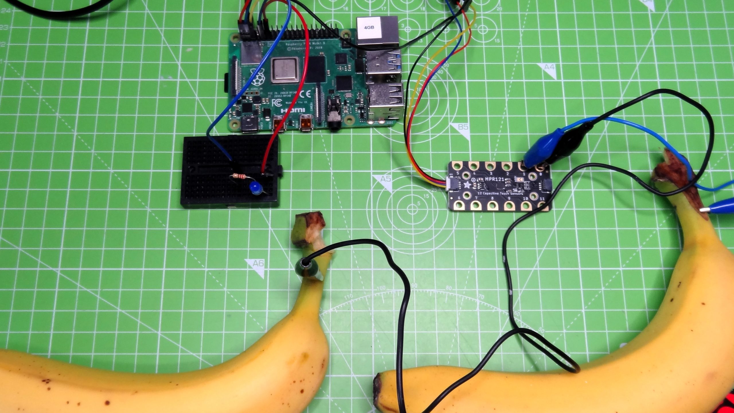
The next project requires a little more equipment, but it is no more difficult than controlling an LED. In this project we shall use an MPR121 capacitive touch sensor and a few crocodile clips to enable us to use conductive objects as inputs. 

The MPR121 is designed for microcontroller boards that have a Stemma QT connector, but with a little ingenuity we can make it work on a Raspberry Pi. The classic MPR121 example project is a banana piano, where touching a banana triggers a note to be played. For our simplified version, we will have two pieces of fruit, and each will turn the LED from the previous project, on and off.

To use the MPR121 touch sensor we will need to install an additional piece of software. Open a terminal and enter the following command.

$ sudo pip3 install adafruit-circuitpython-mpr121

(Image credit: Tom’s Hardware)

The MPR121 board uses a StemmaQT connector, to use with a Raspberry Pi we need to use the breakout lead that gives us four jumper wires. They are colour coded as follows. Red to 3V, Black to GND, Yellow to SCL (GPIO3) and Blue to SDA (GPIO2). Connect the MPR121 to the Raspberry Pi using female to female jumper wires.

(Image credit: Tom’s Hardware)

Using crocodile clips, connect a banana to input 0 of the MPR121, attach the other banana to input 1. Any conductive objects will work, aluminium foil and card is a cheap and easy way to make fun touch interfaces.

Open Thonny and create a new file.

1.  Import the three libraries of code. The first is “time” and this is used to control the pace of our code. The next two, “board” and “digitalio” are CircuitPython specific libraries. Board enables us to interact with the GPIO, digitalio is used to control the state of a GPIO pin.

import time
import board
import digitalio

2. Import two extra libraries for use with the MPR121 The first “busio” enables our code to access the I2C interface that the MPR121 uses for communication. The second clearly enables the use of the MPR121 in our code. 

import busio
import adafruit_mpr121

3. Using an object, led, we tell CircuitPython which GPIO pin we are using, and that it is an output. Our LED is connected to GPIO 17, which in CircuitPython is board.D17.

led = digitalio.DigitalInOut(board.D17)
led.direction = digitalio.Direction.OUTPUT

4. Create an object, i2c, that contains the GPIO pins that are used to connect the MPR121 via I2C. Then connect to the MPR121. CircuitPython has two references for the SCL (clock) and SDA (data) pins used in I2C. These references use the default pins for I2C no matter the device. So using these references on a Raspberry Pi, QT Py RP2040 and Raspberry Pi Pico all use the default I2C pins. 

i2c = busio.I2C(board.SCL, board.SDA)
mpr121 = adafruit_mpr121.MPR121(i2c)

5. Create a loop that will continually check the status of input 0, connected to a banana. If the banana is the function will return True, and then the code to print a message to the Python Shell and turn the LED on (led.value = True) will activate. 

while True:
    if mpr121.is_touched(0) ==  True:
        print("This banana turns light on")
        led.value = True

6. Enter a  second check to read the status of input 1 which is connected to the banana used to turn off the LED. If this is pressed the function returns True and triggers the code to print a message to the Python Shell and to turn the LED off. 

 elif mpr121.is_touched(1) == True:
        print("This banana turns the light off")
        led.value = False
    time.sleep(0.5)

With the code complete we can save the file as touch-test.py and click on Run to start the code. Now press the bananas to turn the LED on and off.

Your code should look like this

import time
import board
import digitalio
import busio
import adafruit_mpr121

led = digitalio.DigitalInOut(board.D17)
led.direction = digitalio.Direction.OUTPUT
i2c = busio.I2C(board.SCL, board.SDA)
mpr121 = adafruit_mpr121.MPR121(i2c)

while True:
    if mpr121.is_touched(0) ==  True:
        print("This banana turns light on")
        led.value = True
    elif mpr121.is_touched(1) == True:
        print("This banana turns the light off")
        led.value = False
    time.sleep(0.5)

CircuitPython provides the easiest way to get started on a project, thanks to a large community of makers using the language and creating libraries for components. CircuitPython is available for over 200 boards, and despite only being with us since 2018, it has been the base of many projects.

This article originally appeared in an issue of Linux Format magazine.
google-pixel-4-vs-pixel-4-xl:-what’s-the-difference?

Google Pixel 4 vs Pixel 4 XL: What’s the difference?

(Pocket-lint) – The Google Pixel 4 and Pixel 4 XL were announced in October 2019, succeeded by the Google Pixel 5 in September 2021. There’s also the Pixel 4a and the Pixel 4a 5G to consider. If you’re choosing between the Pixel 4 and 4 XL and you want to know which might be the right choice for you though, you’re in the right place.

This is a comparison of the Pixel 4 against the Pixel 4 XL. You can also read our Pixel 4 vs Pixel 3 feature to find out how they compare to their predecessors and our Pixel 5 vs Pixel 4 feature to see how they compare to their successors.

squirrel_widget_168586

What’s the same?

  • Design
  • Rear and front camera
  • Processor/RAM/Storage
  • Software and features

The Google Pixel 4 and 4 XL both feature the same design – aside from physical footprint – with a contrasting power button and three colour options. They both have a black frame, a glass front and rear and a rear camera system within a square housing. They also both have gesture controls and Face unlock thanks to Google’s Soli motion-sensing radar chip.

The two devices also feature a bezel at the top of their displays and they both run on Qualcomm’s Snapdragon 855 platform. Neither offers microSD support, as has been the case on all Pixel devices, and neither has a 3.5mm headphone jack.

The software experience is identical, with both launching with Android 10.

What’s different between the Pixel 4 and Pixel 4 XL?

Plenty transfers between little and large in the case of the Pixel 4 devices, but there are a few differences too.

Physical size

  • Pixel 4: 147.1 x 68.8 x 8.2mm
  • Pixel 4 XL: 160.4 x 75.1 x 8.2mm

Unsurprisingly, Google Pixel 4 and Pixel 4 XL differ in terms of physical size.

The Google Pixel 4 measures 147.1 x 68.8 x 8.2mm and weighs 162g, while the Google Pixel 4 XL measures 160.4 x 75.1 x 8.2mm and weighs 193g.

Display 

  • Pixel 4: 5.7-inches, Full HD+, 90Hz
  • Pixel 4 XL: 6.3-inches, Quad HD+, 90Hz

As with the physical footprint, the display size differs between the Pixel 4 and 4 XL. The Pixel 4 has a 5.7-inch screen, while the Pixel 4 XL offers a 6.3-inch screen.

The Pixel 4 has a Full HD+ resolution, while the Pixel 4 XL has a Quad HD+ resolution, meaning the larger device offers a sharper screen. Both have a 90Hz refresh rate though, both are OLED panels and both support HDR.

Battery

  • Pixel 4: 2800mAh
  • Pixel 4 XL: 3700mAh

The Pixel 4 and Pixel 4 XL offer different battery capacities, like the older the Pixel 3 and 3 XL. The Pixel 4 has a 2800mAh battery, while the Pixel 4 XL has a 3700mAh battery.

squirrel_widget_168578

Conclusion

The Google Pixel 4 and 4 XL offer identical designs, hardware and software experiences, though there are differences in battery capacities, price, displays and footprint sizes.

You don’t compromise much by opting for the smaller device though, and you save a few pennies too – especially now these models have been succeeded. Some will want the higher resolution display and larger battery capacity offered by the XL model, but if you aren’t bothered by those, the Pixel 4 is a great option.

  • Google Pixel 4a review

Writing by Britta O’Boyle.

xiaomi-mi-11-lite-5g-review:-chic-and-unique

Xiaomi Mi 11 Lite 5G review: Chic and unique

(Pocket-lint) – The Xiaomi Mi 11 range spans a significant spectrum from top-tier flagship, in the Mi 11 Ultra, to the standard Mi 11, down to the more entry level – which is where this, the Mi 11 Lite 5G, finds itself.

Despite plonking ‘Lite’ into its name, however, the Mi 11 Lite 5G really is not a low-power phone by any means. It’s just not as crazy-powerful as the upper echelons in the range. The second clue to that regard is the ‘5G’ aspect of the name – because, yes, there’s also speedy connectivity.

So if you’re not looking to spend a fortune on a phone, want 5G connectivity, and having a slimmer and easier-to-manage handset is high up your list of appeals, the Xiaomi Mi 11 Lite 5G ticks a lot of boxes. But then so do a bunch of competitors. So can this entry-level 5Ger deliver?

Design & Display

  • Display: 6.55-inch AMOLED panel, 90Hz refresh, 1080 x 2400 resolution
  • Finish options: Truffle Black, Mint Green, Citrus Yellow
  • Dimensions: 160.5 x 75.7 x 6.8mm / Weight: 157g
  • Side-mounted fingerprint scanner
  • No 3.5mm jack

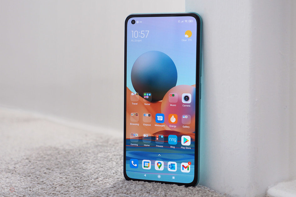
Upon pulling the Mi 11 Lite 5G from its box we let out a rare gasp. Because, shown here in its apparent ‘Mint Green’ finish – it looks more ‘Bubblegum’ to us, which is the name for the non-5G variant – this handset looks really fresh and standout. Very dapper indeed.

That’s partly because Xiaomi has redesigned the range, so the Mi 11 Lite looks way more evolved than the previous 10T Lite version. Look at those side-by-side and the older model looks rather dated – it’s quite a stark difference. Yet there’s mere months between them in terms of release cycle.

That said, the Mi 11 Lite 5G is only a little like other Mi 11 handsets in terms of design. The cameras are far different to the Ultra’s “megabump”, arranged in a really neat format that, although similar to the Mi 11, doesn’t protrude to the same degree from the rear.

The rear finish is good at resisting fingerprints too, which is a breath of fresh air (minty fresh, eh!), while the branding is subtle and nicely integrated.


Motorola’s new Moto G9 Plus is a stunner of a phone – find out why, right here


By Pocket-lint Promotion
·

But above all else, it’s the Mi 11 Lite 5G’s thickness that’s its biggest take-away point. By which we mean thinness: because this handset is far slimmer than, well, pretty much anything we’ve used for months and months. We can’t think of a slimmer 5G smartphone. That, for us, has bags of appeal – it’s been really refreshing not carting a brick around in the pocket for the couple of weeks we’ve been using this phone.

Such a svelte design means the 3.5mm headphone jack has been binned, though, so it’s wireless connectivity only in that regard. But we can take that – it makes the design look more enclosed and complete anyway. There’s also no under-display fingerprint scanner here, with a side-mounted one in the power button a perfectly acceptable alternative – that operates speedily and we’ve got very much used to using it.

The display, at 6.55-inches, is still large despite the phone’s overall trim frame. It’s flat, with the phone body curving gently at the edges to make it really comfortable to hold. And there’s no teardrop notch to cry about this time around either – it’s a single punch-hole one to the upper corner, which is fairly inconspicuous.

That screen, an AMOLED panel, delivers on colour, brightness and verve, while a 90Hz refresh rate can deliver a little added smoothness to proceedings. There’s not a 120Hz option here – kind-of odd, as the 10T Lite did have that – but, really, most eyes aren’t going to tell the difference. We’d take the battery life gains every time instead, thanks.

Performance & Battery

  • Processor: Qualcomm Snapdragon 780G, 8GB RAM
  • Software: MIUI 12 over Google Android 11 OS
  • Battery: 4250mAh, 33W fast-charging
  • Storage: 128GB/256GB, microSD

Speaking of battery, that’s the first thing we assumed would be poor in the Mi 11 Lite 5G – because of how slim it is. But how wrong we were. For starters the 4,250mAh capacity cell is pretty capacious – and in our hands was easily able to deliver 16 hours a day with around 25 per cent battery or more remaining.

That’s been irrelevant of what we’ve asked the phone to do in a given day. Strava tracking for an hour and an hour of gaming in the evening, in addition to hours of screen time, calls and so forth. It’s no problem for this device. Note, however, that we’ve been unable to locate a 5G signal area during testing – lockdown and all that – so whether that would adversely affect battery life is for debate. What we do see in the settings, however, is a 5G option to toggle the connectivity off when it’s not needed, to further extend battery life.

However, while battery life ticks along just fine, part of the reason is down to the rather hardcore software approach. Xiaomi’s MIUI 12 – skinned over the top of Google’s Android 11 operating system – by default has a lot of “off” switches selected. Seriously, MIUI is hell-bent on ensuring battery lasts and lasts – sometimes to the detriment of the experience and use of apps.

As such, you’ll need to investigate individual apps within the settings and permit them to self wake as and when they need, removing any automated battery restrictions from the important ones that you have and would, say, expect push notifications from. In the past we’ve had MIUI cause delays with notifications in other Xiaomi phones. In the Mi 11 Lite 5G, however, that’s been no problem whatsoever – perhaps because we’re so used to it and in setting the software in how we want to conduct our business; or, perhaps, because Xiaomi has sorted that issue out in an incremental update!

Otherwise the software is pretty robust. There are some oddities, such as an additional Xiaomi store as an addition to Google Play, but the two hardly interfere too much. And having copied over a bumper crop of apps, it’s clear to see that there are Xiaomi pre-install favourites and various not-needed staples – browsers, calendars, that kind of stuff – that just clogs up the home screen to start with, but is easily replaced with Chrome and your other favourites.

Regarding the phone’s innards, there’s a Qualcomm Snapdragon 780G platform handling proceedings, putting the Mi 11 Lite 5G one step down from the top-tier 800 series platform. Does that really matter? We’ve not found it to at all. From general user interface use, to app opening time, fluidity has been high throughout.

Besides, a 700 series chipset is more than good enough to run your more demanding favourites too. We’ve been plugging away at South Park: Phone Destroyer and PUBG: Mobile without hindrance, showing just how good the balance of power and battery life can be in devices such as this.

Cameras

  • Triple rear cameras:
    • Main: 64-megapixel, f/1.8 aperture, 0.7µm pixel size, phase detection autofocus (PDAF)
    • Wide-angle (0.5x):  8MP, f/2.2, 1.12µm, 119-degree angle of view
    • Macro: 5MP, f/2.4
  • Single front-facing punch-hole selfie camera: 20MP, f/2.2

Buy a ‘Lite’ phone and you’re never going to expect too much from the cameras, right? However, Xiaomi has done a reasonable job here of balancing things out. For starters all three lenses are actually useful – there’s not a lens here for the sake of number count, like with so much of the competition.

The main 64-megapixel sensor uses four-in-one processing to output 16-megapixel shots as standard, which hold enough colour and detail. Even in low-light conditions we’ve found the quality to hold up fairly well, too, so this sensor delivers the goods.

It’s a shame that there’s no optical stabilisation on the main lens, because holding it steady – especially when shooting Night Mode shots – is tricky and can result in a little softeness in dim conditions if you’re not careful.

Pocket-lint

: Wide-angle – full shotWide-angle – full shot

The wide-angle, however, is a weaker sensor. It’s just 8-megapixels in resolution, can’t deliver the fidelity of the main one by any means, and displays some blur to the edges. That’s pretty common for wide-angle cameras, sure, but there are better iterations around. Still, there’s practical use from a sensor such as this, so it’s a positive to have it rather than not.

Last up out of the trio is a macro sensor. Now, typically, these are throwaway afterthoughts. But, actually, the one on this Mi handset is acceptable – probably because it’s a 5-megapixel sensor, not the 2-megapixel type that too many other budget handsets opt for. That means images are of a usable scale, and you’ll get a little extra something out of super close-up shots from this sensor. We doubt you’ll use it a lot, though, as it’s hardly a practical everydayer, plus its activation is tucked away in settings – but there’s fun to be had from it nonetheless.

What we like about the Mi 11 Lite 5G’s camera setup is that it’s not trying to oversell you a bunch of pointless lenses. It doesn’t protrude five miles from the back of the phone, either, delivering a neat-looking handset that, while hardly reaching for the stars in what it can do, is perfectly capable. And, compared to the likes of the Moto G100, for example, the Xiaomi actually has the upper hand in its image quality delivery.

Verdict

Although the Xiaomi Mi 11 Lite 5G looks and feels different to the rest of the Mi 11 family, there’s something refreshing about its design. It’s really slim, light, and that colour finish looks super. We can’t think of a slimmer, tidier-looking 5G handset – which makes this something of a unique proposition.

Despite being called a ‘Lite’ phone, it shouldn’t be seen entirely in that regard either. With the Qualcomm Snapdragon 780G handling everything, there’s ample power to keep that 90Hz AMOLED screen ticking along, for battery life to last surprisingly long – we didn’t expect it, given the trim design – and software that, if you tend to it with a bit of pruning from the off, has been more robust here than many other Xiaomi handsets we’ve seen in the recent past.

However, forego the 5G need, and there are lots of cheaper competitors that might also appeal, such as the Redmi Note 10 Pro. Similar grade handsets, such as the Moto G100, may also appeal – but, as far as we understand it, the Xiaomi undercuts that device’s price point, asserting its position as one of the top dogs in the affordable 5G market.

Also consider

Moto G100

A near-ish comparison in that there’s 5G and gaming-capable power for less than a flagship price. We prefer the Moto’s software, but the Xiaomi’s design has the upper hand in our view.

  • Read our review

squirrel_widget_4340899

Writing by Mike Lowe.

acer-predator-apollo-ddr4-3600-mhz-cl14-2×8-gb-review

Acer Predator Apollo DDR4-3600 MHz CL14 2×8 GB Review

Introduction

High performance memory kits have evolved over the last few years, both in styling and technology. Styling has shifted to heavier heat sinks, LED light bars, and fancy RGB control software. The technology has done what it inevitably will by producing greater speeds and densities at generally lower cost as DDR4 has matured. The latest processors and graphics cards have been almost impossible to get over the last six months, but memory pricing and availability has remained steady, which makes now the perfect time for Acer to launch a brand-new line of DDR4 memory under their Predator brand. You may recognize the Predator brand from their highly successful gaming monitors or range of gaming laptops and desktops. You may even know the brand because of the Thanos All-In-One gaming chair.

Acer has branched out into a wide variety of gaming products and peripherals. Now, Acer is taking the plunge into core hardware with the aid of business partner BIWIN Storage, a large Chinese OEM with 25 years of experience in the storage and microelectronics business. Acer has granted them permission to produce memory kits under the Predator brand.

The Predator Apollo RGB kit I have for testing today is one of their top-spec kits: 16 GB (2x 8 GB) at 3600 MHz, 14-15-15-35 timings, and 1.45 V. 3600 MHz has become the new gold standard for Ryzen builds, driving new focus into memory kits targeting a previously obscure specification. Let’s see how the Predator Apollo RGB holds up in this ultra-competitive segment!

Specifications

Specifications
Manufacturer: Predator
Model: BL.9BWWR.253
Speed Rating: DDR4-3600
Rated Timings: 14-15-15-35
Tested Capacity: 16 GB (8 GB x2)
Tested Voltage: 1.45 V
PCB Type: 10 layers
Registered/Unbuffered: Unbuffered
Error Checking: Non-ECC
Form Factor: 288-pin DIMM
Warranty: Lifetime Limited
the-macos-11.3-update-includes-a-massive-security-patch-and-new-emoji

The macOS 11.3 update includes a massive security patch and new emoji

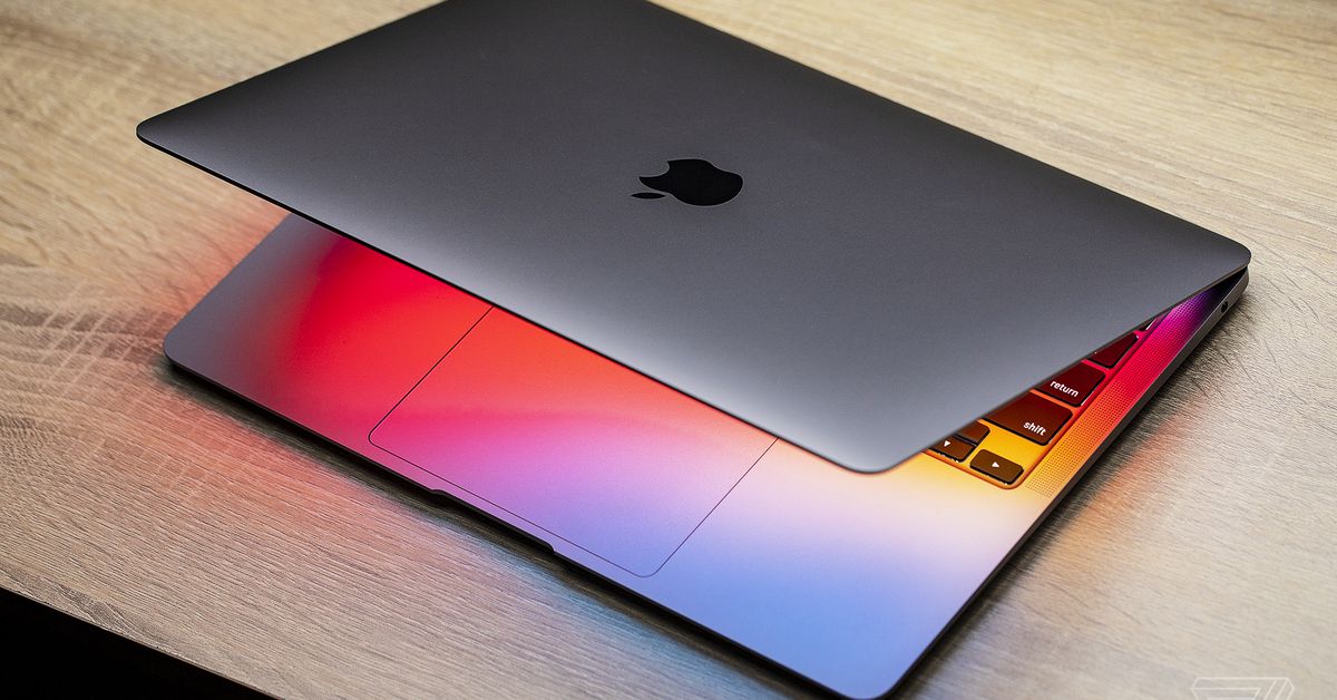
Apple has just released macOS 11.3, alongside iOS 14.5. It’s probably worth updating your Mac to it as soon as you can — not only because it comes with some new features, including improvements for running iPhone and iPad apps on M1 Macs and updates to Apple Music and Podcasts, but it also fixes a major security flaw.

The update reportedly patches a vulnerability that allowed malware to bypass many of macOS’s built-in protections, like File Quarantine and GateKeeper’s opening dialog box. While Apple’s built-in anti-malware system could still block malicious programs if Apple were aware of them, enterprise software company Jamf did find evidence that the security flaw was being exploited by attackers.

Apple also details a slew of other security fixes that are included with the latest update on its security update page. Catalina and Mojave have received security patches as well, for those who haven’t yet updated to Big Sur.

Aside from security updates, one of the biggest new improvements in 11.3 (at least for owners of M1 Macs) is the ability to resize iPhone and iPad app windows. Apple’s also added keyboard, mouse, and trackpad support for games that are compatible with controllers.

The infinity symbol in the queue controls the Autoplay feature.

Apple has also added autoplay to the Music app — a feature which is either great or annoying depending on your mood. After you reach the end of a song or playlist, Apple Music will continue playing music that it thinks is similar (thankfully, it can be turned off if you’re just looking to listen to one specific song). The News and Podcasts apps also have redesigned pages to make them easier to use (with the former getting a reworked search feature — something that’s exciting to me, and possibly no one else).

The update also adds many of the features that are in iOS 14.5: the ability to track AirTags using the Find My app, new emoji and Siri voices, and support for the Xbox Series X / S and PlayStation 5 DualSense controllers. You can visit Apple’s site to see the entire list of updates and features.

ios-14.5-is-out-now-with-new-face-id-mask-features-and-apple’s-app-tracking-transparency

iOS 14.5 is out now with new Face ID mask features and Apple’s App Tracking Transparency

Apple has begun rolling out iOS and iPadOS 14.5. The latest software update includes the new App Tracking Transparency feature, which lets users decide whether to allow apps to track their activity “across other companies’ apps and websites” for advertising purposes. A pop-up will now appear whenever apps are designed to share your activity in this way. Facebook has heavily criticized Apple over App Tracking Transparency, claiming that it presents “a false tradeoff between personalized ads and privacy.” The new option could have a detrimental impact on Facebook’s ad business.

Perhaps more important to day-to-day iPhone usage, iOS 14.5 also includes a very helpful and timely new trick: if you own an Apple Watch, you can set your iPhone to automatically unlock without requiring a Face ID match or passcode as long as Apple’s smartwatch is on your wrist. This is designed to make getting into your phone that much quicker while we’re all still wearing face masks so frequently throughout the day. Installing watchOS 7.4 is necessary for this feature to work; that update is also available as of today.

iOS and iPadOS 14.5 include a ton of new emoji with a focus on inclusivity. The update adds the ability to watch Apple Fitness Plus workouts on a TV with AirPlay 2. Apple’s Podcasts app is getting a new design and optional subscriptions. The latest video game controllers for the PS5 and Xbox Series X / S are now supported on the iPhone and iPad as of this update. And all iPhone 12 models will allow for 5G connectivity in dual-SIM mode in more countries. Starting with the 14.5 update, Apple will no longer default to a female-sounding voice for its Siri assistant. Instead, you’ll be prompted to choose your preferred voice during device setup. Apple has a post up with all of the miscellaneous improvements and additions.

iOS and iPadOS 14.5 is rolling out to iPhone and iPad users now; you can check the “software update” section in settings to begin the update process right away.

apple-announces-new-$1-billion-north-carolina-campus-and-$80-billion-additional-us-spending

Apple announces new $1 billion North Carolina campus and $80 billion additional US spending

Apple has announced new spending plans for the US, including the establishment of a 3,000-employee “campus and engineering hub” in North Carolina and the commitment of an additional $80 billion in investment across the country.

Back in 2018, the firm said it would spend more than $350 billion in the US over the next five years, but today, it announced it is increasing that figure by 20 percent to $430 billion.

“At this moment of recovery and rebuilding, Apple is doubling down on our commitment to US innovation and manufacturing with a generational investment reaching communities across all 50 states,” said Apple CEO Tim Cook in a press statement.

And why not? Like many big tech firms, Apple has done very well during the pandemic, when other industries have suffered and investors have sought safe places for their money. The company likes to spin these investment announcements as a sort of largesse, but they are, of course, par for the course for a hugely successful and ambitious firm like Apple. As today’s press release notes, the $80 billion will go toward “direct spend with American suppliers, data center investments, capital expenditures in the US, and other domestic spend — including dozens of Apple TV+ productions across 20 states.”

The new campus in North Carolina is noteworthy and part of an ongoing trend among tech firms to look outside their traditional California homes. Google is currently investing $1 billion in a New York City campus; Amazon is building its second HQ in Virginia; and Oracle announced last year it’s moving its headquarters from Silicon Valley to Austin, Texas.

Apple’s North Carolina campus will be part of the state’s Research Triangle (named after the trio of nearby universities: Duke University, North Carolina State University, and the University of North Carolina at Chapel Hill). The company will invest more than $1 billion in the area and pledges to create at least 3,000 new jobs in “machine learning, artificial intelligence, software engineering, and other cutting-edge fields.”

Notably, Apple also says it will establish a $100 million fund to support “schools and communities” in North Carolina and will contribute more than $110 million to 80 of the state’s poorest counties to help fund critical infrastructure like “broadband, roads and bridges, and public schools.” The Biden administration has made such infrastructure spending a critical part of its plans for the US, but it seems that when government lags behind, private firms will step in.

You can read Apple’s full press release for further details, including the companies expanding hiring in its teams in California, Colorado, Massachusetts, Texas, Washington, and Iowa, and its investments in new clean energy projects in the US and abroad.

inventive-grandson-builds-telegram-messaging-machine-for-96-year-old-grandmother

Inventive grandson builds Telegram messaging machine for 96-year-old grandmother

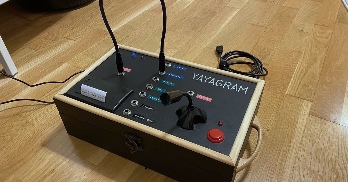
Making sure elders can keep in contact with children and grandchildren has never been more important in a time of global lockdown. That’s why Twitter user @mrcatacroquer, Manuel Lucio Dallo, built the Yayagram — a DIY project that makes sending and receiving voice and text messages over Telegram a physical process just like using an old-fashioned phone switchboard.

It’s important, of course, not to generalize about the ability of older generations to get to grips with new technology. But speaking from personal experience, I know my own grandparents struggled with the digital interfaces of modern phones and smartphones. They much preferred physical buttons and switches to apps and touchscreens.

That’s why the Yayagram is so compelling (“Yaya” is slang for “granny” in Castillean, says Dallo, “a warm way to refer to your grandmother”). To send a message, the user physically plugs in a cable next to the recipient’s name. They then press and hold a button to record audio and speak into the integrated microphone. The message then appears on the recipient’s phone like a regular voice note. And when the operator of the Yayagram receives a text message, it’s printed off using a built-in thermal printer.

And, what happens when you send a text message back to your Granny? Well, the Yayagram prints it on thermal paper so they can touch it and read it, like the old telegrams. pic.twitter.com/ljcRkBaBIM

— Manu (@mrcatacroquer) April 25, 2021

Dallo, who’s a senior engineer for software firm Códice Software, goes into some detail about how the device was made in this Twitter thread. It’s powered by a Raspberry Pi 4, runs on Python, and uses several third-party software libraries to tie everything together. The microphone is a cheap USB one and the printer similar to those used in cashier tills. He notes that he chose to use Telegram rather than WhatsApp or another messaging service as it’s more open (and he doesn’t like Facebook).

Speaking to The Verge, Dallo says his grandmother is 96 and lives with his parents in Burgos, a city in Spain where he also resides. He says he was inspired to build the device because of the pandemic lockdowns. “Most of the grandchildren live outside of Burgos and because of covid movement restrictions they can’t visit us and her,” said Dallo.

Dallo adds that his grandmother is hard of hearing, which makes regular phone calls and video calls difficult. The Yayagram, by comparison, gives her the independence to make and receive messages by herself. “It empowers her and builds communication bridges with the rest of her grandchildren who are not lucky enough to live nearby,” he says.

It’s a fantastic project and you can see Dallo and his Yaya using the device below:

longer-orange-10-3d-printer-review:-cheap-price,-poor-performance

Longer Orange 10 3D Printer Review: Cheap Price, Poor Performance

Our Verdict

A small-format resin 3D printer with a bargain-basement price, the Longer Orange 10’s weak output and wobbly build quality make it a poor bargain.

For

  • + Inexpensive price
  • + Small footprint

Against

  • – Laser-cut UV lid feels wobbly
  • – Low XY resolution
  • – Small build volume

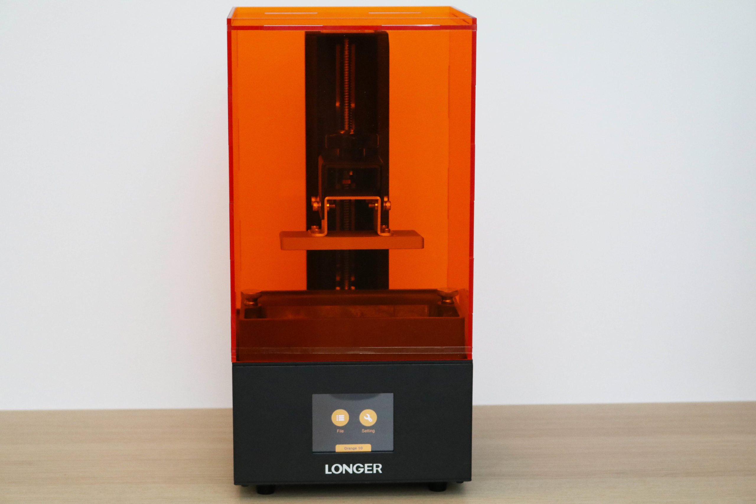
The Longer Orange 10 is the entry-level 3D printer in the Orange lineup and sits below the Orange 30 and Orange 4K in both price and features. It’s available from the Longer site for $139, a surprisingly-low price that is around the cheapest I’ve seen a 3D printer of any kind for sale. 

After testing the Orange 10, I’m left with more questions than answers as to who this printer is marketed towards. It uses an RGB masking LCD that defaults to a slow per-layer cure time as well as a small build volume. Importantly, it also has a pixel resolution that is over 50% larger than the Creality LD-002R, a comparable printer in price and size, resulting in lower resolution prints and pronounced stepping on shallow curves.

Longer Orange 10 Specifications

Machine Footprint 6.7″ x 6.7″ x 14.2″ (17.0cm x 17.0cm x 36.0cm)
Build Volume 3.86″ x 2.17″ x 5.5″ (98mm x 55mm x 140mm)
Resin DLP Photopolymer Resin
UV Light UV Matrix 405nm UV LED
Masking LCD Resolution 854 x 480
Masking LCD Size 4.5″
Interface 2.8″ LCD Touchscreen
XY Axis Resolution .115mm

Included in the Box of Longer Orange 10

(Image credit: Tom’s Hardware)

The Longer Orange 10 ships with all of the consumables you need to get up and printing including the power supply, a metal scraper for removing parts, gloves, a clean-up rag, a microSD card, a USB microSD card reader, and some resin filters for reusing resin. The UV-resistant lid ships disassembled (more on that later), and all the pieces required to assemble it are included in the box. The Orange 10 also includes a printed manual that covers all of the steps involved with getting the printer up and running.

Assembly of Longer Orange 10

(Image credit: Tom’s Hardware)

The Longer Orange 10 includes a UV-resistant lid that requires assembly before it can be mounted onto the printer. This is a little unusual; most MSLA resin printers like the Anycubic Photon Mono, Creality LD-002R, and the Elegoo Mars Pro use a single-piece acrylic lid that ships mounted to the printer. The lid for the Longer Orange 10 ships in five pieces that all have a protective film applied to both sides. This film tends to tear and delaminate when peeled and was very time-consuming to remove; it took me almost fifteen minutes to remove it fully.

(Image credit: Tom’s Hardware)

Once the protective film has been removed, the lid can be assembled. The jigsaw pattern on the sides of the panels allows them to snap into place, and the included black brackets hold the side panels together before the top panel is added. Assembling the lid felt a bit like a juggling act; the brackets and top hold the sides together, but the sides can’t be assembled without the top to hold them in place. It took a few tries to get it right but the lid eventually snapped together.

(Image credit: Tom’s Hardware)

The lid is held together with a pair of rubber bands; one at the top and one at the bottom. While this solution is relatively inexpensive and allows the printer to ship in a slightly smaller box, the general shakiness and lack of a sturdy lid did not inspire much confidence in me after it was put together. The rubber bands pulled tight around the acrylic corners, and I’m concerned that picking up the lid will cause the rubber band to tear over time from rubbing against the sharp corners of the acrylic panels.

Design of Longer Orange 10 

(Image credit: Tom’s Hardware)

The user interface of the Longer Orange 10 is a 2.8-inch color touchscreen LCD that offers basic functionality controls as well as real-time information during printing. The LCD is bright and responsive, but the overall UI is a little bare and the controls used to calibrate the build platform aren’t labeled intuitively.

(Image credit: Tom’s Hardware)

The Orange 10 uses a custom controller board with an STM32F103 microcontroller and an A4988 stepper driver. The controller board cooling fan is the loudest component on the printer, and it operates at a very reasonable volume during printing. The case of the Orange 10 is made from bent sheet metal, and I liked the solid and stable feel that it provided.

(Image credit: Tom’s Hardware)

The masking LCD on the Longer Orange 10 is a 4.5-inch screen with a resolution of 854 x 480. This combination results in a relatively low .115mm XY resolution, a much coarser resolution than the .035mm achieved by the 4K resolution masking LCDs like the one on the Phrozen Sonic Mini 4K. Even non-4K masking LCD screens like the one on the Creality LD-002R are capable of sub-.1mm resolution (the LD-002R is .075mm), so this slightly-thick XY resolution can result in parts with visible stepping on shallow curves.

(Image credit: Tom’s Hardware)

The build platform has a rear-facing slant, which allows resin to drip back into the vat during printing. The gantry to which it attaches is made from a bent piece of metal and the Z threaded rod has an anti-backlash nut installed to prevent banding during rapid movements. The motion components on the machine generally feel solid, and the gantry doesn’t seem to have any play during printing.

Leveling the Build Platform on Longer Orange 10 

(Image credit: Tom’s Hardware)

The build platform on the Longer Orange 10 is secured to the gantry with four bolts that are also used for leveling. After loosening the bolts on the gantry and placing a piece of paper over the masking LCD screen, I dropped the build platform to the home position and tightened the bolts on the gantry. 

The bolts have split ring lock washers as opposed to regular washers, which make leveling the bed a tedious and difficult task. As I tightened the bolts, the split ring washer moved just slightly and caused the build platform to raise or lower. Leveling this printer was a challenge that required me to work very slowly to make sure the build platform didn’t shift while tightening.

(Image credit: Tom’s Hardware)

After I leveled the build platform, I installed the resin vat in the printer and secured it with the two attached thumbscrews. The vat has a polymer frame with fill indicators graduated to the max fill line of 200ml embossed on the side. The FEP film at the bottom of the vat has been installed, pretensioned and is ready to use right out of the box.

Printing Safety with Longer Orange 10 

(Image credit: Tom’s Hardware)

The Longer Orange 10 uses 405nm UV resin, a material that you need to handle safely when in an uncured state to avoid injury. The resin can be harmful when making contact with skin, so make sure to wear gloves when pouring, cleaning up, or handling uncured resin. I also make sure I’m wearing gloves when removing the build platform after a print, as the resin tends to pool on top of the platform and can drip off while the platform is being removed.

Make sure you use the Orange 10 in a well-ventilated room to minimize the danger from inhaling fumes. Any spills or uncured resin stuck to a surface should be cleaned using 99% Isopropyl Alcohol and the container for the resin should be kept closed and secured when not actively pouring material.

(Image credit: Tom’s Hardware)

The build platform on the Orange 10 has four upward-facing bolts that are used to secure it to the bracket. This is a poor design element, as the location of the bolts means it is very difficult to clean uncured resin off inside the bolt caps or clean the space between the bolt heads and the bracket. While the slanted build platform does allow the majority of the resin to slide back into the vat, it still pools around where the bracket meets the build platform and it can be difficult to clean completely. While this isn’t a problem unique to the Longer Orange 10, it is certainly something I find to be unnecessarily time-consuming and could be easily solved with a one-piece build platform.

Printing the Included Test Prints on the Longer Orange 10

(Image credit: Tom’s Hardware)

The Longer Orange 10 includes four pre-sliced models that are ready for printing, as well as the .STL files used to make them. The first one I tested was VampireLordBust.lgs, a 75.26mm model that prints in five hours and nine minutes. The model (which I found uploaded on MyMiniFactory by searching for the file name) has supports designed into the model as opposed to being generated by the slicer software.

(Image credit: Tom’s Hardware)

I try to avoid models with supports designed into them, as every printer will handle them differently and the slicer software is usually better at generating them. This is more of a problem with MSLA resin printers, as larger supports need to be broken off which can shatter or crack the brittle cured resin.

(Image credit: Tom’s Hardware)

The part printed without any issues and, as expected, removing the support material left some defects. The two large bars underneath the arms were difficult to remove fully, and the thin beams under the chin left material behind after they were cracked off. The overall level of detail on the model was muted, and the resolution didn’t look as sharp as I would have expected from an MSLA resin printer. The teeth on this vampire bust have been individually modeled, but I noticed that they were difficult to differentiate on the printed model.

Image 1 of 2

(Image credit: Tom’s Hardware)

Image 2 of 2

(Image credit: Tom’s Hardware)

The built-in model The_Three_Wise_Skulls_20mb.lgs is a taller print (107.25mm) that let me get a better feel for the level of detail the Orange 10 was capable of. This sliced model was interesting for two reasons; it prints out completely support-free, and it also prints completely solid. This means that it uses more resin in the printing process and has a heavier, denser feel than the Vampire Lord bust (78 grams as opposed to 27). 

I was a little more impressed with the detail shown on this model, and the nine hour and 17 minute print time was a pleasant surprise considering the height of the model. The low XY resolution (.115mm) leads to visible stepping on the shallow curves of the model, most notably the back and sides of the skulls.

(Image credit: Tom’s Hardware)

Preparing Files for Printing with LongerWare 

(Image credit: Longer)

Longer includes two apps with the Orange 10; LongerWare and Chitubox. LongerWare is an app that is designed for the Orange 10, Orange 30, and Orange 120 MSLA resin 3D printers. LongerWare includes profiles for the various resin types including water-washable, standard, and castable at multiple resolutions. LongerWare offers the functionality you would expect from a slicing software, such as the ability to scale, rotate, and move models before preparing them for printing.

(Image credit: Longer)

I was disappointed in the overall experience while using LongerWare, though, as


thesoftware feels a little unfinished. There’s no ability to preview print times or material usage in the software, and once exported as an .lgs file for the Orange 10, the object can’t be opened to examine the settings. This feels like a major oversight, and it made planning my print schedule a little difficult. The only way to see the estimated print time is to save a project as a .lgs file, export it to the microSD card, insert the card into the printer, click print, and then see the time on the printer touchscreen interface.

(Image credit: Tom’s Hardware)

To test out LongerWare, I printed out a 32mm mini from Loot Studios sliced using the .05mm Water Washable resin profile. The mini (32mm_Georgios_HelmetVersion) printed in just over four hours, and it wasn’t until the mini was above the vat of resin that I noticed the supports had not attached to the model at various points. After removing the model and cleaning it, I saw that the shield was missing a large section. The supports for the shield printed all the way up to the contact point then stopped abruptly, leaving me to believe that the connection between model and support wasn’t strong enough to hold the model in place.

Image 1 of 2

(Image credit: Tom’s Hardware)

Image 2 of 2

(Image credit: Tom’s Hardware)

Despite the lack of support material on the shield, the spear printed without issue and successfully completed. The quality of the support material on the spear is hit or miss, with some of the individual structures fused with those adjacent to them.The various defects in this model are frustrating, but the bigger takeaway for me was the difficulty in using the LongerWare software. When compared with the alternative offered by Longer (Chitubox), it’s hard to imagine a situation where it would be advantageous to use LongerWare.

Preparing Files for Printing with Chitubox

(Image credit: Chitubox)

Chitubox includes the Orange Longer 10 on its list of supported printers, but you’ll need to import a plugin to export the .lgs extension used by the printer. Longer includes both the Chitubox app as well as the required plugin on the microSD card included with the machine. Chitubox offers all of the functionality of LongerWare as well as additional features such as print time estimates, material usage estimates, and the ability to fix any potential issues with a sliced file by deleting islands (individual pixels that are not connected to the main body and can float around in the vat or stick to the FEP film).

(Image credit: Chitubox)

I used the same profile on Chitubox that I used on LongerWare (Water Washable for 0.05mm), but I noticed that the exposure time was set to six seconds as opposed to eight. This is a minor difference, but it did make me wonder about what other changes may exist in the various profiles between the slicers. The Z speeds all seemed to be the same, and the bottom layers had the same exposure and height settings as well.

(Image credit: Tom’s Hardware)

Sliced in Chitubox, the 32mm miniature Minotaur model by Loot Studios printed out in 3 hours and 2 minutes and didn’t seem to have the support delamination issue that the model sliced in LongerWare had. The detail was similar to the other models printed, although some of the smaller features looked a little soft. The support material was attached to the model throughout, and the removal was quick and easy.

(Image credit: Tom’s Hardware)

(Image credit: Tom’s Hardware)

The Longer Orange 10 is a compact 3D printer with a noticeably smaller footprint than other MSLA resin 3D printers. The $199 Creality LD-002R MSLA resin 3D printer offers similar specifications at a slightly-higher price point, so it makes sense to compare the overall build volume and printer volume to get a feel for how much smaller the Longer Orange 10 really is.

Longer Orange 10 Creality LD-002R
Masking LCD Resolution 854 x 480 2560 x 1140
XY Resolution .115mm .075mm
Build Dimensions 3.86 x 2.17 x 5.5 inches 4.69 x 2.56 x 6.3 inches
Build Volume 46.07 cubic inches 75.64 cubic inches
Printer Dimensions 6.7 x 6.7 x 14.2 inches 8.7 x 8.7 x 15.9 inches
Printer Volume 637.44 cubic inches 1203.471 cubic inches
Build / Footprint Ratio (higher is better) 7.20% 6.20%

The significantly reduced length in the X and Z axes on the Orange 10 directly translates to a significantly impacted build volume when compared with the LD-002R. The lower resolution masking LCD on the Orange 10 means that the XY resolution is also lower than the LD-002R. However, the compact form factor of the Orange 10 gives it a slight advantage when comparing the overall build volume to footprint ratio.  

(Image credit: Tom’s Hardware)

Printing the Included Bracket Print on the Longer Orange 10 

(Image credit: Tom’s Hardware)

After printing a few miniatures, I wanted to see how the Longer Orange 10 performed when making parts that were intended for real-life use. The Orange 10 includes a file on the microSD called ‘BRACKET.lgs’ which prints out in a speedy hour and a half. The bracket has been filled with hexagonal lightweighting holes that perforate the model vertically and circular lightweighting holes that run through horizontally.  

(Image credit: Tom’s Hardware)

The printed bracket felt stiff and lightweight, and the inclusion of this model gave me something to think about while it was curing. While the overall resolution of the Orange 10 doesn’t seem up to the task of printing highly-detailed miniatures, larger or blockier models that don’t require sharp detail may be a good fit for this printer. 

The bracket had a minor amount of stepping in the XY plane, but that’s less of a consideration when printing functional parts like this. Seeing this model made me think that this printer may have a home with any user who is looking to print functional parts where accuracy is less of a concern.

Bottom Line

(Image credit: Tom’s Hardware)

The Longer Orange 10 is currently available directly from Longer for $139. In addition, the Orange 10 is $179.99 on Amazon, and Amazon Prime members can currently pick it up for a very reasonable $143.99 with free shipping. At that price, it can certainly appear that the Orange 10 is a good value for someone interested in getting involved with 3D printing. 

Unfortunately, I have a hard time finding a compelling reason to go with the Longer Orange 10 when other budget MSLA resin 3D printers like the Creality LD-002R exist in the same price range. The relatively low resolution on the XY plane and non-Mono LCD means that the Orange 10 will take longer to print lower resolution parts than other budget MSLA resin machines. The Orange 10 strikes me as an application-specific machine, but you will need to have that application ready and in mind before purchasing this printer. 

Generally speaking, a lot of the appeal of the Orange 10 will likely come from the rock-bottom pricing of the machine. For users unconcerned with speed or accuracy who want a hands-on assembly like they would get from the Creality Ender 3 Pro FDM 3D printer, the Orange 10 offers a complete MSLA resin 3D printing experience for less money than a date night for two.