polar-ignite-2-review:-enough-of-a-spark?

Polar Ignite 2 review: Enough of a spark?

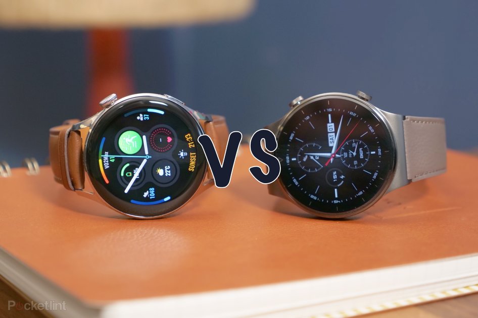
(Pocket-lint) – The Polar Ignite 2 is the follow-up fitness watch to the 2019 original. While it gives you all those key sports watch features, its key skills are to track your workouts and tell you the ones you should be doing next.

The relatively low asking price puts it up against the likes of the now older Apple Watch Series 3 or Fitbit Versa 3, but does the second-gen Polar deliver enough spark?

Design and display

  • 1.2-inch IPS TFT touchscreen, 240 x 204 resolution
  • 43mm case diameter, 8.5mm thick
  • Waterproof to 30 metres
  • Weighs 35g

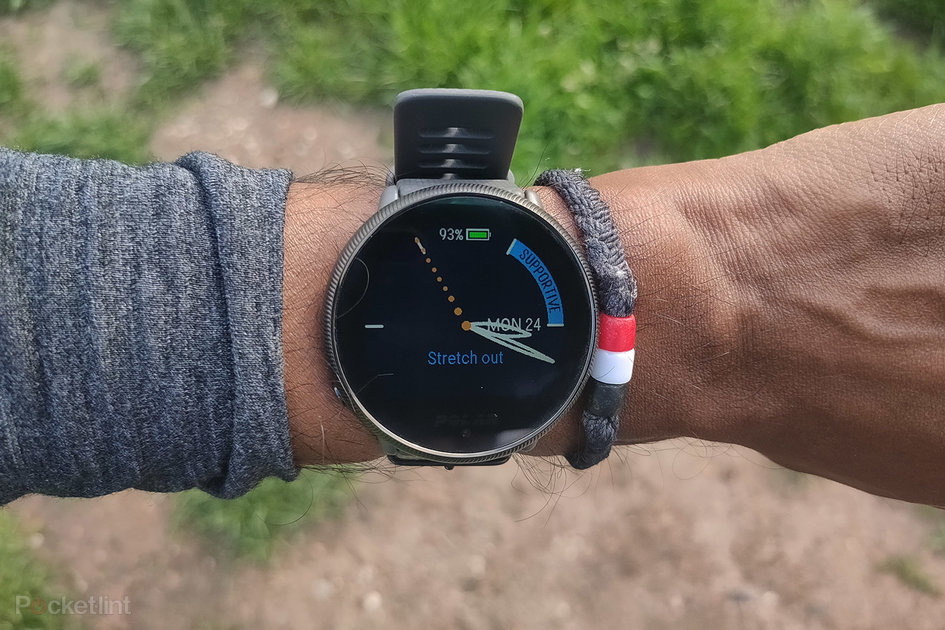
The Ignite 2 is virtually identical to the original watch. It has the same-sized round polymer case, with a single physical button tucked away in the bottom corner, and a touchscreen controlled display. 

Pocket-lint

That’s partnered up with a silicone strap with a traditional watch-style buckle that comes in two size options. Those straps are removable too with a simple pin mechanism, letting you quickly swap for one of Polar’s dressier options or a strap that looks a lot like one of Apple’s sport bands.

Polar is offering some more colourful options here too as well. There’s now champagne, blue, black, and pink strap options to go with the four case colour options.

The Ignite 2 is a light watch – at just 35g – and we’ve found it’s been very comfortable to wear 24/7. If you like the idea of a watch that doesn’t sit big and bulky on your wrist, then it’s got appeal. 

The biggest design change over the Ignite lies with the more textured, grippier finish on the case. With the right case and strap combo, it gives a slightly nicer-looking watch than its predecessor, but it’s the smallest of changes where pretty much everything else otherwise remains the same.

Pocket-lint

Another element that hasn’t changed is the screen. It’s the same 1.2-inch touchscreen display that offers the same in the way of overall quality and viewing angles. It’s not as crisp, vibrant or as colourful as an AMOLED screen, but it’s a good enough screen surroundings to soak up your stats. 

What isn’t so good is the still lingering lagging you get when interacting with this screen. It was the same on the first Ignite and clearly Polar hasn’t sought to improve things regarding the screen’s slightly delayed response.

Software and performance

  • Phone notifications, music controls and weather forecasts
  • Works with Polar Flow and third-party apps 

As is the case with all of Polar’s watches (aside from a brief play with Google’s Wear OS for its M600 watch), it sticks to packing on its own in-house operating system. 

It’s a software that pairs to your phone over Bluetooth and does offer the ability to pair up external Bluetooth heart-rate sensors. In the Ignite 2 you don’t get the ANT+ connectivity you get on more expensive Polar watches to widen the support of devices you can connect it to.

The software experience is similar to what you’ll find on Polar’s top-end watches, albeit with a greater emphasis on using the touchscreen to navigate your way around the interface. You can commence workout tracking in the same fashion, while swiping left and right on the watch screen will drop additional information around the watch face, such as current heart rate, activity tracking data, and a useful weekly summary of your training.

Polar has sought to offer more smartwatch features on the Ignite this time around, rolling out features that have already appeared on its Vantage series and Grit X watches. Along with the same notification support, you now getting weather forecasts, the ability to adjust the look of watch faces, and there’s now music controls here too.

Pocket-lint

They’re not groundbreaking features, but they’re ones that make the Ignite 2 more useful to have around when you’re not just working out. They work well enough, too, although displaying notifications still feels a little clunky. The music controls are easy to use and work with third-party apps like Spotify, though, which is good news.

Off the watch, your go-to place for setting things up is the Polar Flow phone app or desktop app, but this is a watch that will play nice with third-party apps if you want to bypass Polar’s own once you’ve set things up. Much like Garmin, there’s a lot going on in Polar Flow and it pays to spend some time to get to know where things live in the app and get a sense of what all of the extra training insights mean.

Sports and fitness tracking 

  • FitSpark workout recommendations
  • Nightly Recharge measurements 
  • Pool swim tracking  

Despite its small stature, Polar still manages to pack in quite an impressive array of features into the Ignite 2. There’s built-in GPS, the same Precision Prime heart rate monitor technology used on its pricier Vantage watches, and a rich collection of training features like adaptive running programmes.

Pocket-lint

For sports tracking, you’re getting access to over 130 profiles – with activities like running, cycling, pool swimming the best served. There’s also profiles for HIIT and cross training, with a bigger emphasis on monitoring heart rate to measure effort levels during those workouts.

GPS signal pick-up was nice and snappy on our outdoor runs and distance tracking accuracy and core running metrics were in line with a similarly-priced Garmin watch.

In the water, however, the Polar wasn’t so good. Accuracy of tracking laps was fine on shorter swims, but accuracy waned noticeably over swimming longer distances above 400-500 metres.

Pocket-lint

If you’re hoping for a reliable heart rate monitor, then the one on the Ignite 2 performed well in most of our tests. On runs and home workouts, it was a few beats per minute (bpm) out from a Garmin HRM-Pro chest strap monitor. For something more intense like interval training, that accuracy and ability to keep up with the sudden spikes and drops in heart rate shows though. It’s not a terrible performer, but if you yearn for supreme accuracy, take the opportunity to pair up an external sensor.

One of the standout features on the Ignite 2 is FitSpark. This is Polar’s smart suggested workouts feature that looks at the types of sessions you’ve logged with your watch to recommend workouts you should do around them. So it may suggest working on strength if you’ve been smashing the cardio lately, or adding some mobility work to better balance your training.

It works really well too, clearly instructing you what to do during the workouts and will start a countdown and send a vibrating buzz to let you know when to prepare for the next workout. It’s not a feature unique to this Polar watch, but it’s one that’s great to use if you’re not sure about what to do when it comes to training.

Pocket-lint

If you’re yearning for some of the more advanced training analysis you get on Polar’s other watches, you can still get details on your cardio load status and you can learn more about whether you’re under- or over-training. You can now also understand what’s fuelling your run with the new Energy Sources feature – this heart rate-fuelled feature gives you a breakdown if you’ve used carbohydrates, proteins or fats to power a workout. 

The Ignite 2 doubles up as a pretty solid fitness tracker too. It will track steps, distances, nudge you when you’ve not been active for a period of time, and display in the app a breakdown of when you were most active during the day.

But what’s really impressive with the Ignite 2 is the sleep tracking. It offers all the typical things you’d expect to find on a sleep monitoring watch, including a breakdown of sleep stages including REM sleep and sleep scores. Where things get interesting are the Nightly Recharge measurements, which aim to help you better assess if you’ve recovered from a tough physical day. It looks at sleep quality and how your autonomic nervous system calms during the early hours of sleep to generate the measurement. It can then offer tips on whether you should train or why you might have had a bad night of sleep.

Pocket-lint

The accuracy of sleep tracking ultimately dictates how useful this feature is – and against a Fitbit’s pretty impressive sleep tracking the Polar held up really well on that front. So if you’re looking for a watch that tracks sleep but also offers useful, actionable insights based on that data, the Ignite 2 fits the bill. 

Battery life

  • 165mAh battery, up to 5 days per charge
  • 100 hours in training mode
  • 20 hours GPS battery life

The Ignite 2 promises to deliver up to five days of life in smartwatch mode – with continuous heart rate monitoring in use. When you’re using GPS, you can expect to get 20 hours of tracking time. And there’s now a new training mode that will record workouts up to 100 hours.

What we’ve learnt over our experience with Polar’s latest watches is that they can come up a little short on those claims. That doesn’t change with the Ignite 2. It’s clear the more advanced sleep monitoring features Polar has introduced have quite a noticeable drain on battery – and you can’t turn it off. You can disable continuous heart rate monitoring, which will get you to that five day mark – otherwise it’s more like four.

Pocket-lint

When you’re putting GPS tracking to use, you’re getting around the same battery life as a similarly priced watch from Garmin, but significantly more GPS battery life than what you’re going to get from any Apple Watch model. If you want something that can get you just under a week of training, then that’s what the Ignite 2 will get you.

When it’s time for charging, Polar retains the same disc charger that clips onto the back and takes over an hour to get from 0-100 per cent, so it’s a relatively snappy charger.

Verdict

Polar hasn’t made wholesale changes compared to the first Ignite, instead focusing on improving the look and trickling down some features from its pricier watches into the Ignite 2.

But it’s got pretty much everything you could want in a fitness watch, offering solid tracking for most activities, plenty in the way of data, features and insights, and is a light and comfortable watch to live with.

Features like FitSpark and the Nightly Recharge measurements is what really makes the Ignite 2 stand out from the similar price competition. The latter though clearly is a drain on battery life. 

As a smartwatch you’ll get more from the likes of Garmin, Fitbit and Apple. But in terms of a fitness watch first and foremost there’s a lot to like here.

If you like the idea of a watch that does a great job of bringing training and recovery closer together and helping you make sense of it, the Ignite 2 is worth strapping on.

Also consider

Pocket-lint

Apple Watch Series 3

While you’ll have to live with much less battery life, the Series 3 gives you a better screen, smartwatch features, and pretty solid sports tracking in a more attractive, customisable look.

  • Read our review

squirrel_widget_148296

Pocket-lint

Garmin Venu Sq

The square Venu Sq is in a similar price range and again offers a nicer display and more smartwatch features like Spotify offline playlist support.

  • Read our review

squirrel_widget_2682025

Pocket-lint

Polar Unite

If you can live without the built-in GPS, the Unite offers those great FitSpark and Nightly Recharge measurements for less money.

  • Read our review

squirrel_widget_272302

Writing by Michael Sawh. Editing by Mike Lowe.
oneplus-updates-its-midrange-nord-with-new-processor-and-a-headphone-jack

OnePlus updates its midrange Nord with new processor and a headphone jack

OnePlus has announced a new addition to its lineup of midrange phones, the Nord CE. According to the company, the “CE” stands for “Core Edition,” an indication that the company is focusing on the fundamentals, rather than inflating the device’s spec sheet with unnecessary extras. The phone is launching in Europe and India, and there are no plans for a US release.

What this focus on the fundamentals means in practice is that the Nord CE is slightly stripped down compared to last year’s Nord, but it’s slightly higher-specced than its predecessor, too. So you’re getting a higher-resolution 64-megapixel main camera (up from 48 megapixels), but there are only three rear sensors in total. (There’s also an 8-megapixel ultrawide with a 119-degree field of view and a 2-megapixel monochrome sensor.) The Nord CE also only has a single 16-megapixel selfie camera, with no secondary ultrawide like the original Nord.

The phone features a very similar design to its predecessor.
Image: OnePlus

Internally, there’s a Snapdragon 750G powering this year’s model, compared to the 765G in last year’s phone. OnePlus claims its CPU is 20 percent faster, while its GPU is 10 percent faster. That’s paired with a choice of 6, 8, or 12GB of RAM, although these options vary slightly based on region. There’s a 4,500mAh battery inside the Nord CE, up from 4,115mAh last year, and the phone supports Warp Charge 30T Plus fast charging, which OnePlus says should charge you from 0 to 70 percent in half an hour.

Externally, the Nord CE looks very similar to its predecessor. It’s got a very similarly styled camera bump on the back left (though with three rather than four cameras) and a hole-punch for its selfie camera on the front of the phone (again, with one rather than two cameras). However, on the bottom of the phone, you’ll find a headphone jack, which was missing from last year’s device. In terms of display, the Nord CE comes with a 6.43-inch 90Hz 1080p OLED panel. The phone is available in blue, black, or silver.

The Nord CE will be available to preorder in limited quantities from OnePlus itself starting today in the UK, and these devices will ship on June 14th. The device goes on general sale on June 21st. In the UK, it starts at £299 (€329) for the model with 8GB of RAM and 128GB of storage, and £369 (€399) for the model with 12GB of RAM and 256GB of storage. In Europe, there’s a version with 6GB of RAM and 128GB of storage, which will retail for €299. Those prices are slightly cheaper than the original Nord, which started at £379 (€399) for its 8GB model.

Like the original Nord, OnePlus says it doesn’t have plans to release the Nord CE in the US. Instead, the US has the OnePlus Nord N200 5G to look forward to. It’s a successor to the N100 that OnePlus CEO Pete Lau recently confirmed will retail for under $250.

samsung-pushes-pixel-size-even-further-with-new-camera-sensor

Samsung pushes pixel size even further with new camera sensor

Samsung has announced a new image sensor for smartphone cameras that it says has the smallest pixels in the industry. The ISOCELL JN1 is a 50-megapixel sensor with a relatively tiny 1/2.76-inch format, meaning its pixels are just 0.64μm in size. For comparison, Samsung already broke records in 2019 with the slightly larger ISOCELL Slim GH1, another 50-megapixel sensor with 0.7μm pixels.

Conventional camera wisdom says that smaller pixels usually result in worse image quality with higher noise, so why is Samsung doing this? According to the company, it’s about form factor versatility. The sensor’s smaller size means it can be used in ultrawide or telephoto camera modules — which are challenging to design when size is at a premium — or as a way to reduce the height of the primary camera bump.

As with other high-resolution camera sensors, the JN1 will make use of pixel-binning technology that combines multiple pixels into one for higher light sensitivity. In this case, Samsung says the sensor will capture 12.5-megapixel photos with the equivalent of 1.28μm pixels, and the company is also claiming a 16 percent boost to light sensitivity with its ISOCELL 2.0 tech.

Unusually, Samsung even held a full-on live-streamed launch event for this sensor, which you can watch here:

Samsung says the JN1 is currently in mass production, so it’s likely to show up in smartphones before too long.

cooler-master-mm720-review:-respawn

Cooler Master MM720 Review: Respawn

Our Verdict

The Cooler Master MM720 is a unique gaming mouse that improves on its predecessor, the Spawn, with a case, sensor and cable that compete with other high-end mice.

For

  • + Unique design with ring finger support
  • + Pure PTFE feet
  • + Very lightweight, flexible cord

Against

  • – Side buttons can be hard to reach
  • – Cable already suffers from light kinking

It took nearly a decade, but Cooler Master finally announced a followup to its Spawn gaming mouse at CES 2020. The vendor has followed up its cult classic with the Cooler Master MM720. Available for $40$50 as of writing, the MM720 is ready for the new millennium with a honeycomb-style chassis, upgraded sensor and a cable with both pros and cons. Ultimately, it’s a winning package that not only competes favorably against modern rivals but also its predecessor, which some consider the best gaming mouse of yesteryear.  

Cooler Master MM720 Specs

Sensor Model PixArt PMW-3389
Sensitivity Up to 16,000 CPI native or 32,000 via software 
Polling Rates 125, 250, 500, or 1,000 Hz
Programmable Buttons 6
LED Zones and Colors 2x RGB
Cable 6 foot (1.8m) USB Type-A 
Connectivity  USB Type-A
Measurements (LxWxH) 4.15 x 3.01 x 1.47 inches (105.42 x 76.5 x 37.4mm)
Weight (without cable)  1.72 ounces (49g) 
Extra Replacement PTFE feet

Design and Comfort 

Modern gaming mice often seem like they were made from the same mold. That isn’t necessarily a bad thing because manufacturers have mostly settled on shapes that can appeal to a broad audience, and breaking that mold can result in a truly awful mouse. But that didn’t stop Cooler Master from eschewing the staid designs of modern mice in favor of the unique, seemingly hand-molded case that inspired the original Spawn gaming mouse.

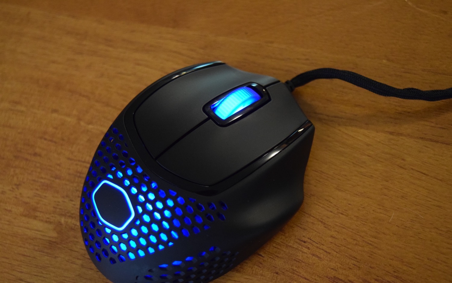
The Cooler Master MM720 is short, wide and defined by its curves. It almost seems like the company handed someone a ball of Silly Putty, told them to pretend it was a mouse and then used the resulting shape as inspiration. There is nary a flat surface on the mouse; every point of contact has been contoured in some way to better accommodate the natural shape of most people’s hands. This looks weird, yes, but it feels great during use.

Image 1 of 6

(Image credit: Tom’s Hardware)

Image 2 of 6

(Image credit: Tom’s Hardware)

Image 3 of 6

(Image credit: Tom’s Hardware)

Image 4 of 6

(Image credit: Tom’s Hardware)

Image 5 of 6

(Image credit: Tom’s Hardware)

Image 6 of 6

(Image credit: Tom’s Hardware)

But all of those things were true of the Spawn when it debuted a decade ago. The Cooler Master MM720 complements that ergonomic design with an ABS plastic honeycomb shell that weighs roughly half as much as its predecessor, a PixArt PMW-3389 optical sensor that’s been moved to a more sensible location under the mouse and a braided cable that should offer a better experience than the rubber cable Cooler Master had to use in the Spawn.

Cooler Master has also welcomed modern design trends with the MM720 in the form of two color options, white and black, with either a glossy or a matte finish. There’s a subdued Cooler Master logo on the palm rest that—along with the scroll wheel—provides the new mouse’s obligatory RGB lighting. And, of course, the honeycomb shell makes the MM720 look much different from the Spawn’s solid plastic construction.

The result is a mouse that is familiar in many ways, thanks to its similarity to mice like the similarly priced Cooler Master MM710 and Glorious Model D, yet still novel because of its shape. The Cooler Master MM720 measures 4.15 inches long, 3.01 inches wide and 1.5 inches tall and weighs 1.72 ounces. For comparison, the MM710 is 4.59 x 2.46 x 1.51 inches and about 1.87 ounces, and the Model D- is 4.72 x 2.40-2.64 x 1.30-1.57 inches and 2.4 ounces. 

Unfortunately, the matte black option of the Cooler Master MM720 we tested is also a fingerprint magnet, which gives the already odd-looking mouse an even less appealing aesthetic. This problem might not be as noticeable on other versions of the mouse though, especially the white ones. And it’s merely a cosmetic issue. Cooler Master says the MM720’s case offers IP58 dust and water resistance, thanks to its special coating. The company also claims “you can dunk this bad boy in water to clean it off,” but I wasn’t brave enough to test that claim.

I also noticed some light kinking on the cable after just a little over a week of use. At this point it’s more of a visual distraction than anything else, but it does raise concerns about the cable’s long-term durability.

Gaming Performance

The Cooler Master MM720 is surprisingly comfortable to use for extended periods, and that’s mostly because it offers a place to rest your ring finger while you’re playing. Most gaming mice tend to ignore the existence of our ring fingers entirely—companies typically account for our thumbs, index fingers and middle fingers before calling it quits. But the Cooler Master MM720’s design accounts for one of those neglected appendages (sorry, pinky), and this seemingly inconsequential change makes a noticeable difference over the course of a long play session.

It’s also surprisingly easy to fling the Cooler Master MM720 around a mousepad. Many of the changes Cooler Master made to this mouse contribute to that ease of movement: the 100% pure PTFE feet are smoother than Rob Thomas, and the braided cable offers minimal drag, although it was still somewhat distracting coming off the wireless mice I’ve reviewed lately. I’m firmly in the wireless camp at this point, (see our Best Wireless Mouse page for recommendations), but if you insist on having a cable you could do worse than the Cooler Master MM720 when it comes to actual gameplay. Of course, your final views will depend on how founded or unfounded those concerns about durability prove to be.

The Cooler Master MM720’s light weight, smooth feet and braided cable are complemented by the PMW-3389 optical sensor, specced for up to 16,000 counts per inch (CPI) sensitivity, a max velocity of 400 inches per second (IPS) and max acceleration of 50g. Many other mice, including the excellent Razer Naga Pro, use the same sensor to great effect. 

The sensor’s also in a sensible position on the MM720: smack-dab in the middle of the mouse, as opposed to the offset sensor found in the original Spawn. I didn’t have any trouble popping heads in Valorant with the Cooler Master MM720, and the PMW-3389’s reliability is a big contributor to that. 

Another contributor: The LK optical micro switches used in the primary mouse buttons. They are certainly responsive, and I only found myself shouting “but I clicked!” because of network problems, not because of a missed input. Cooler Master markets the switches as offering “nearly instant actuation” and reducing debounce time to “practically zero.”

In fact, the only problems I had in-game with the Cooler Master MM720 involved the side buttons. They appear to be well-made, as I didn’t notice any pre or post-travel during everyday use, but their placement just doesn’t work for me. Practically every aspect of the mouse lends itself to a relaxed grip, so I want to rest my thumb in the dedicated groove along the side of the case, but the side buttons are located above that groove. This placement wouldn’t be a problem with my normal fingertip grip, but because of the Cooler Master MM720’s design, I would end up using something closer to a palm grip that forced me to stretch my thumb every time I wanted to press a side button. Cooler Master says the MM720 is fit for palm and claw grippers, but I can’t comfortably use a claw grip and take advantage of the ring finger rest, so it ended up being a matter of which trade-off I was most willing to live with.

Whether or not that’s a problem for you will depend on the grip you use, the size of your hand and how much importance you put on the side buttons. But it did seem a bit strange that this one aspect of the Cooler Master MM720’s design was at odds with the rest of the mouse. Maybe there’s a technical limitation preventing a lower placement for the side buttons or perhaps the grip I settled on wasn’t actually what Cooler Master had in mind. Hopefully others fare better in that regard.

Features and Software

Image 1 of 5

(Image credit: Tom’s Hardware)

Image 2 of 5

(Image credit: Tom’s Hardware)

Image 3 of 5

(Image credit: Tom’s Hardware)

Image 4 of 5

(Image credit: Tom’s Hardware)

Image 5 of 5

(Image credit: Tom’s Hardware)

The Cooler Master MM720 is configured using the comically named Cooler Master MasterPlus+ software. The utility offers information about your system, like the temperature, usage percentage, and voltage of your CPU and GPU by default. You can also use it to manage your other Cooler Master hardware. It checks for any new firmware on first launch, offers to install it and then gets out of the way so you can configure the Cooler Master MM720 using its many distinct settings.

The six programmable buttons can all be configured under the appropriately titled Buttons page. Because of the software’s Mouse Combo feature, there are actually just five programmable buttons—the side buttons, right mouse button and the scroll wheel directional inputs—by default. That setting allows each of the mouse’s buttons to perform a secondary function when the scroll wheel button is held down. Luckily that setting, which is enabled by default, can be disabled right on this page.

The MasterPlus+ software offers a variety of actions. Each button can be disabled, set to behave like another mouse button, keyboard key, or DPI switch, used to control multimedia playback or tasked with executing a macro, switching between profiles or performing a Rapid Fire action that repeats a given input up to 99 times as quickly as possible. There’s also an option to disable the sensor, which could prove useful if you want to stop someone from clicking around your system or if you want to watch a video without the controls popping up because you happened to jostle your desk, and the DPI switch on the bottom of the mouse can be assigned any of these functions as well.

The Cooler Master MM720 also offers a surprising amount of control over its performance. The usual settings are all here: You can enable angle snapping, toggle lift-off distance, or set the polling rate to 125, 250, 500, or 1,000 Hz. There are also sensitivity controls between 200 and 32,000 CPI; just be warned that setting the CPI any higher than 16,000 uses software and also causes problems because of the PMW-3389’s limitations. And by “causing problems” I mean the cursor is nigh impossible to control, skips around the screen, and is essentially unusable. Cooler Master provides seven CPI stages for toggling with the CPI switch that all offer separate values for their horizontal and vertical sensitivity; although, the two are linked by default.

MasterPlus+ also offers sliders for angle tunability, button response time and the operating system’s settings for double-click speed and pointer sensitivity. But the premier feature is Surface Tuning, which is supposed to optimize the sensor for your particular mousepad. I didn’t notice any improvement, but I’m also used to adapting to a variety of sensors in numerous mice, so maybe someone who spends months on end with the same mouse and/or sensor would better appreciate the setting.

The software’s RGB settings are similar to those found in most other utilities. Cooler Master offers seven preset colors, as well as slots for seven custom colors that you can set by using a color wheel or providing RGB values and adjusting the brightness slider. There are four built-in effects—Static, Breathing, Color Cycle and Indicator—that mostly perform as expected. I say mostly because Indicator is a bit of an odd duck. It’s not clear what exactly it’s indicating, and it’s the only built-in effect that uses different colors for the two RGB zones—blue in the palm rest and pink under the scroll wheel— but those colors don’t appear to be customizable and they remain static even if I move the mouse or click around the app.

There’s also the option to create a custom lighting effect, but this seems to be limited to solid colors because the LED speed and LED direction settings are grayed out. Aside from using the Indicator setting, this appears to be the only way to set different colors for the two RGB zones, but the process isn’t particularly intuitive. You have to select a color and then, entirely without prompting, click on the zone you want to assign that color in the preview window.

Macros, meanwhile, are surprisingly limited. All you’re able to do is tell MasterPlus+ to start recording your keyboard or mouse inputs, tell it when to stop recording and then set the input delay for the individual actions you performed. The only other option is to run a macro once, have it loop for as long as the designated execution key is held down or have it loop until that key is pressed again. That isn’t to say the macros can’t prove useful, but they are more limited than they are in other utilities.

Finally, there are profiles. Cooler Master offers five by default, and they can each be reset, renamed, overridden by an imported profile, exported, or viewed as a .exe file in your file system. Otherwise, they simply store the settings managed by the other sections in the app to the mouse’s 512KB of onboard storage. You can change the mouse’s current profile without having to open (or download) the app again by using the profile switch button.

Bottom Line

(Image credit: Tom’s Hardware)

I said in my review of the MSI Clutch GM41 Lightweight Wireless that it featured the “prototypical gaming mouse look.” Nobody could say that about the Cooler Master MM720. It’s a unique mouse that breaks the mold with purpose—providing a more comfortable gaming experience—instead of a misguided attempt to simply look different from the other mice on the market. Sure, the groundwork for this design was laid over a decade ago, but it’ll still be novel to most of its potential customers. 

The Cooler Master MM720 is also a surprisingly good value, with  a honeycomb shell, modern-day sensor, braided cable, large 100% pure PTFE feet and two RGB lighting zones, starting at $40 as of writing. Many companies would either charge more for mice with those components or choose different parts. The HK-Gaming Mira-M (currently $40), for example, relies on a PMW-3360 sensor and smaller feet.

The primary drawbacks to the Cooler Master MM720 are the placement of its side buttons and the questionable durability of its cable. But of far greater concern is the mouse’s shape and if it fits your style. I preferred palm gripping with the MM720, and people who’ve been waiting for a followup to the Spawn or a more ergonomic gaming mouse should be excited by the MM720. If you prefer an ambidextrous mouse or a claw grip, the Glorious Model D- and Mira-M may be better options. 

There isn’t necessarily a clear winner between the Mira-M, Model D- and MM720, which all earned our Editor’s Choice Award. But that might actually be a good thing: Having options with quite different shapes but similar pricing, specs and performance is a sign that this ultralight segment is maturing. Now you can opt for the mouse that best suits your hand size, grip and play style. 

For gamers seeking a unique, ergonomic-minded option, the Cooler Master MM720 is a solid product. Let’s just hope it doesn’t take Cooler Master another decade to release a followup, eh?